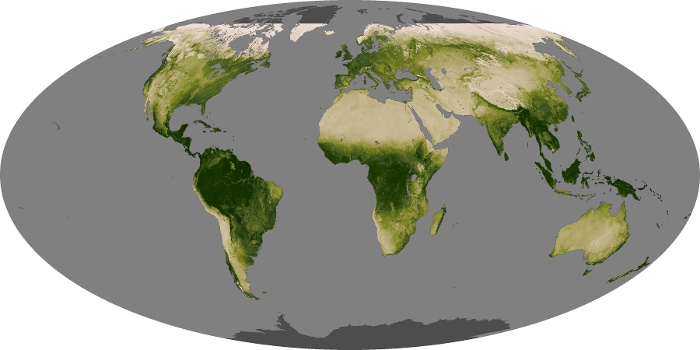


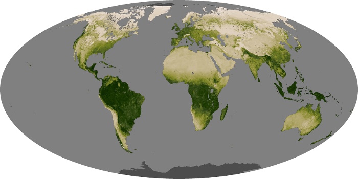

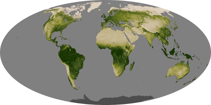


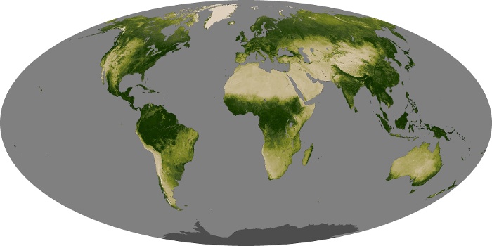

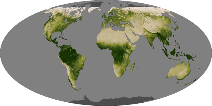


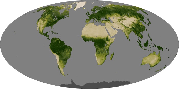


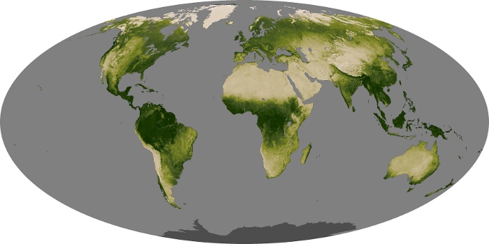


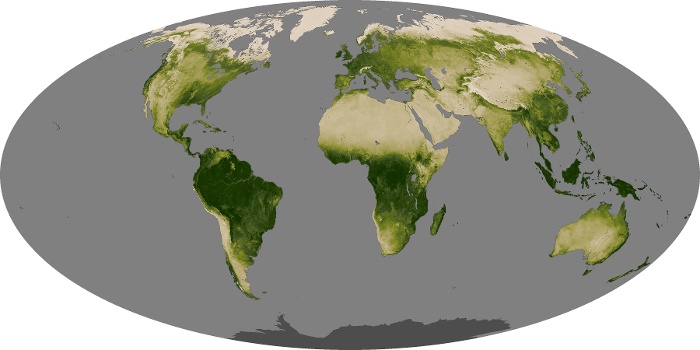
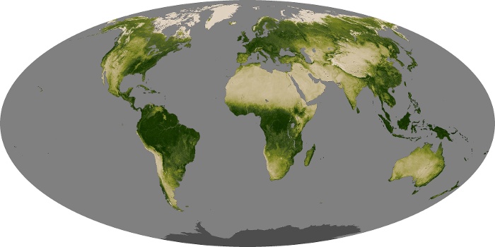


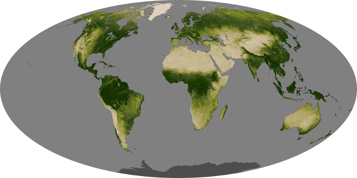
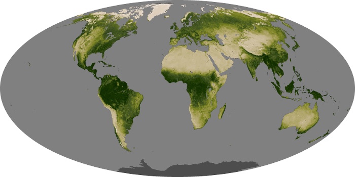

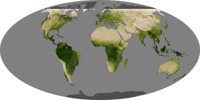

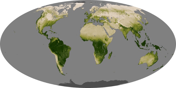
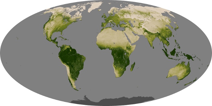
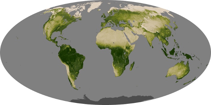


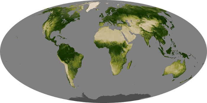

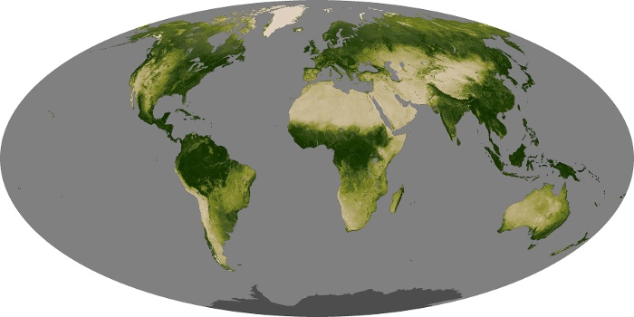

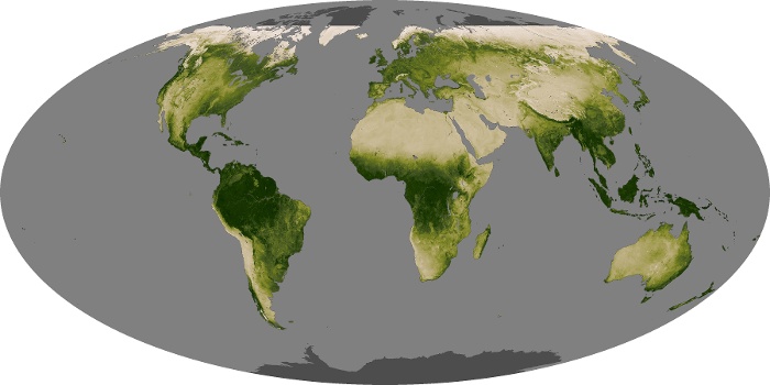
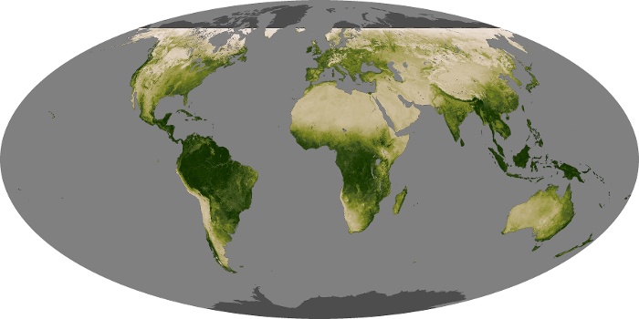


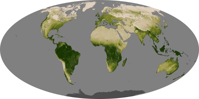
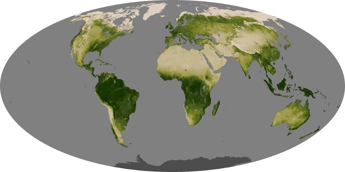
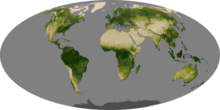

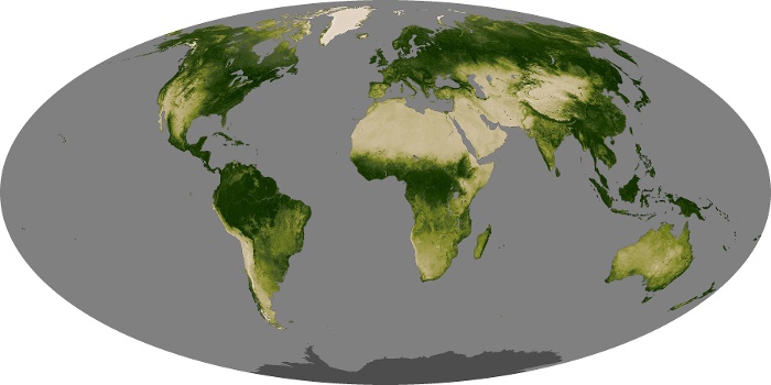
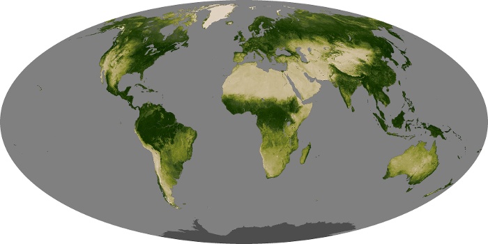

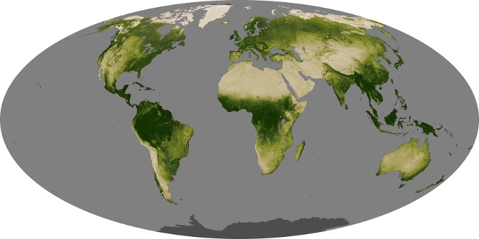


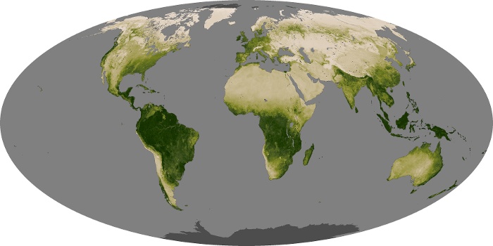
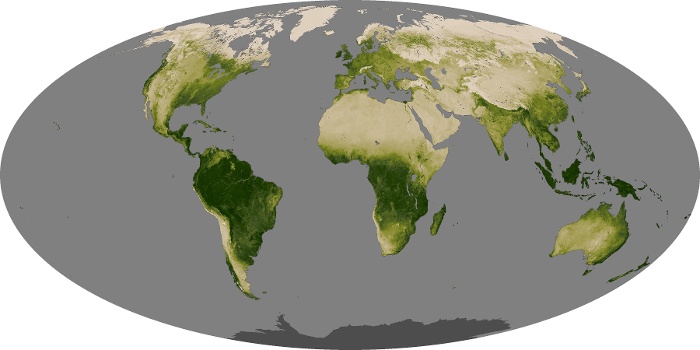
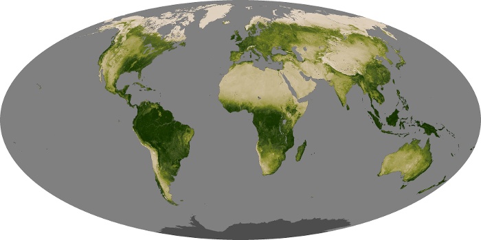

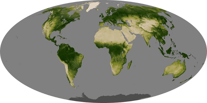
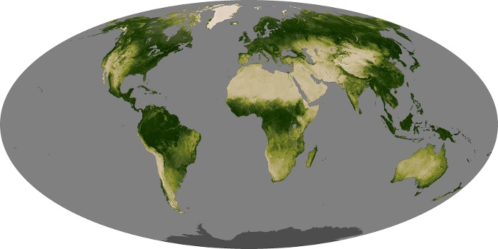
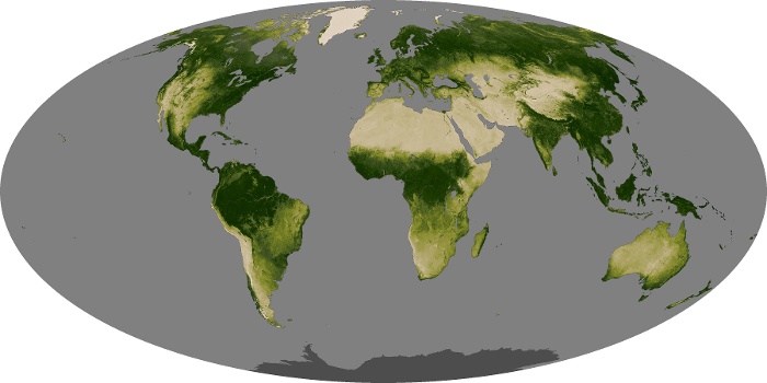


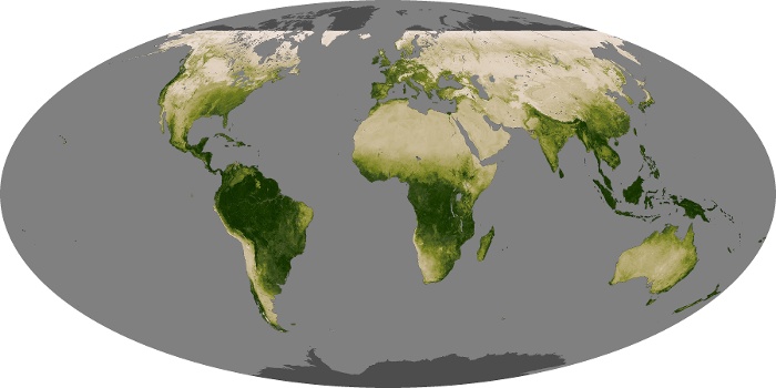
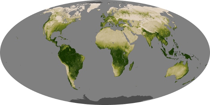

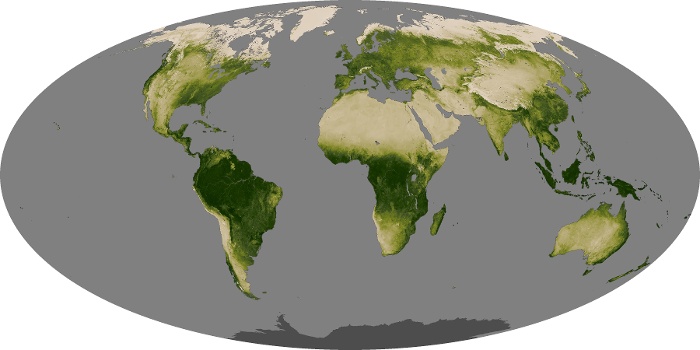


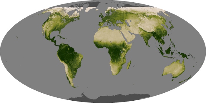


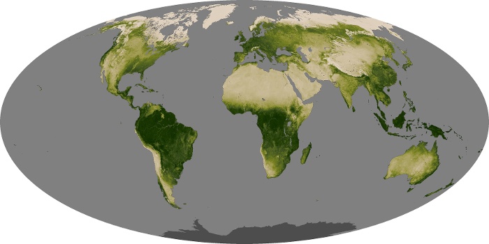


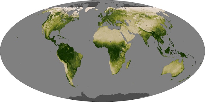


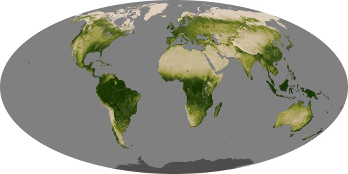


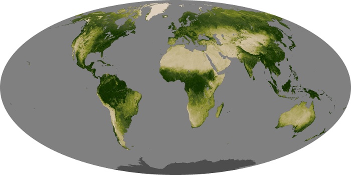

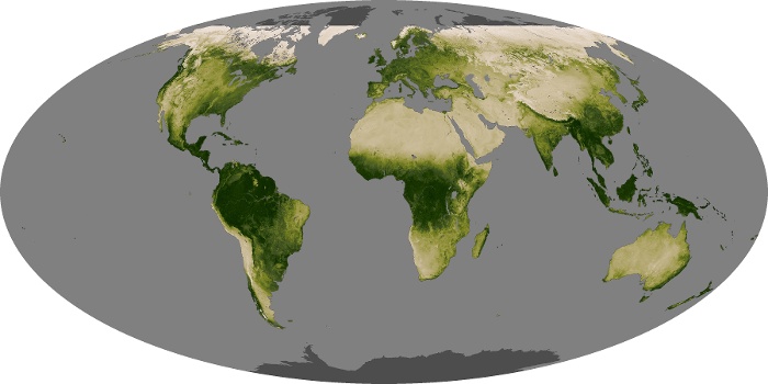


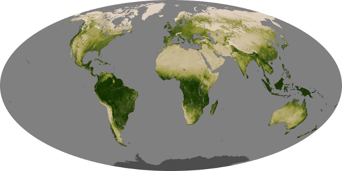
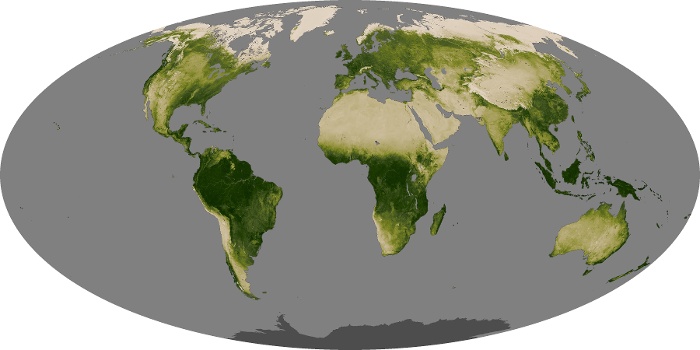


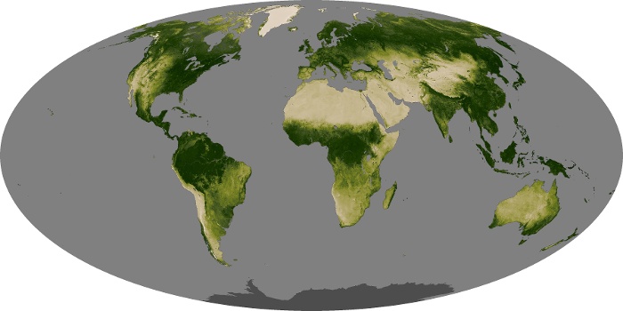

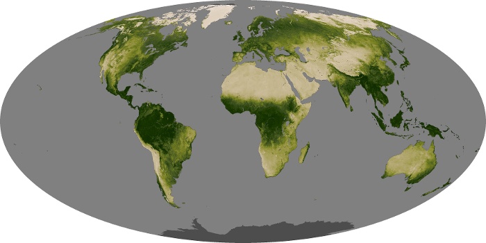


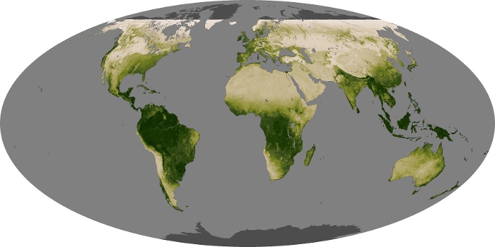
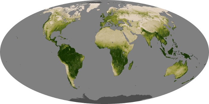
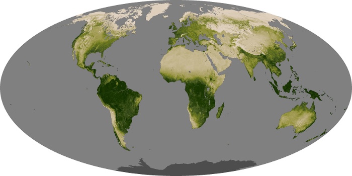
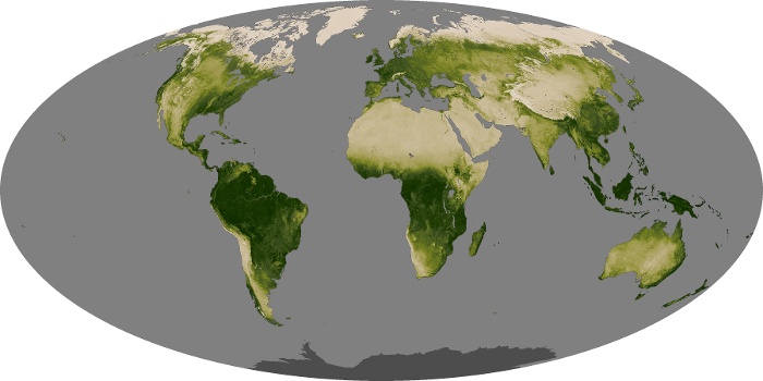
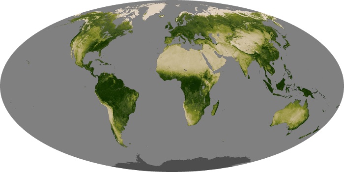

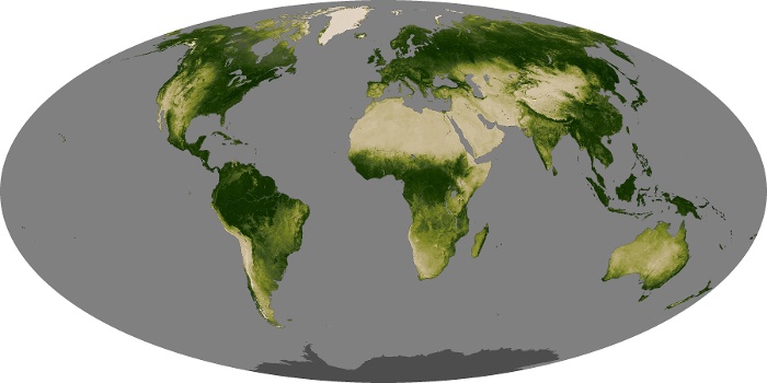
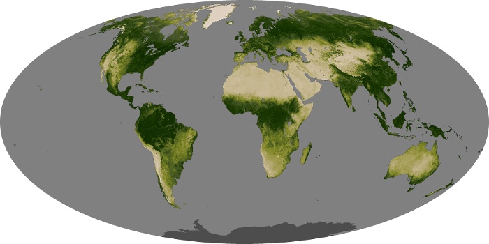

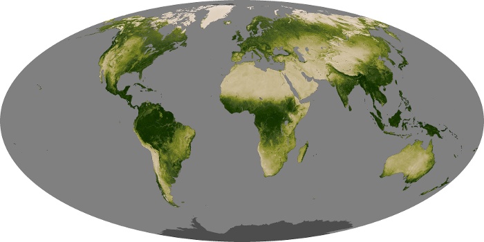


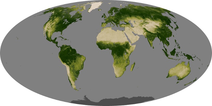

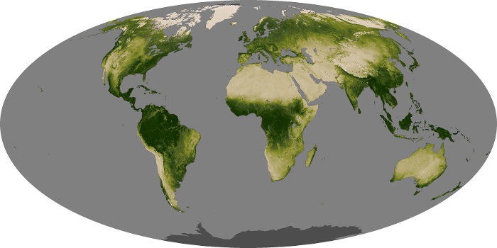


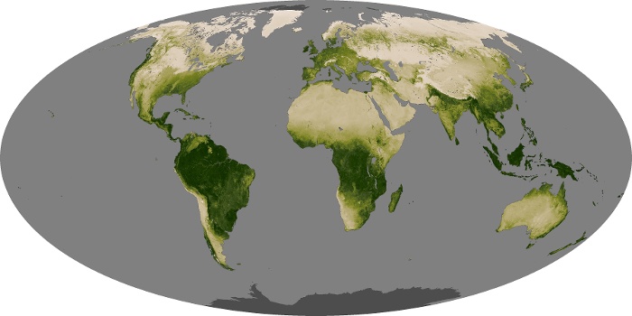

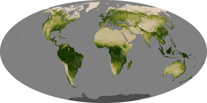


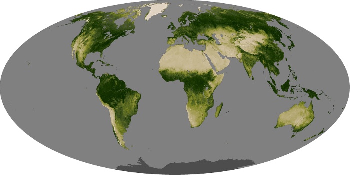


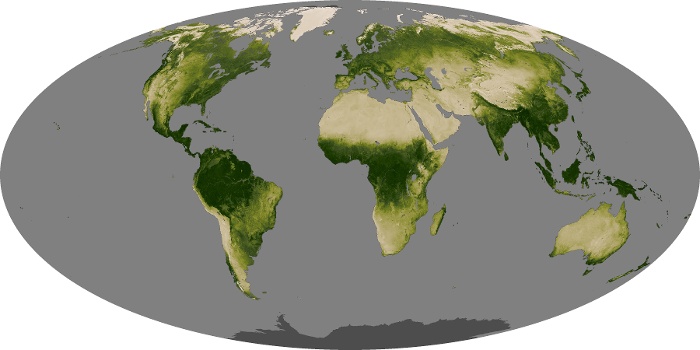
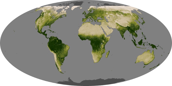
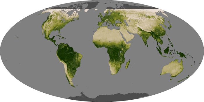
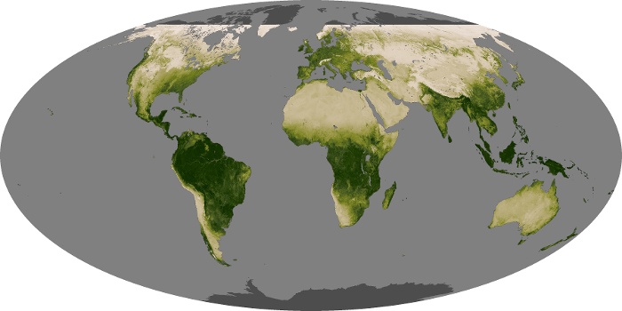


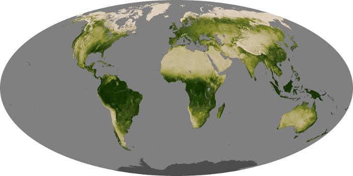

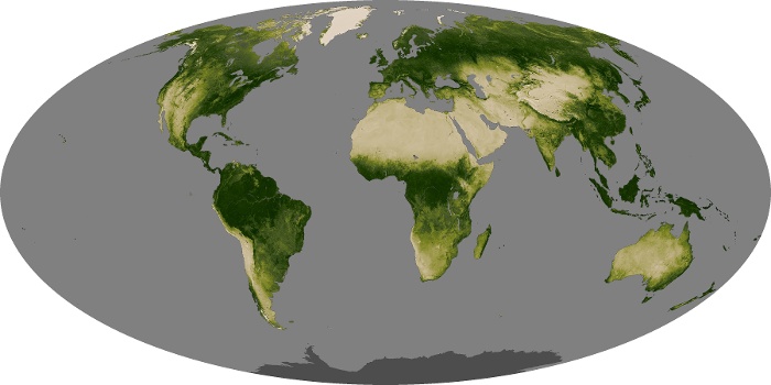

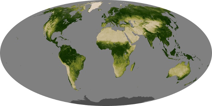

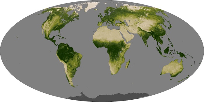
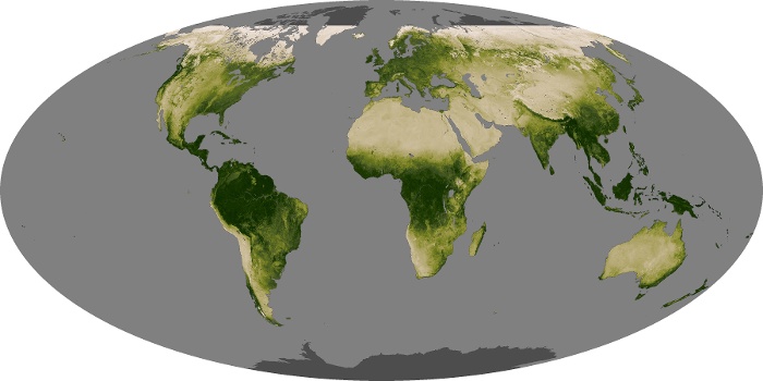

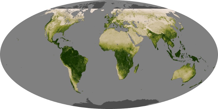
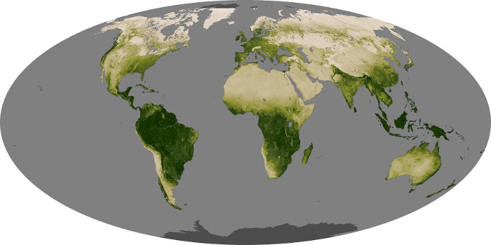


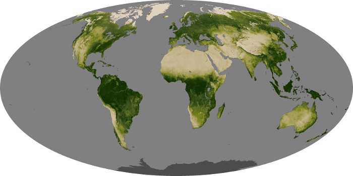
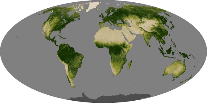


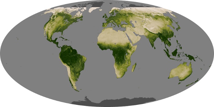


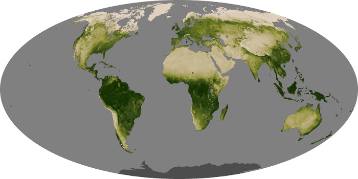
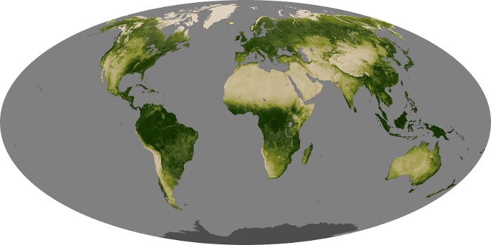


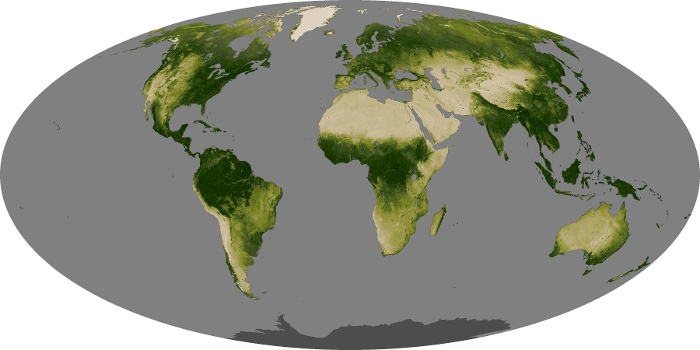
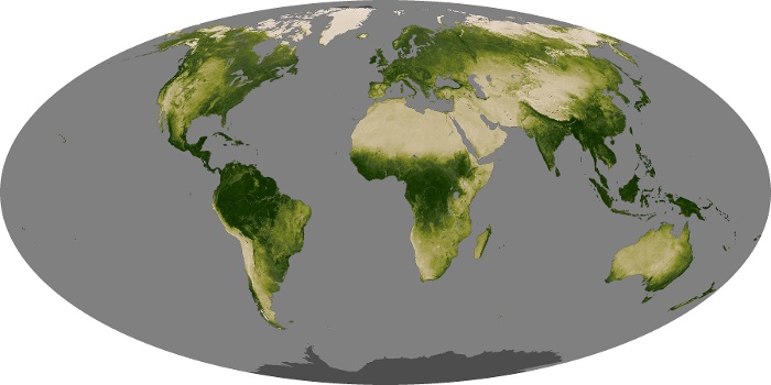
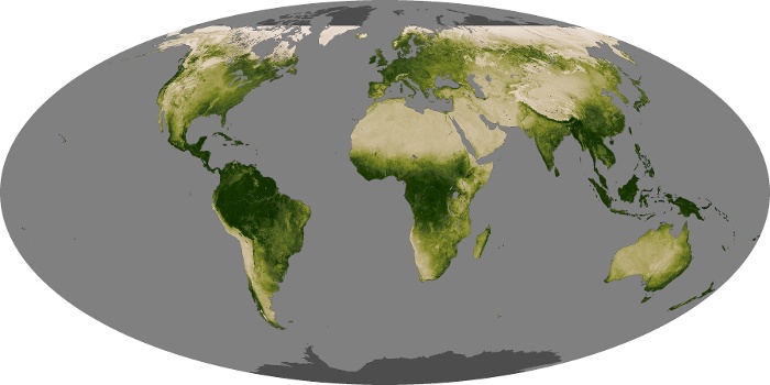
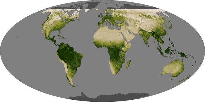


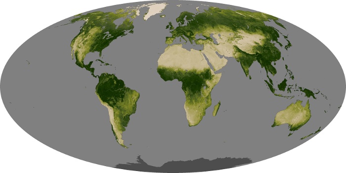
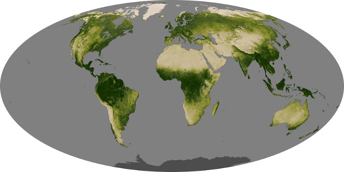
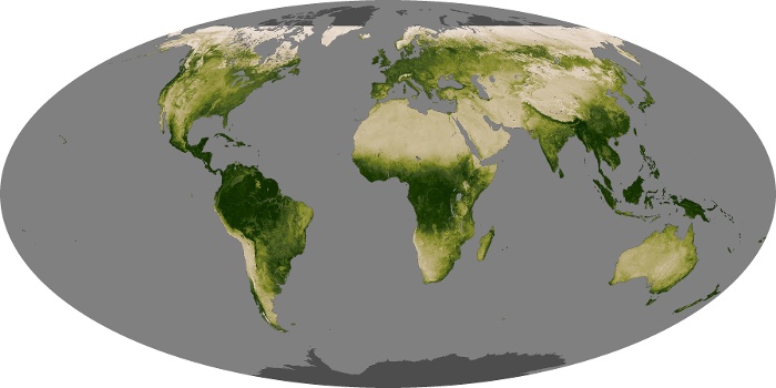


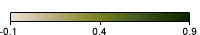


On these maps, vegetation is pictured as a scale, or index, of greenness. Greenness is based on several factors: the number and type of plants, how leafy they are, and how healthy they are. In places where foliage is dense and plants are growing quickly, the index is high, represented in dark green. Regions where few plants grow have a low vegetation index, shown in tan. The index is based on measurements taken by the Moderate Resolution Imaging Spectroradiometer (MODIS) on NASA’s Terra satellite. Areas where the satellite did not collect data are gray.
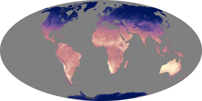
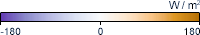
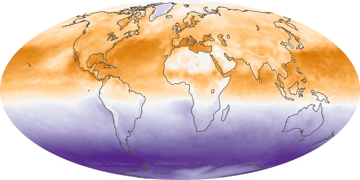
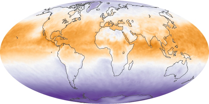
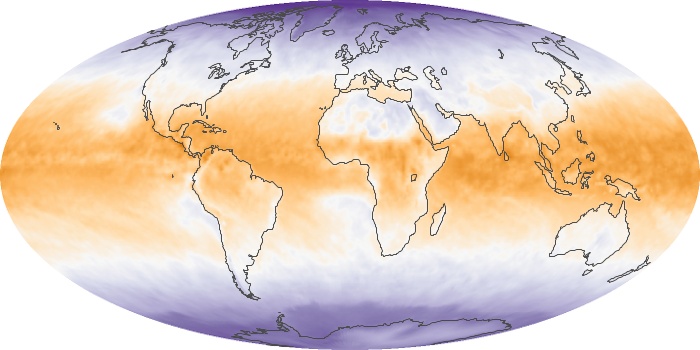
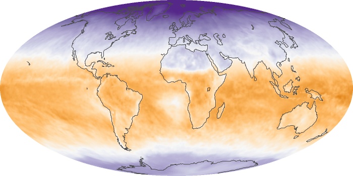
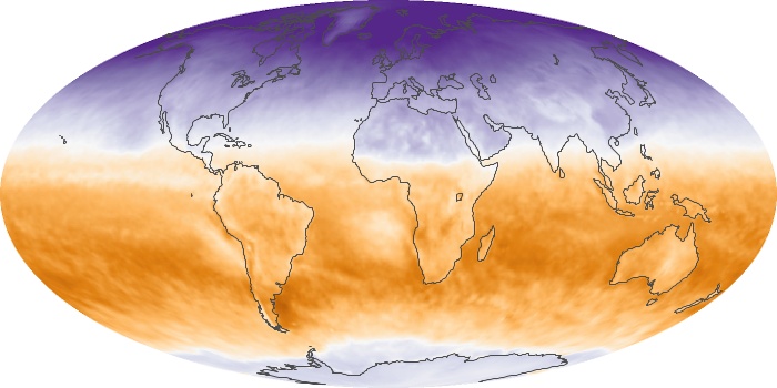
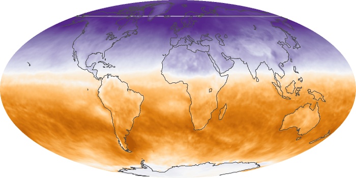
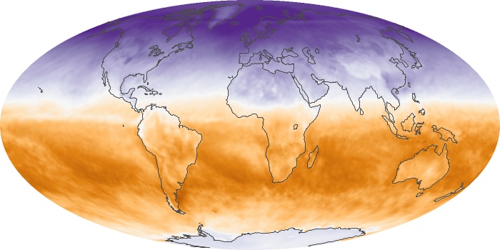
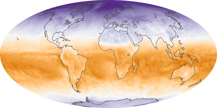
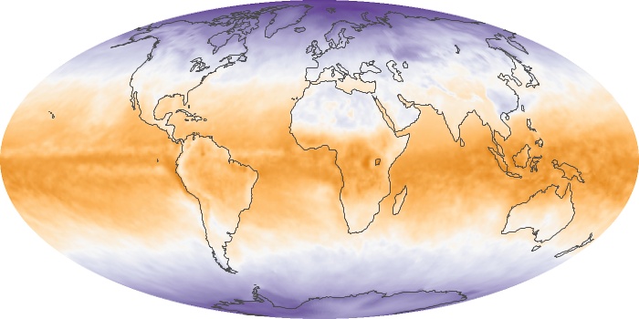
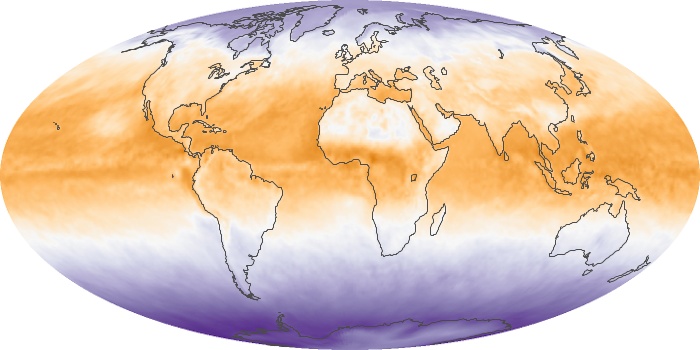
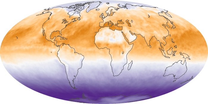
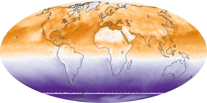
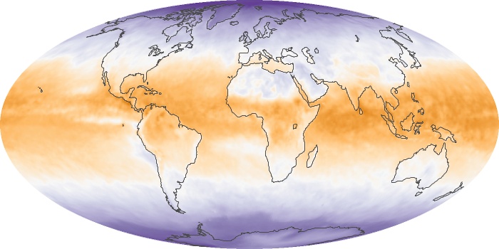
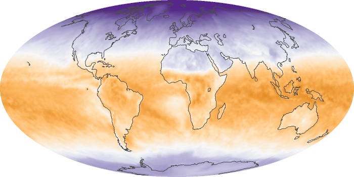
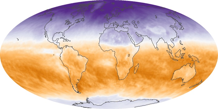
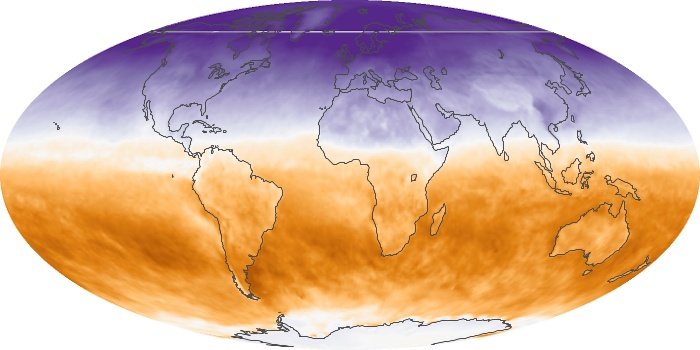
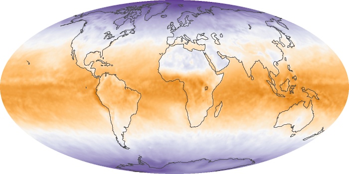
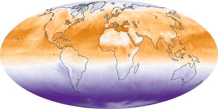
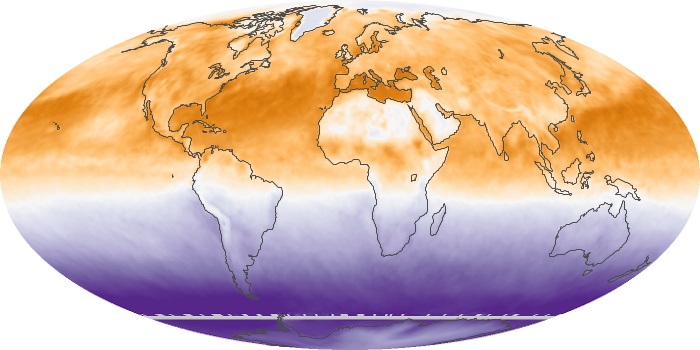
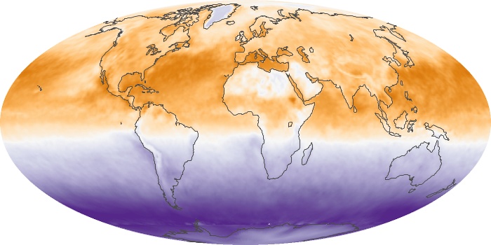
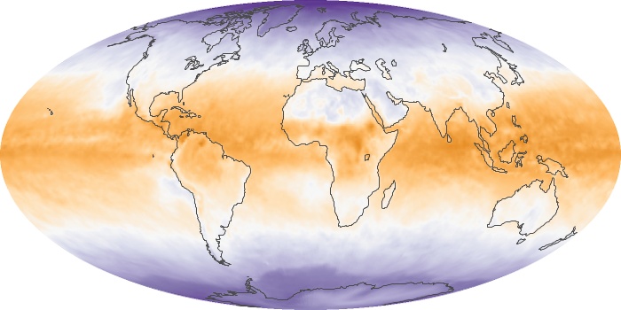
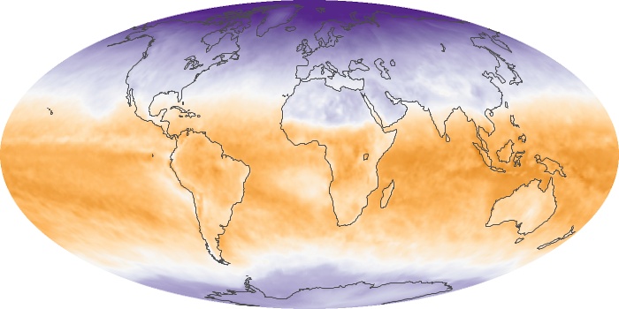
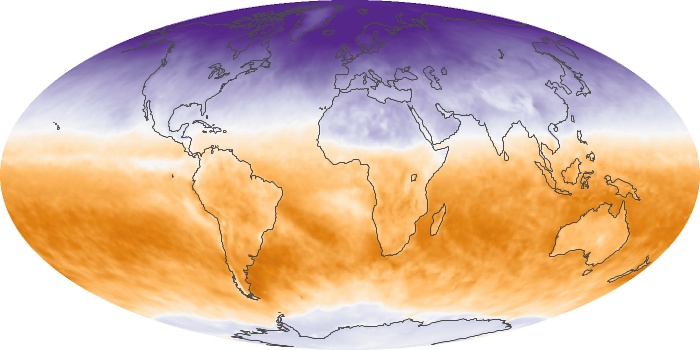
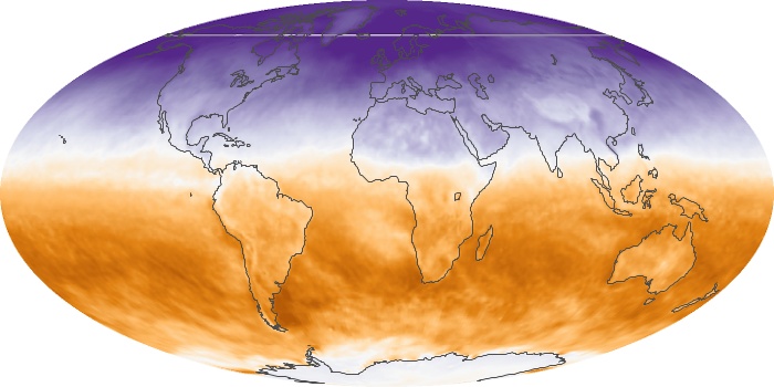
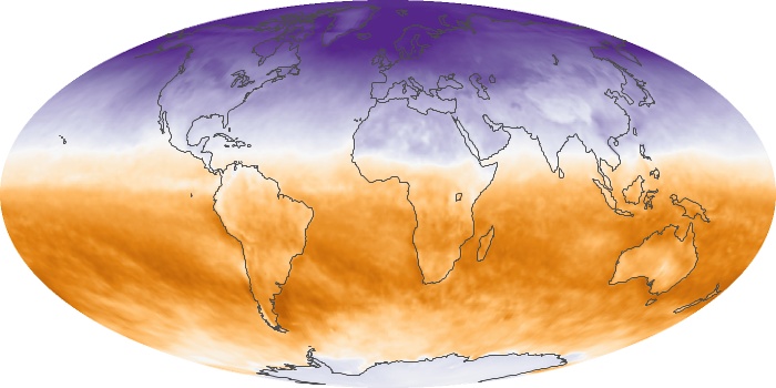
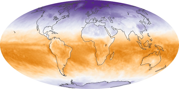
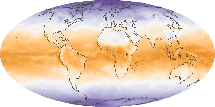
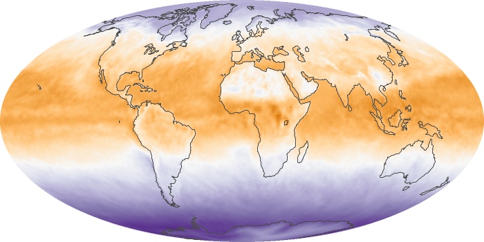
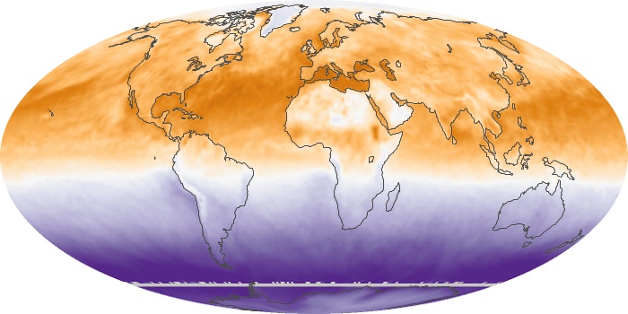
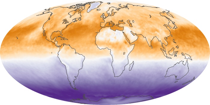
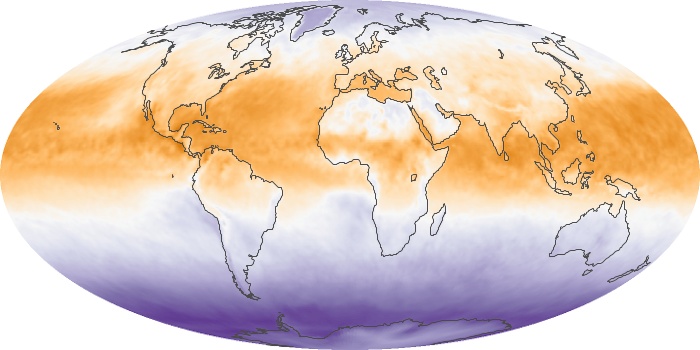
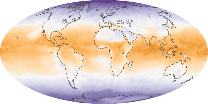
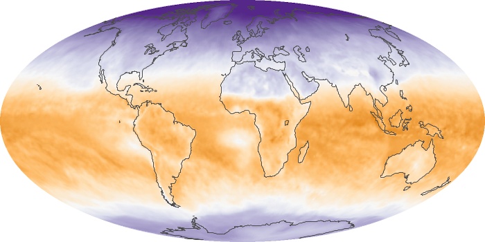
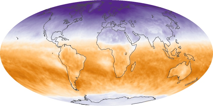
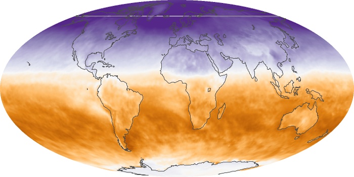
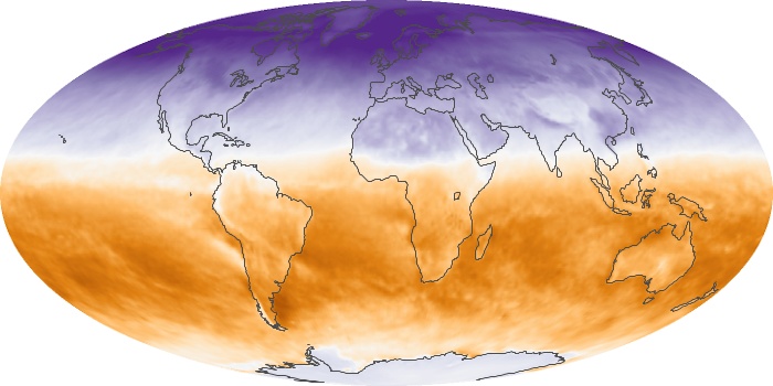
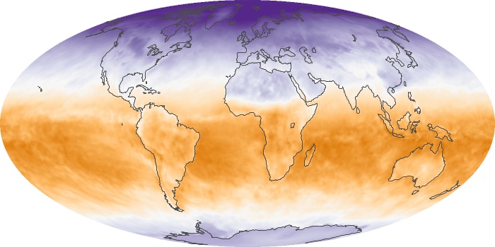
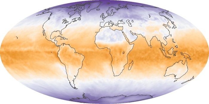
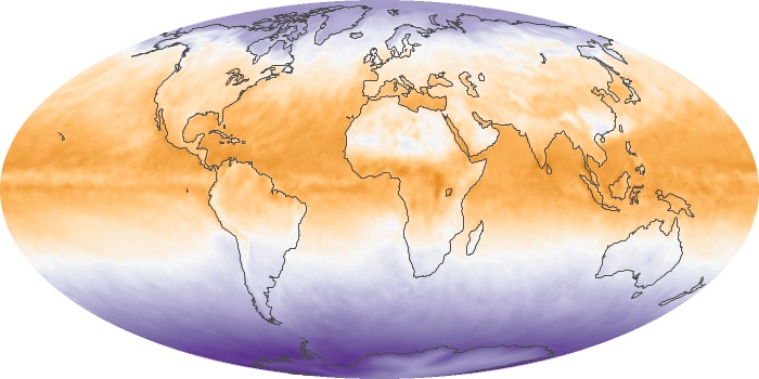
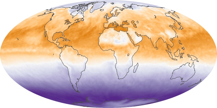
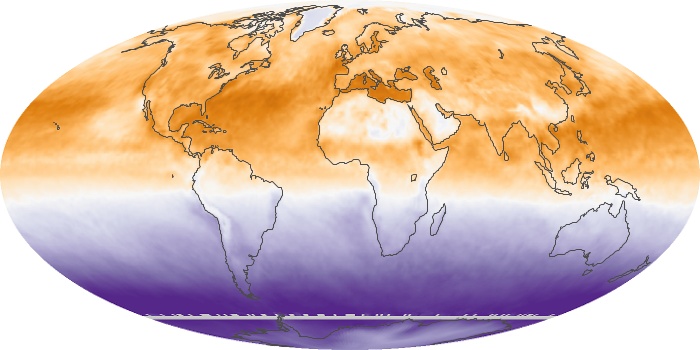
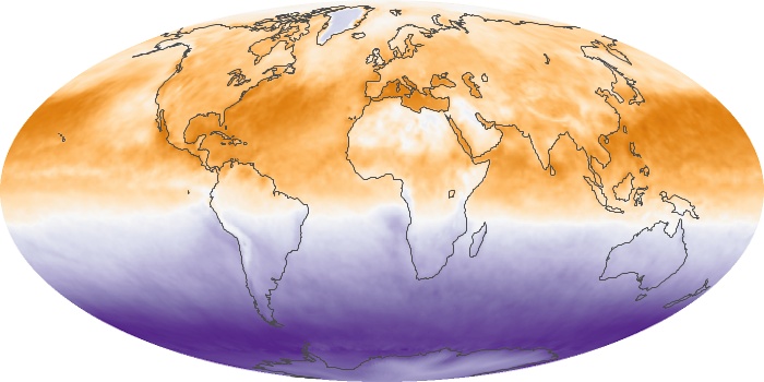
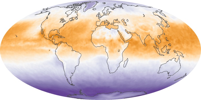
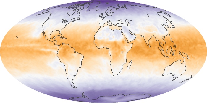
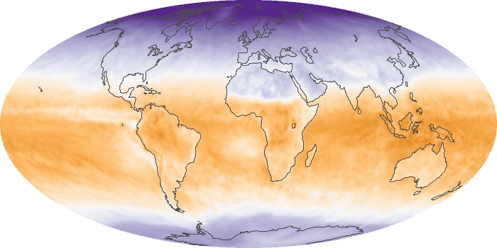
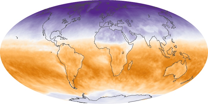
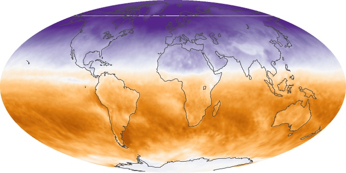
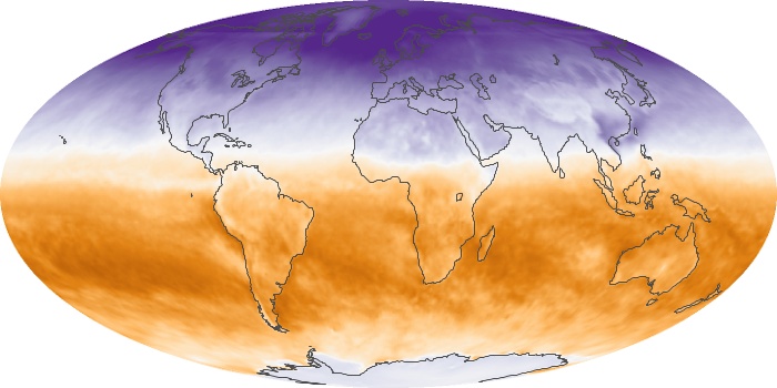
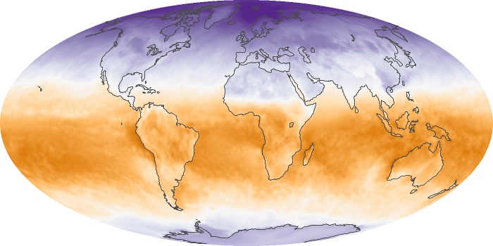
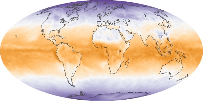
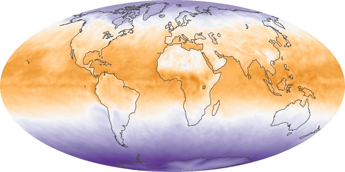
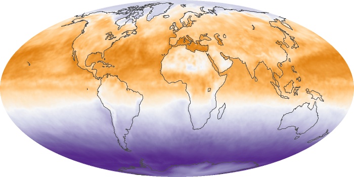
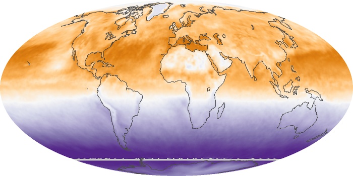
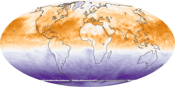
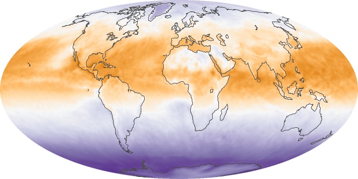
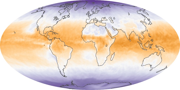
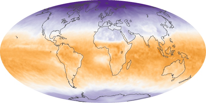
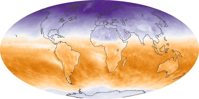
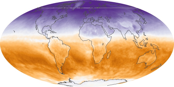
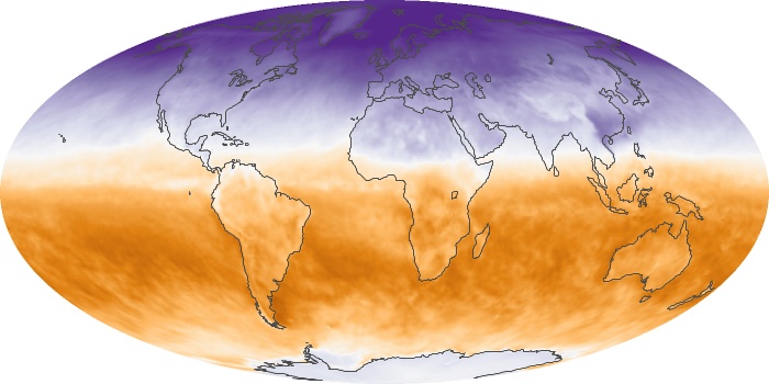
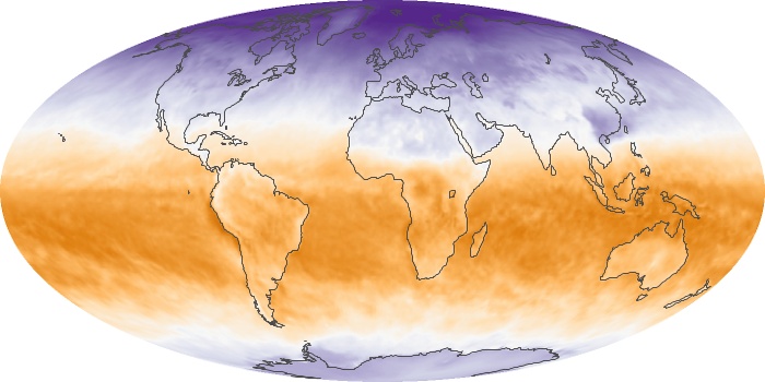
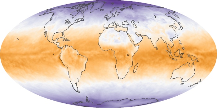
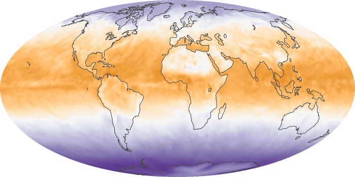
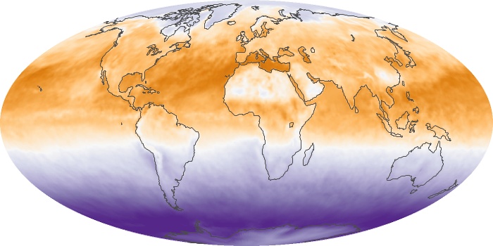
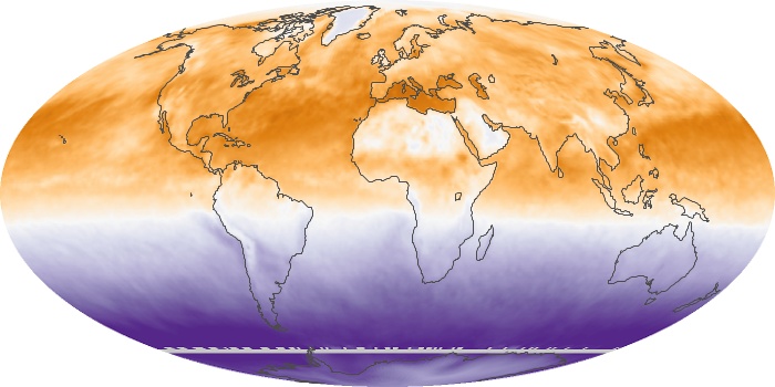
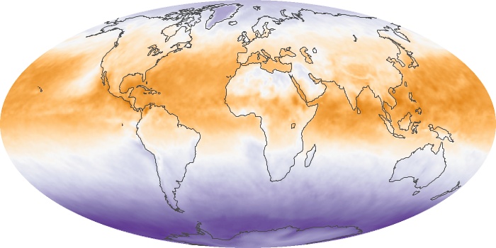
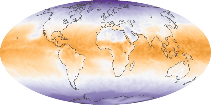
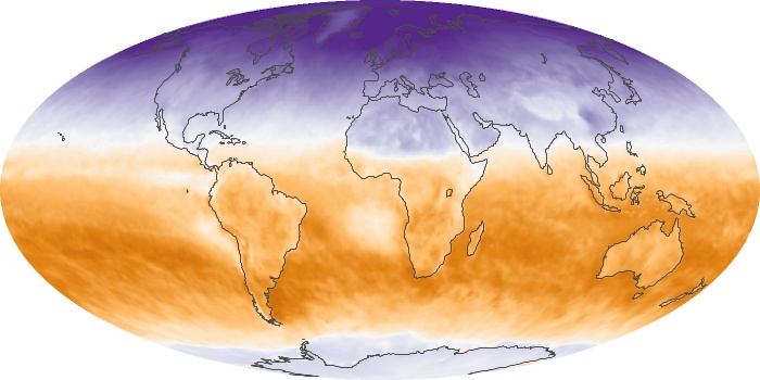
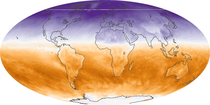
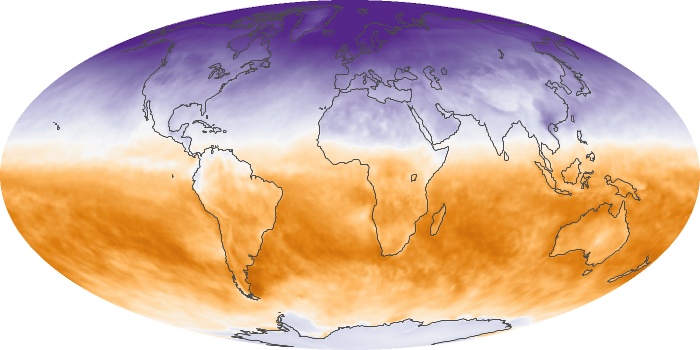
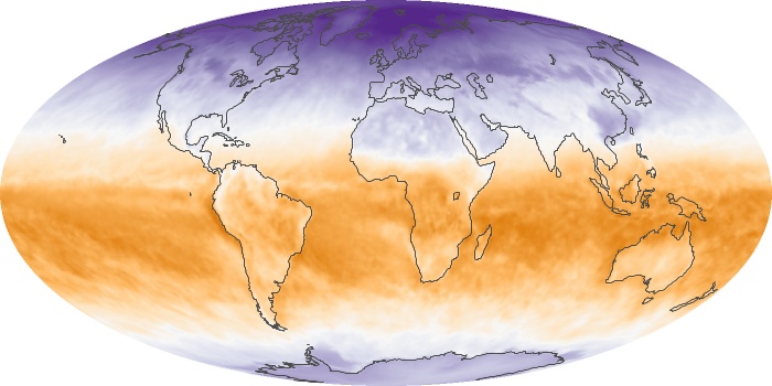
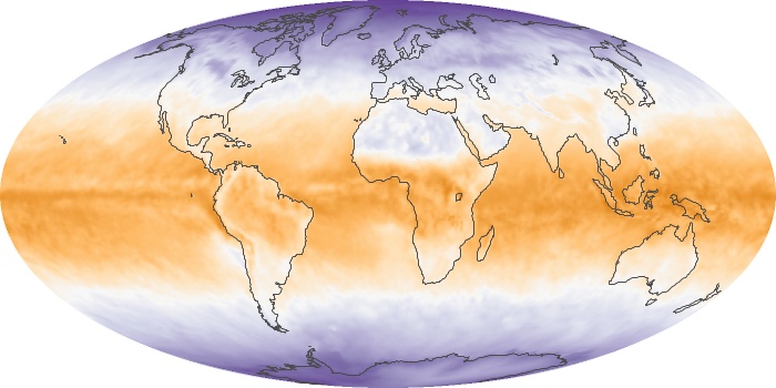
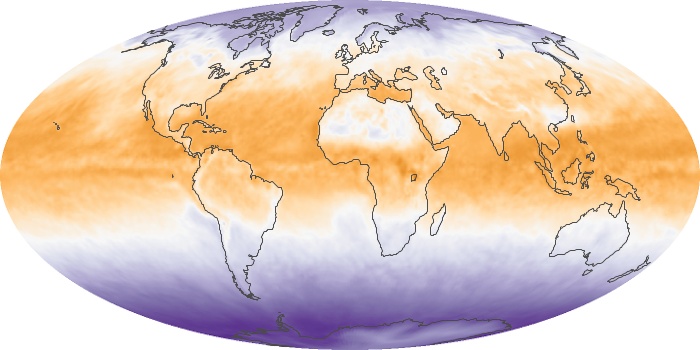
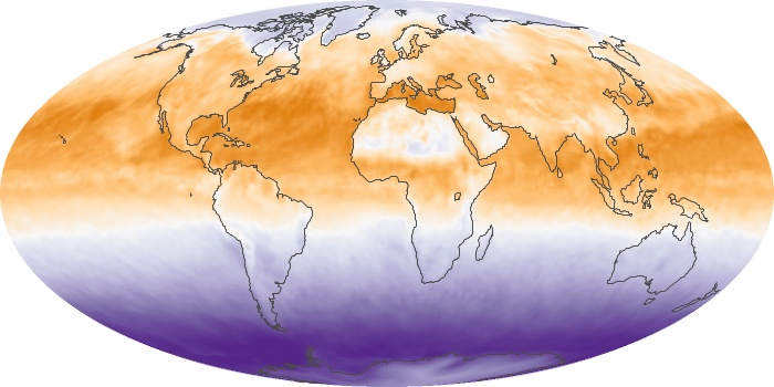
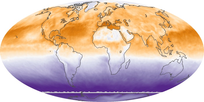
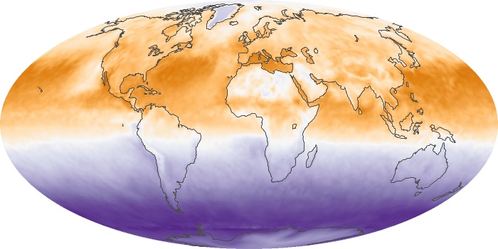
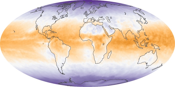
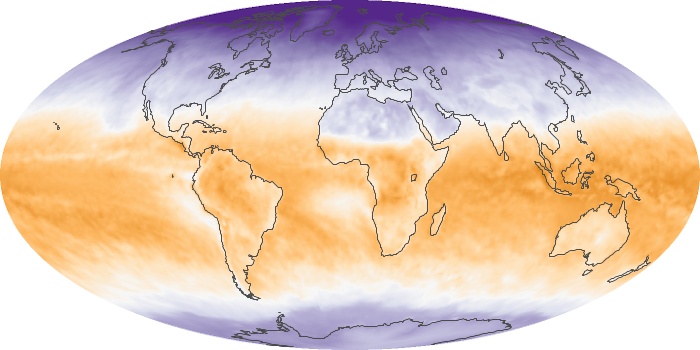
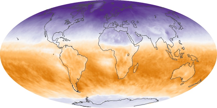
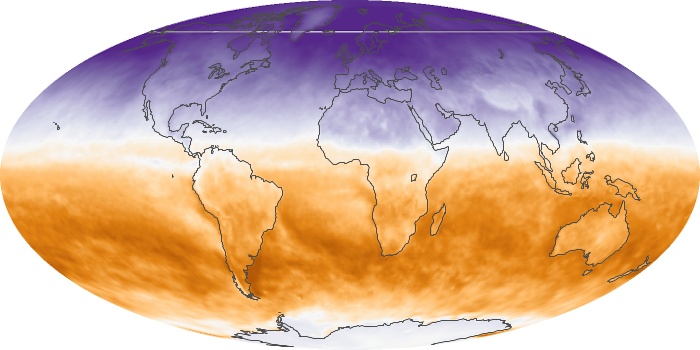
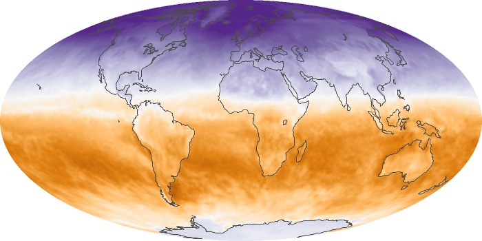
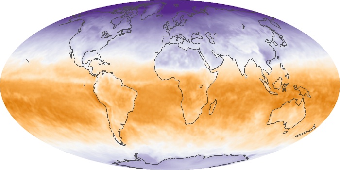
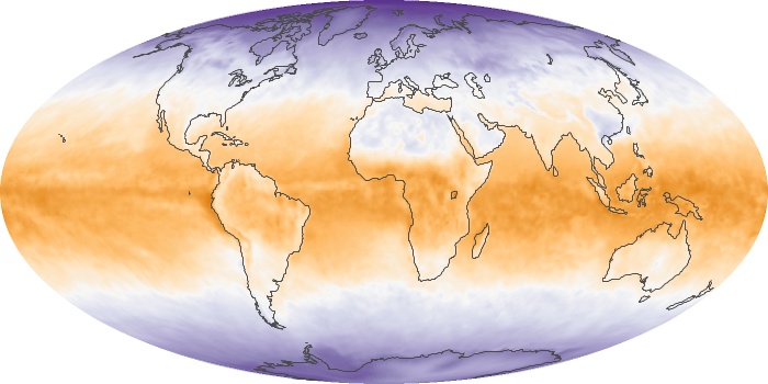
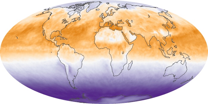
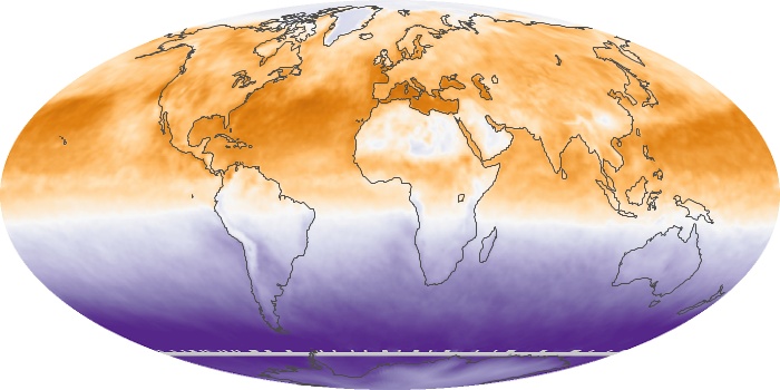
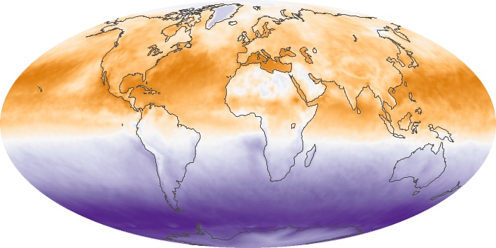
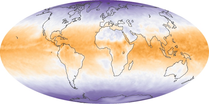
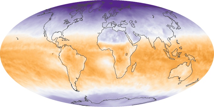
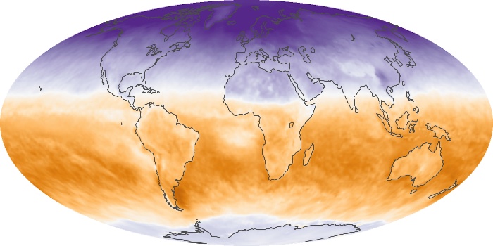
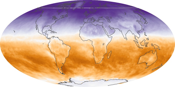
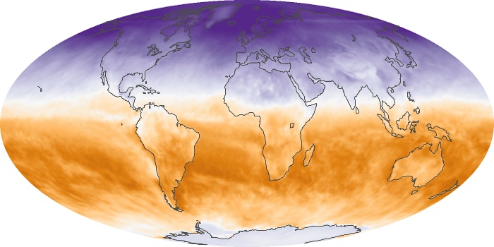
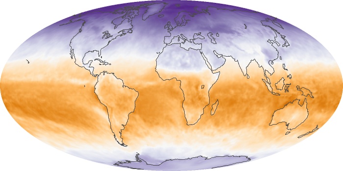
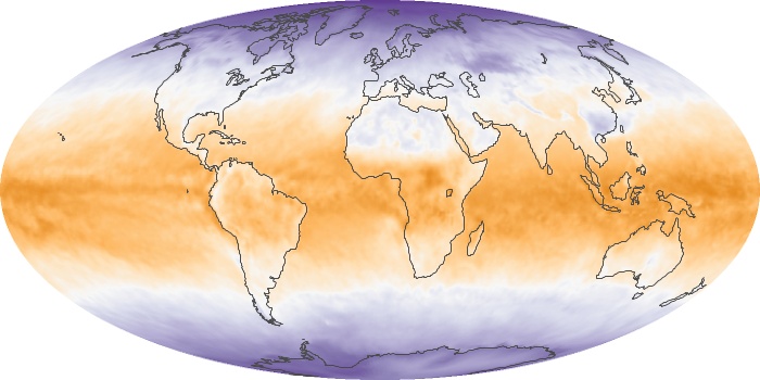
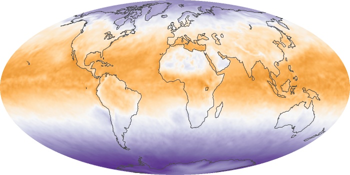
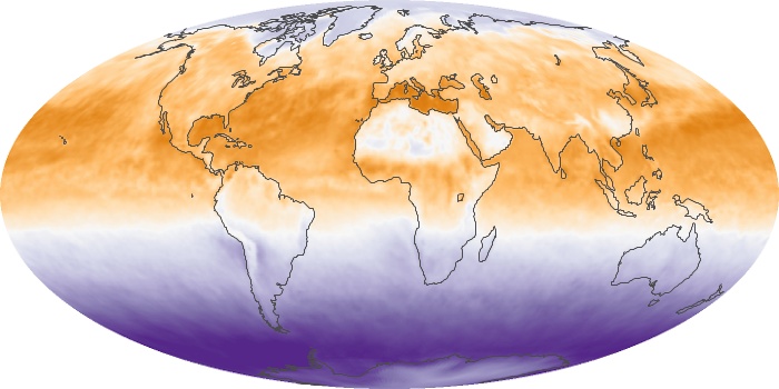
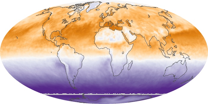
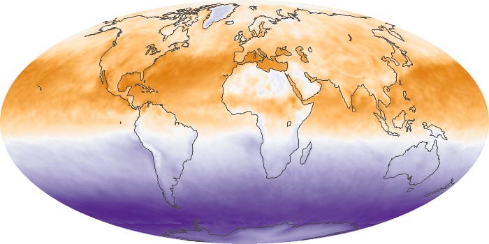
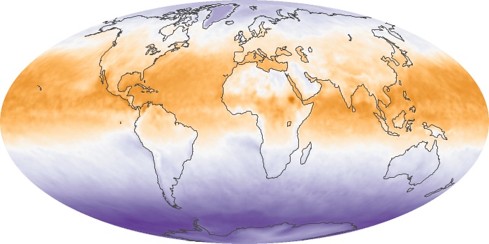
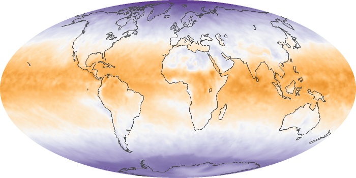
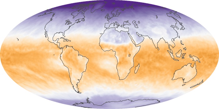
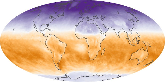
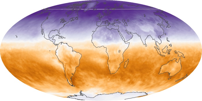
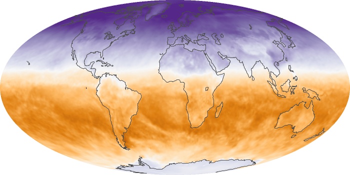
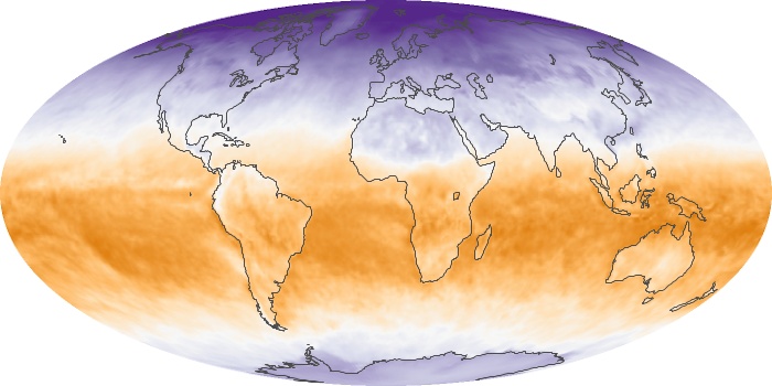
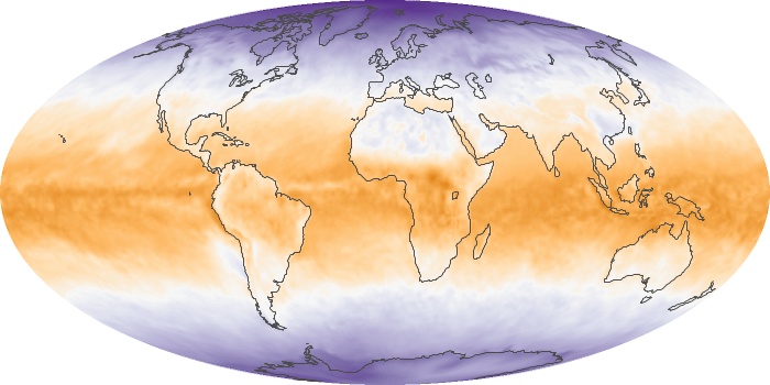
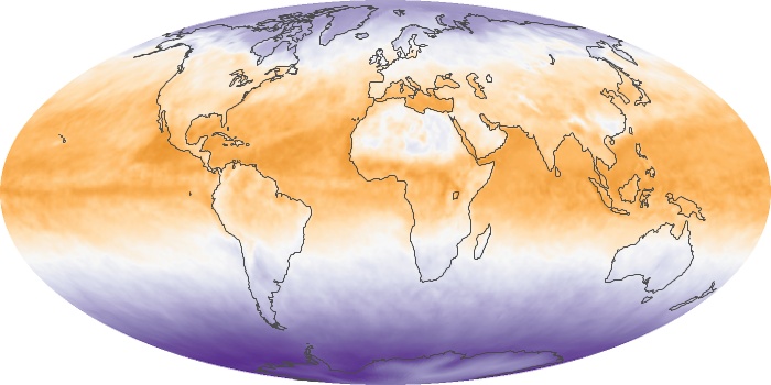
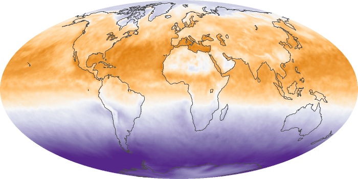
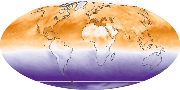
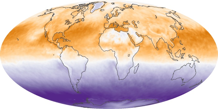
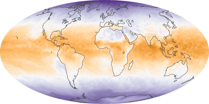
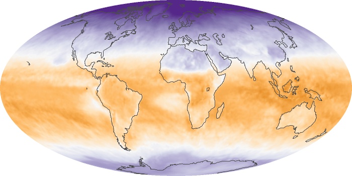
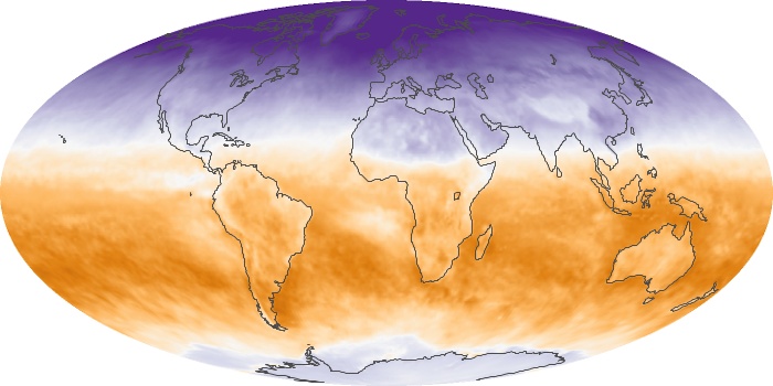
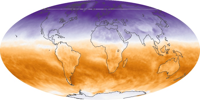
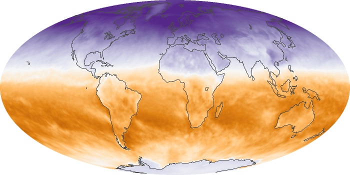
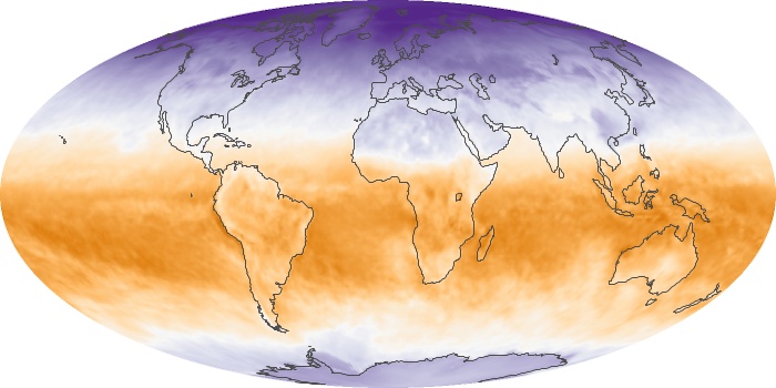
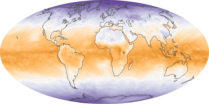
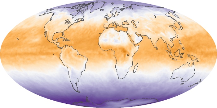
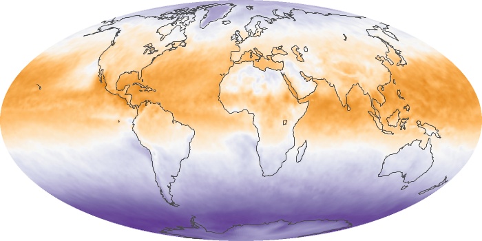
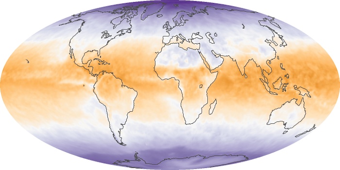
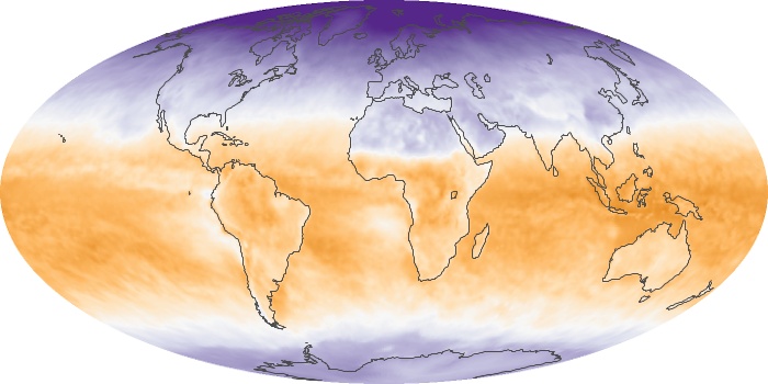
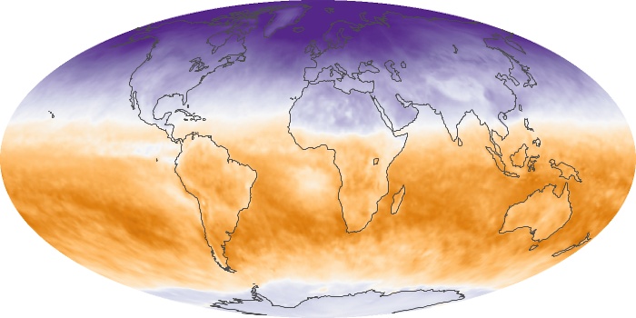
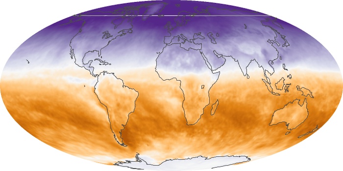
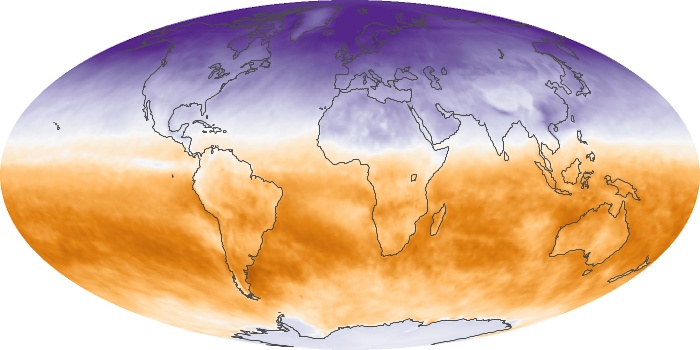
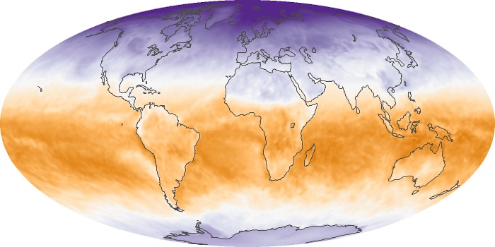
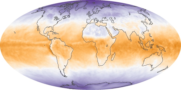
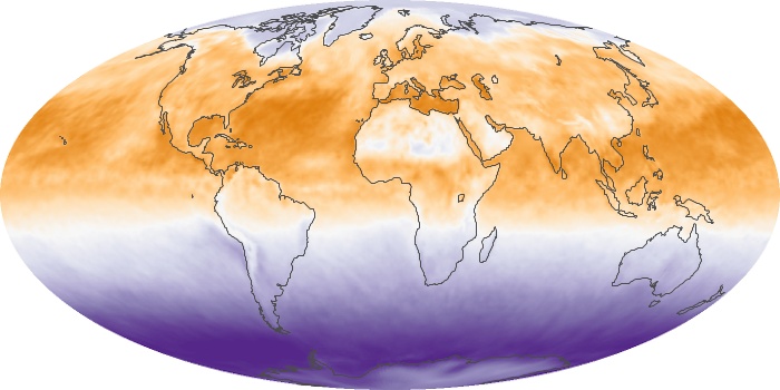
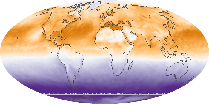
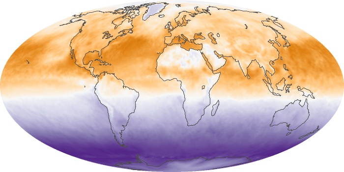
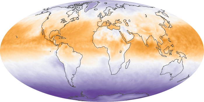
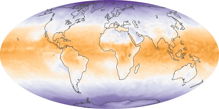
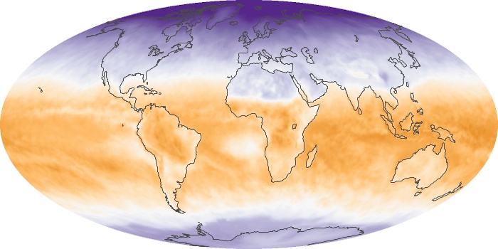
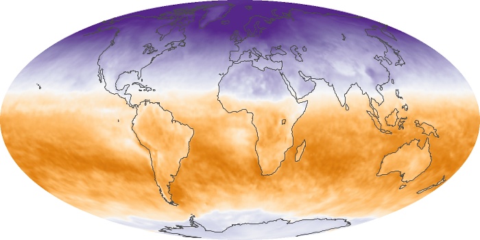
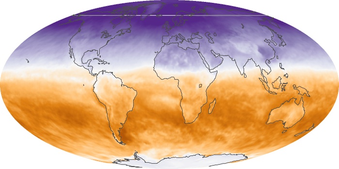
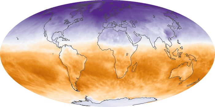
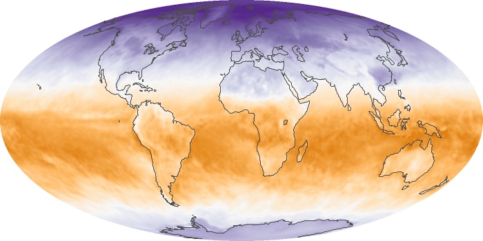
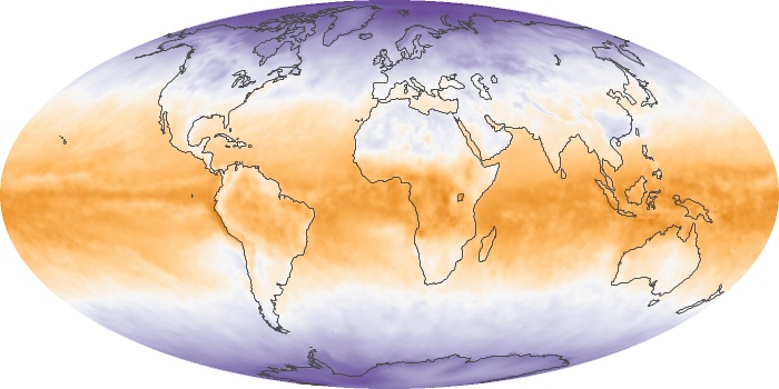
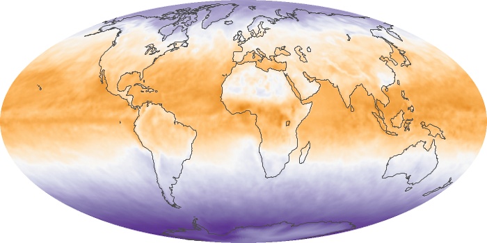
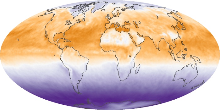
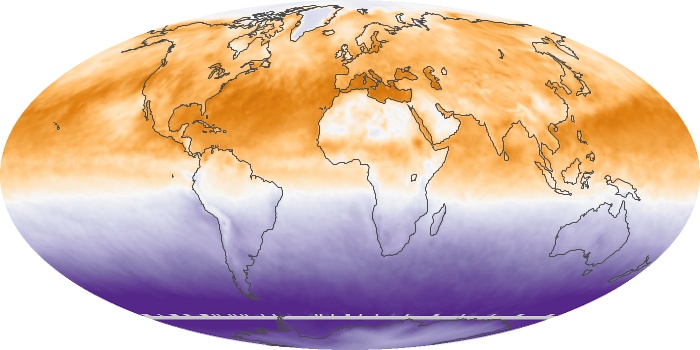
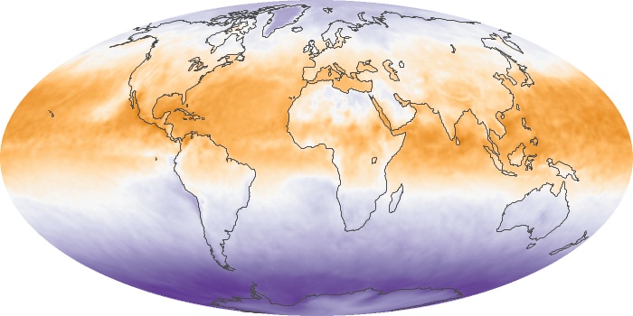
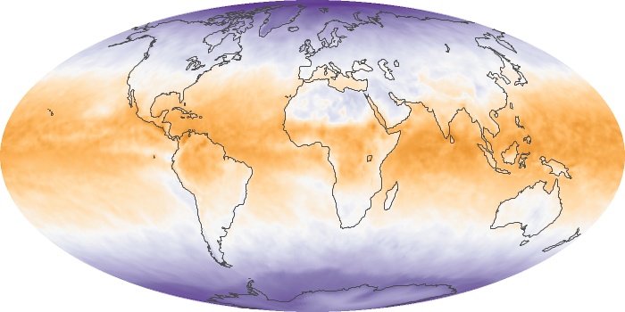
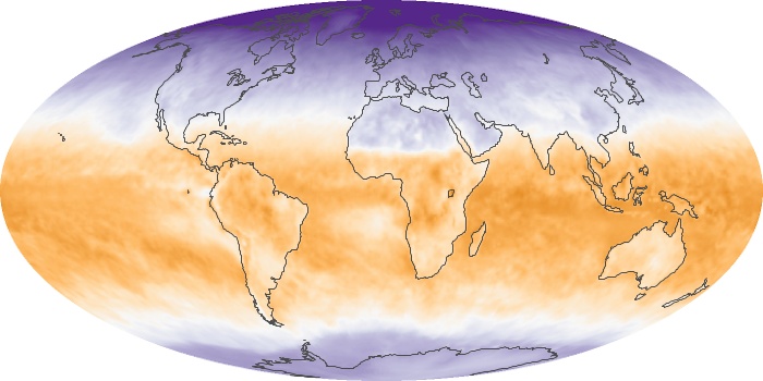
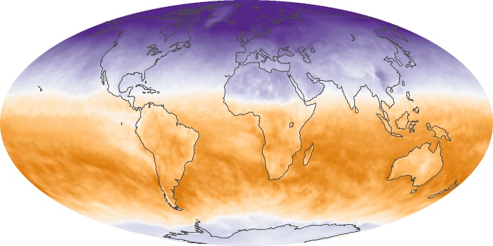
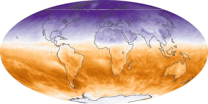
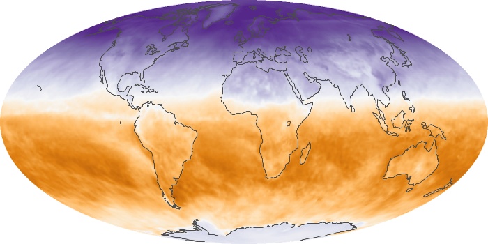
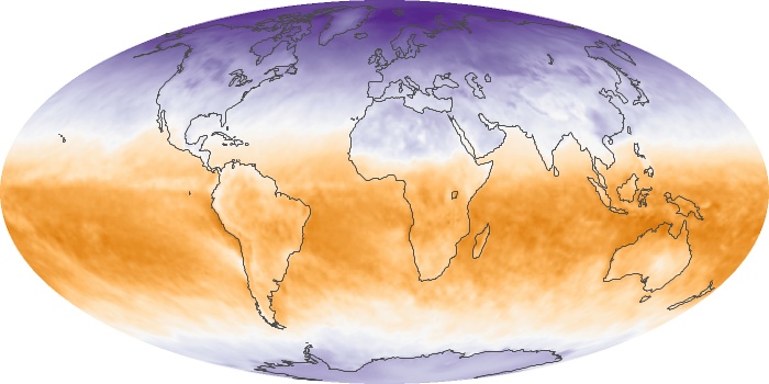
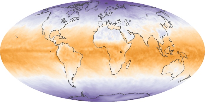
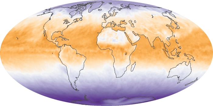
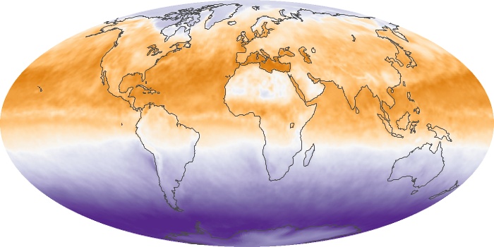
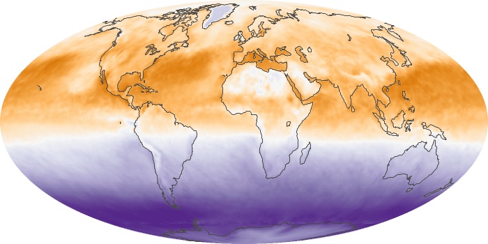
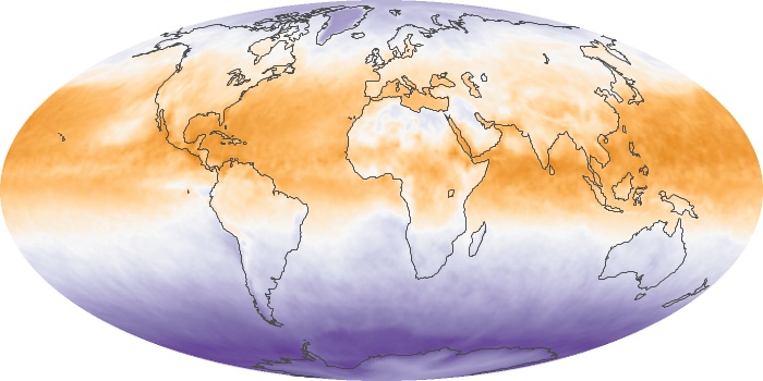
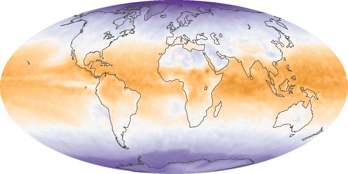
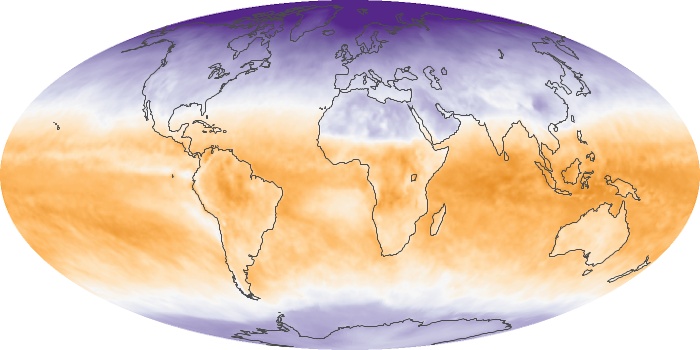
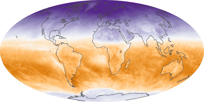
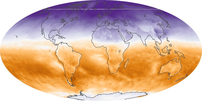
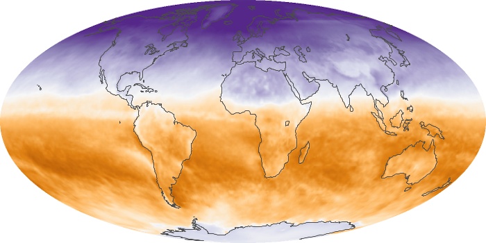
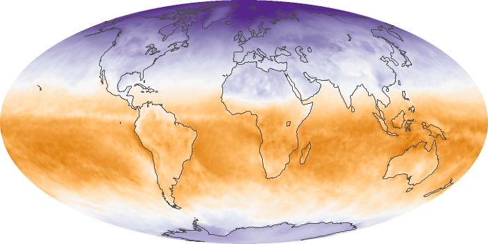
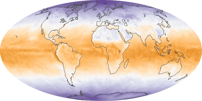
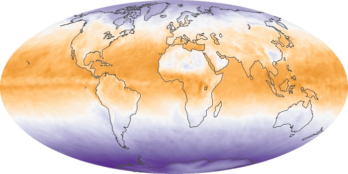
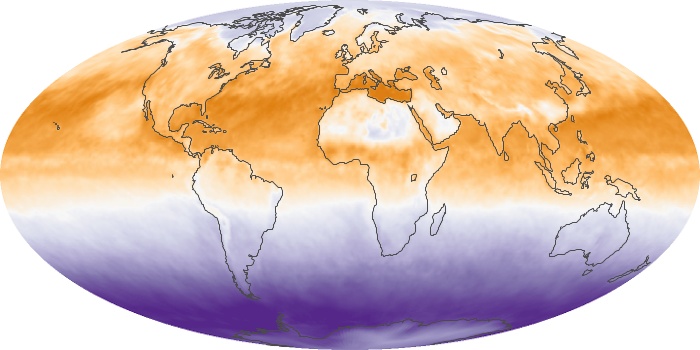
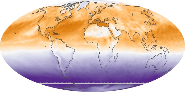
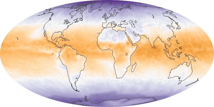
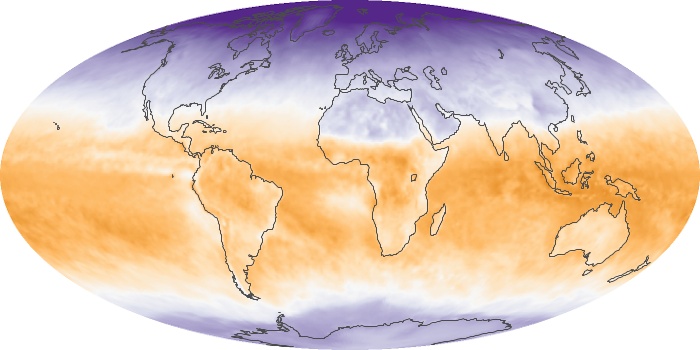
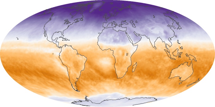
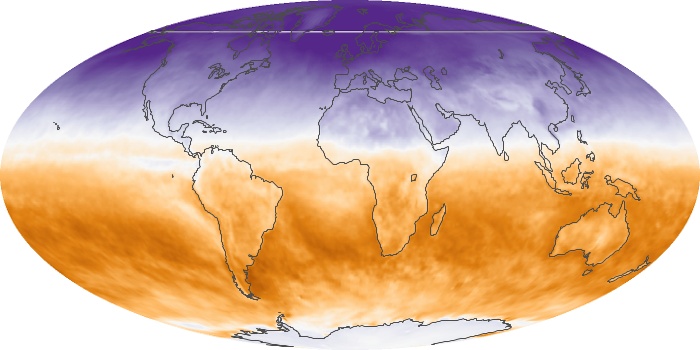
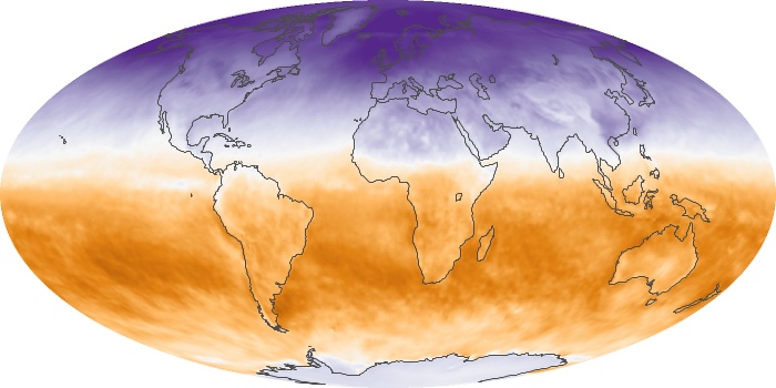
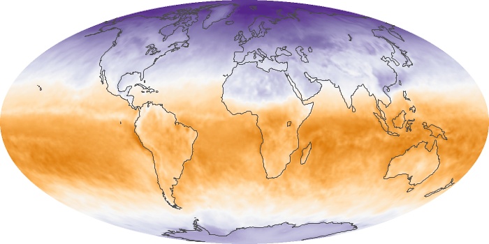
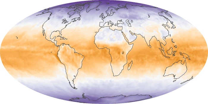
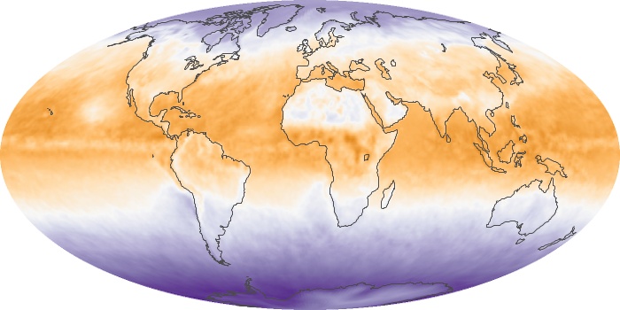
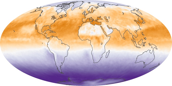
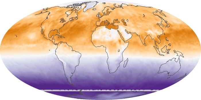
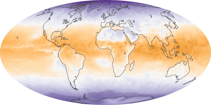
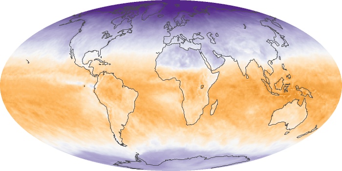
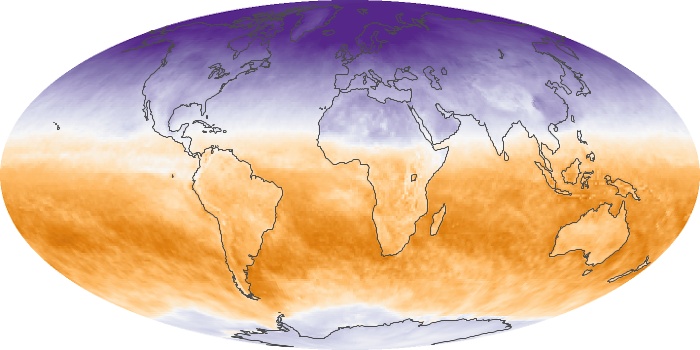
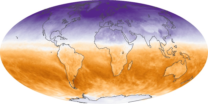
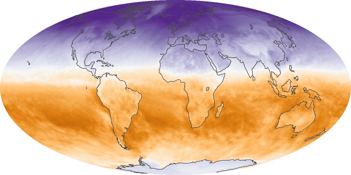
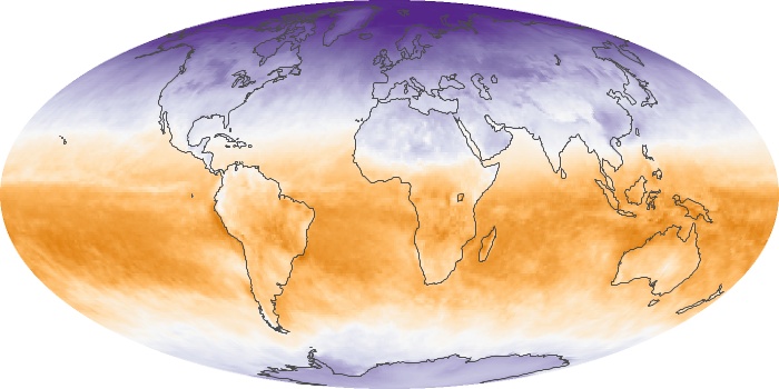
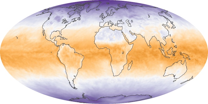
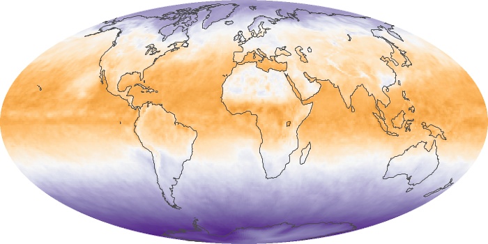
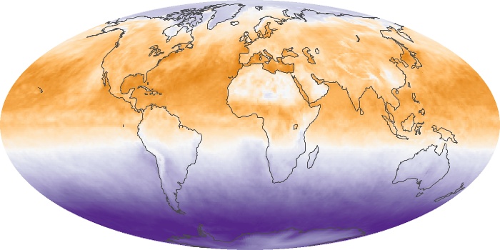
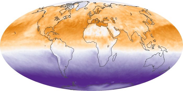
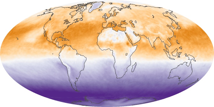
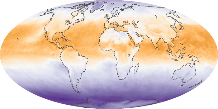
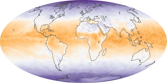
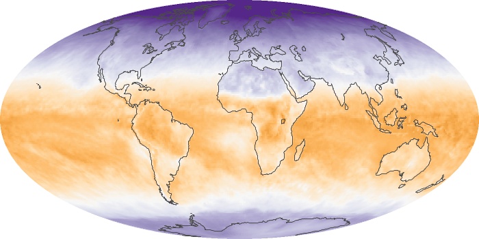
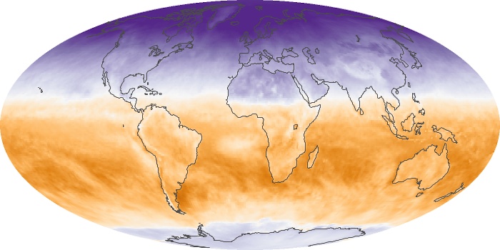
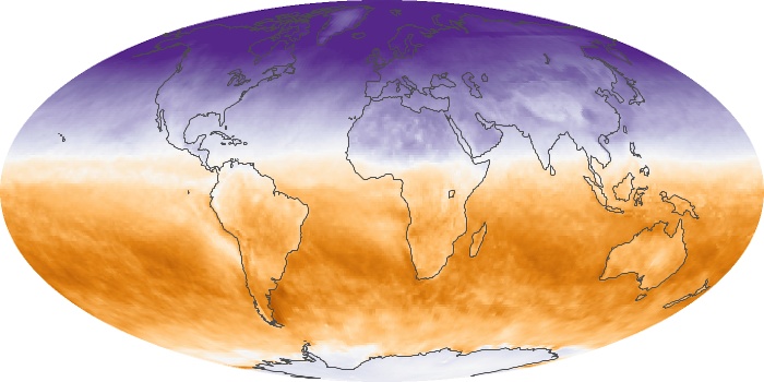
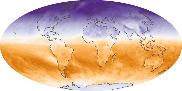
The map of net flux shows monthly changes in the balance of incoming and outgoing energy on Earth as measured by the Clouds and the Earth Radiant Energy System (CERES) sensor on NASA's Terra and Aqua satellites. Places where the amounts of incoming and outgoing energy were in balance are white. Places where more energy was coming in than going out (energy surplus) are orange. Places where less energy was coming in than going out (energy deficit) are purple.
View, download, or analyze more of these data from NASA Earth Observations (NEO):
Vegetation
Net Radiation