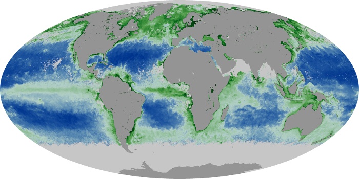
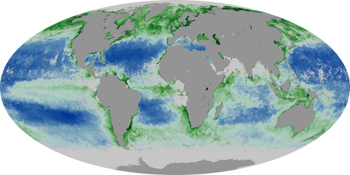
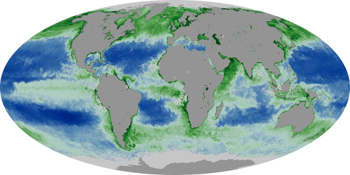
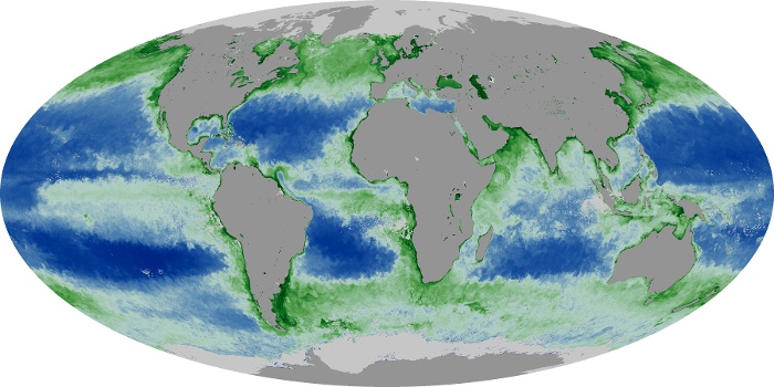
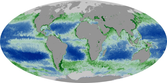
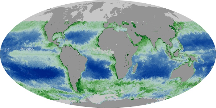

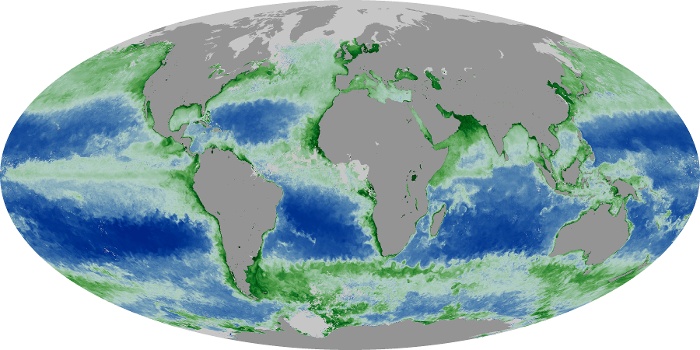

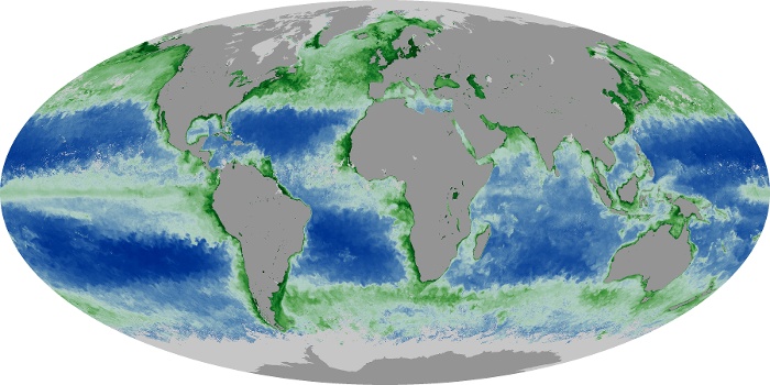
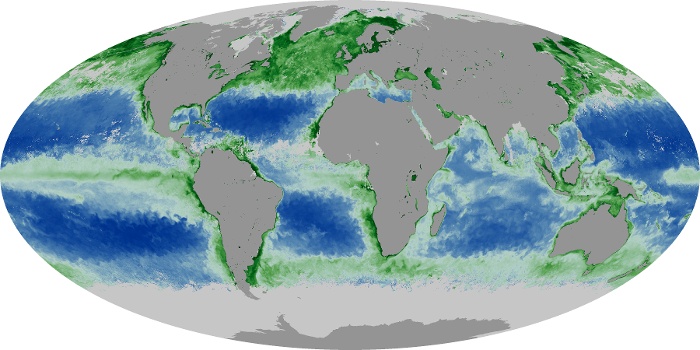
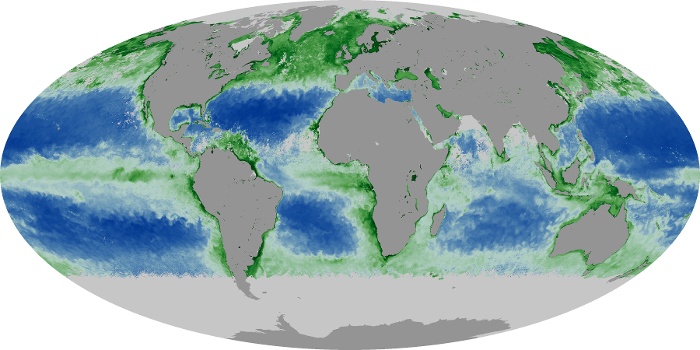
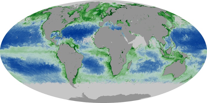
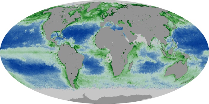
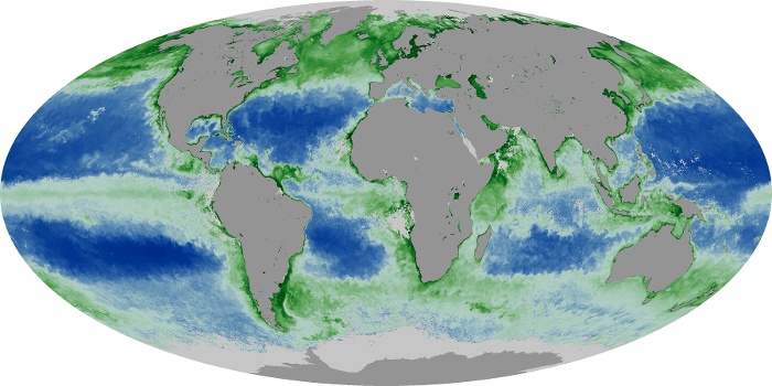
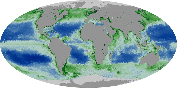
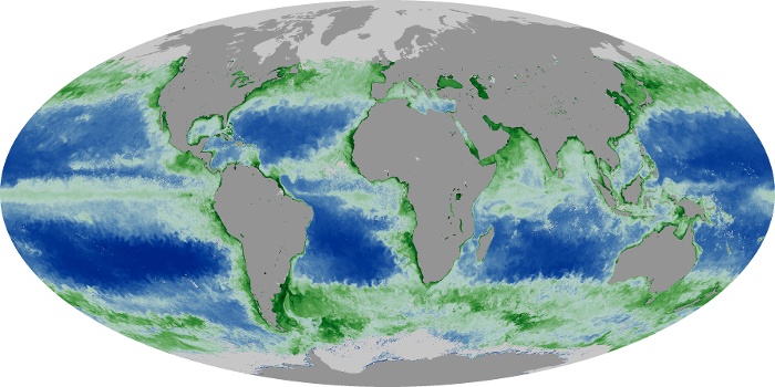
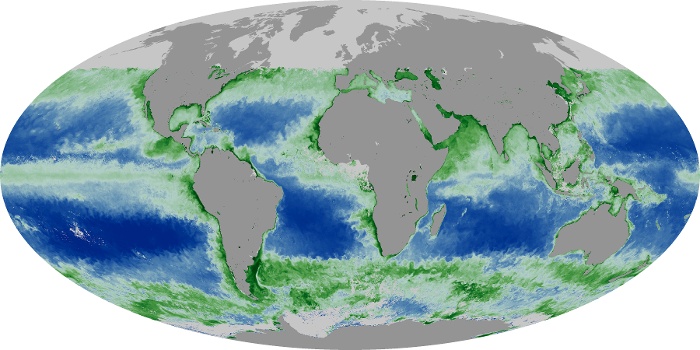
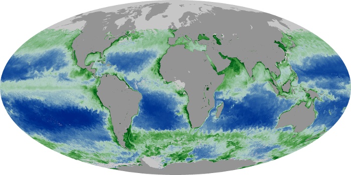
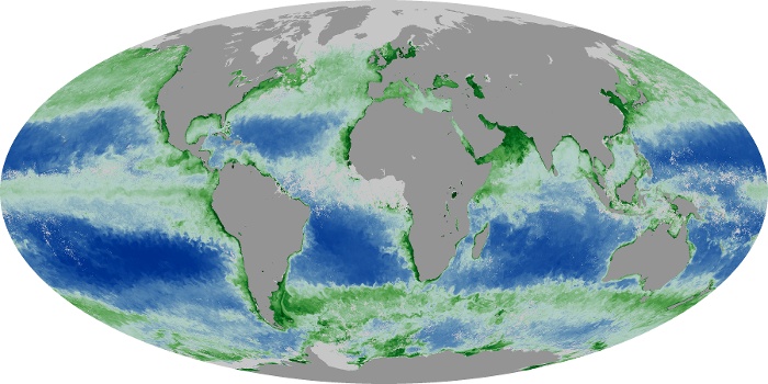
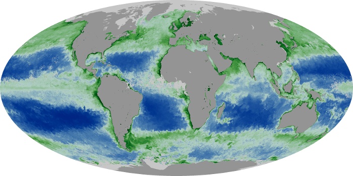
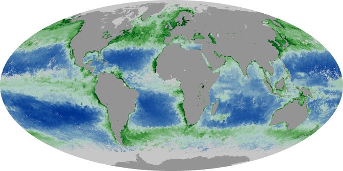
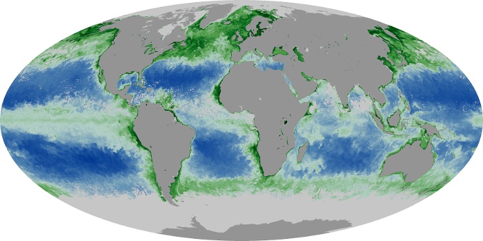
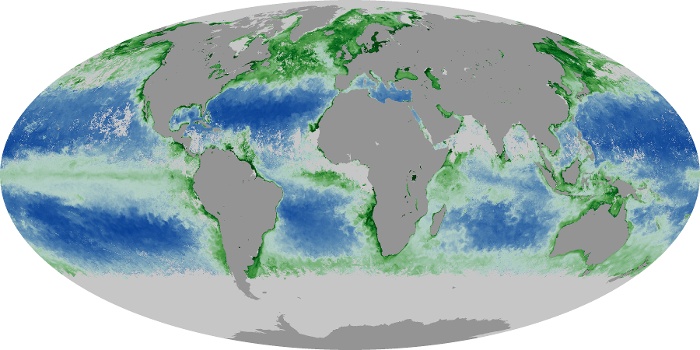
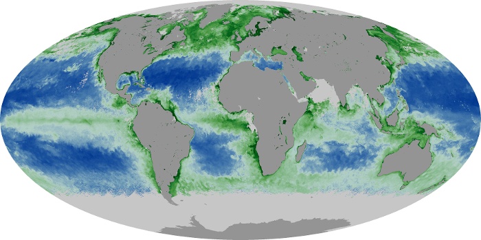
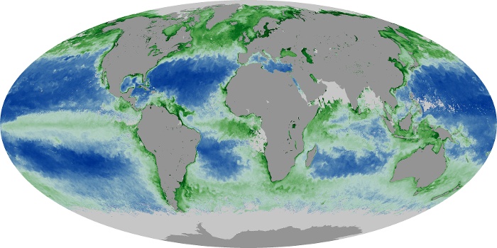
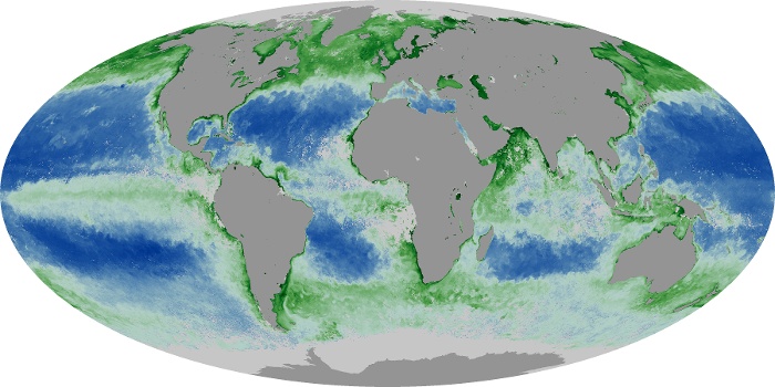
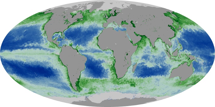

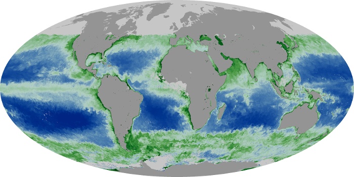
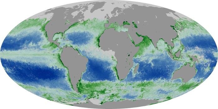
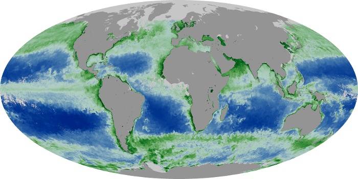
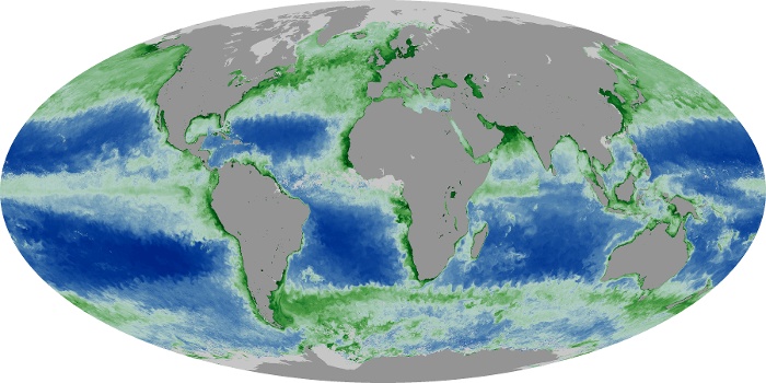

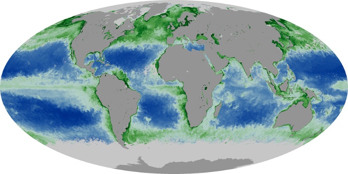
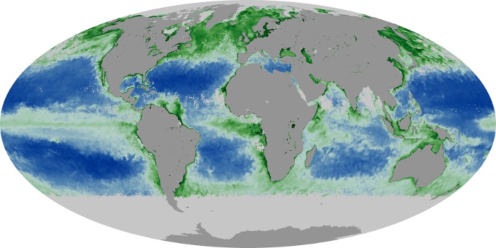

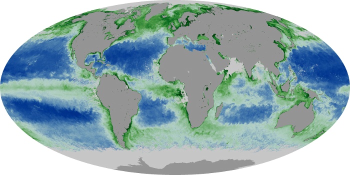
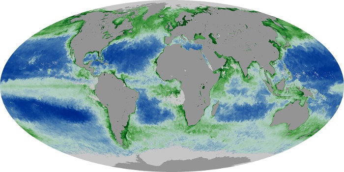
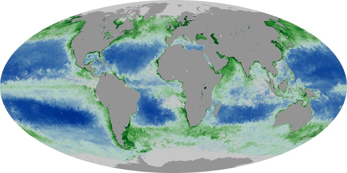
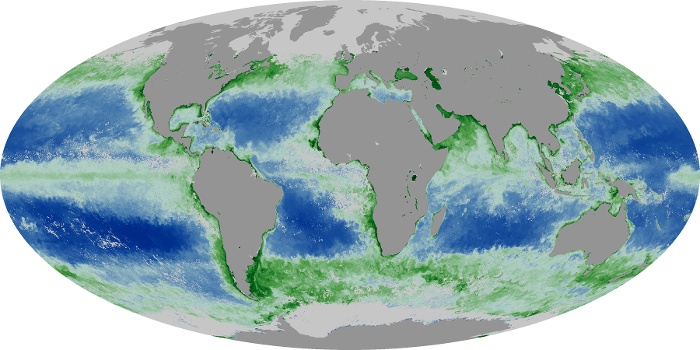
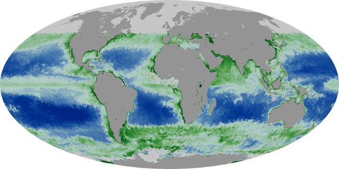
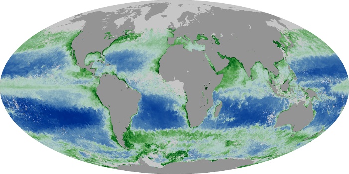
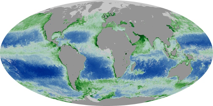
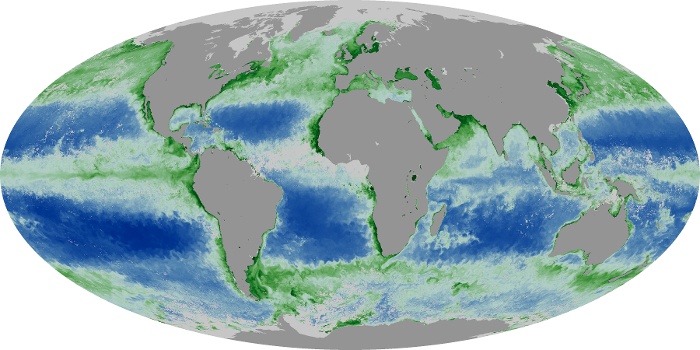
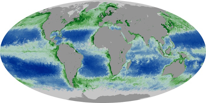
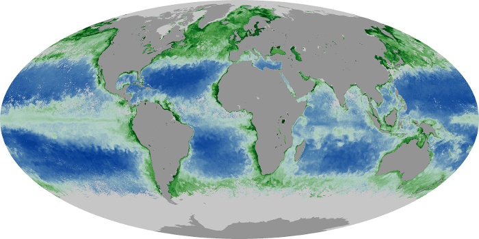
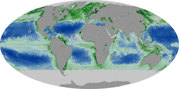
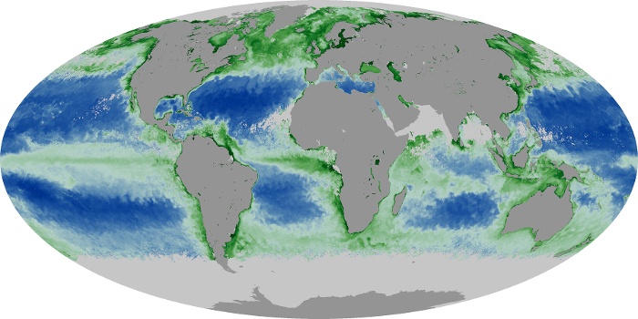
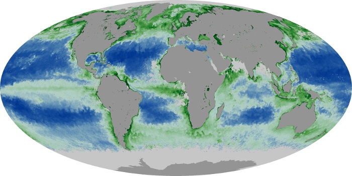
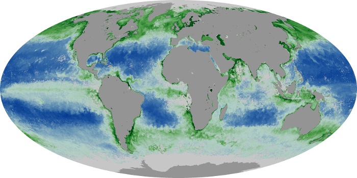
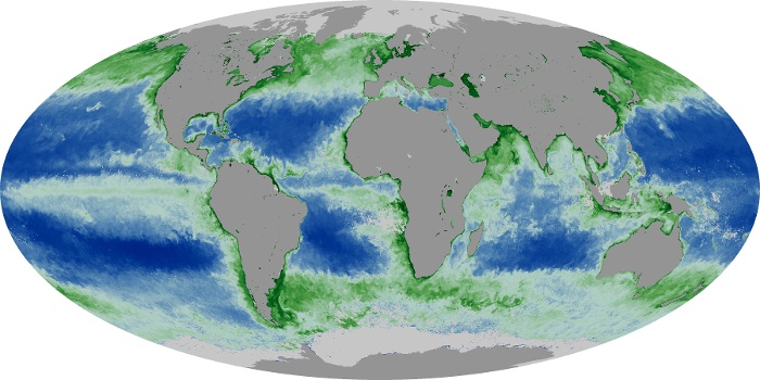

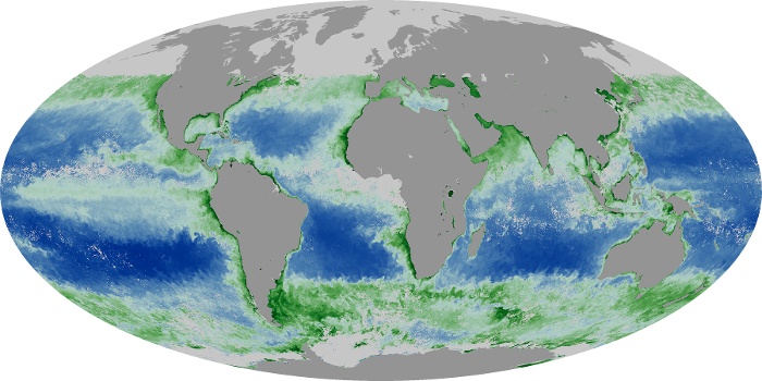
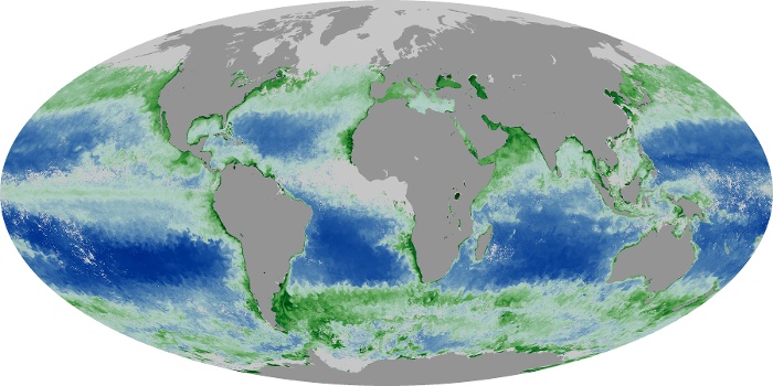
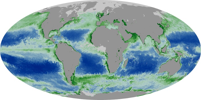
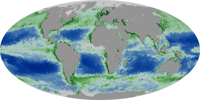

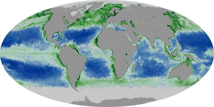


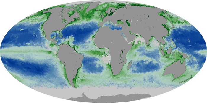
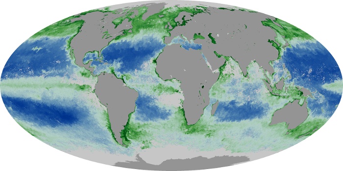
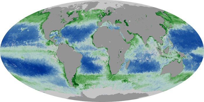
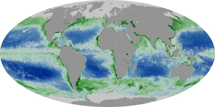
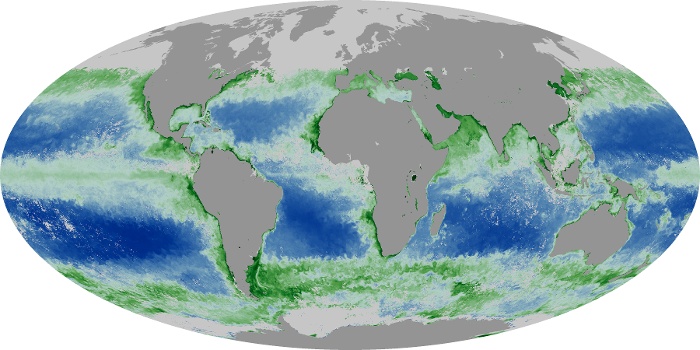
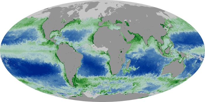
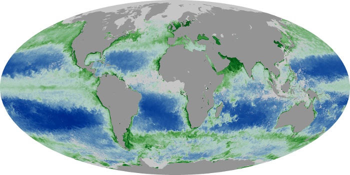
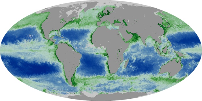
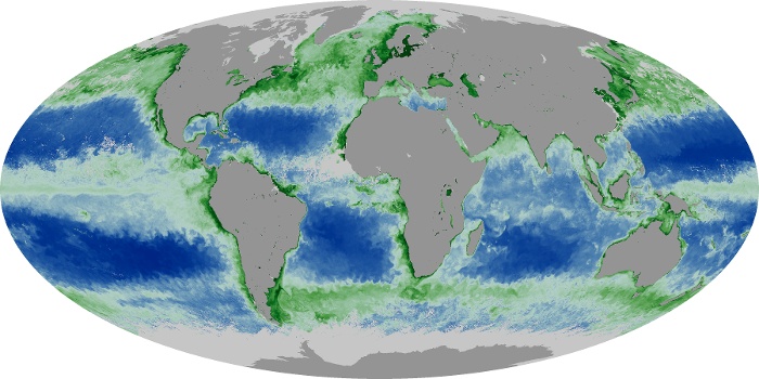
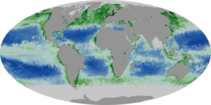
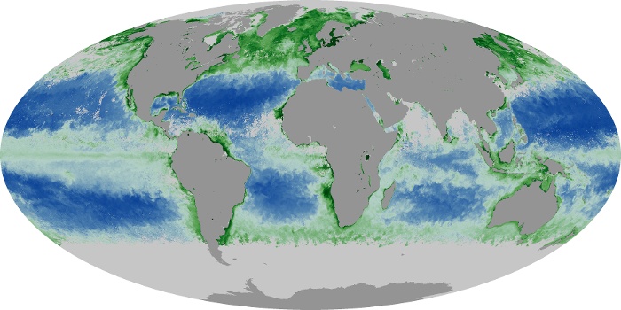
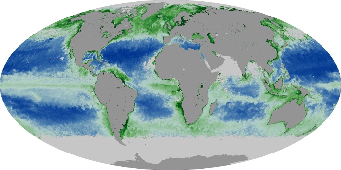
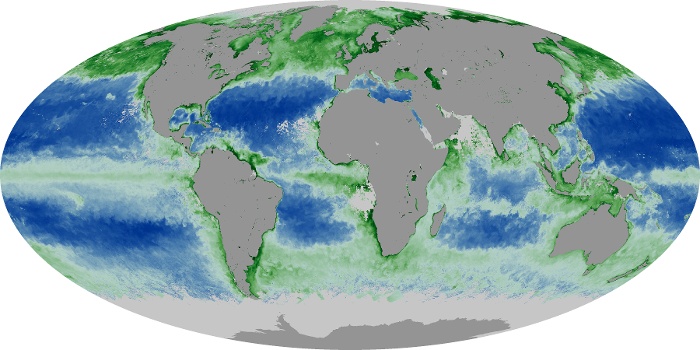
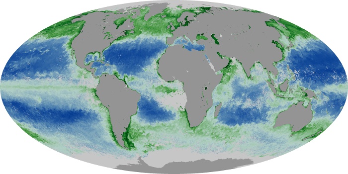
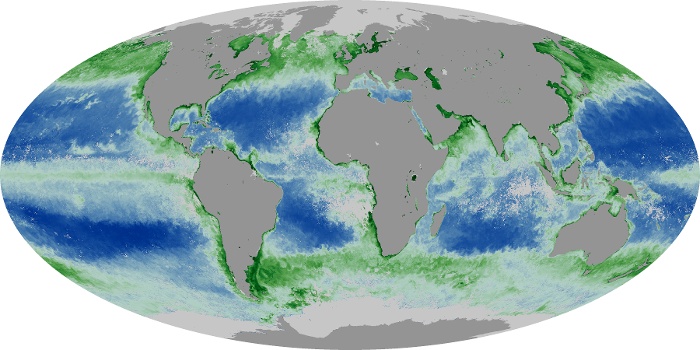
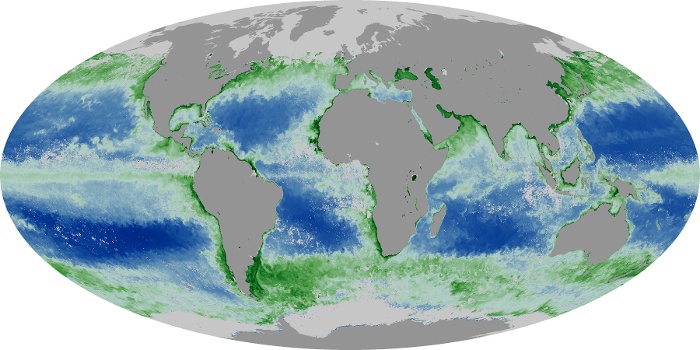

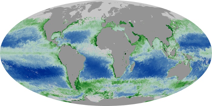
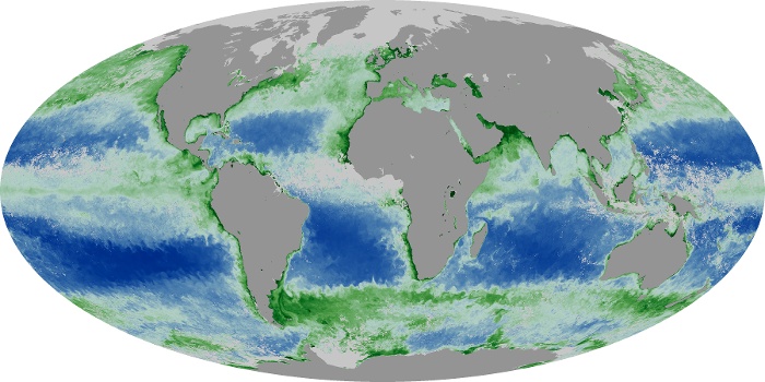
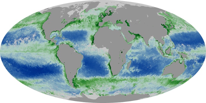
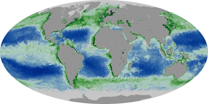
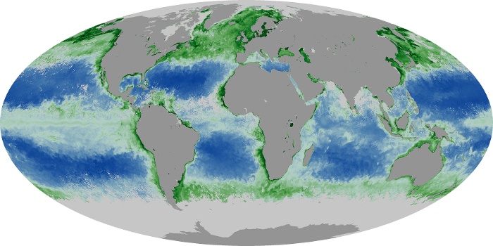
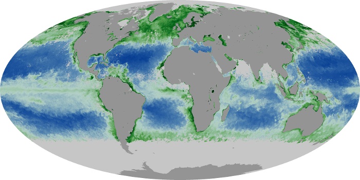
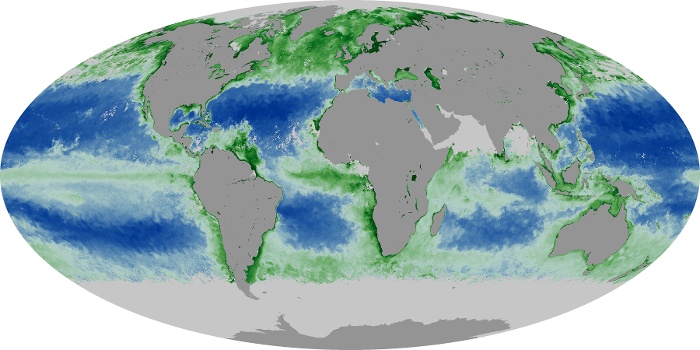
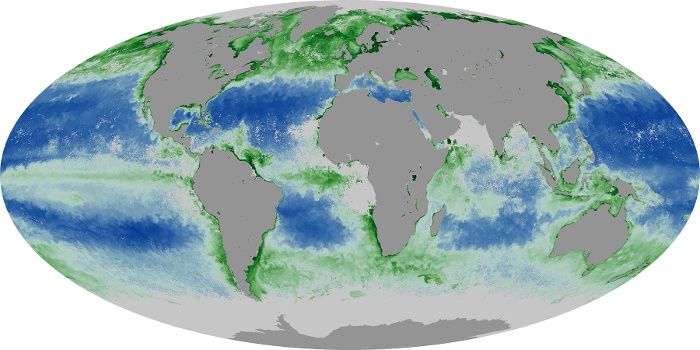
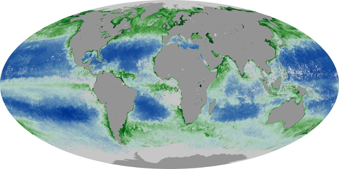
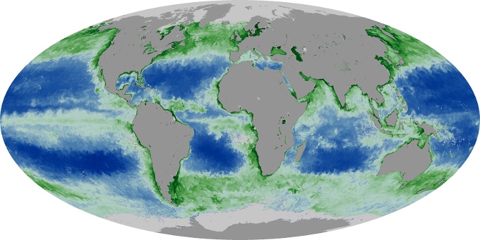
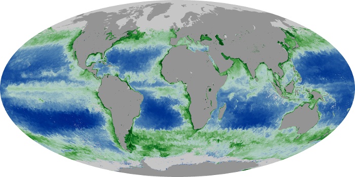
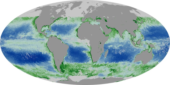
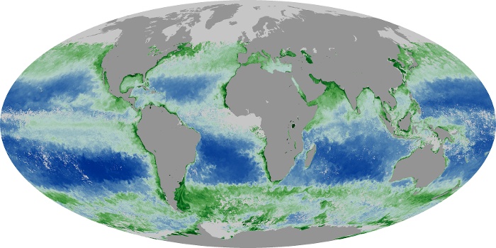
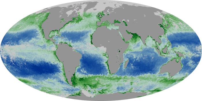
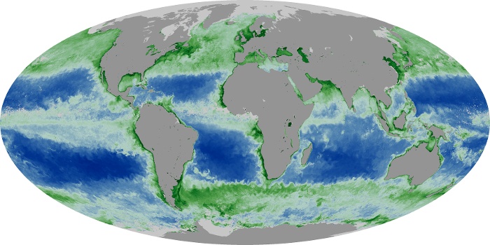

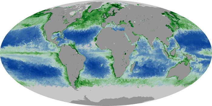
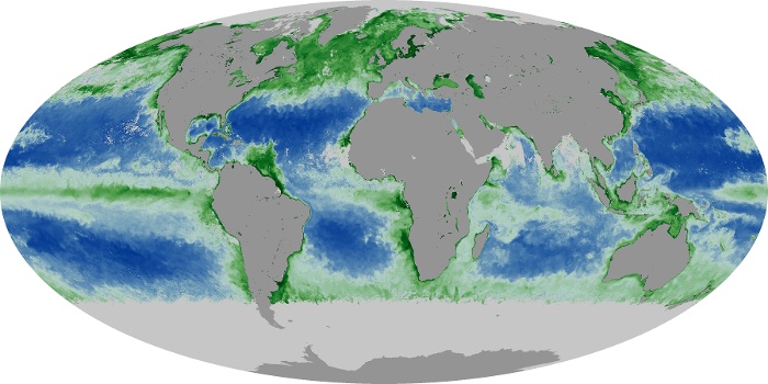
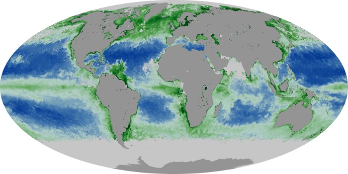
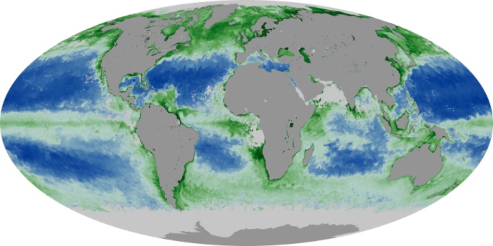
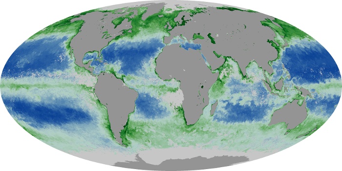
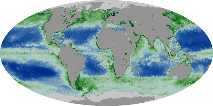
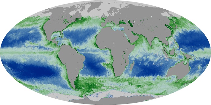
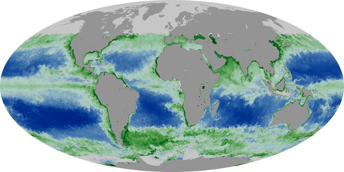
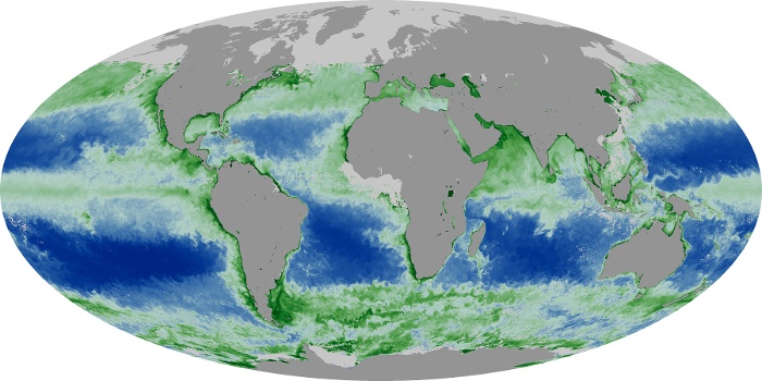
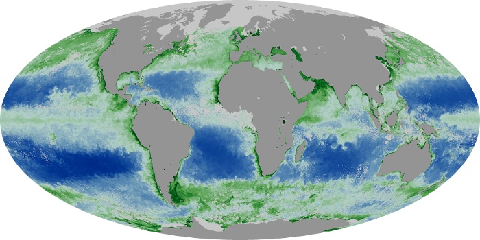
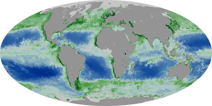
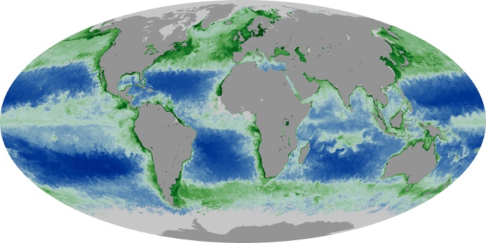
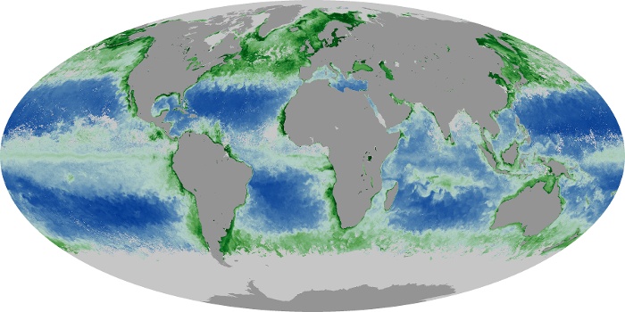
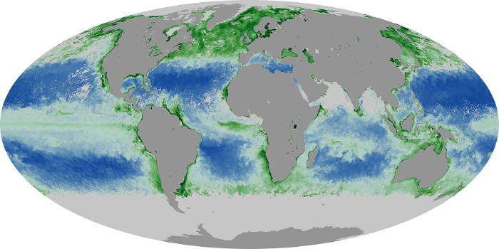
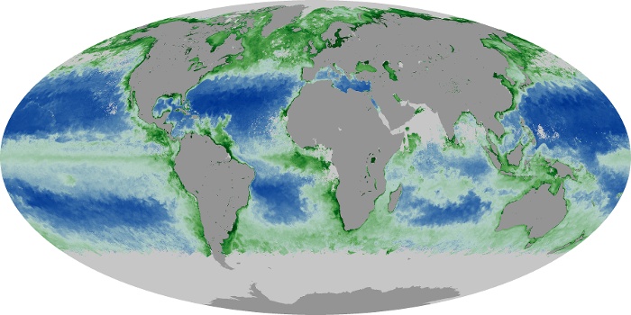
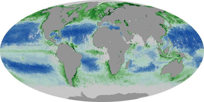
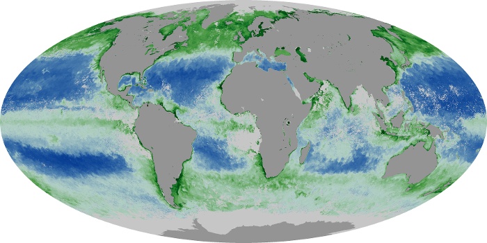
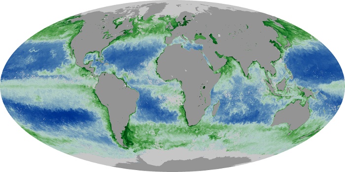
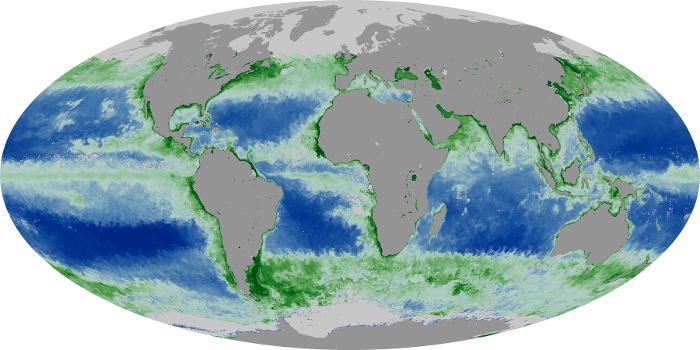
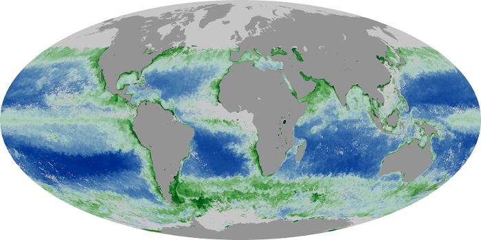
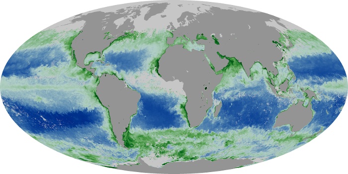
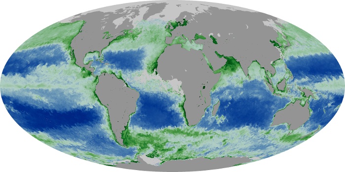
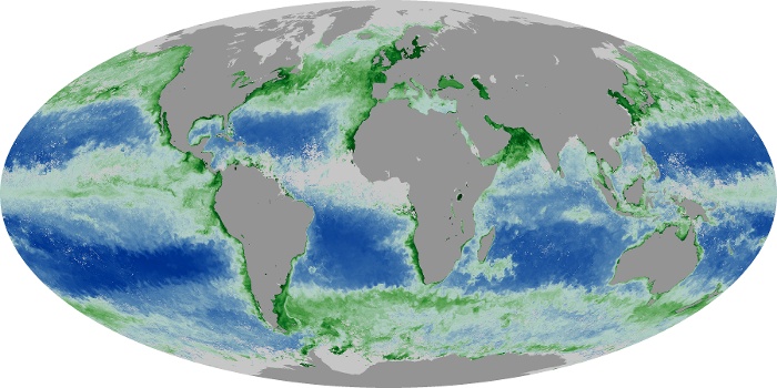
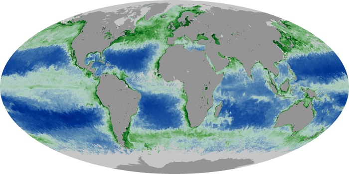
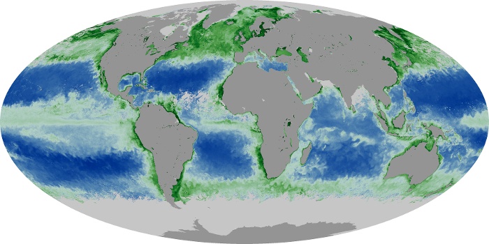
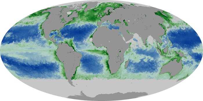
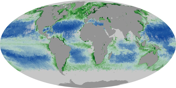
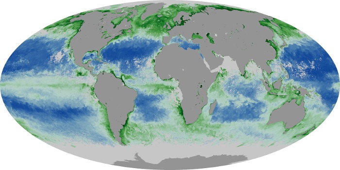


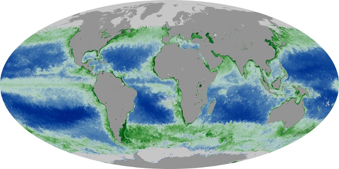
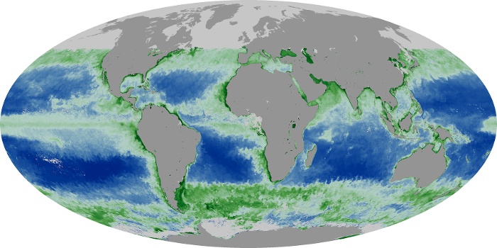
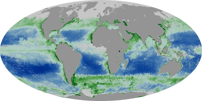
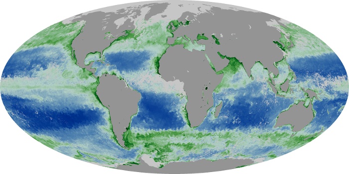
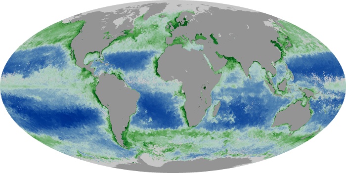
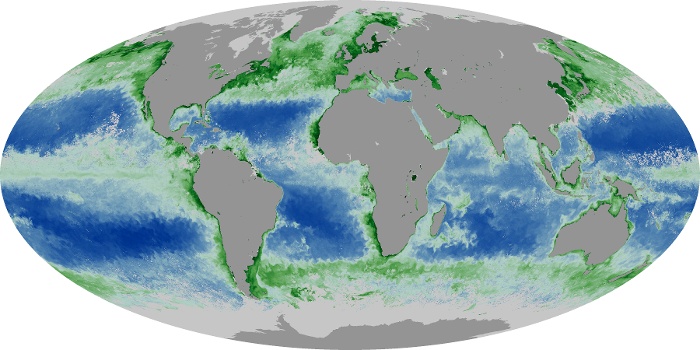
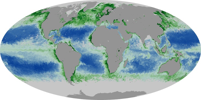
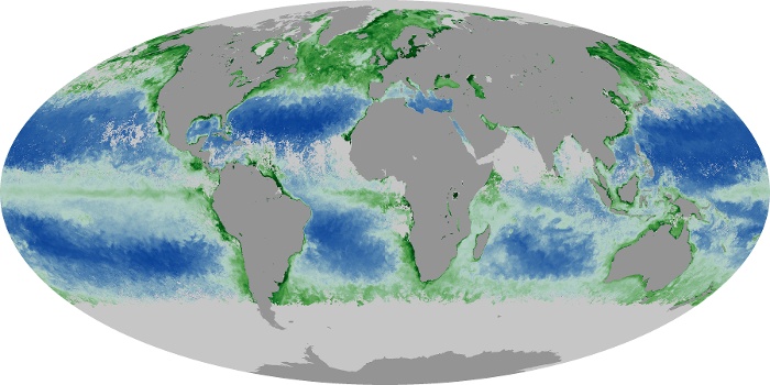

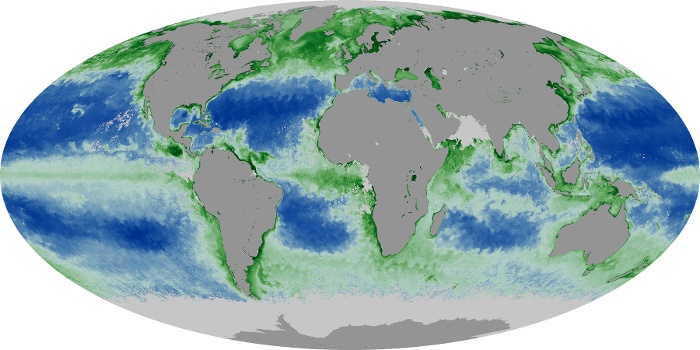
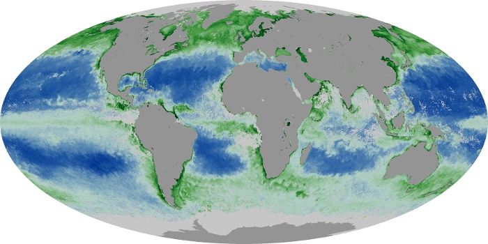
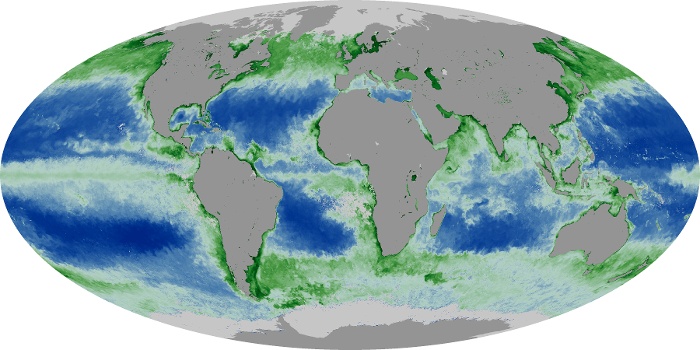
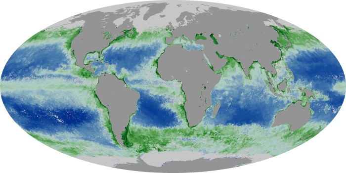
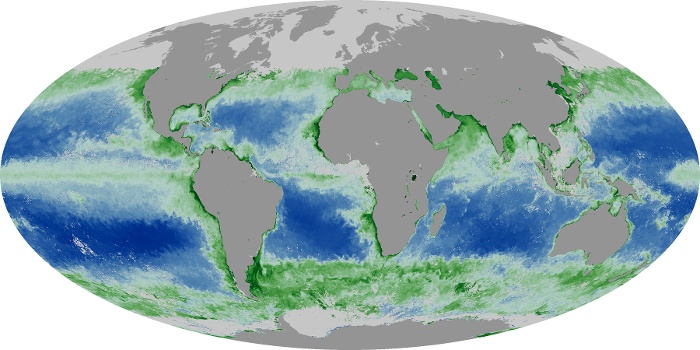
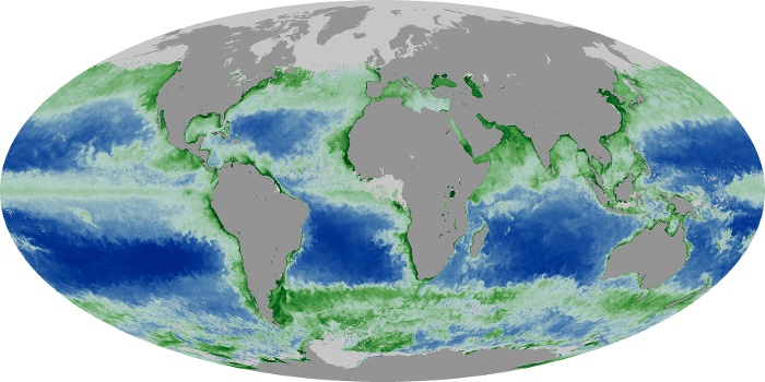
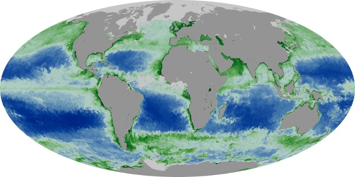
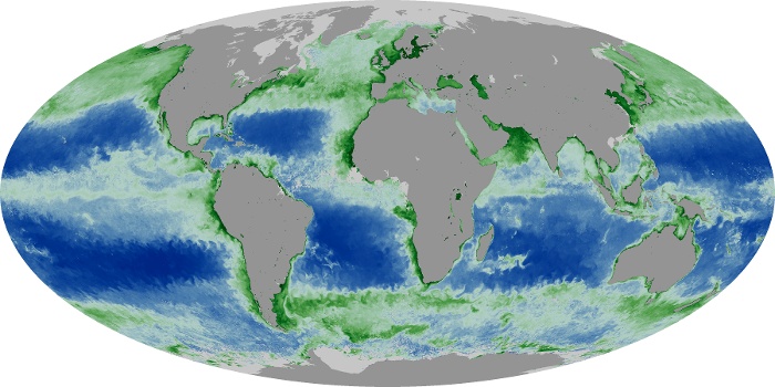
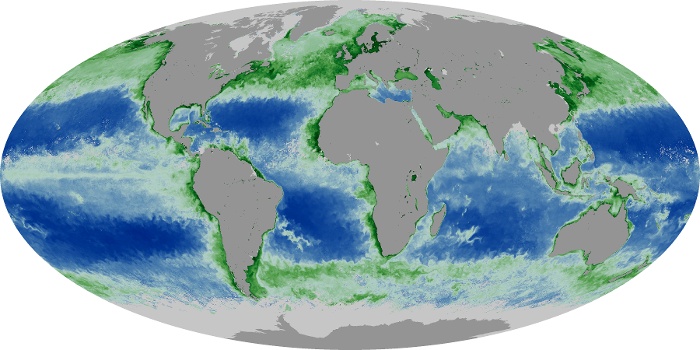
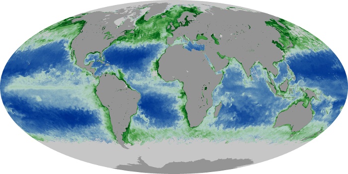
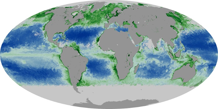
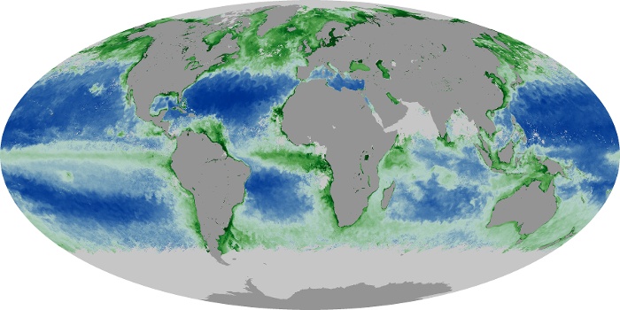
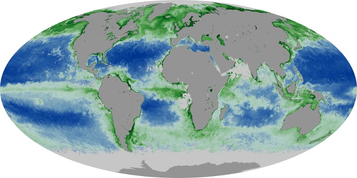
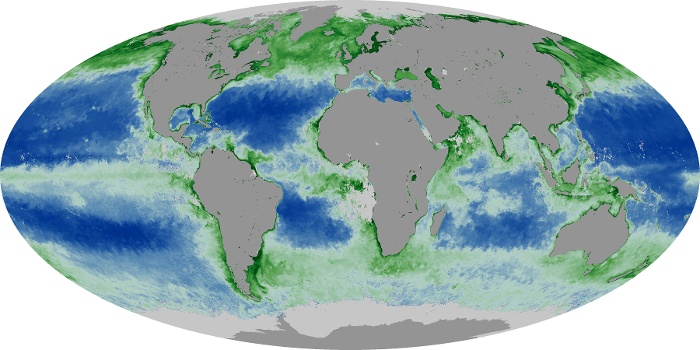
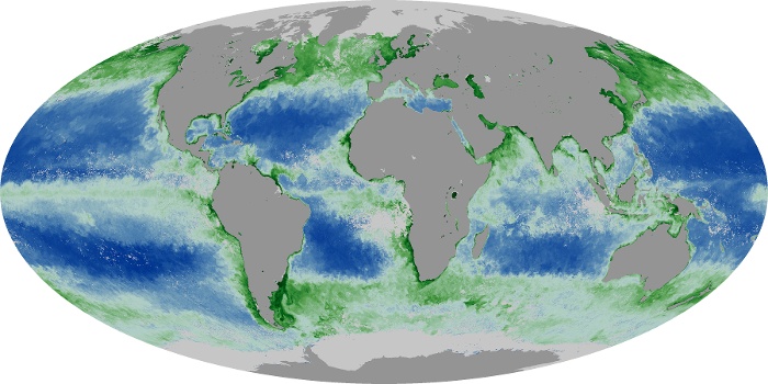
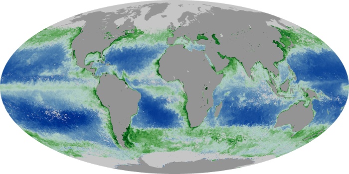
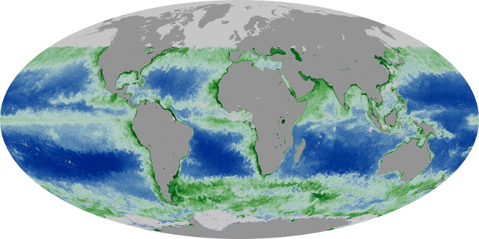
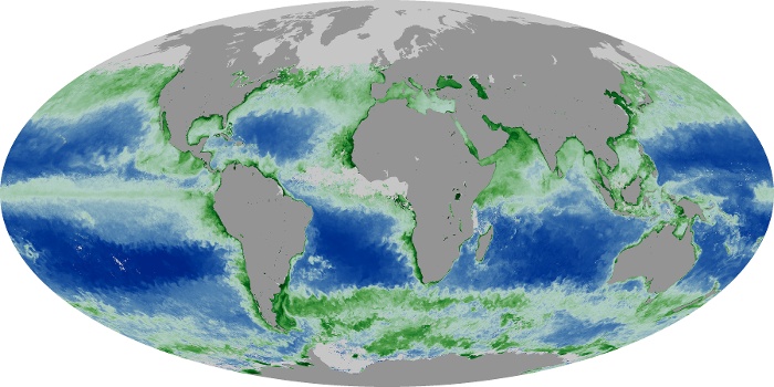

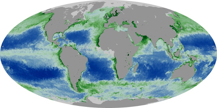
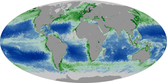
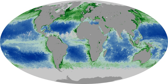
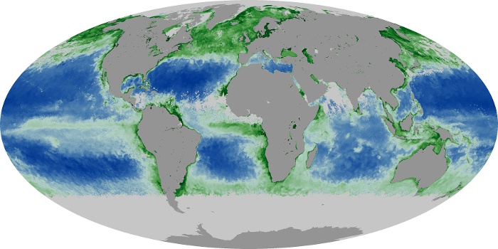
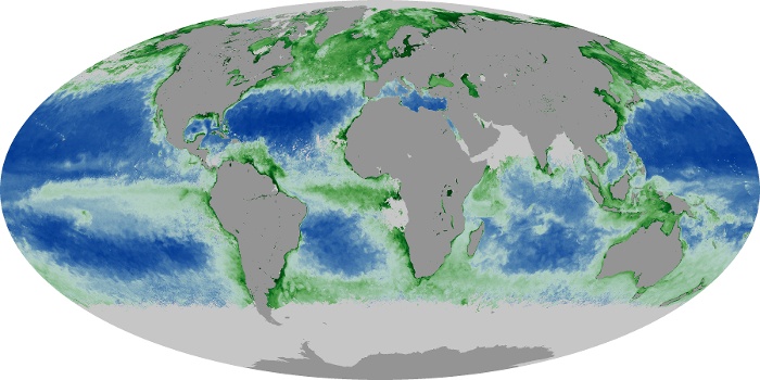
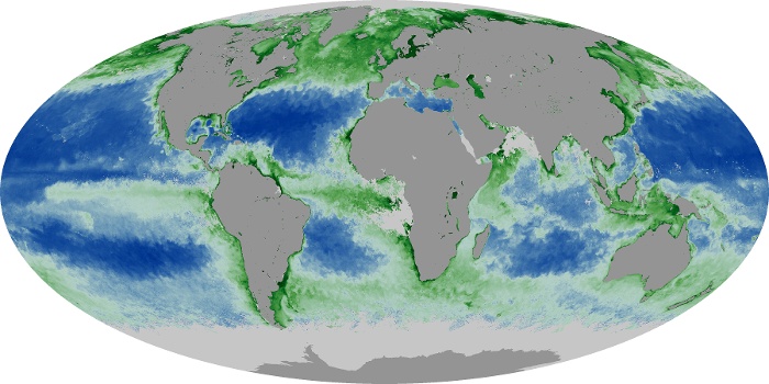
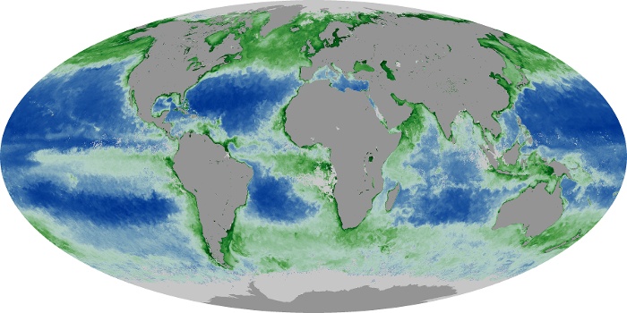
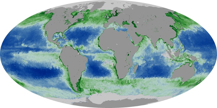
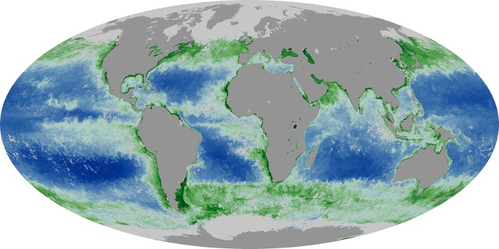
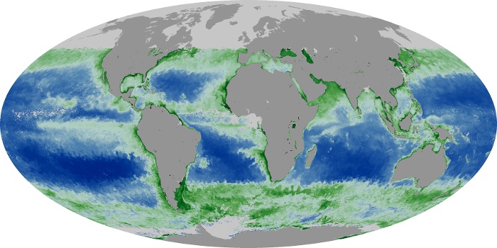
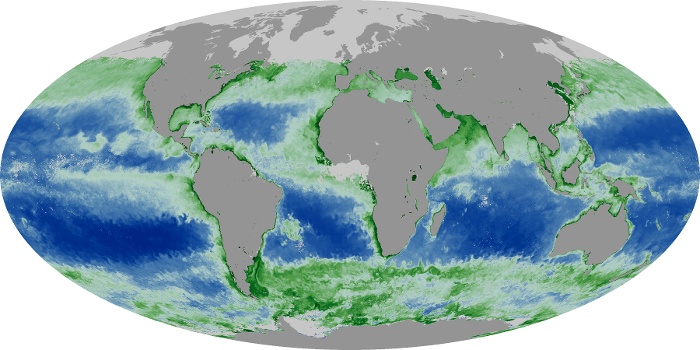
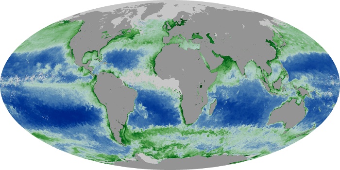
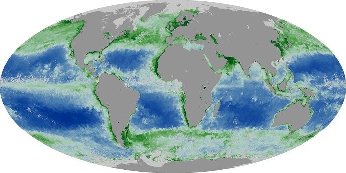
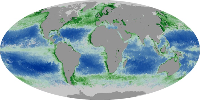
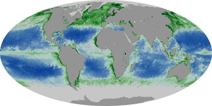
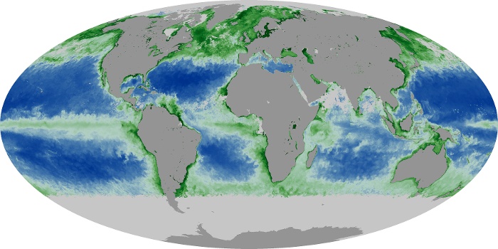
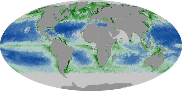
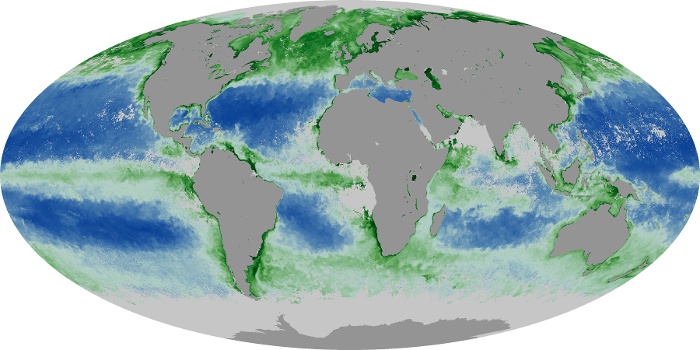
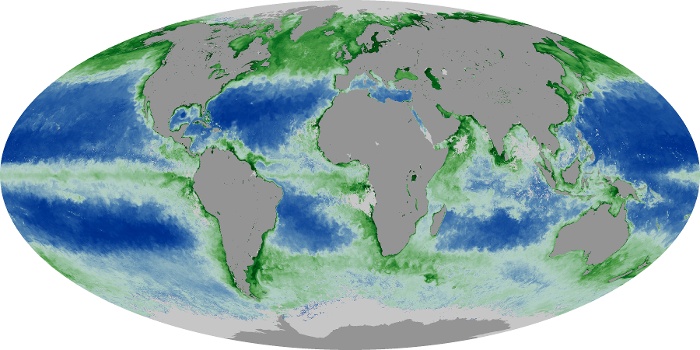
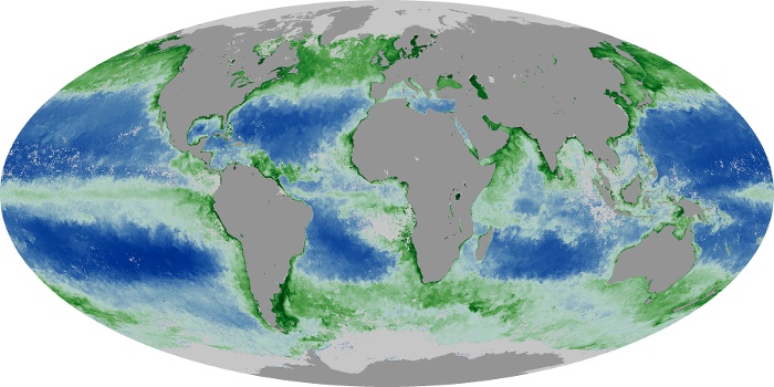
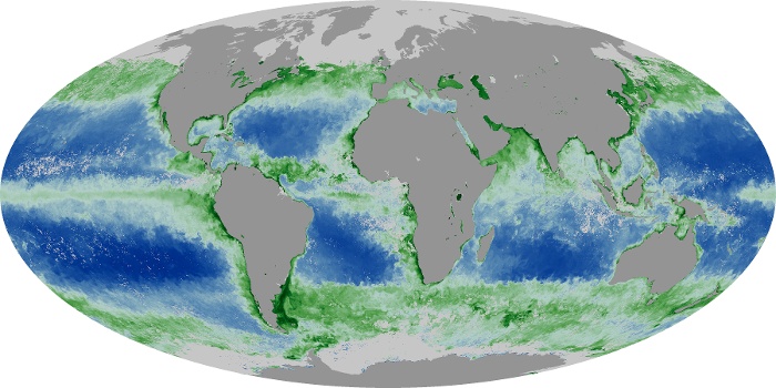
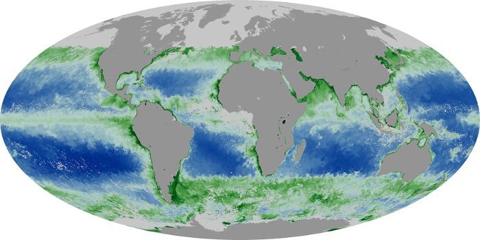
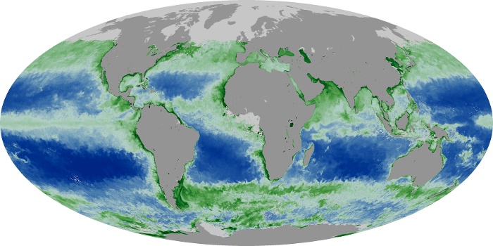
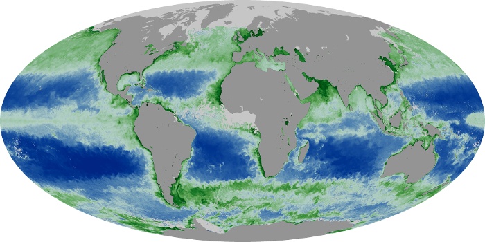
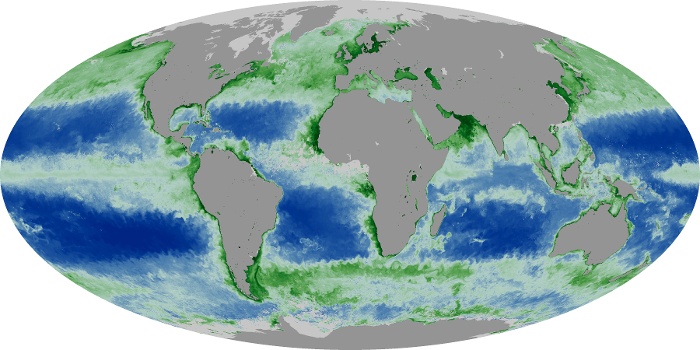
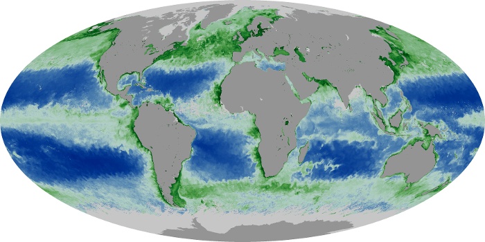
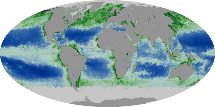
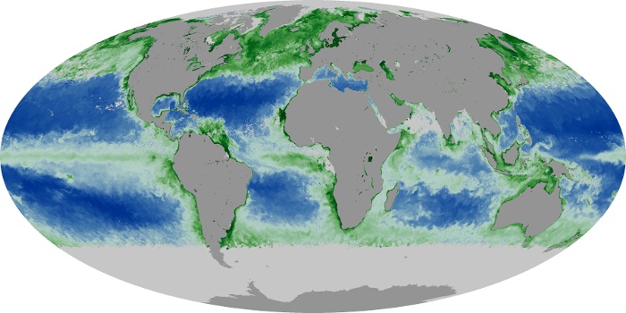
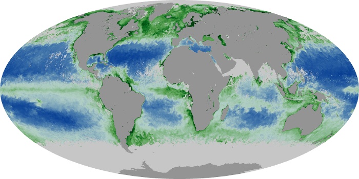
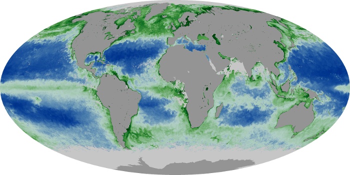
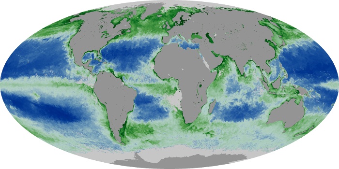
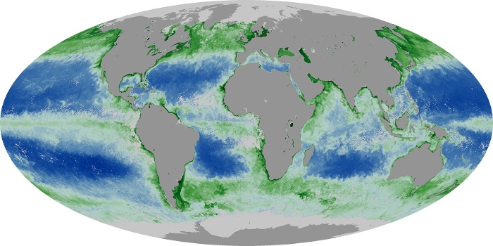
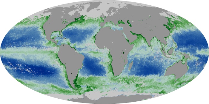
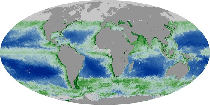
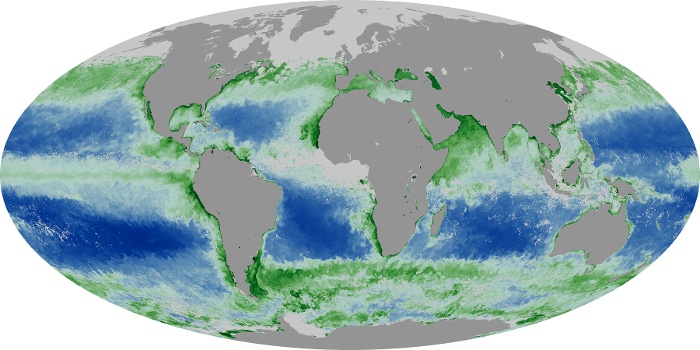
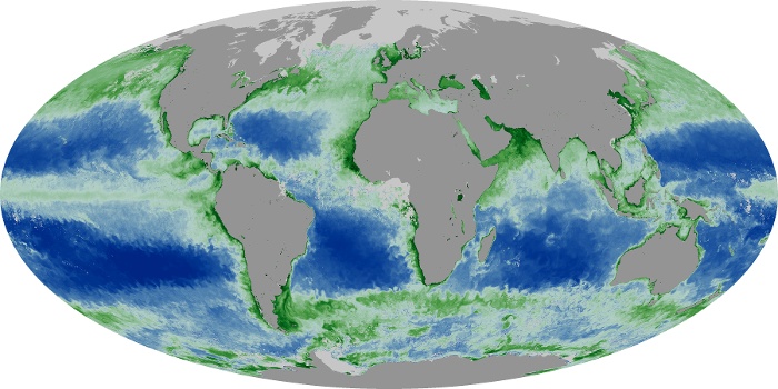
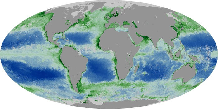
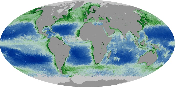

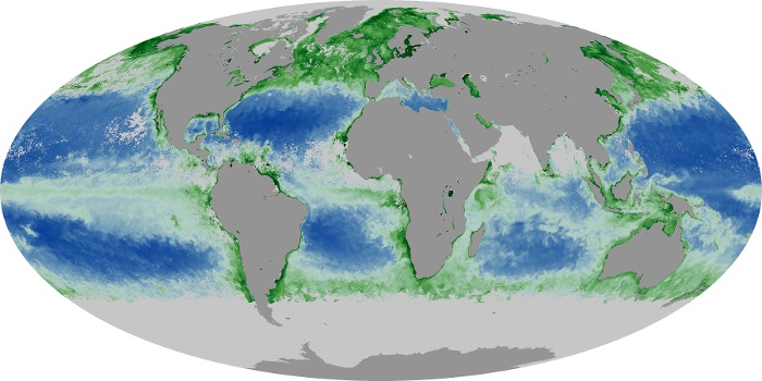
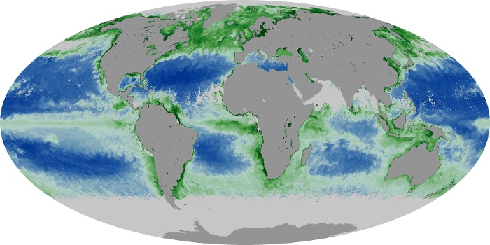
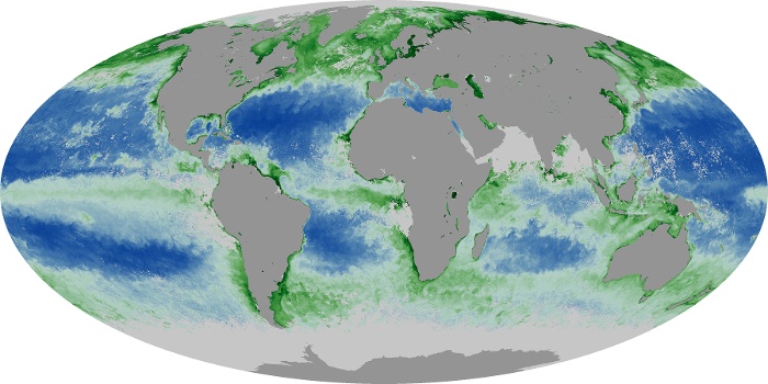
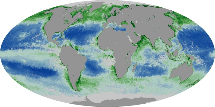
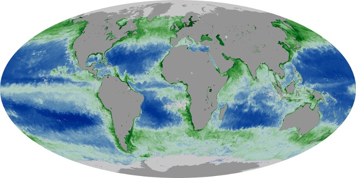
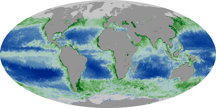
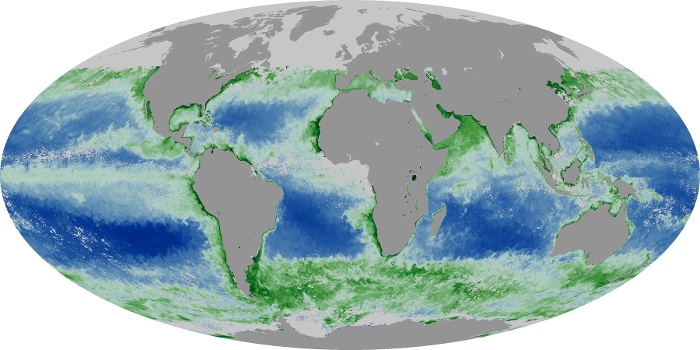
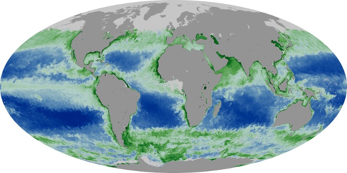
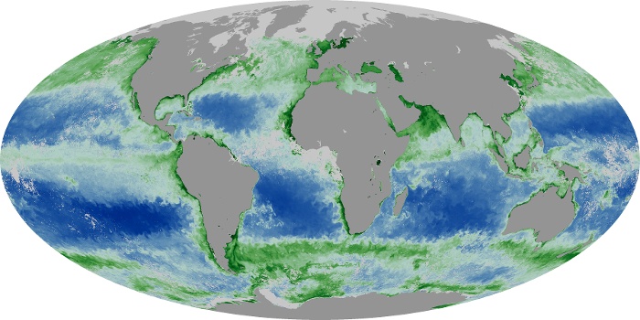
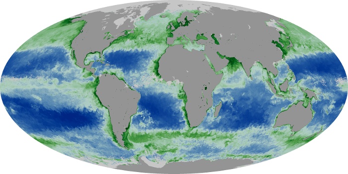

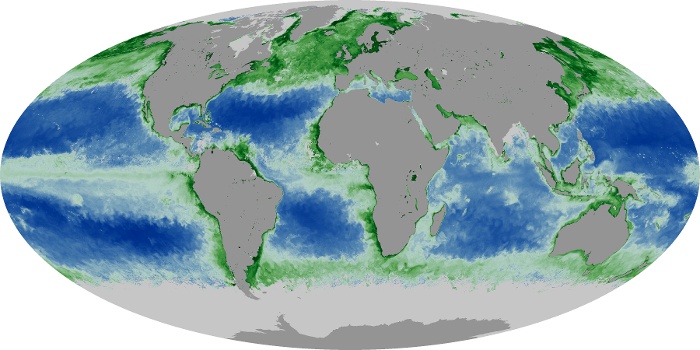
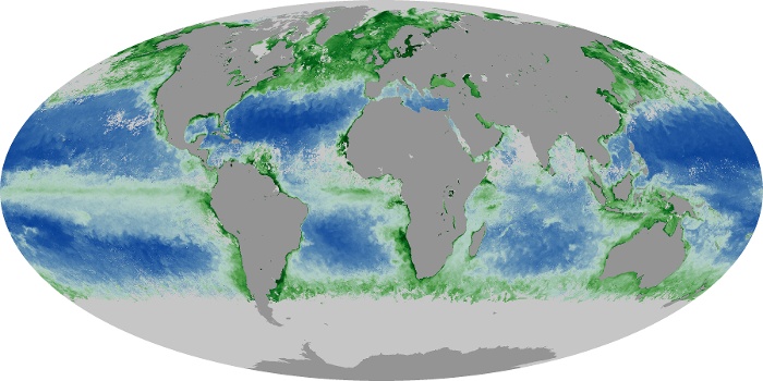
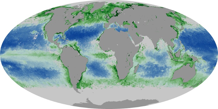
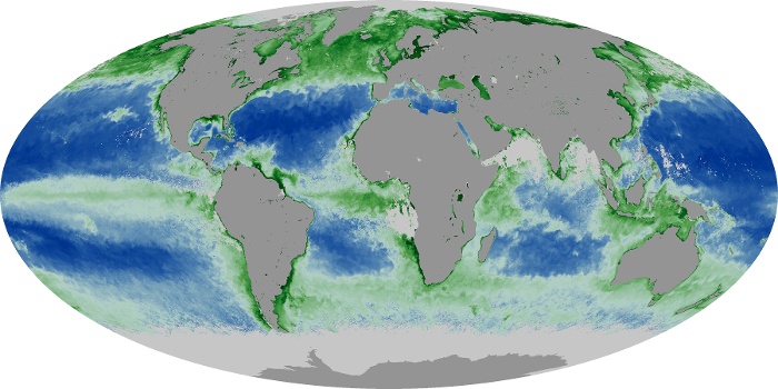
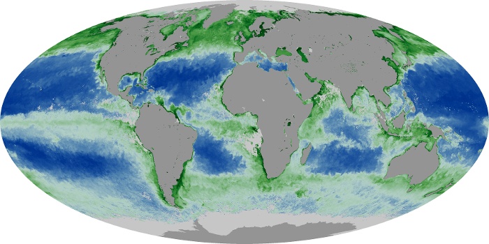
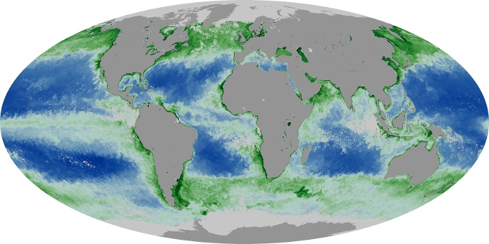
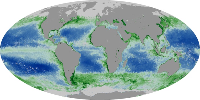
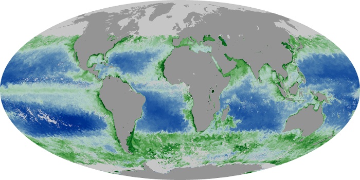
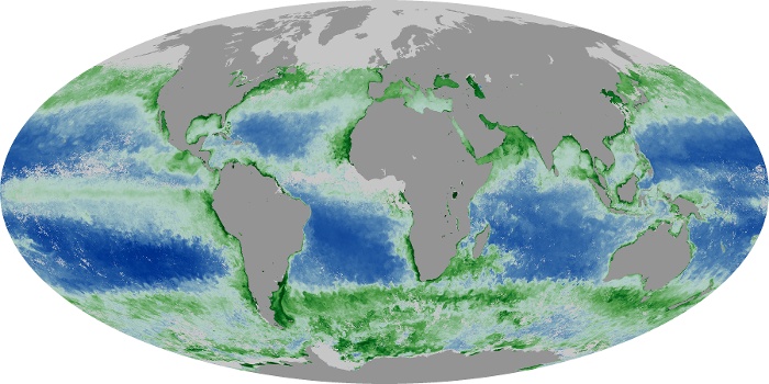
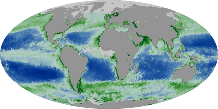
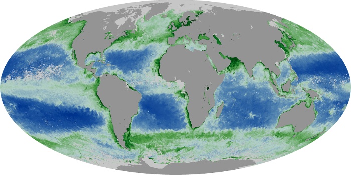
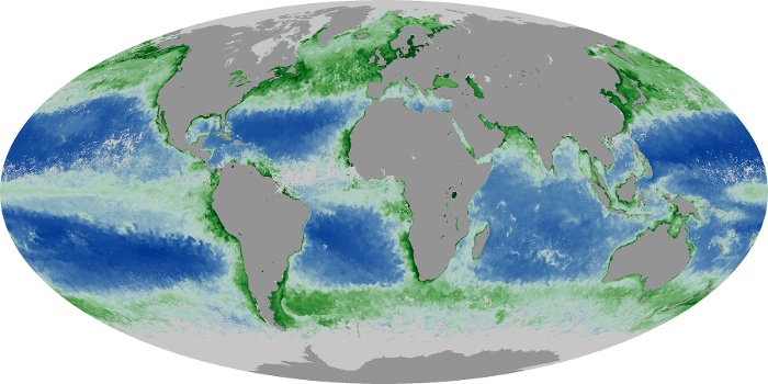
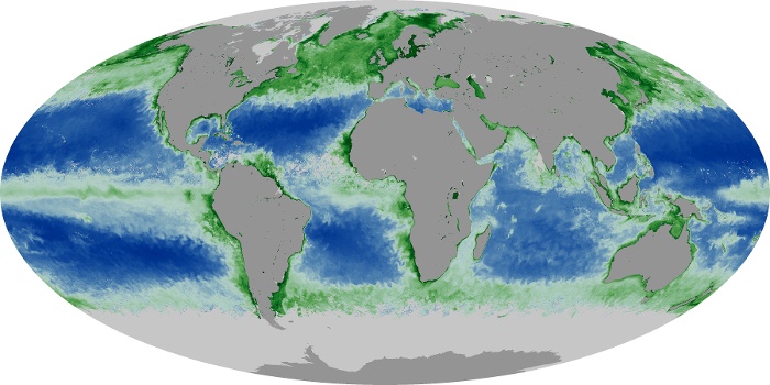
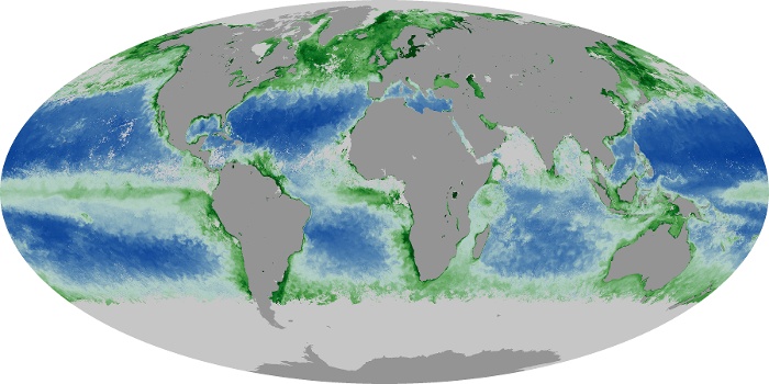

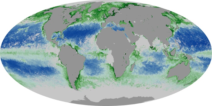
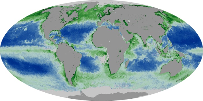
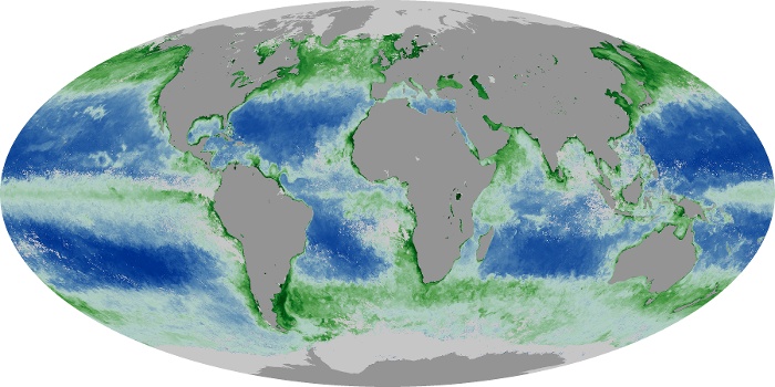
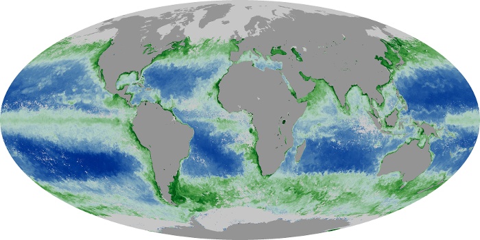
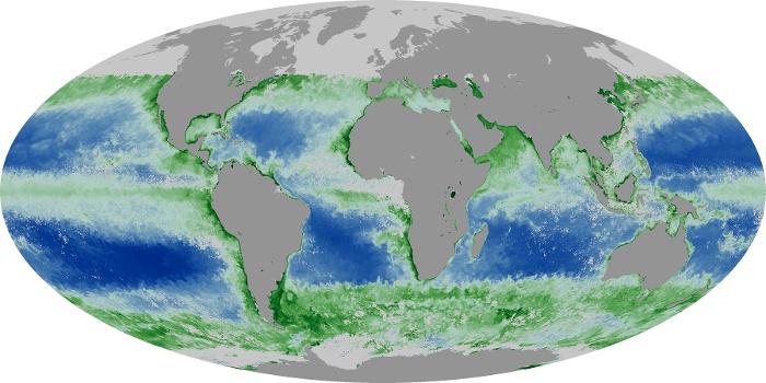
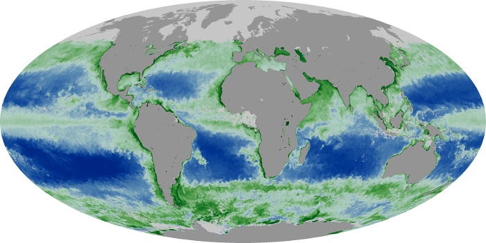
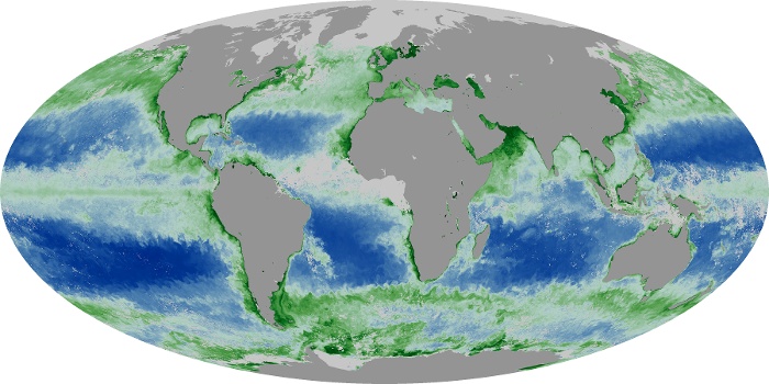
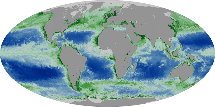
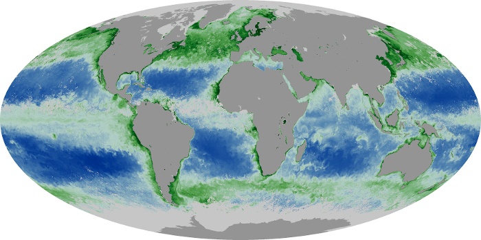
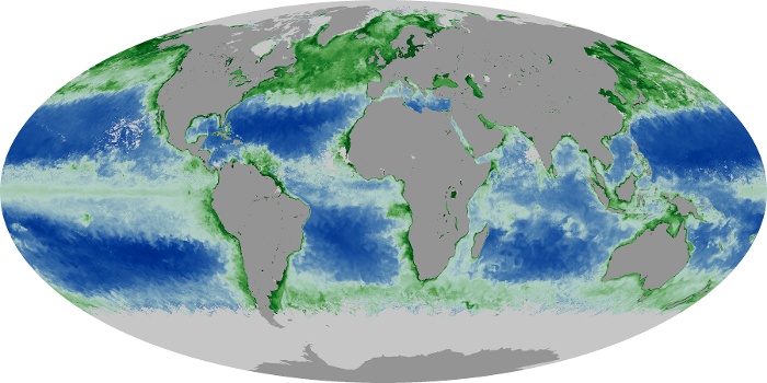
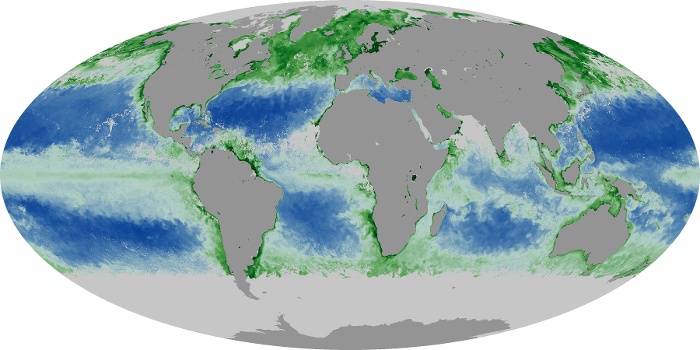
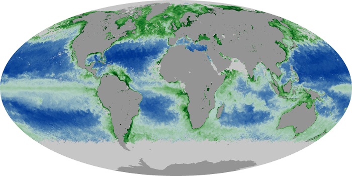
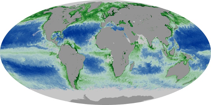
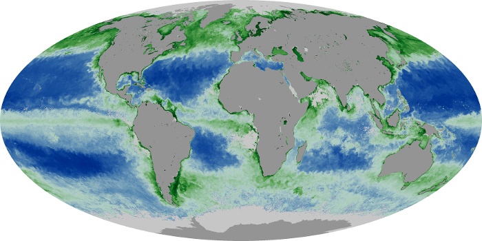
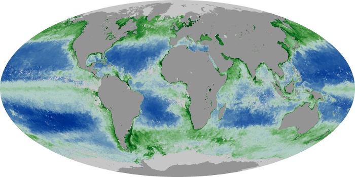
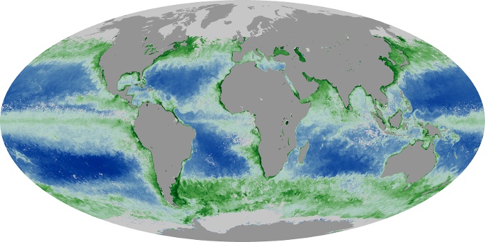
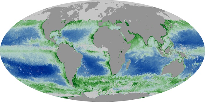
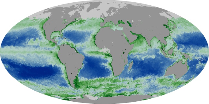
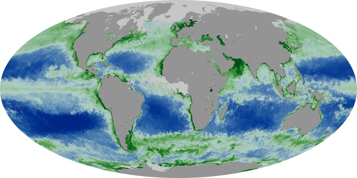
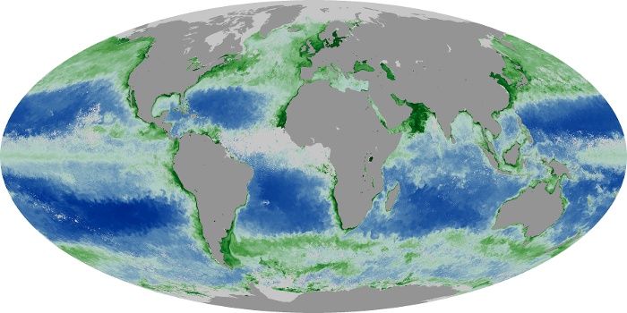
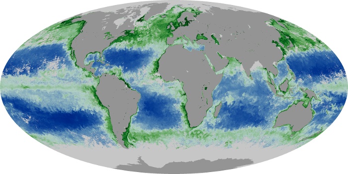
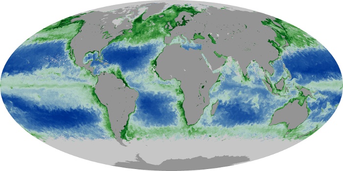
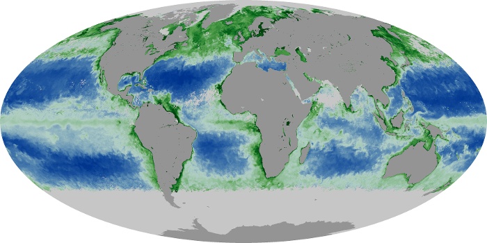
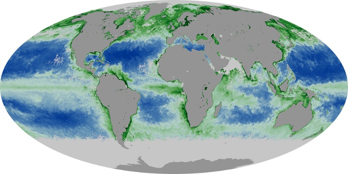
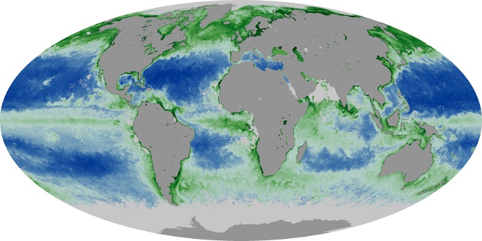
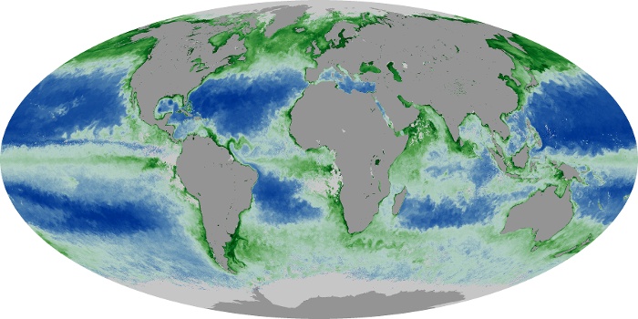

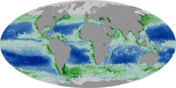
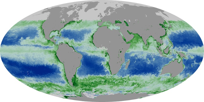
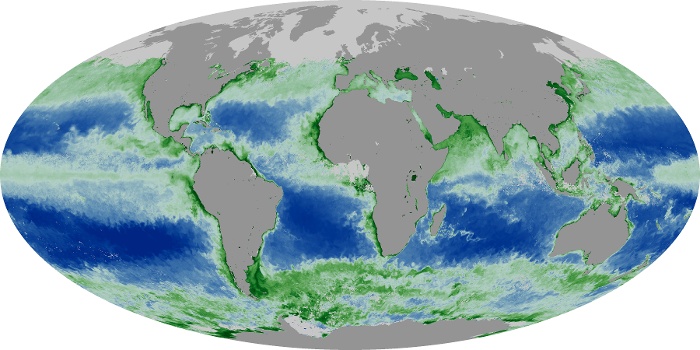
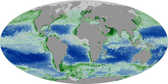
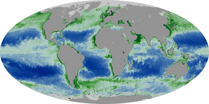
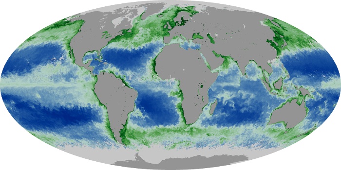
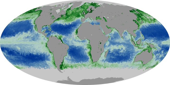
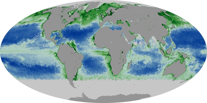
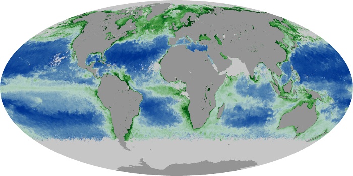
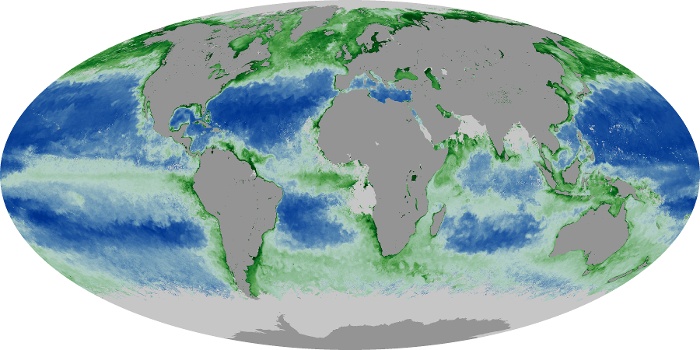
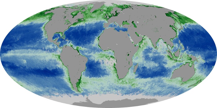


The chlorophyll maps show milligrams of chlorophyll per cubic meter of seawater each month. Places where chlorophyll amounts were very low, indicating very low numbers of phytoplankton are blue. Places where chlorophyll concentrations were high, meaning many phytoplankton were growing, are dark green. The observations come from the MODIS sensor on NASA's Aqua satellite. Land is dark gray, and places where MODIS could not collect data (reasons include sea ice, polar darkness, or clouds) are light gray.
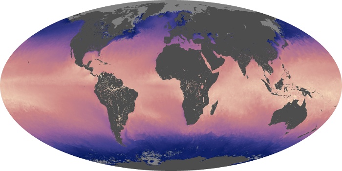
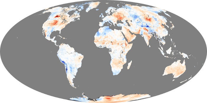
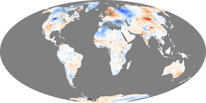
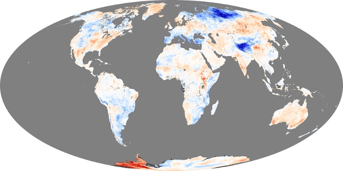
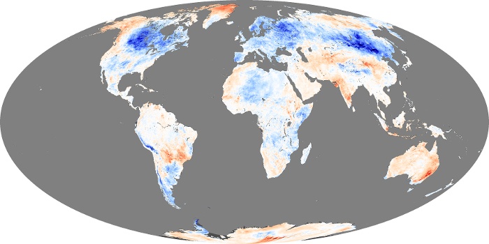
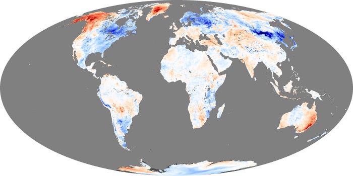
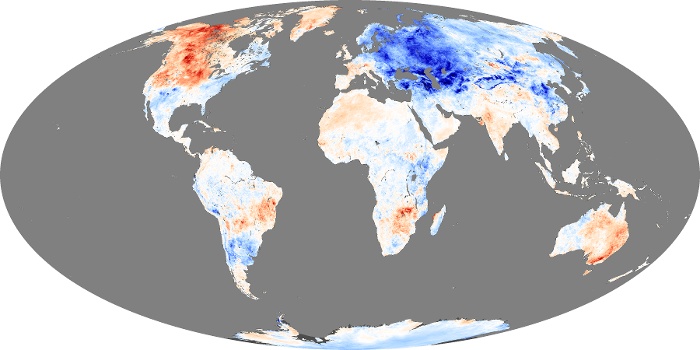
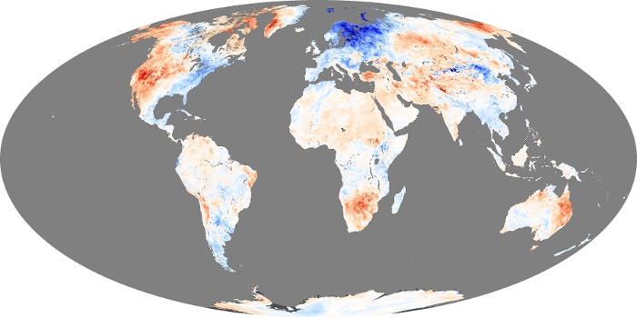
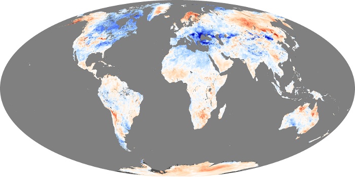
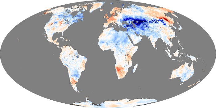
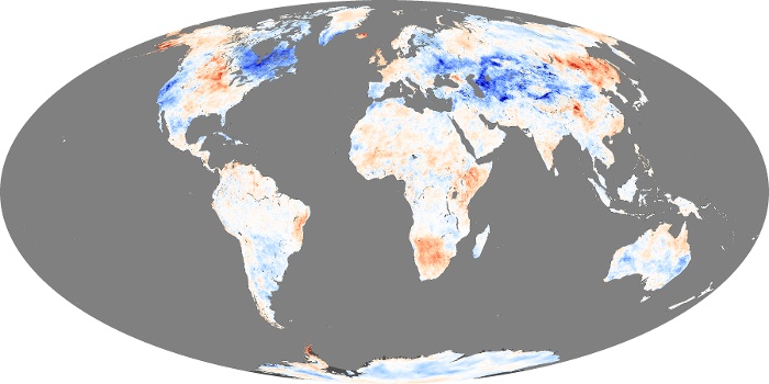
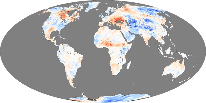
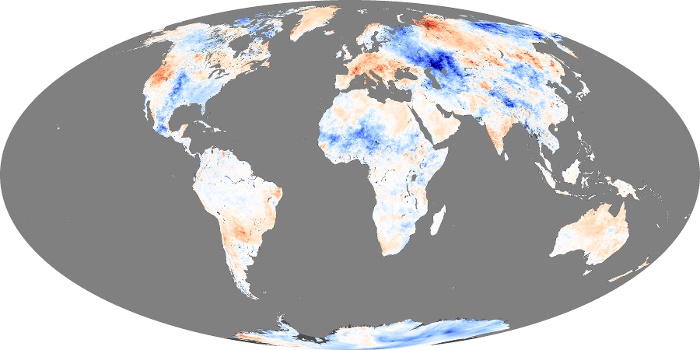
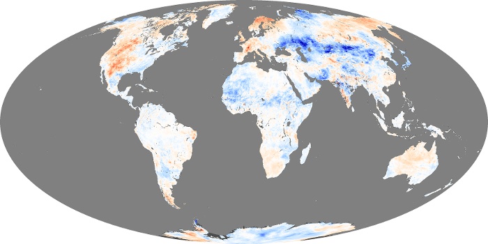
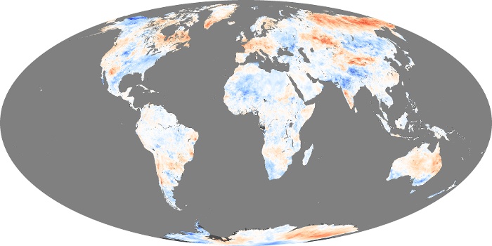
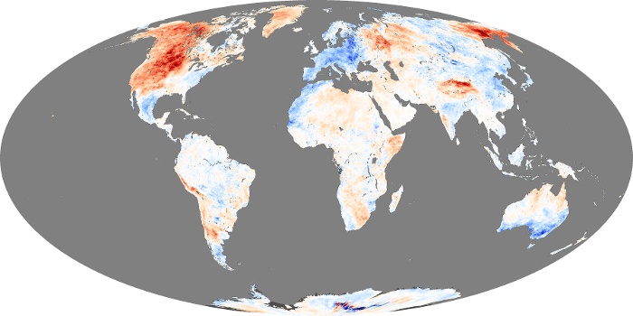
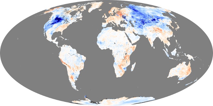
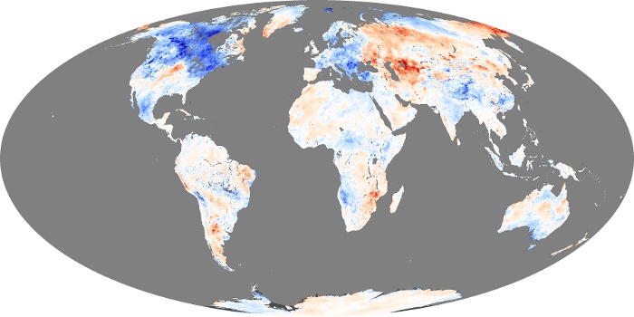
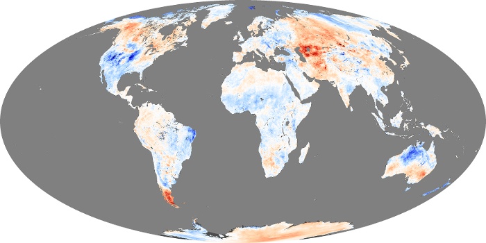
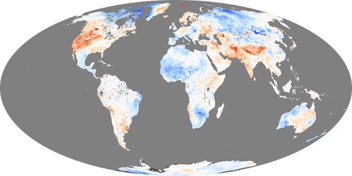
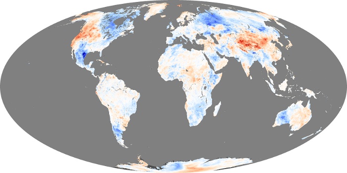
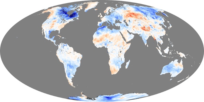
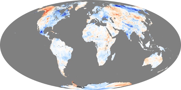
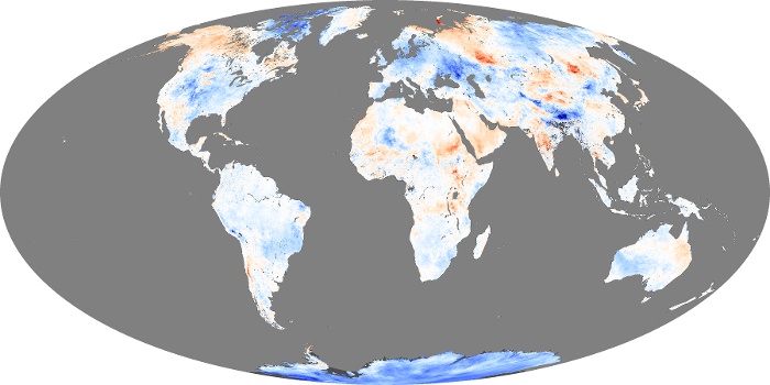
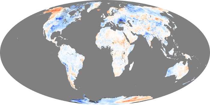
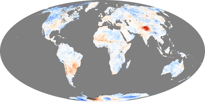
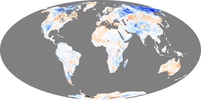
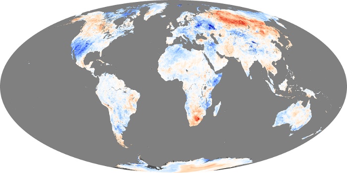
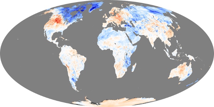
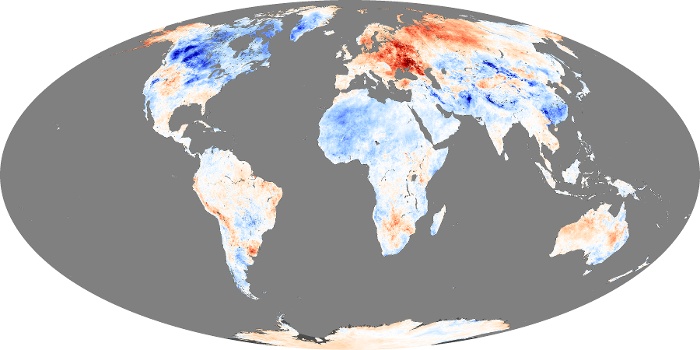
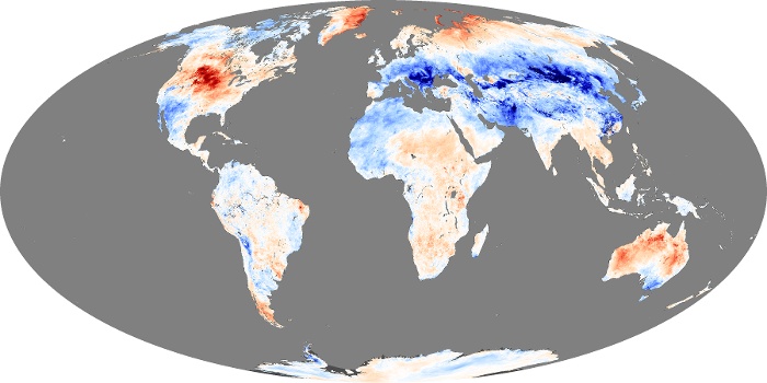
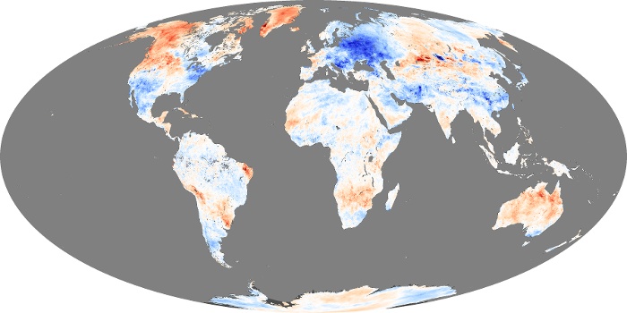
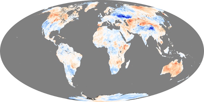
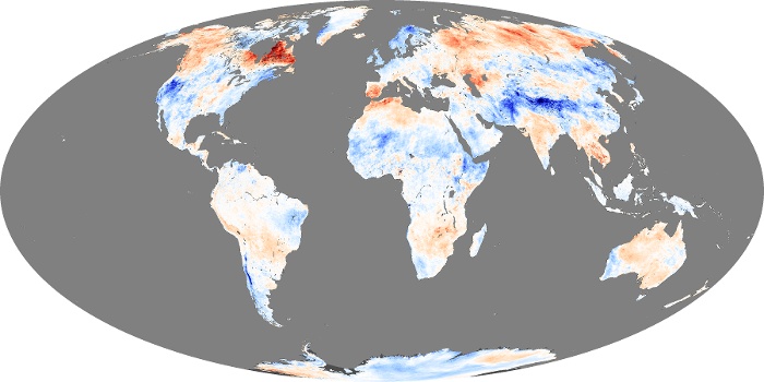
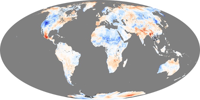
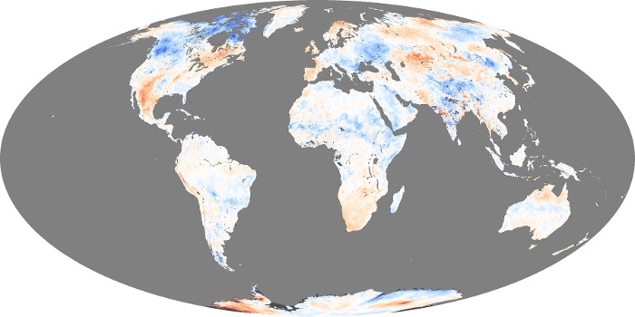
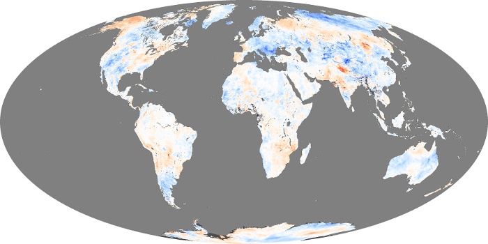
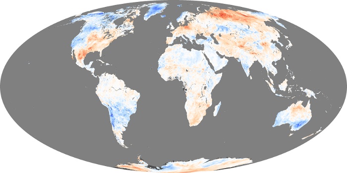
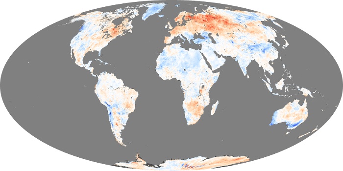
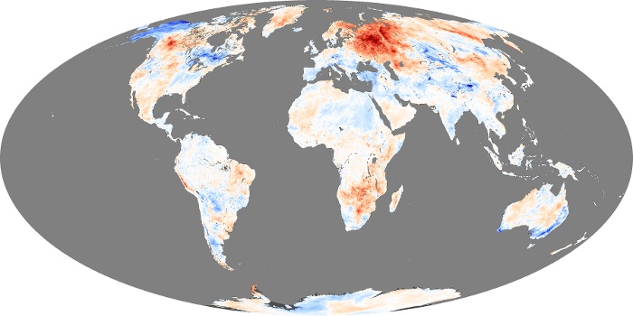
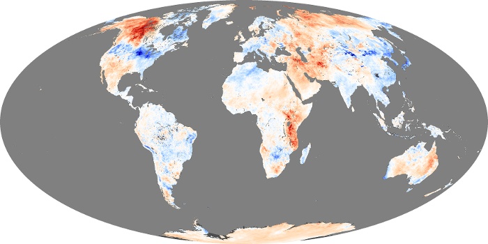
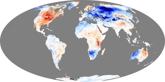
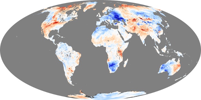
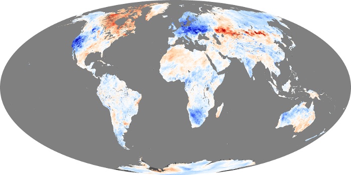
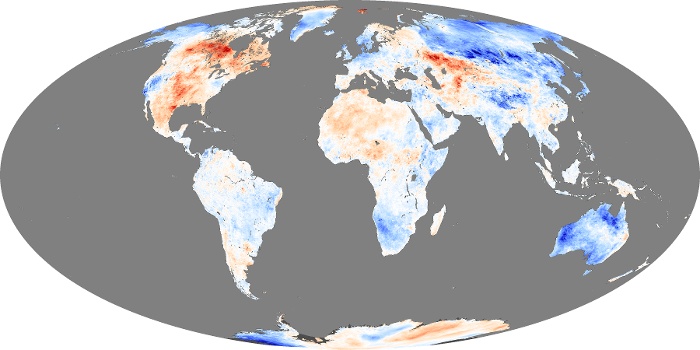
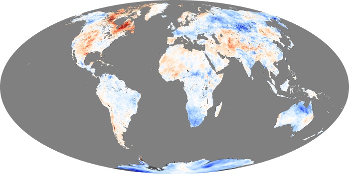
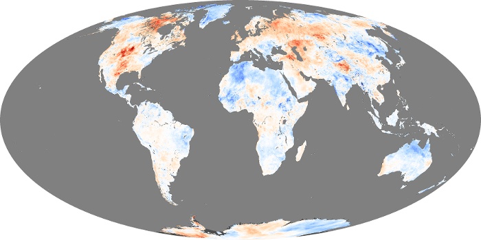
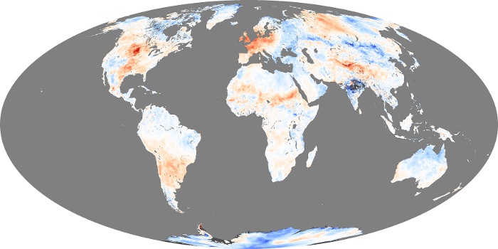
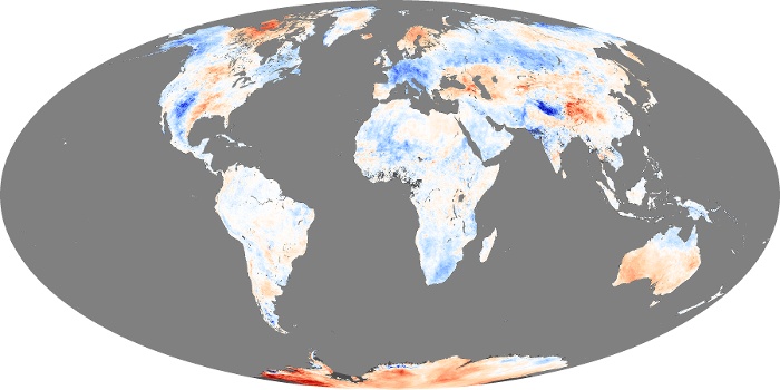
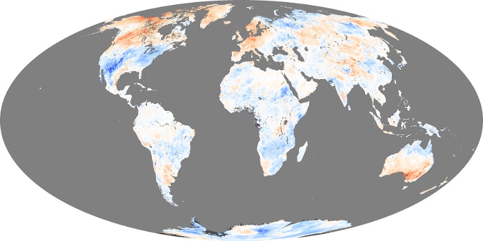
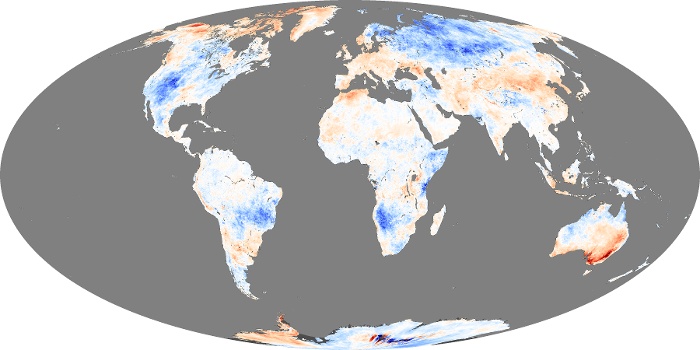
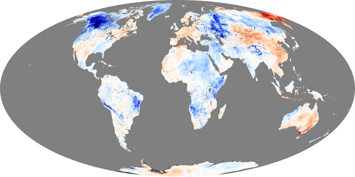
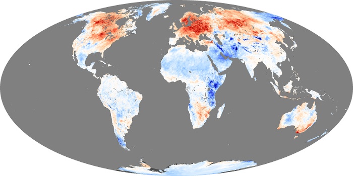
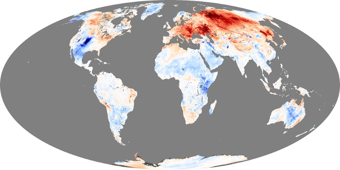
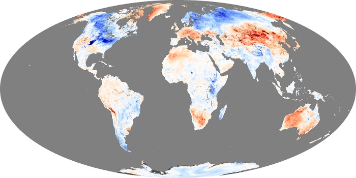
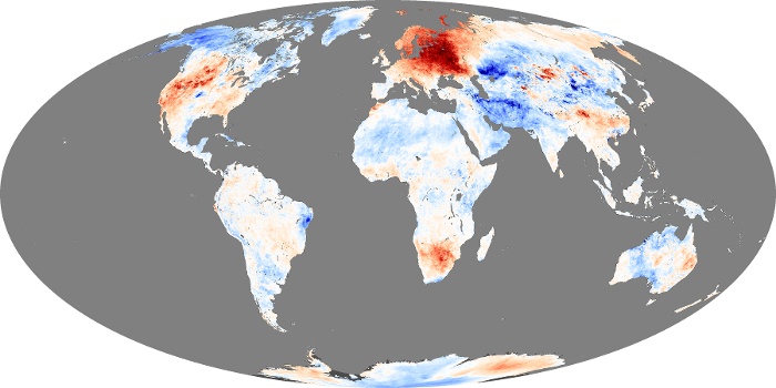
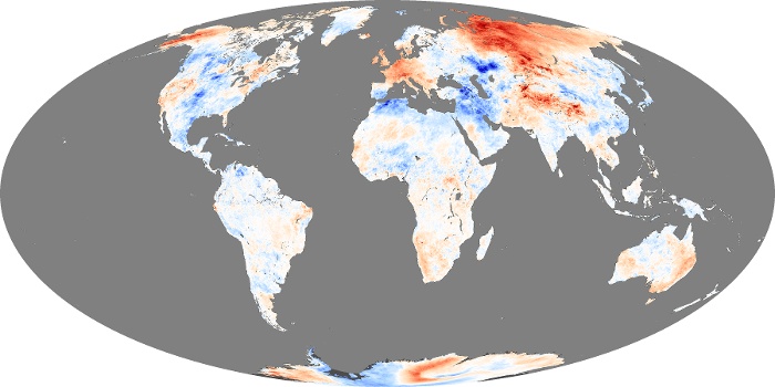
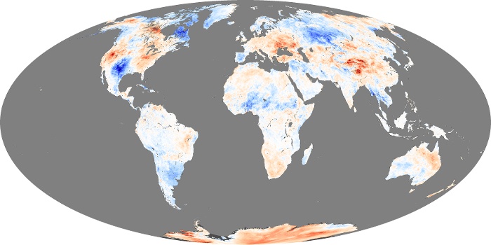
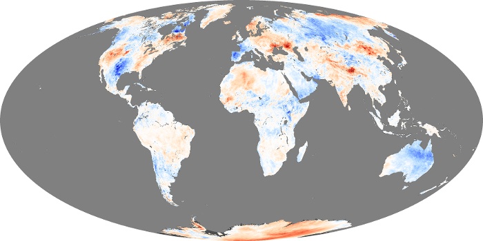
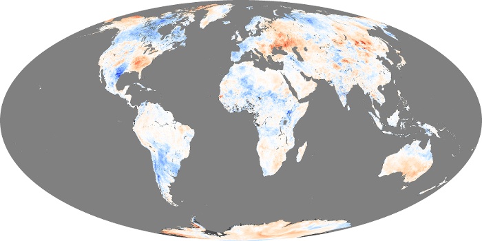
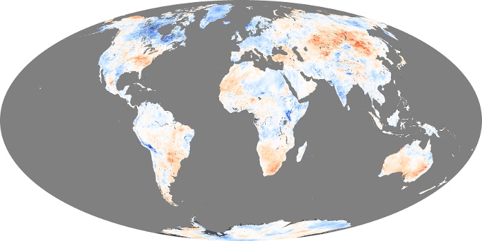
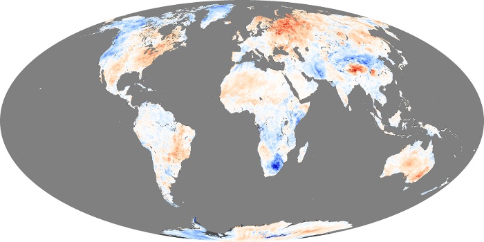
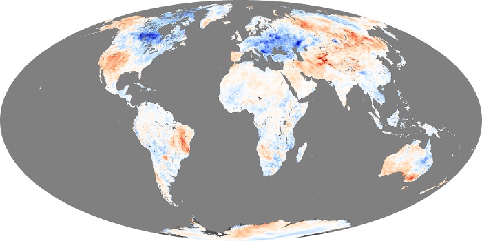
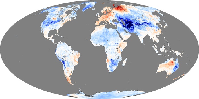
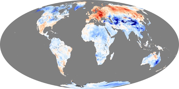
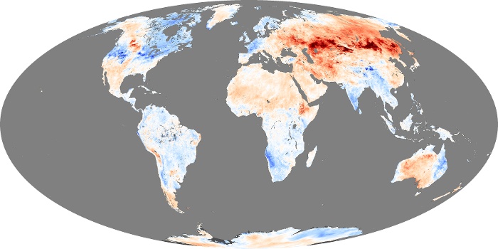
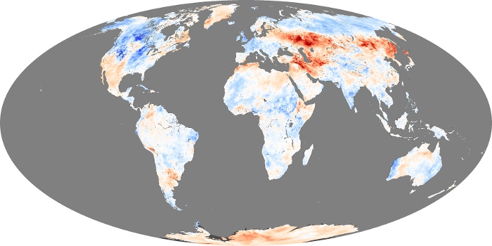
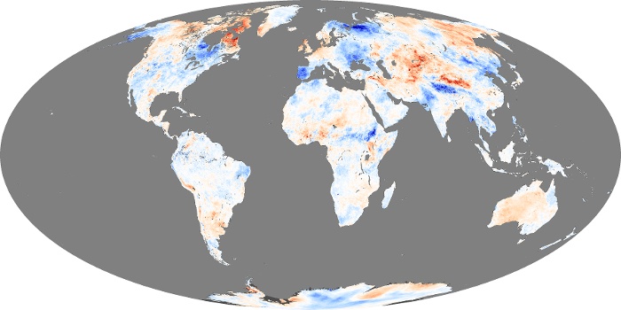
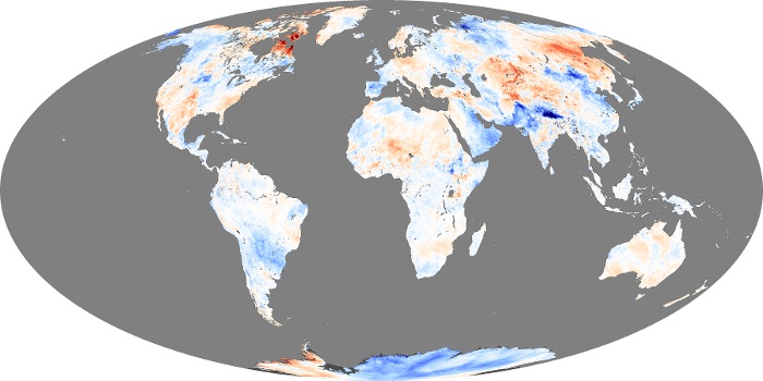
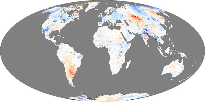
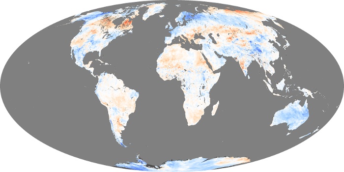
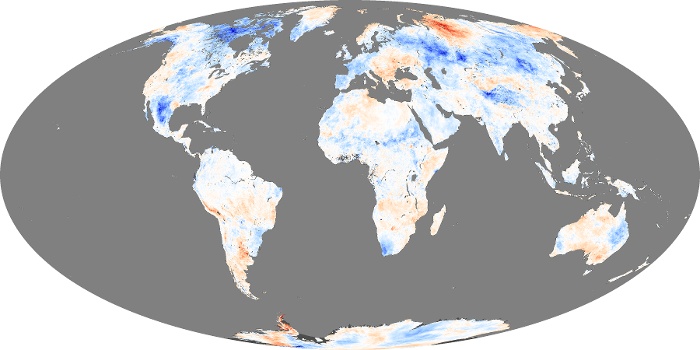
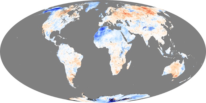
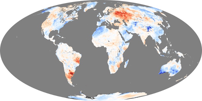
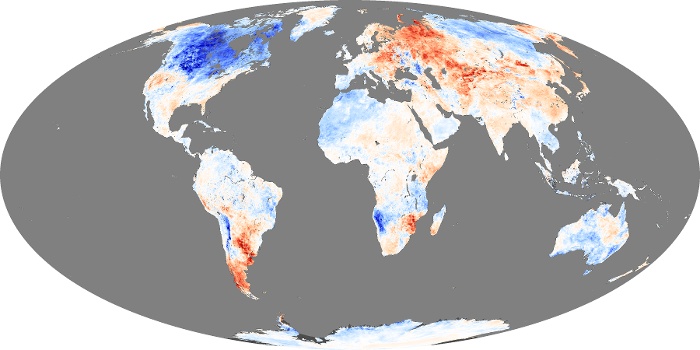
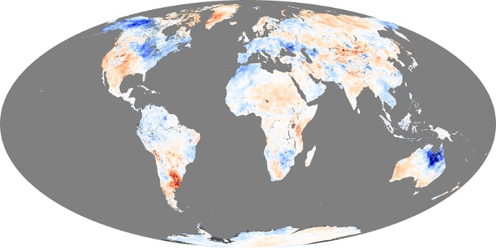
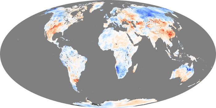
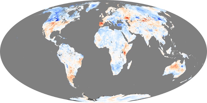
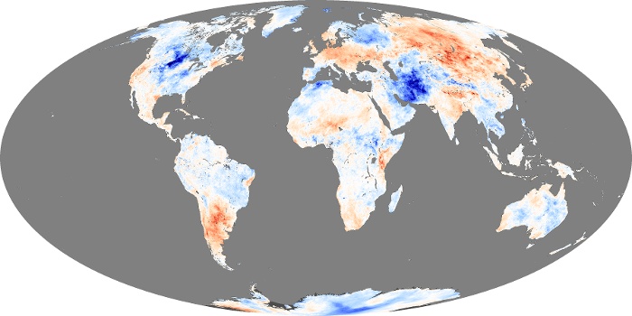
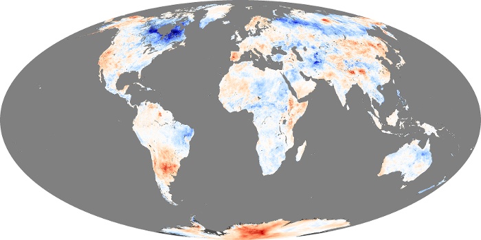
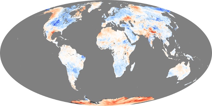
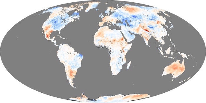
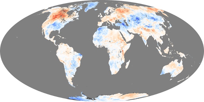
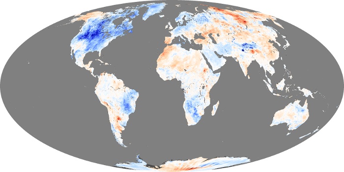
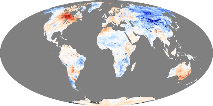
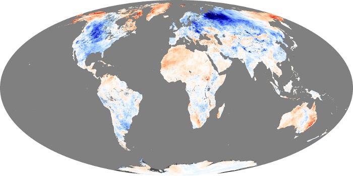
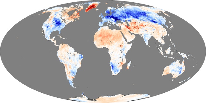
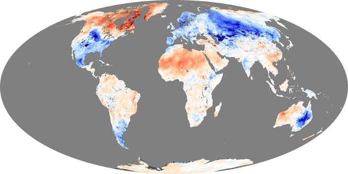
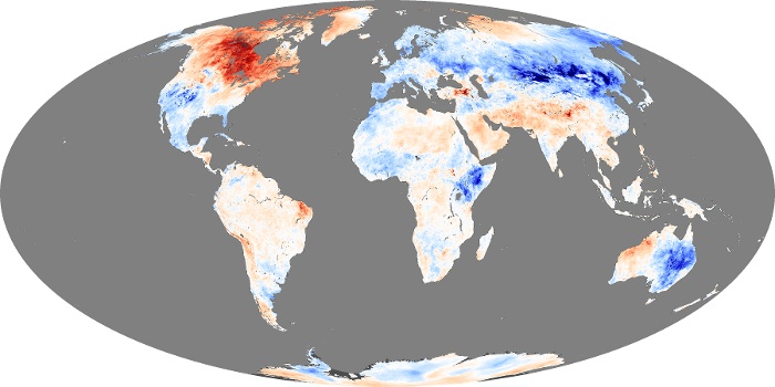
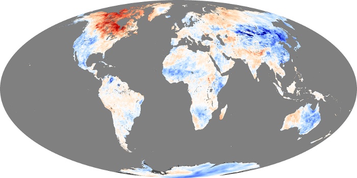
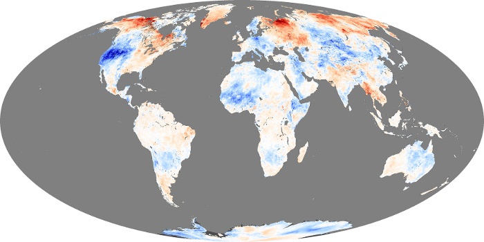
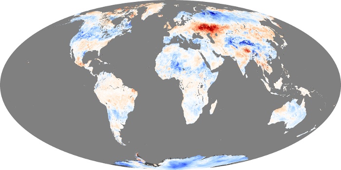
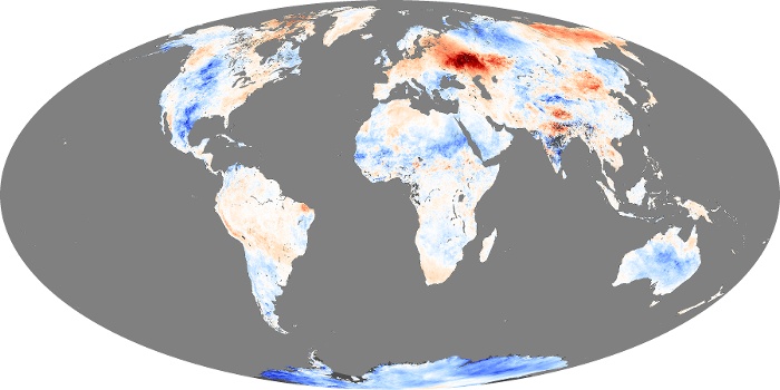
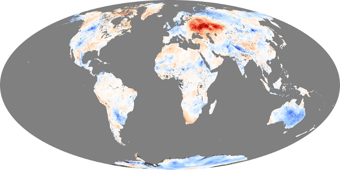
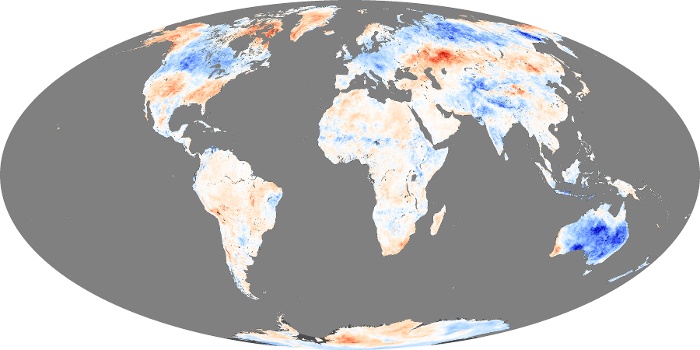
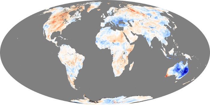
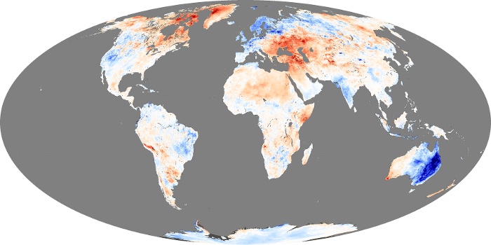
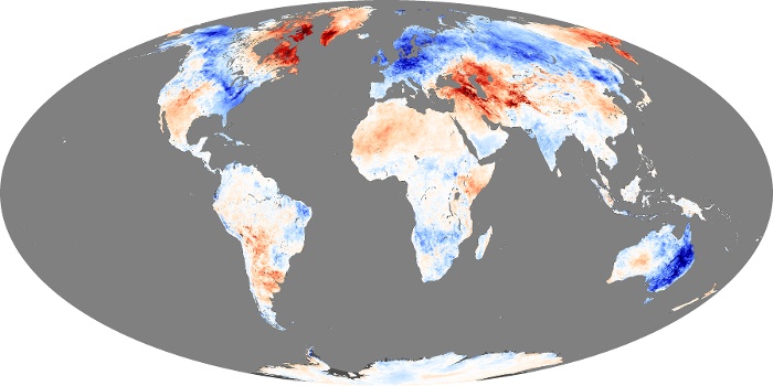
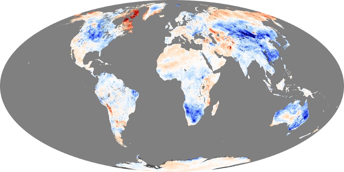
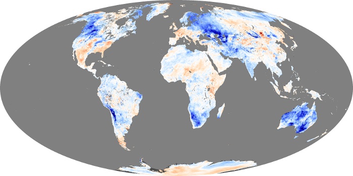
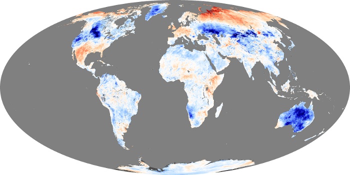
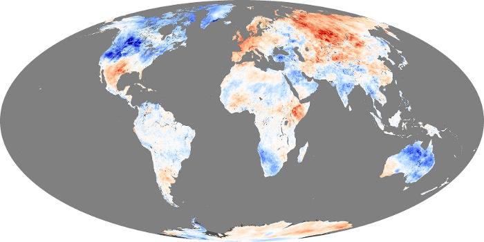
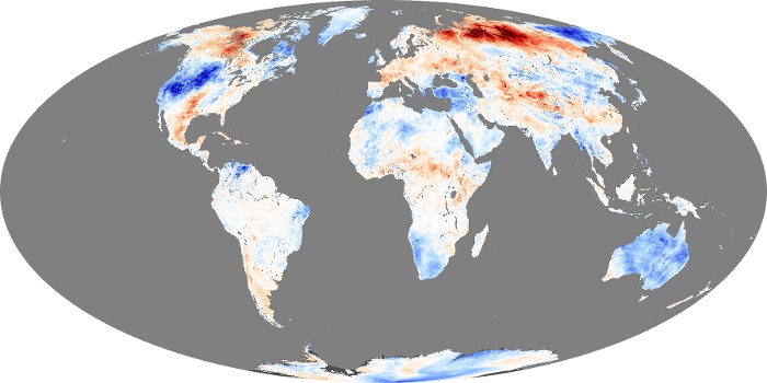
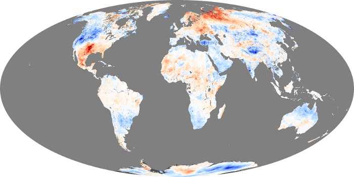
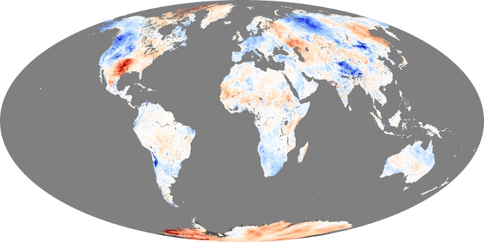
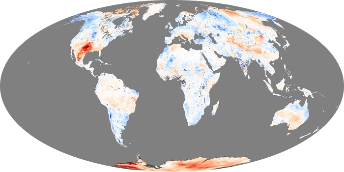
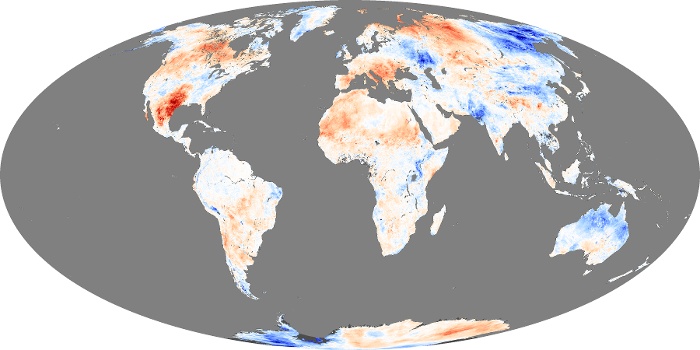
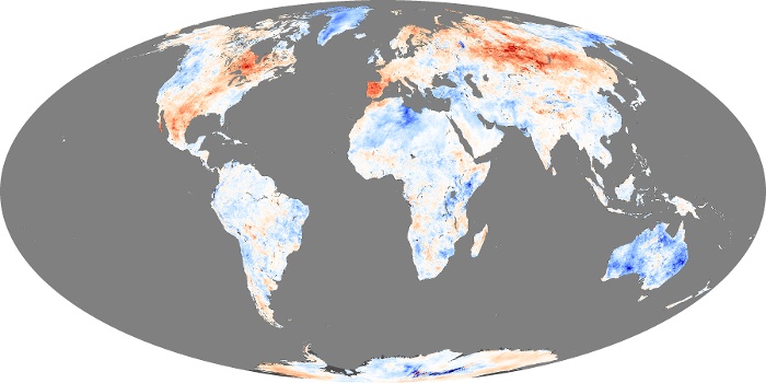
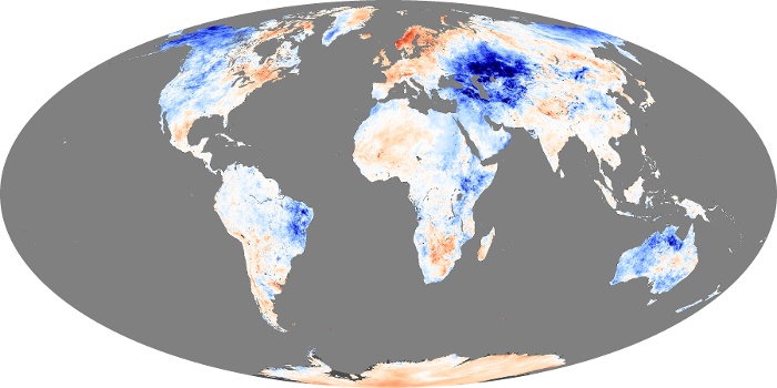
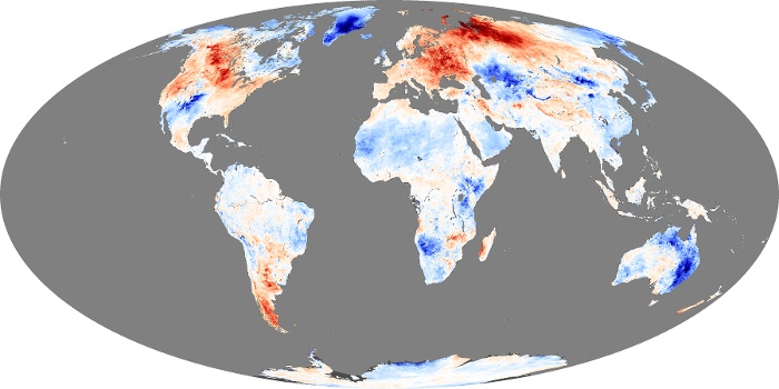
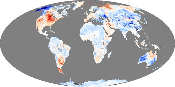
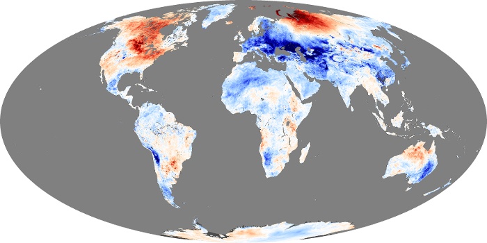
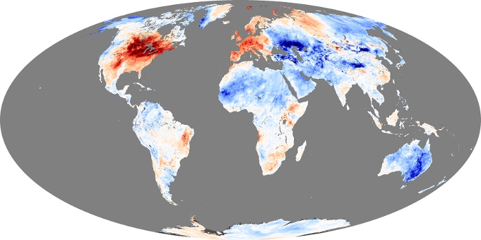
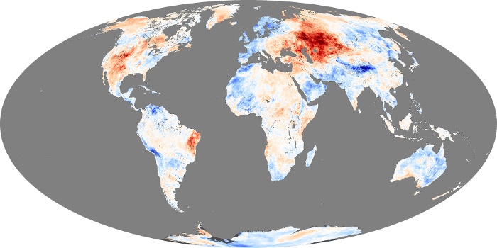
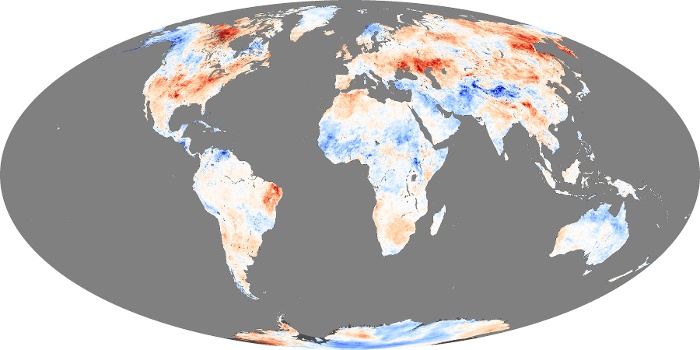
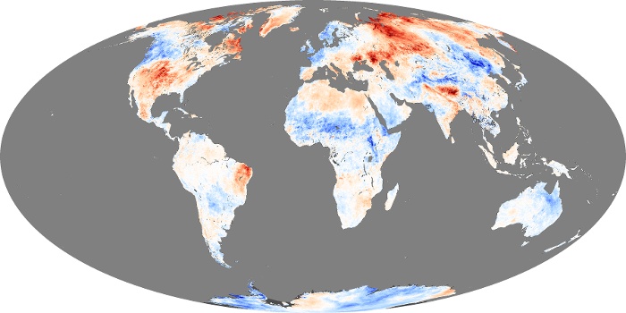
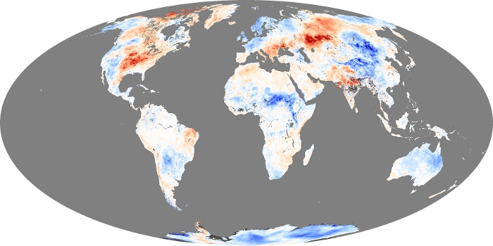
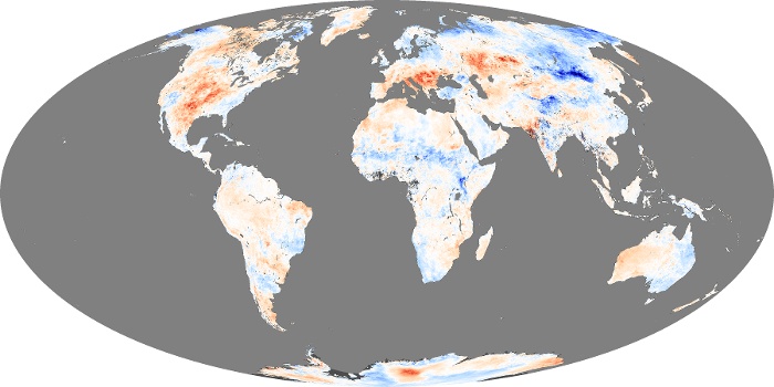
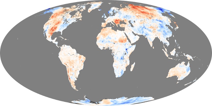
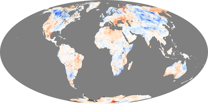
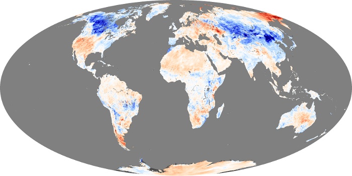
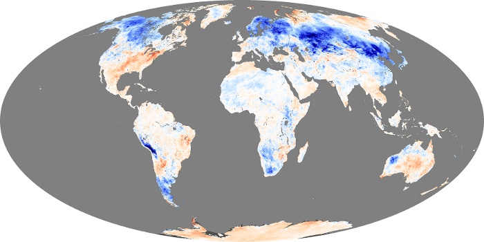
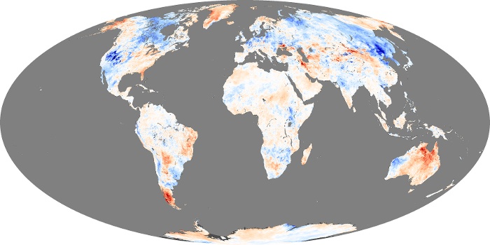
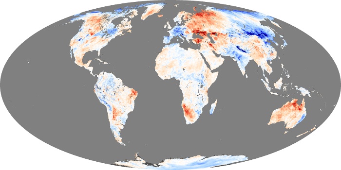
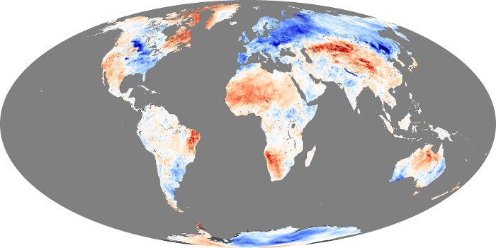
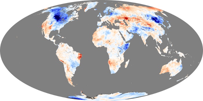
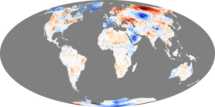
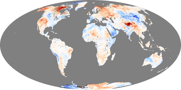
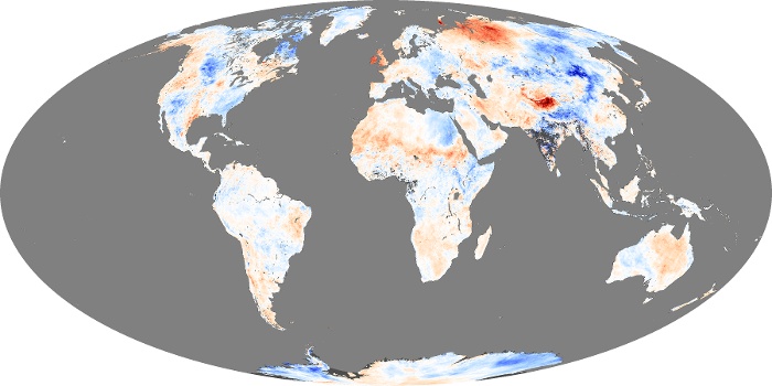
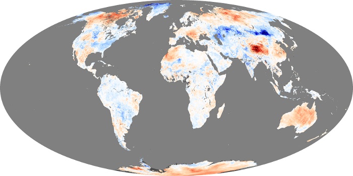
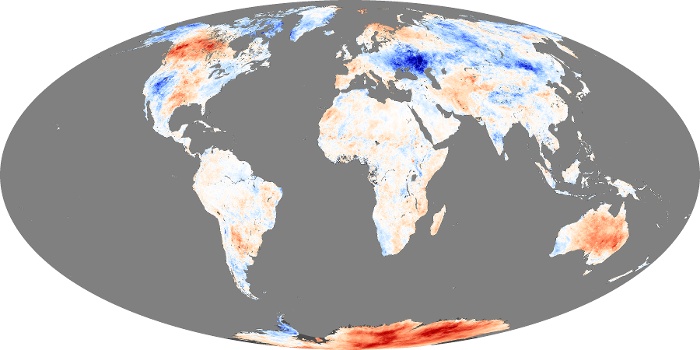
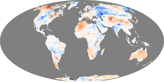
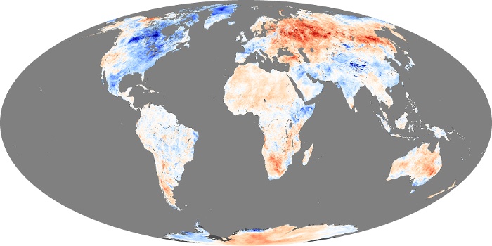
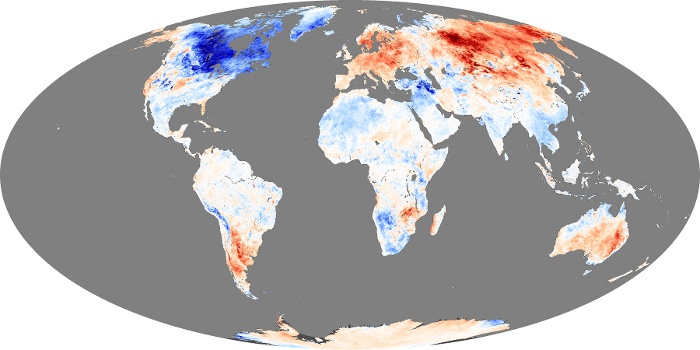
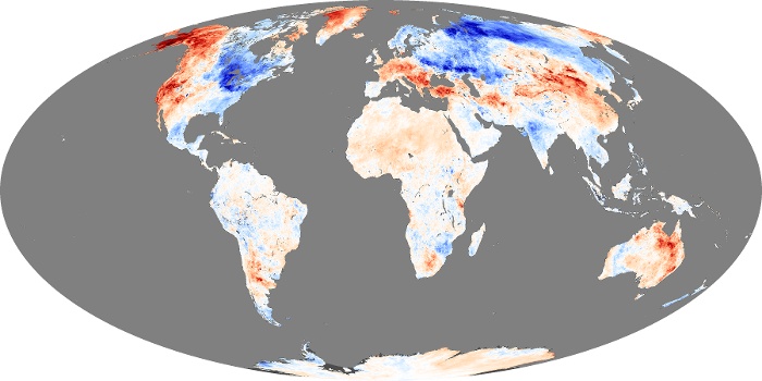
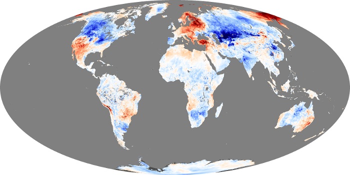
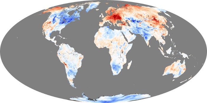
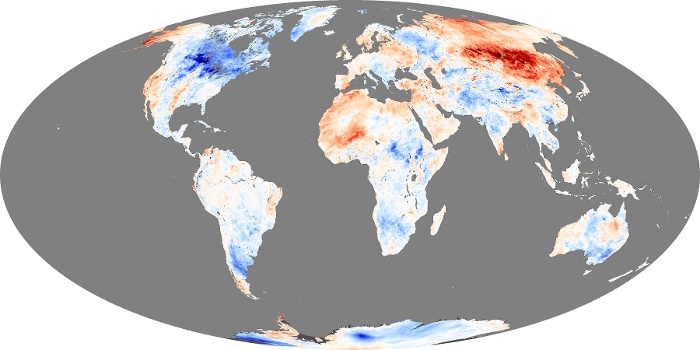
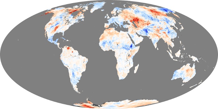
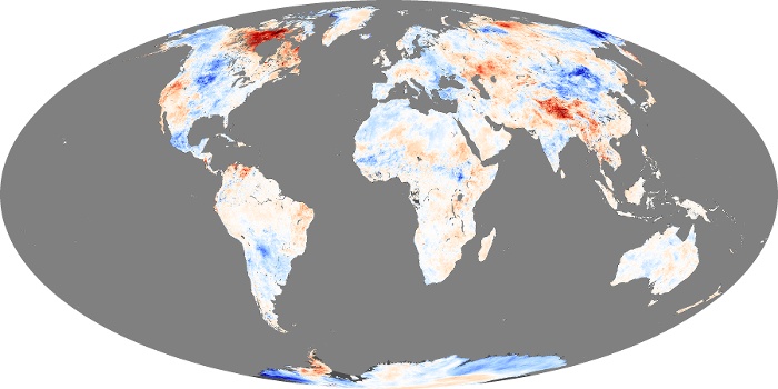
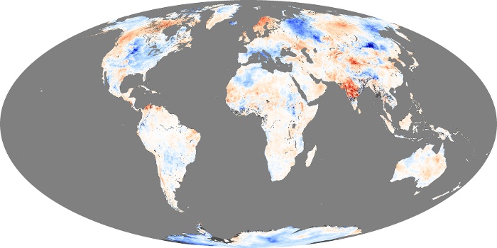
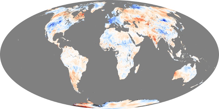
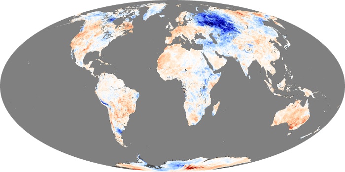
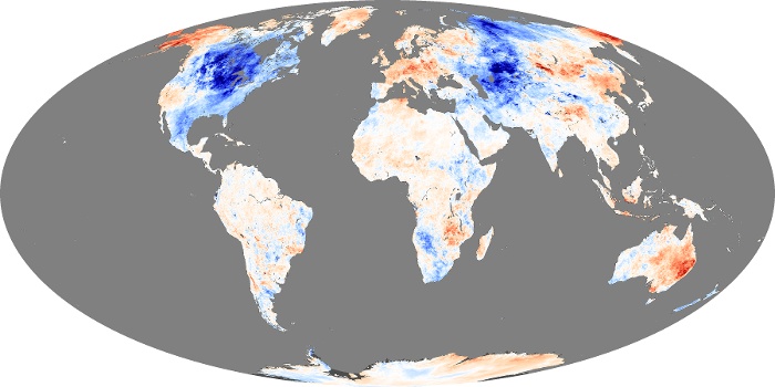
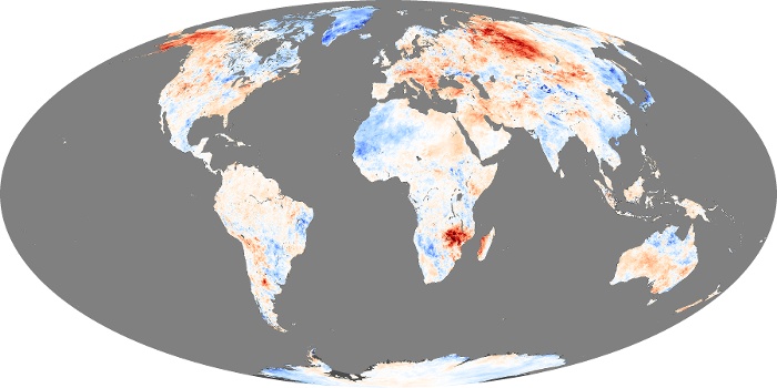
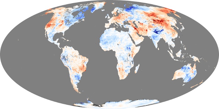
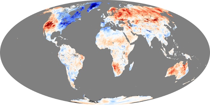
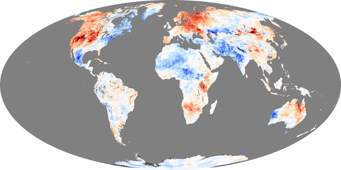
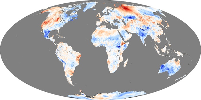
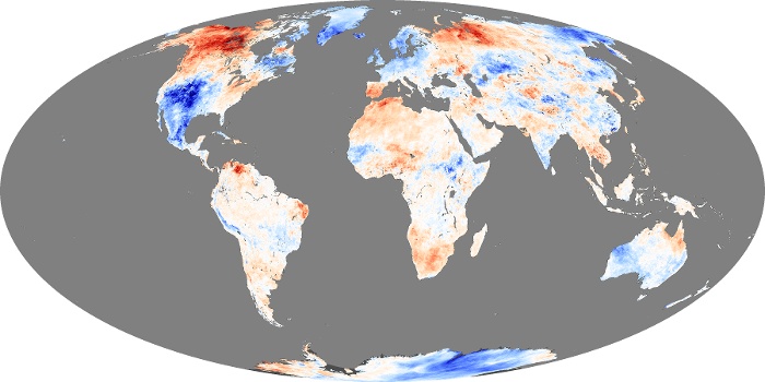
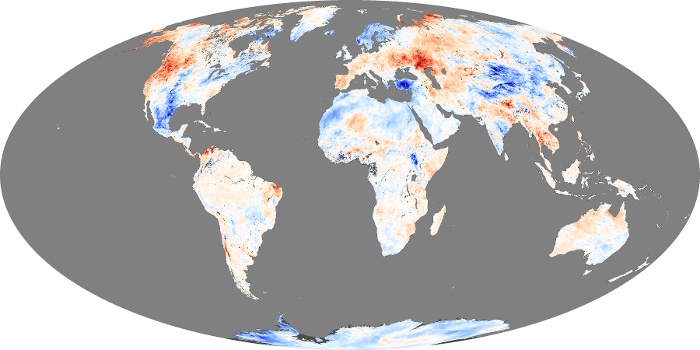
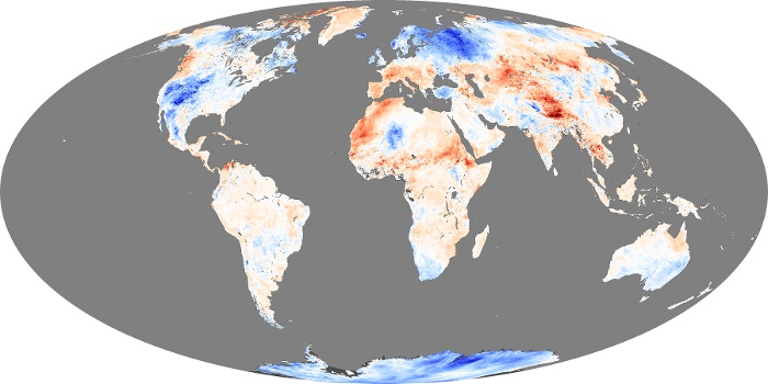
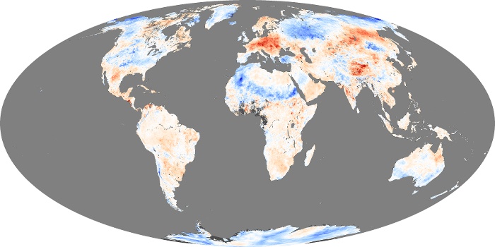
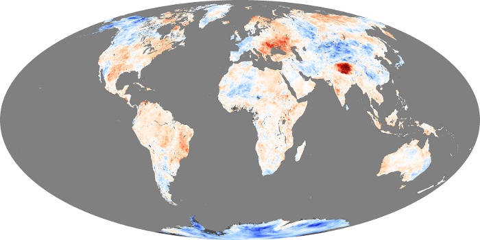
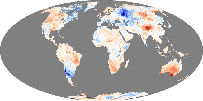
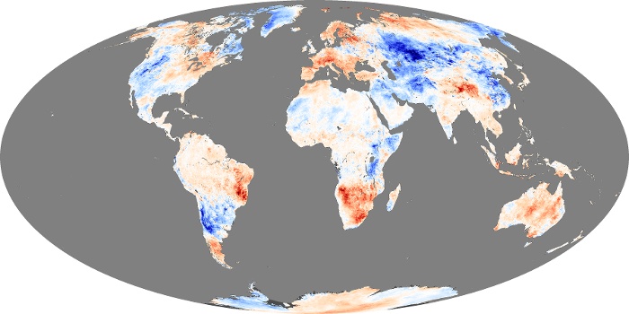
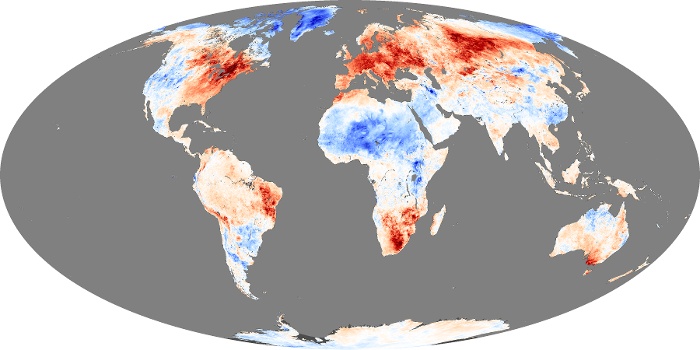
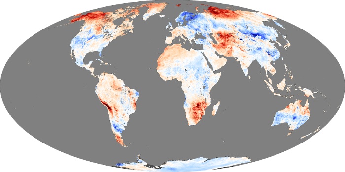
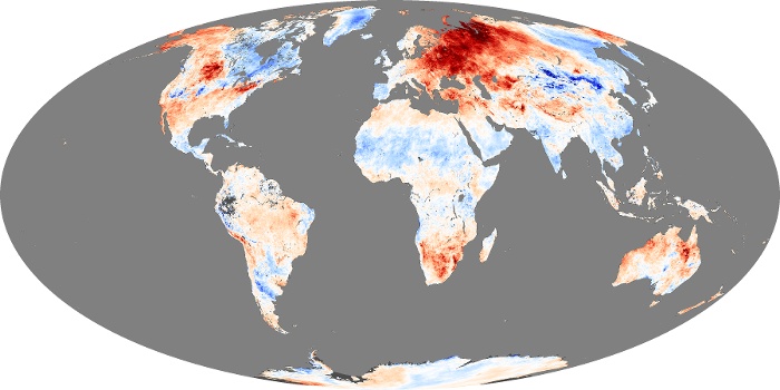
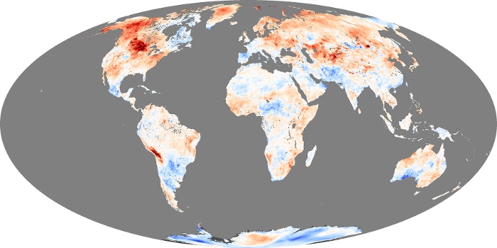
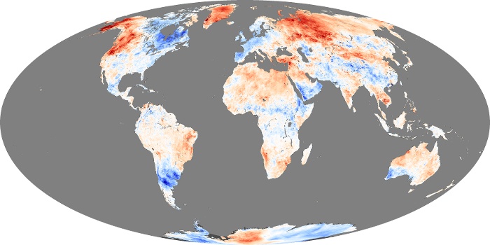
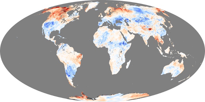
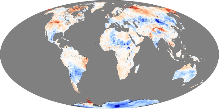
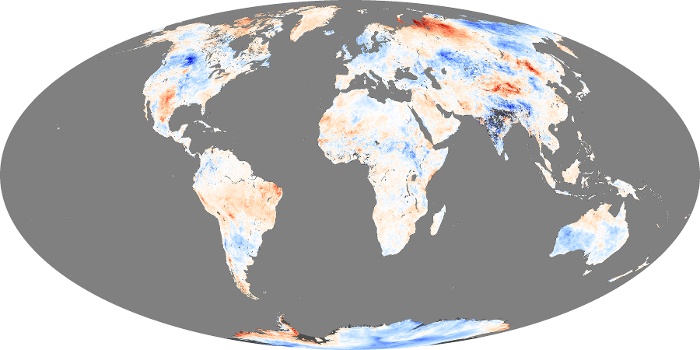
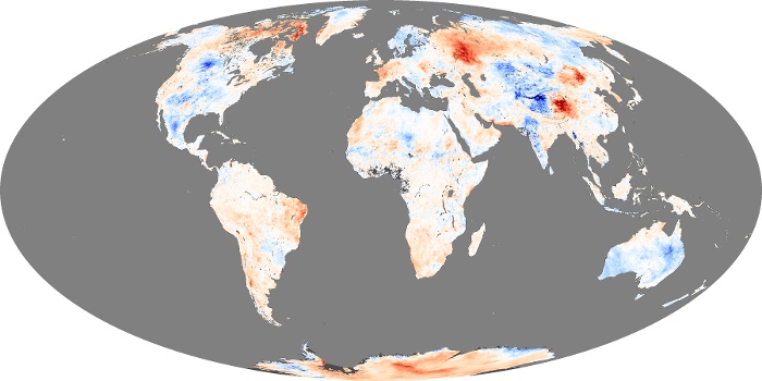
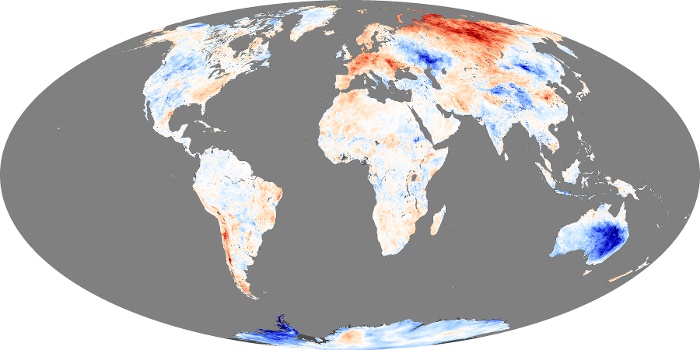
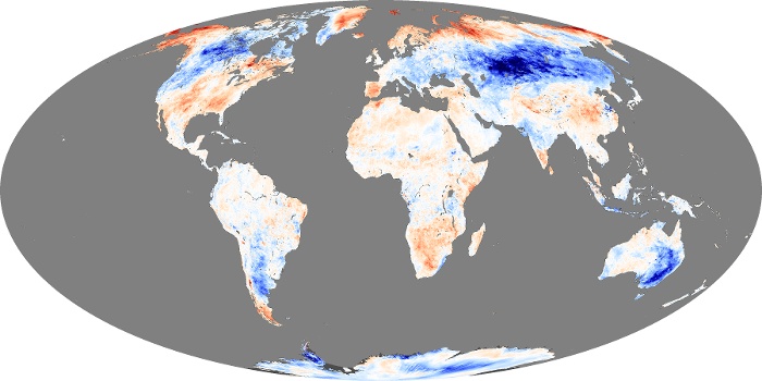
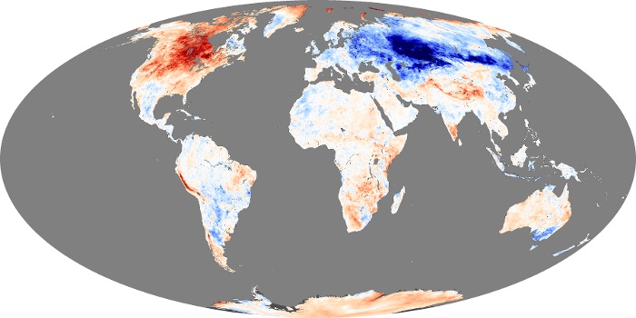
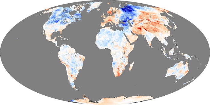
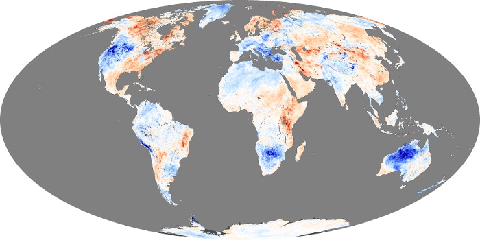
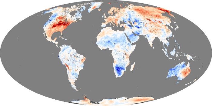
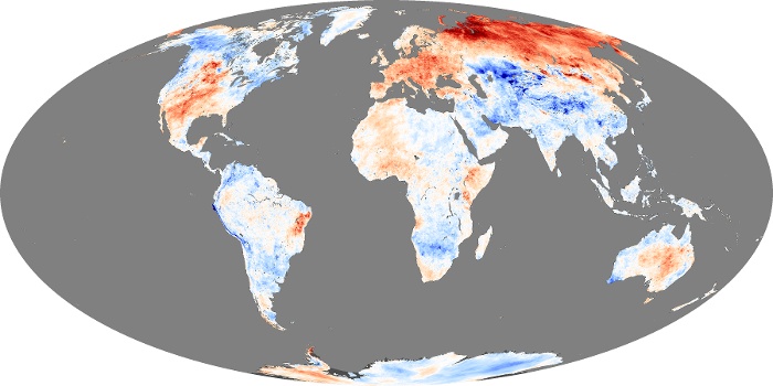
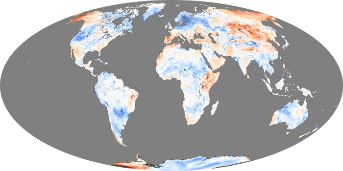
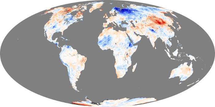
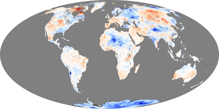
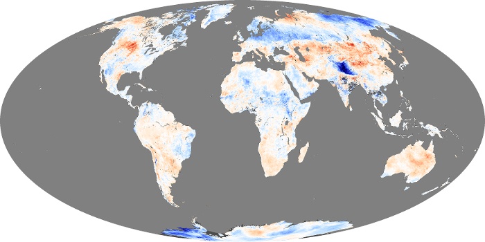
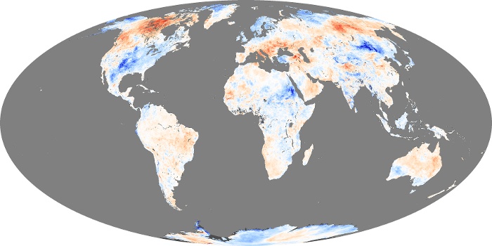
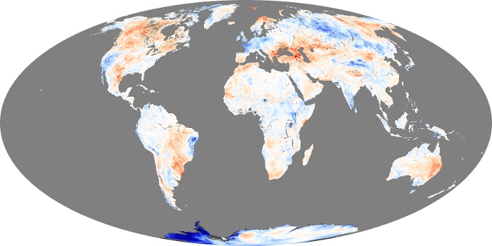
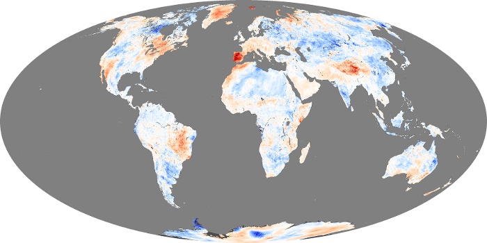
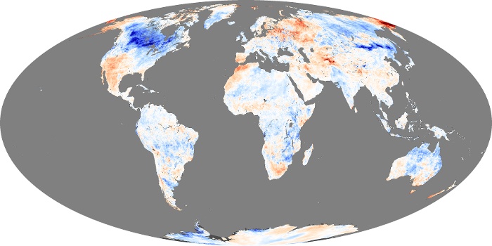
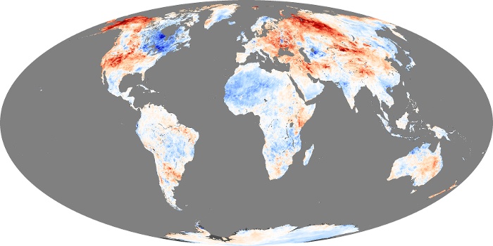
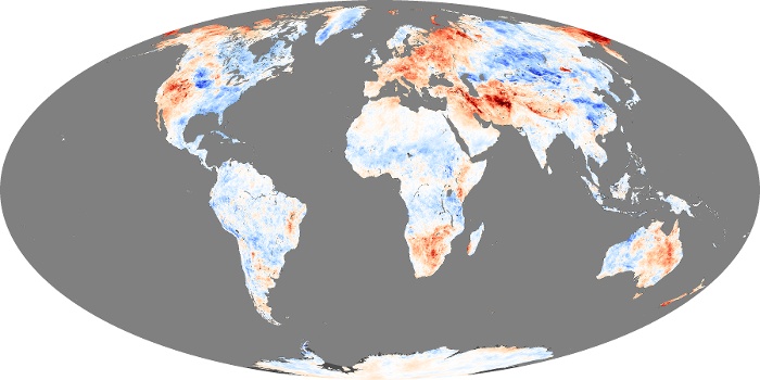
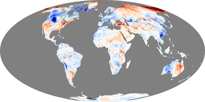
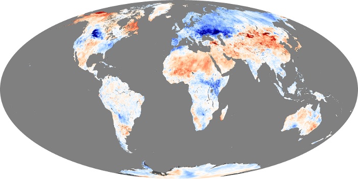
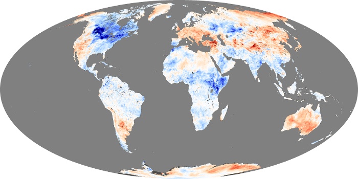
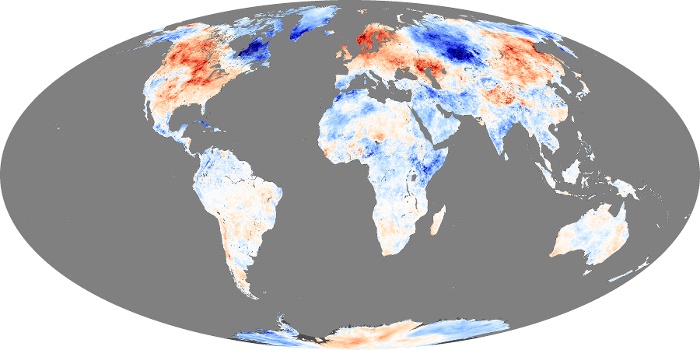
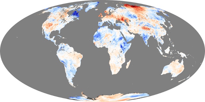
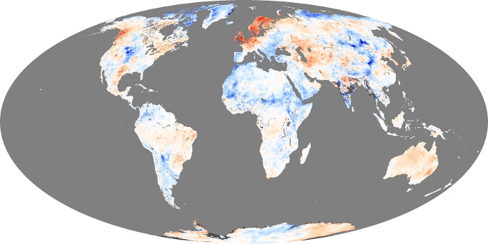
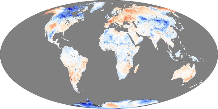
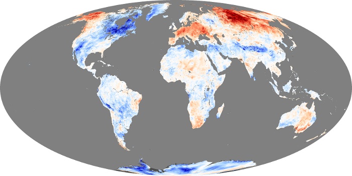
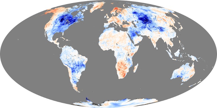
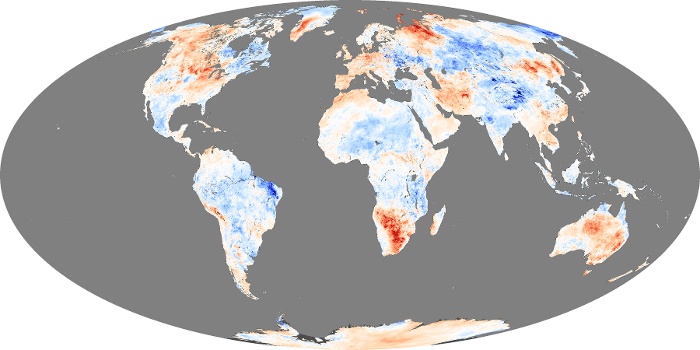
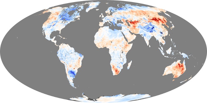
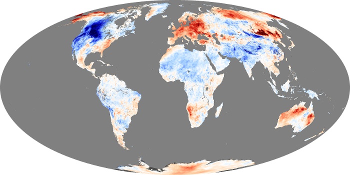
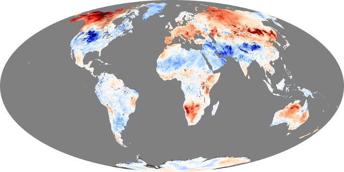
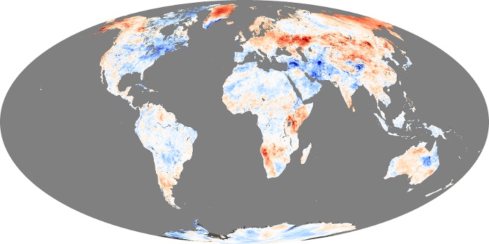
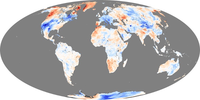
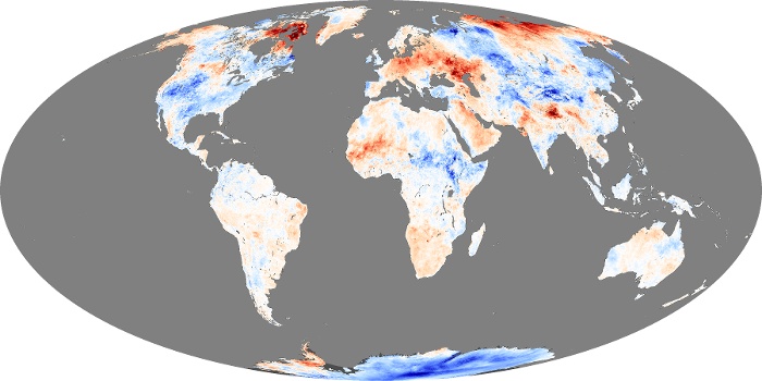
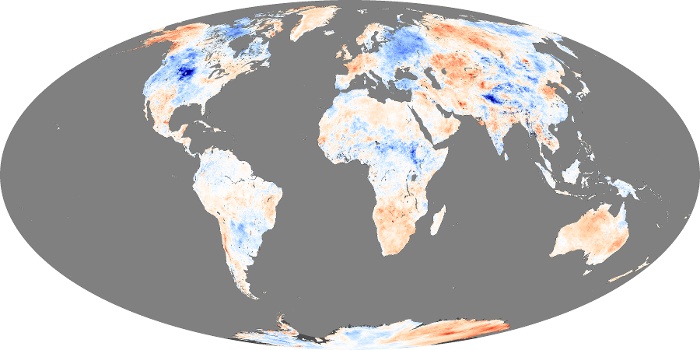
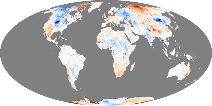
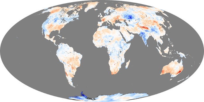
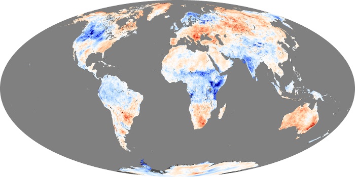
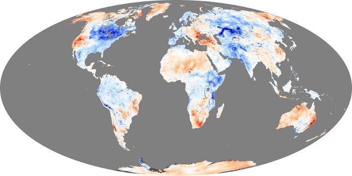
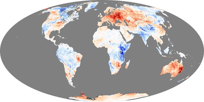
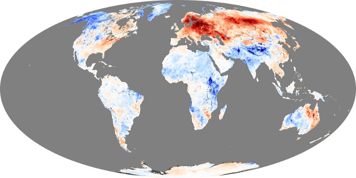
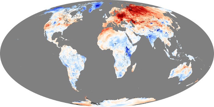
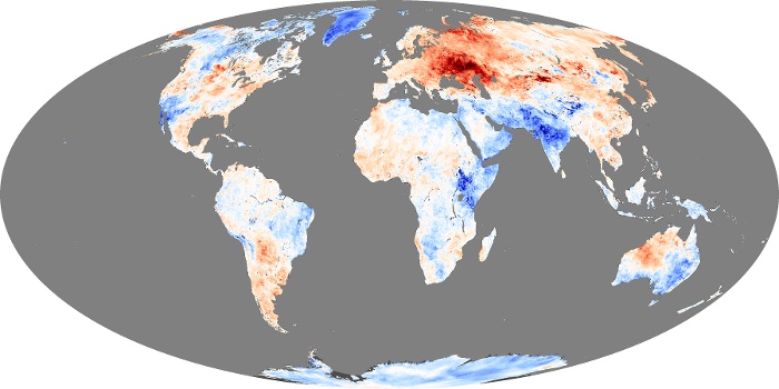
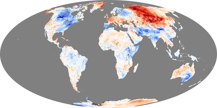
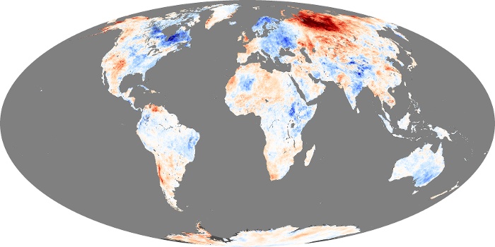
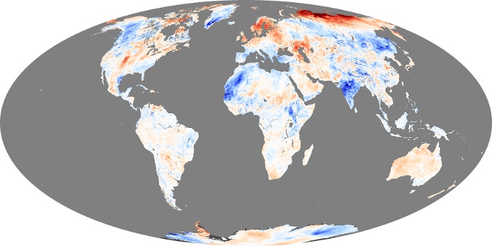
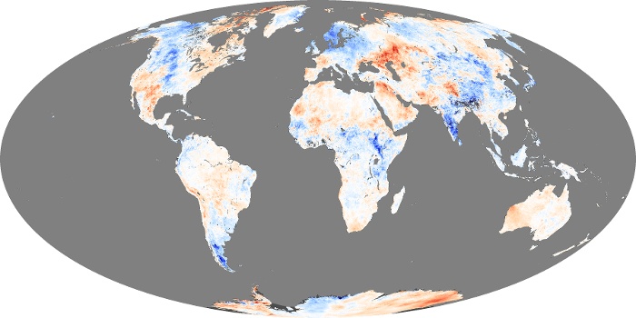
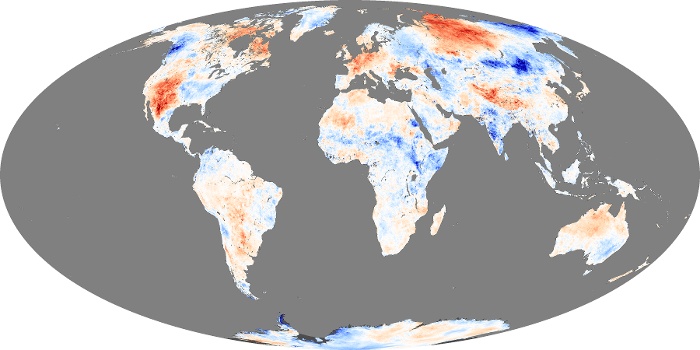
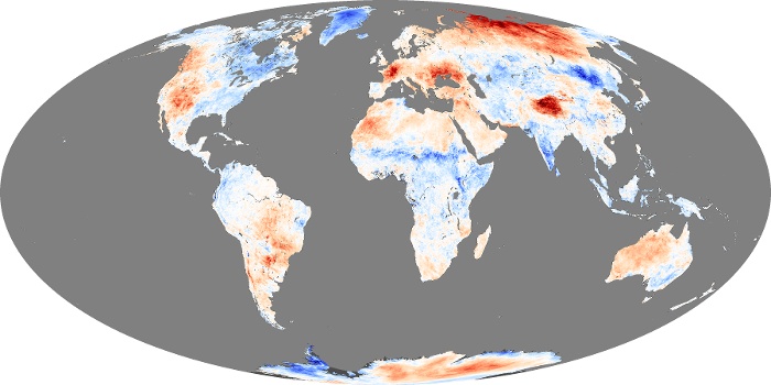
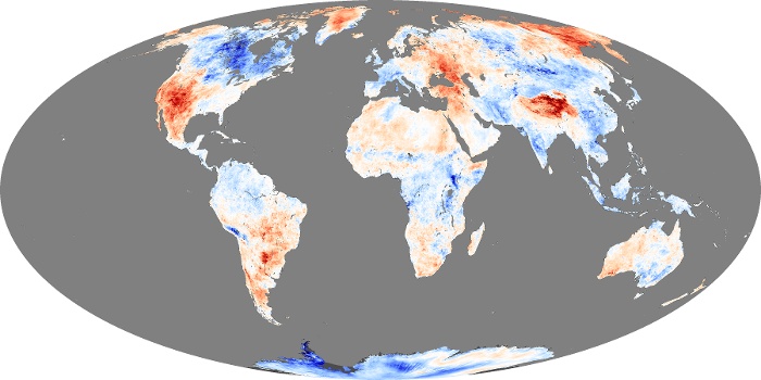
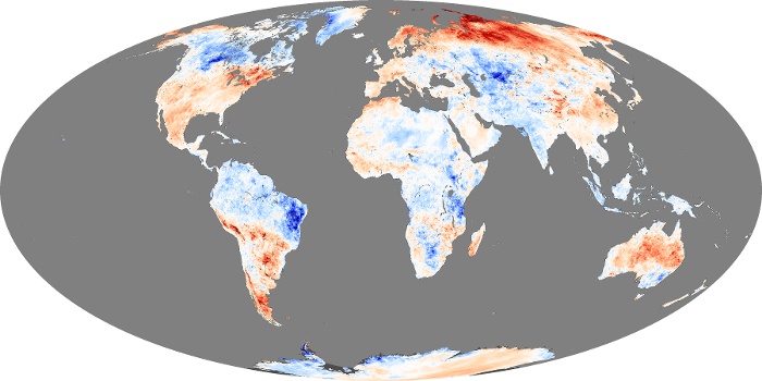
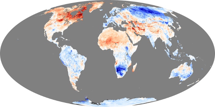
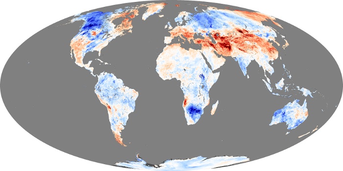
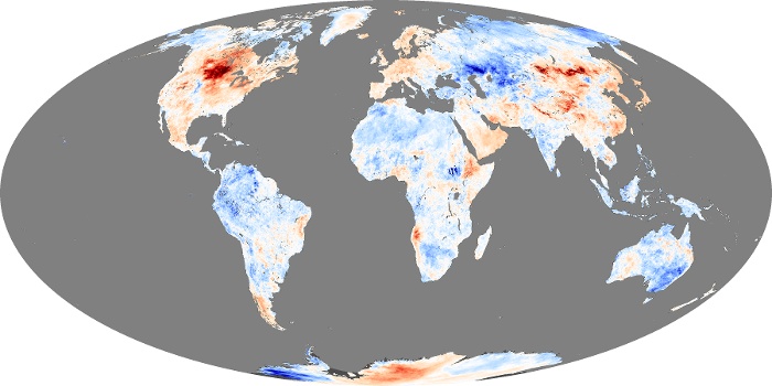
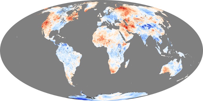
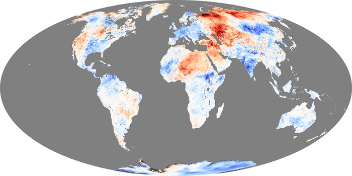
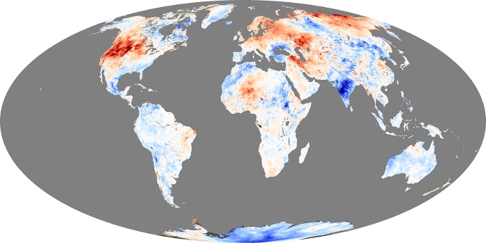
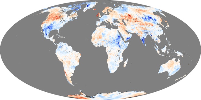
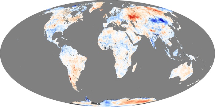
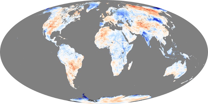
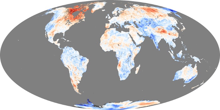
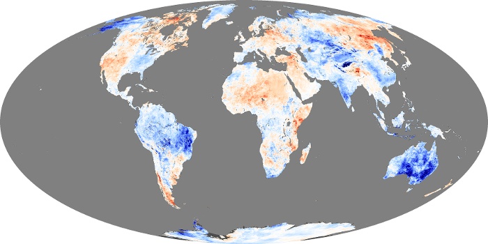
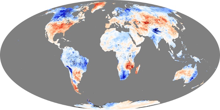
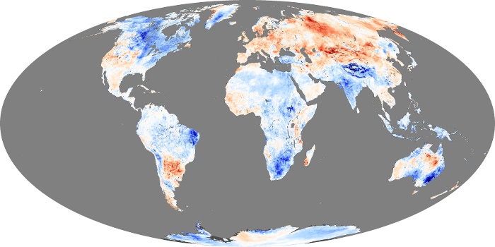
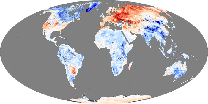
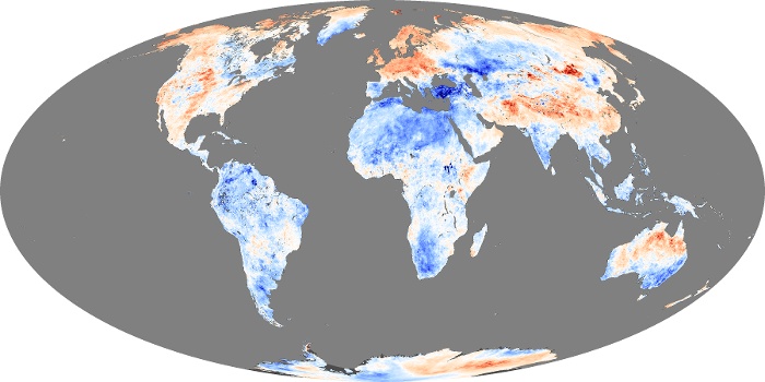
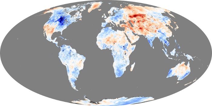
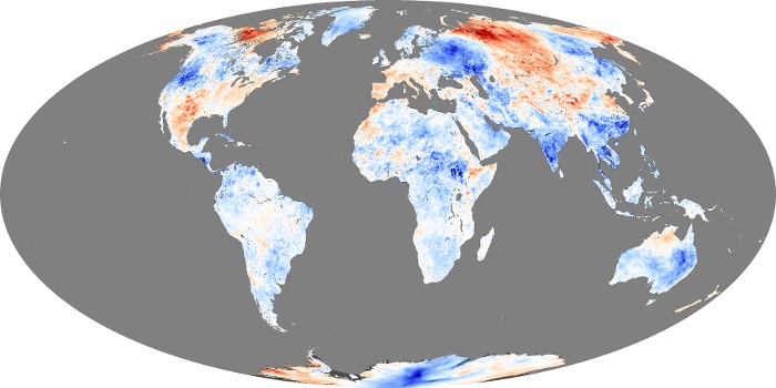
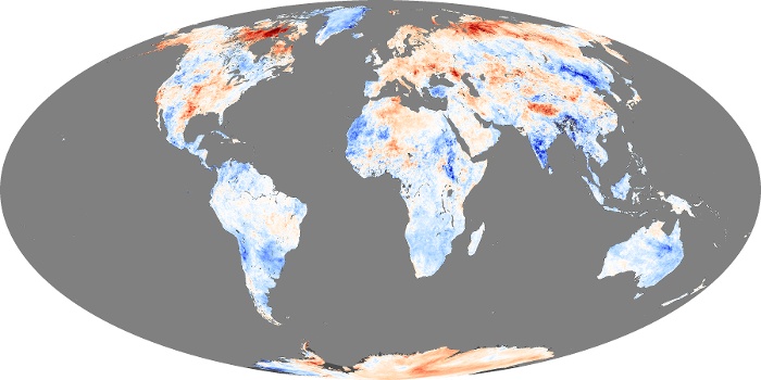
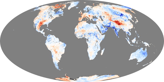
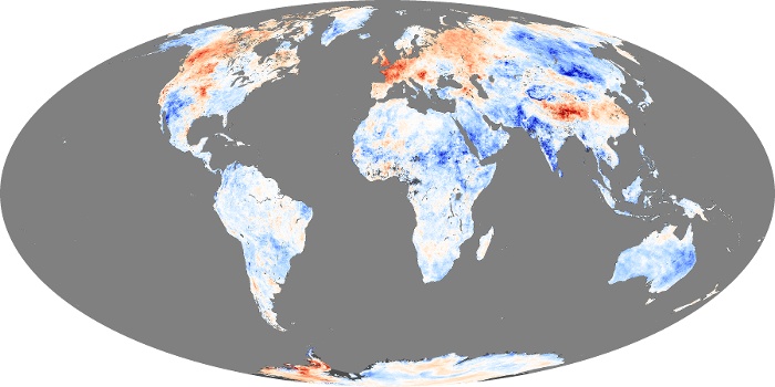
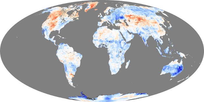
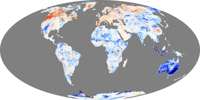
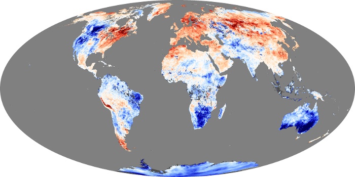
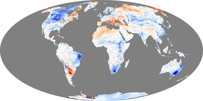
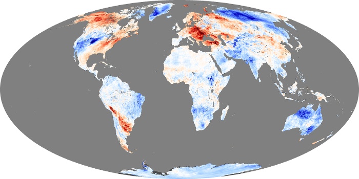
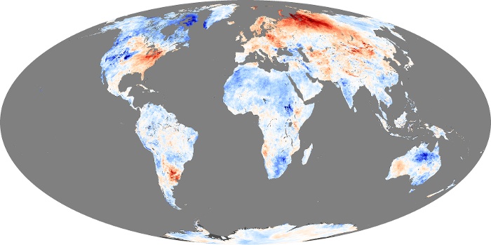
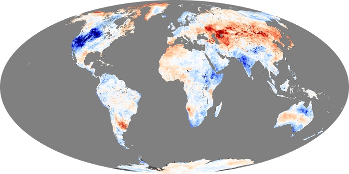
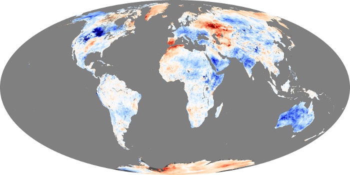
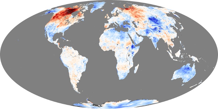
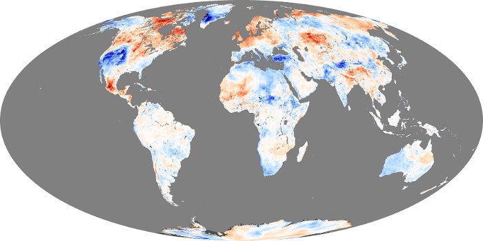
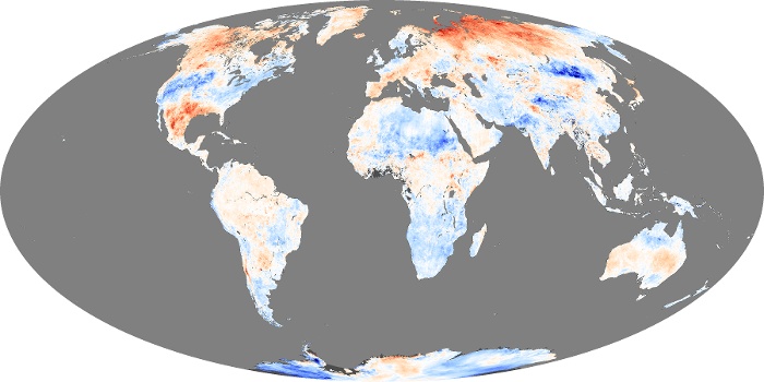
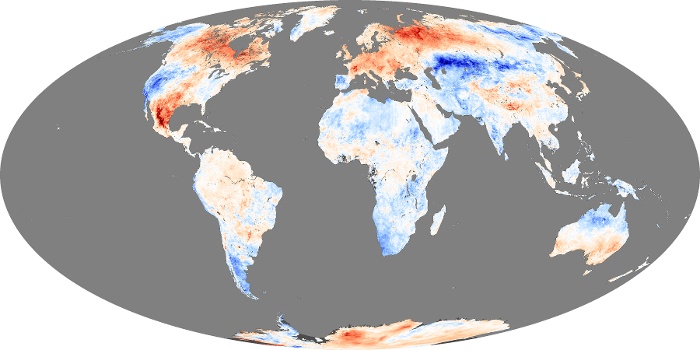
Land surface temperature is how hot the “surface” of the Earth would feel to the touch in a particular location. From a satellite’s point of view, the “surface” is whatever it sees when it looks through the atmosphere to the ground. It could be snow and ice, the grass on a lawn, or the roof of a building. These maps compare daytime land surface temperatures in a particular month to the average temperatures for that month from 2000-2008. Places that were warmer than average are red, places that were near normal are white, and places that were cooler than average are blue. The observations were collected by the Moderate Resolution Imaging Spectroradiometer (MODIS) on NASA’s Terra satellite.
View, download, or analyze more of these data from NASA Earth Observations (NEO):
Chlorophyll
Land Surface Temperature Anomaly