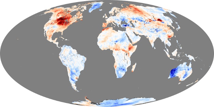
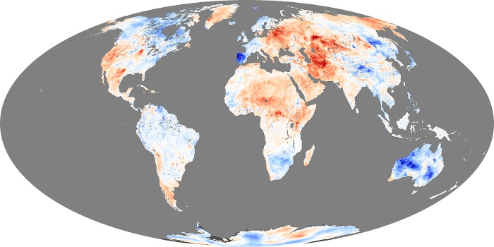
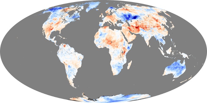
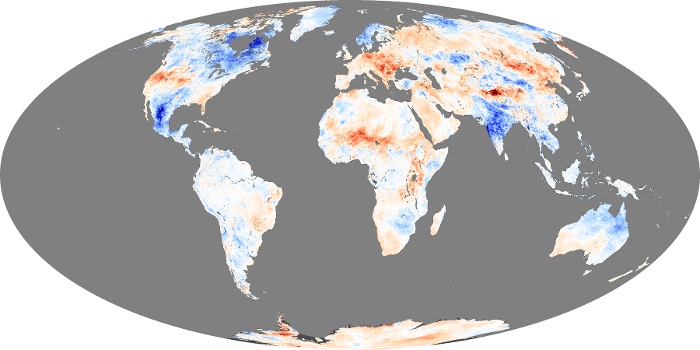
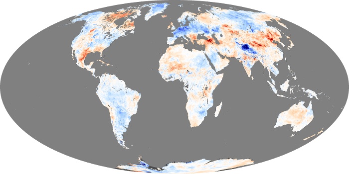
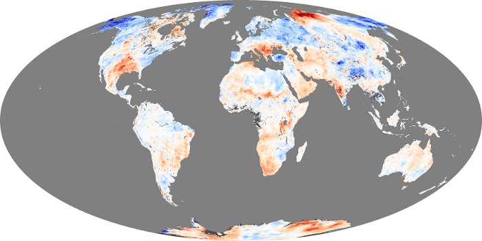
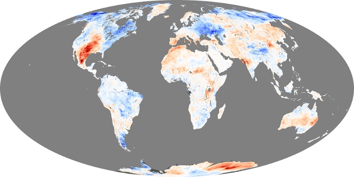
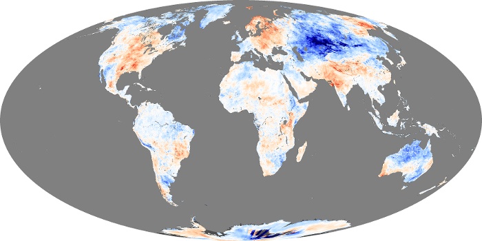
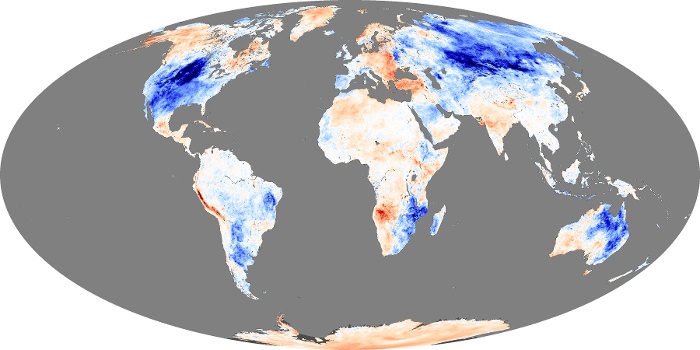
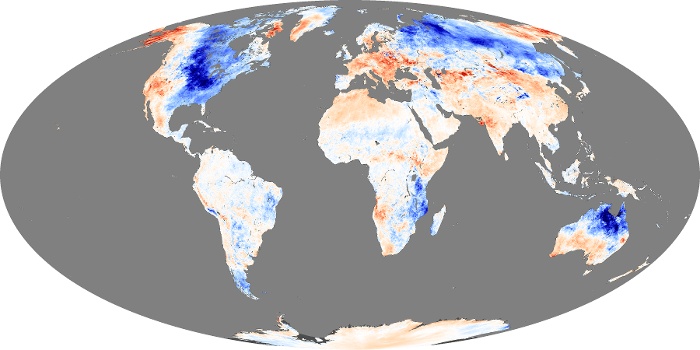
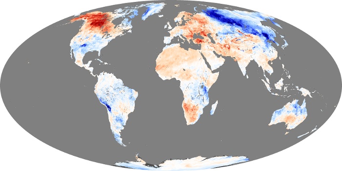
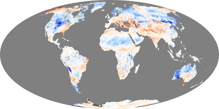
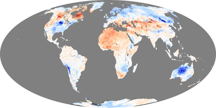
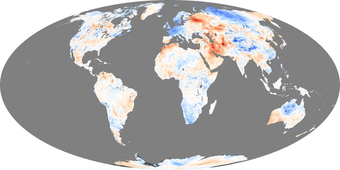
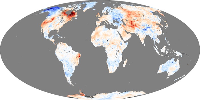
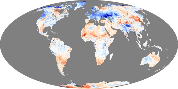
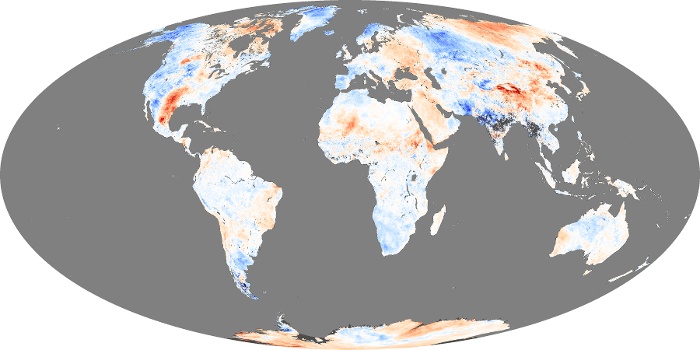
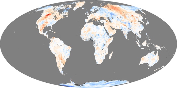
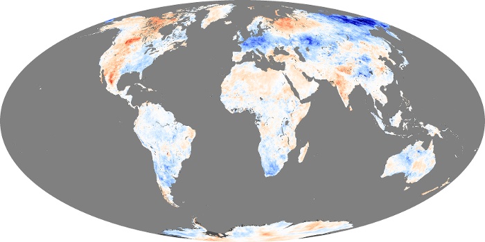
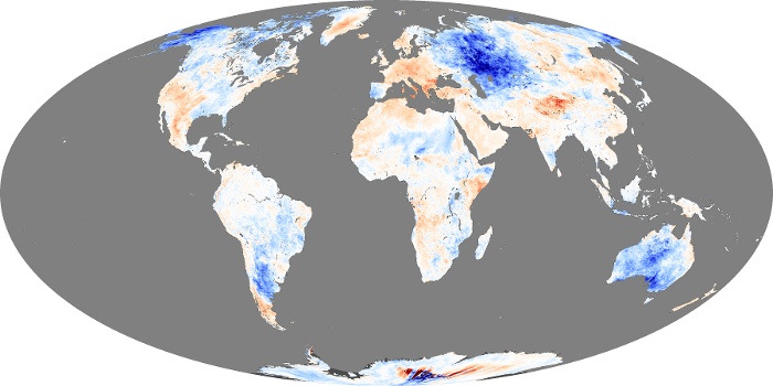
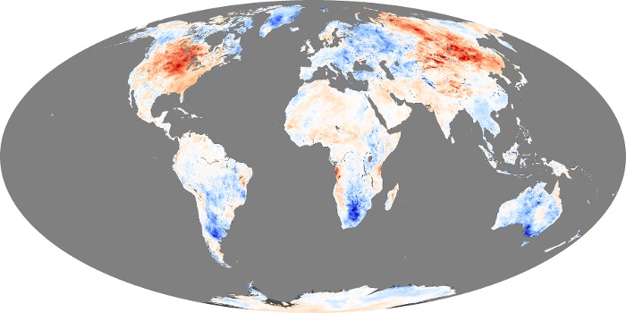
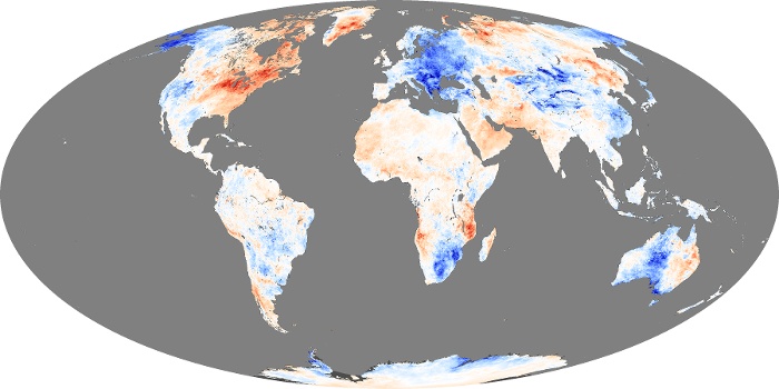
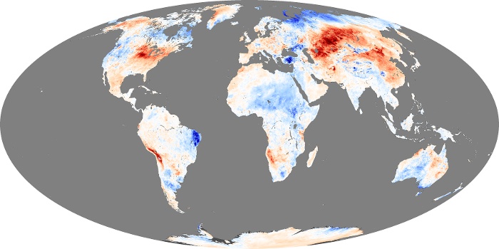
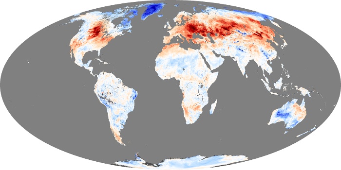
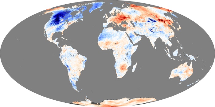
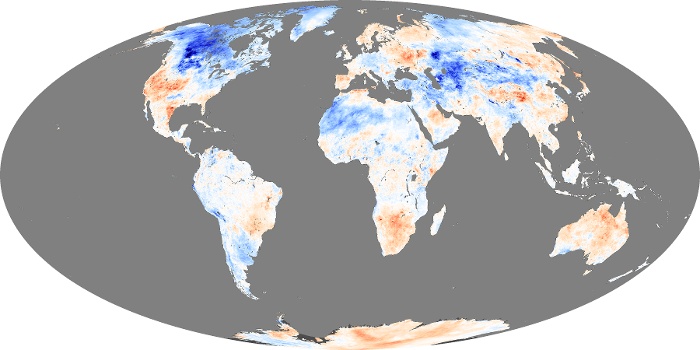
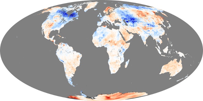
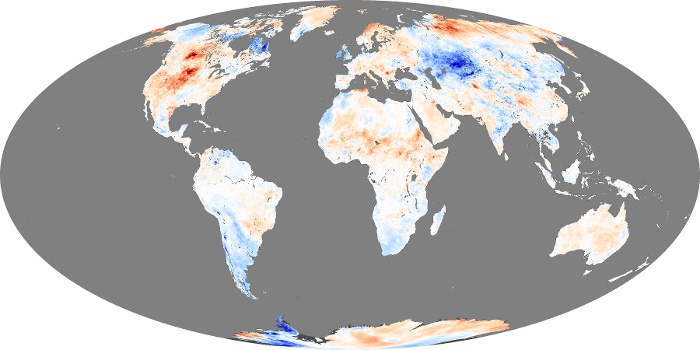
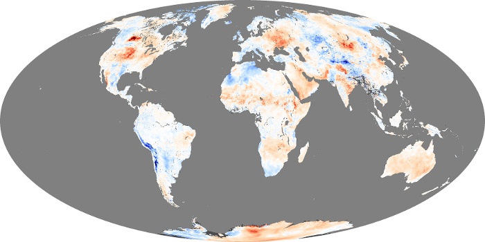
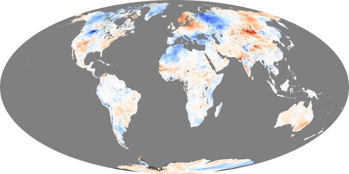
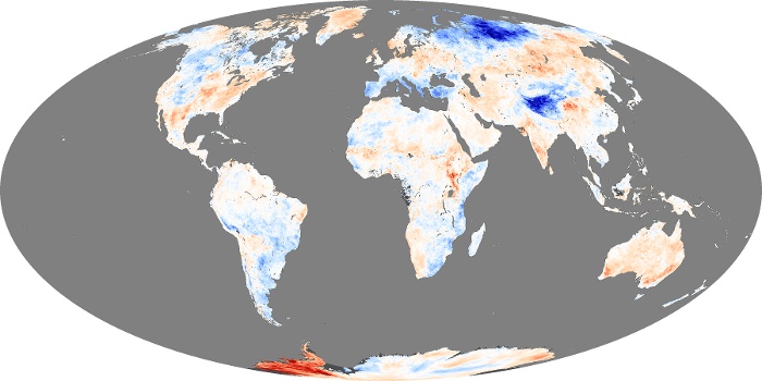
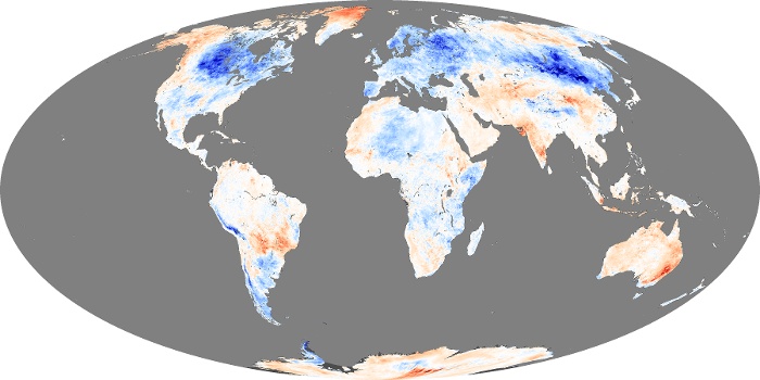
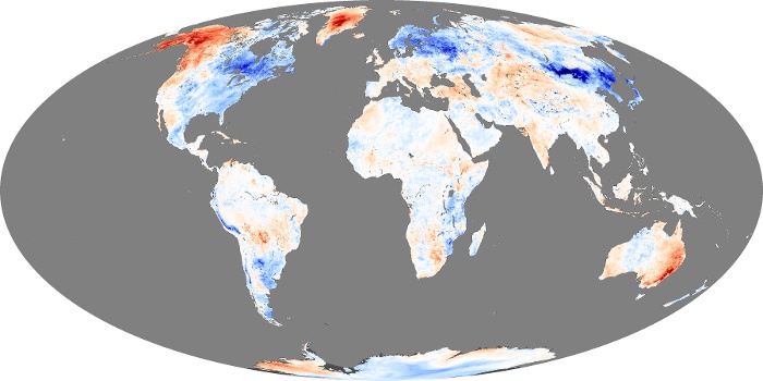
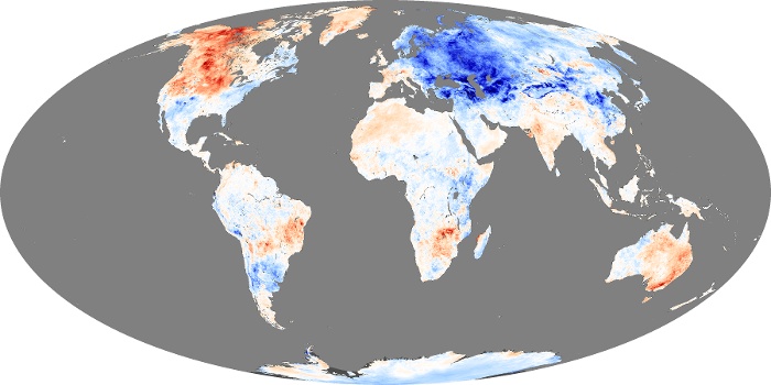
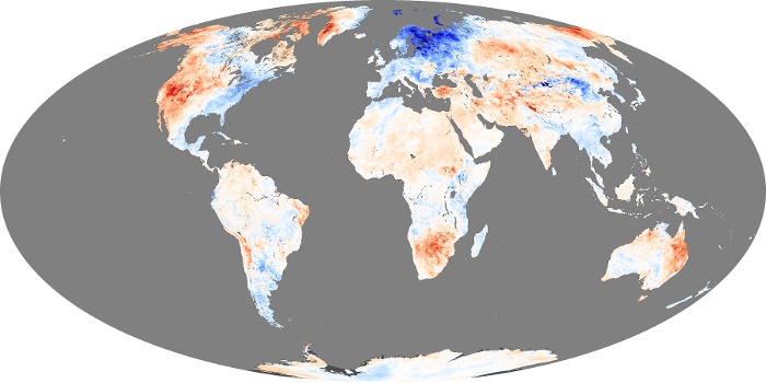
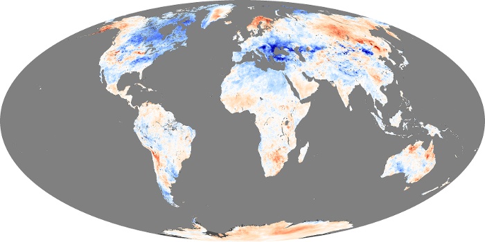
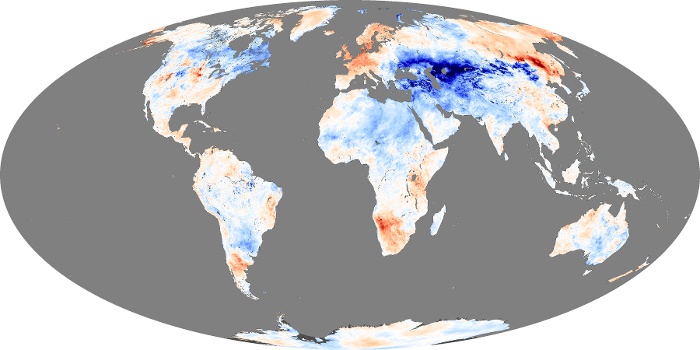
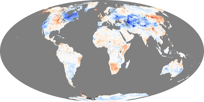
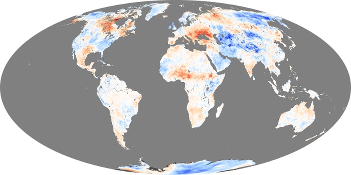
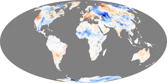
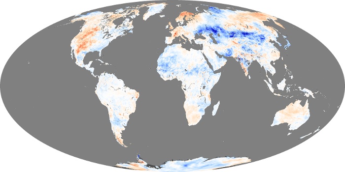

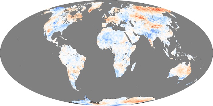
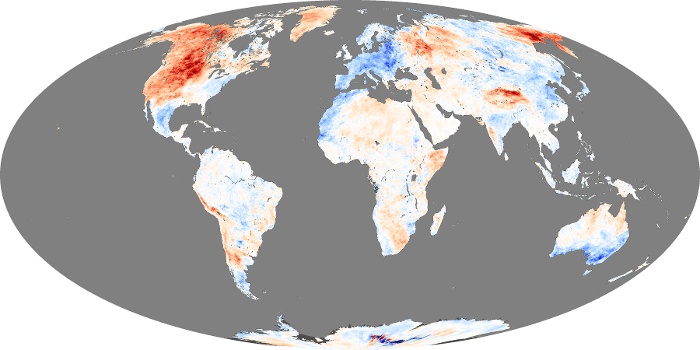
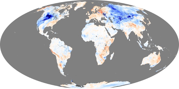

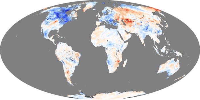
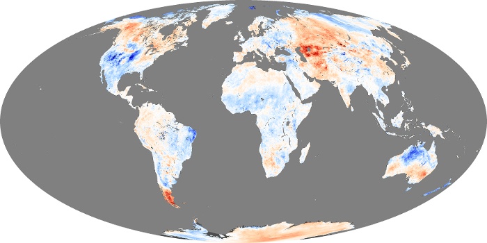
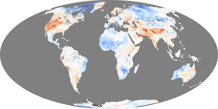
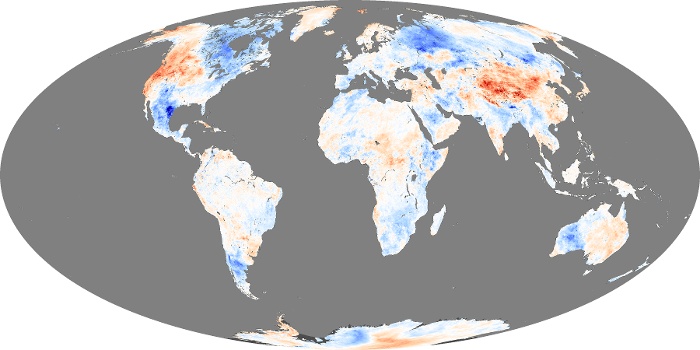
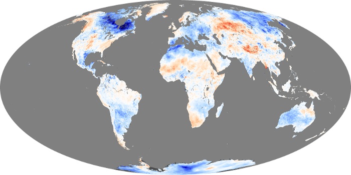
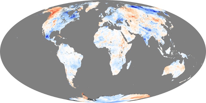
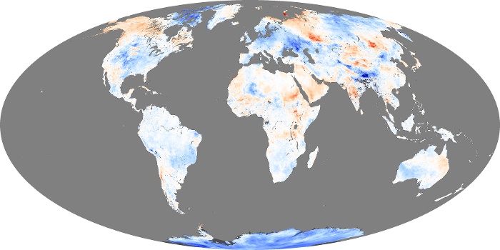
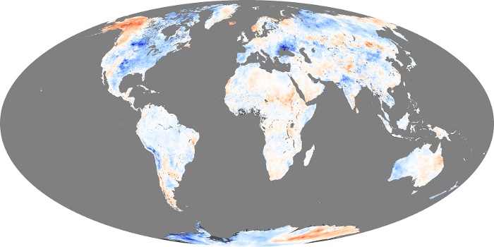
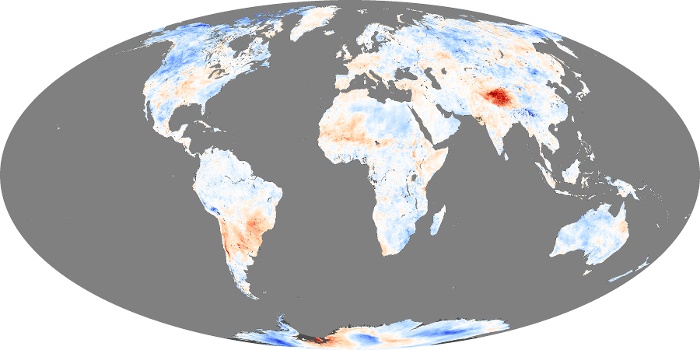
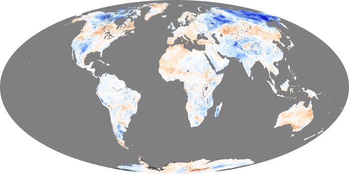
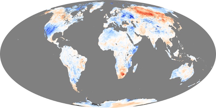
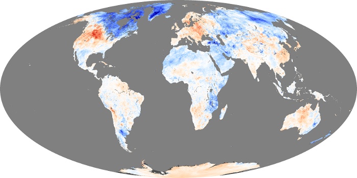
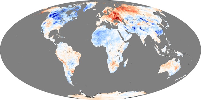
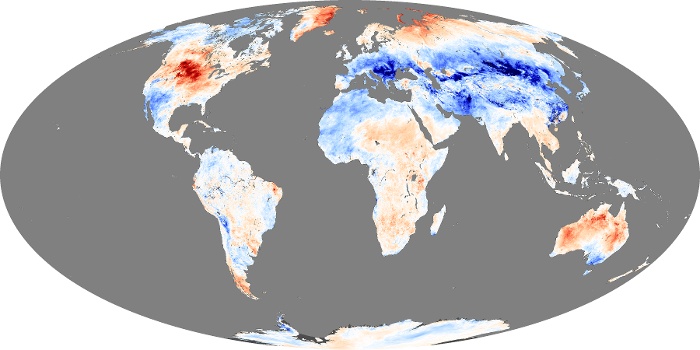
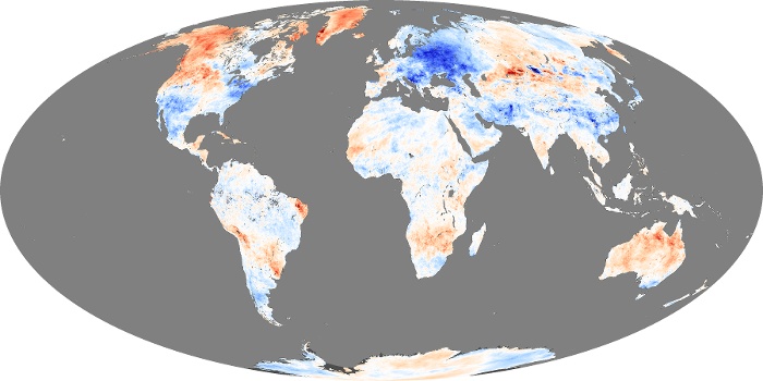
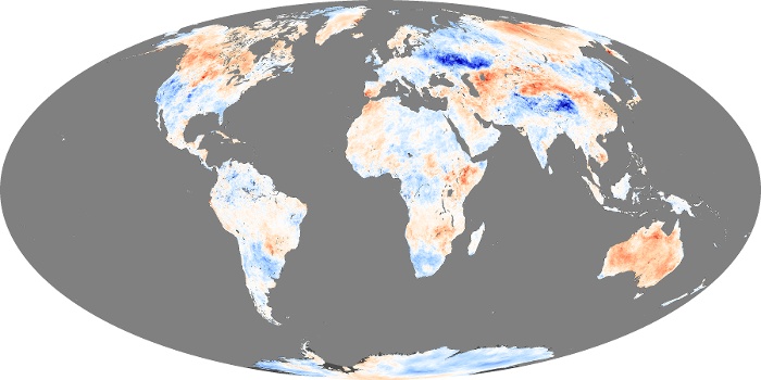
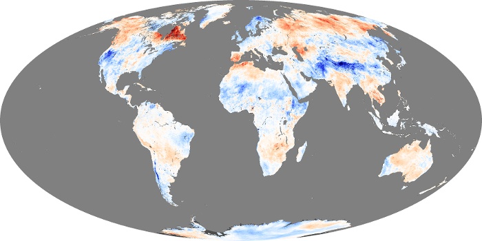
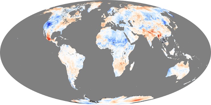
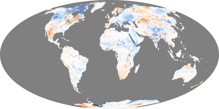
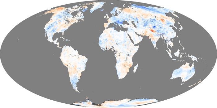
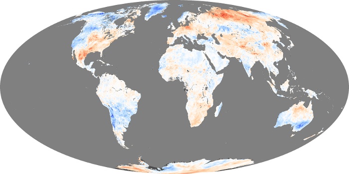
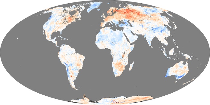
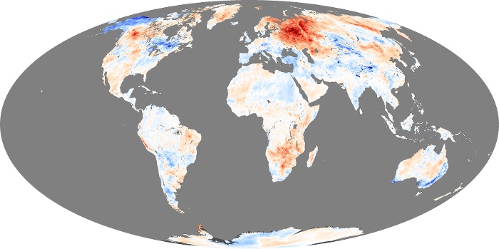
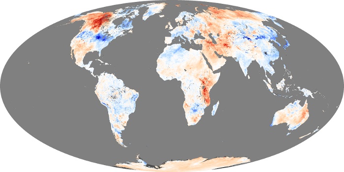
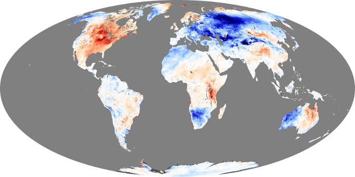
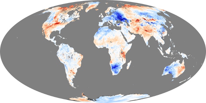
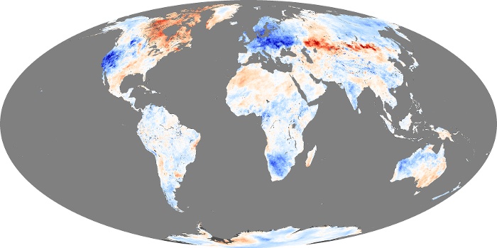
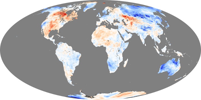
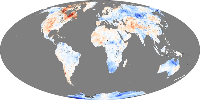
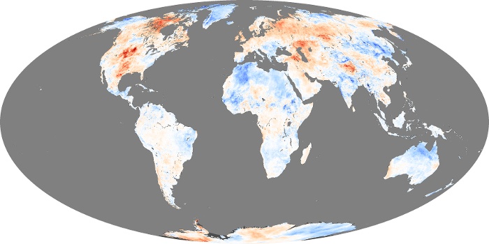
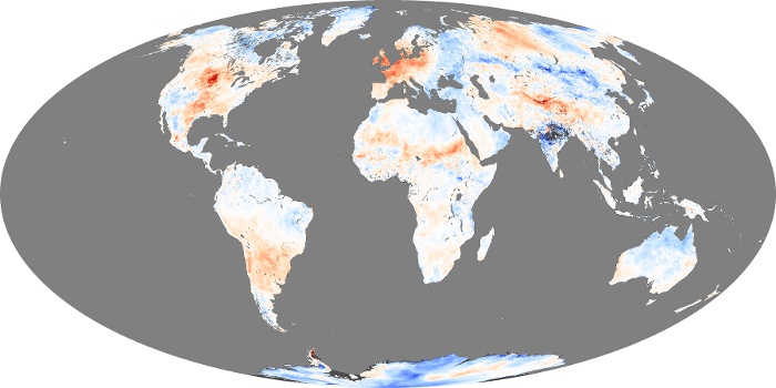
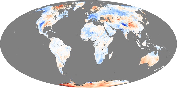
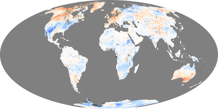
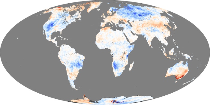
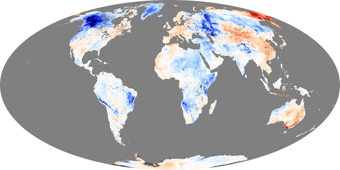
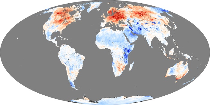
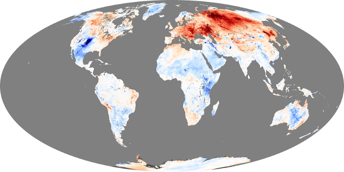
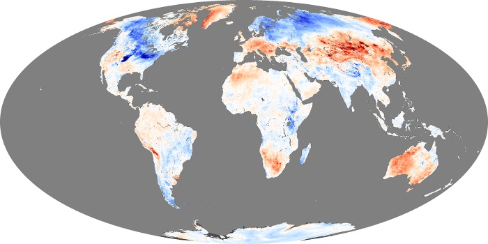
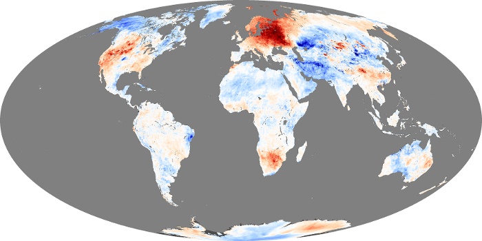
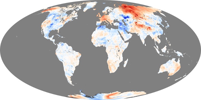
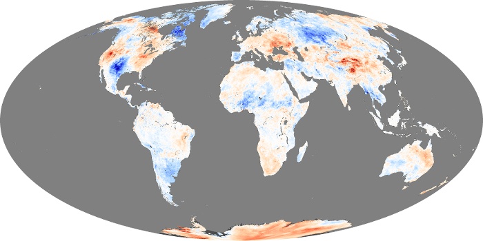
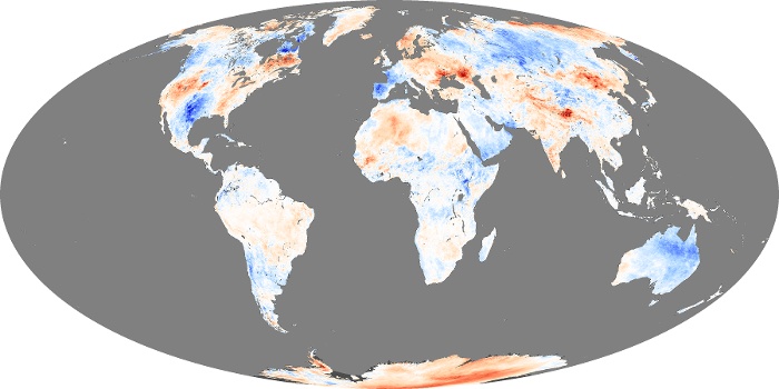

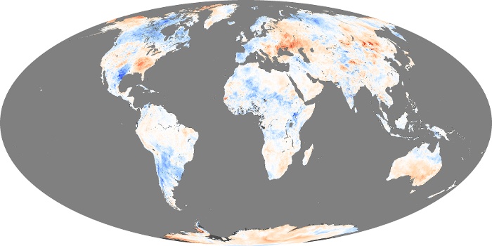
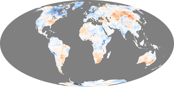
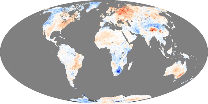
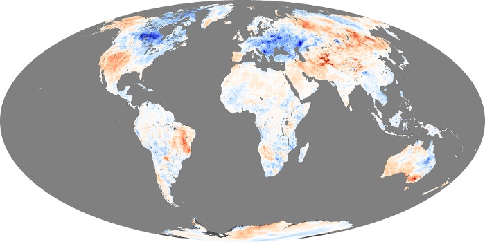

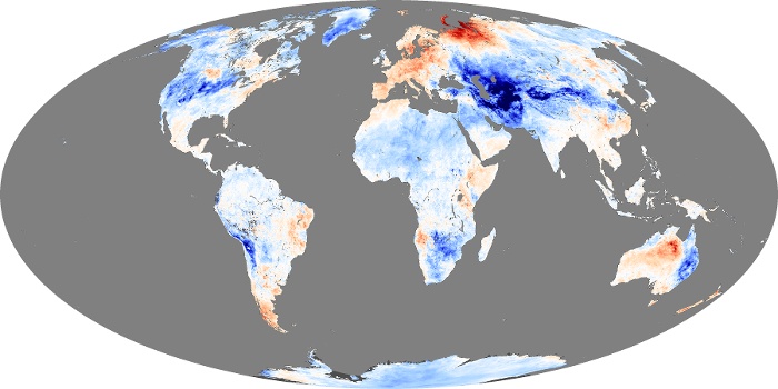
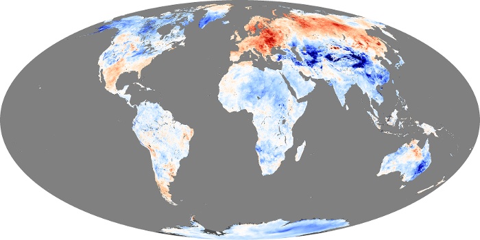
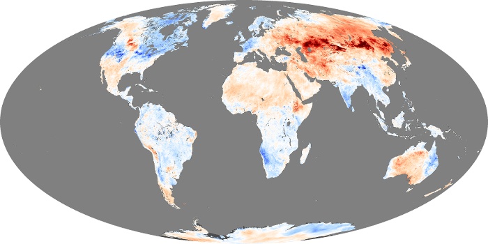
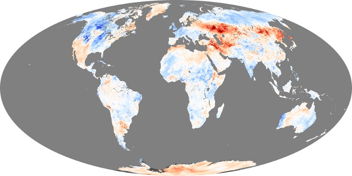
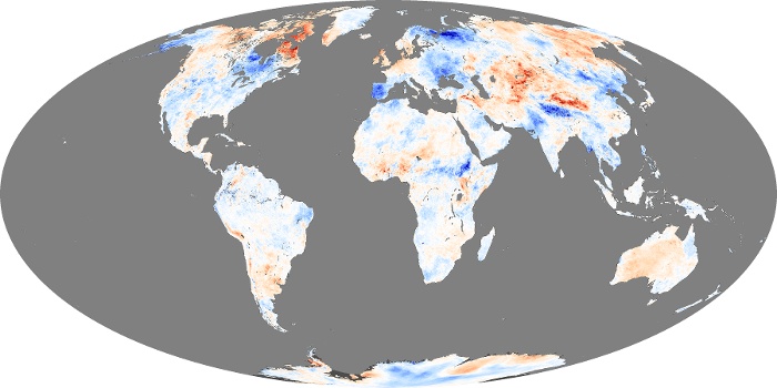
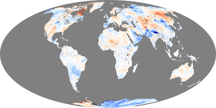
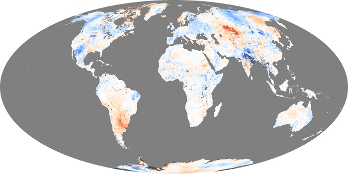
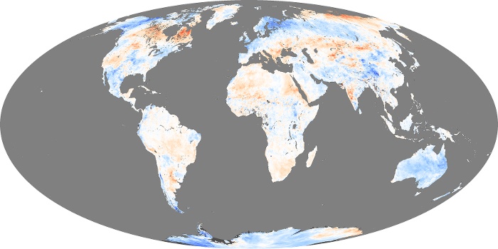
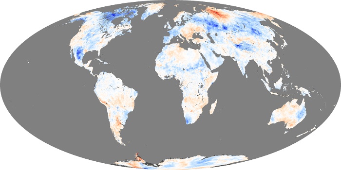
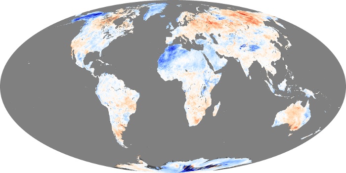
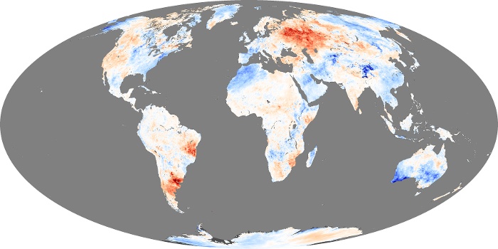
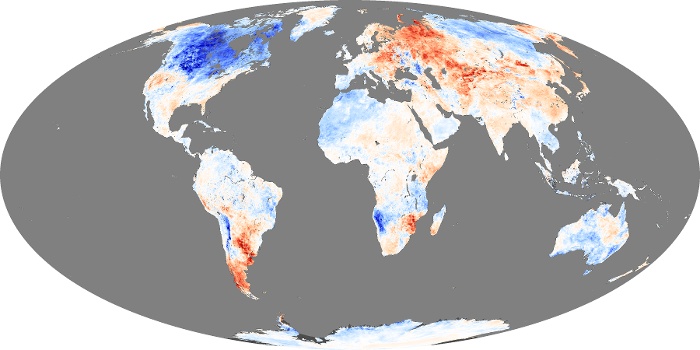
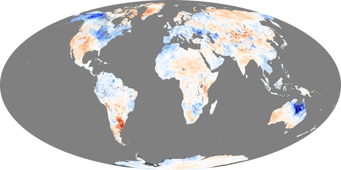
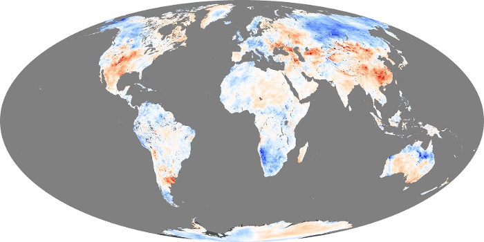
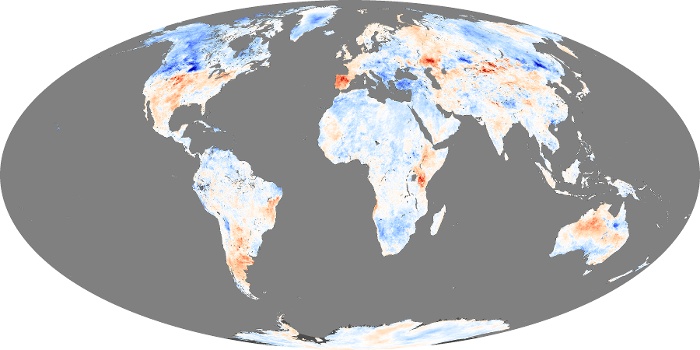
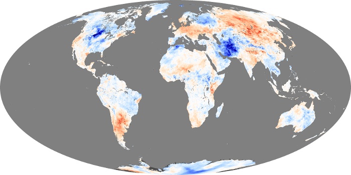
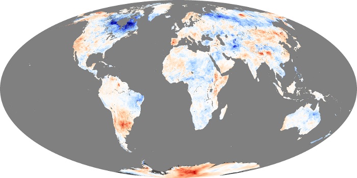

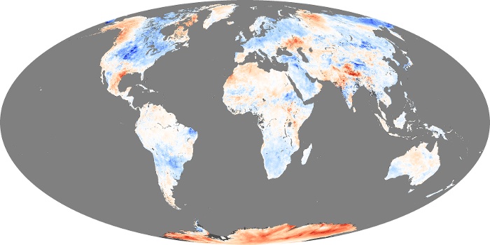
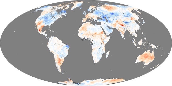
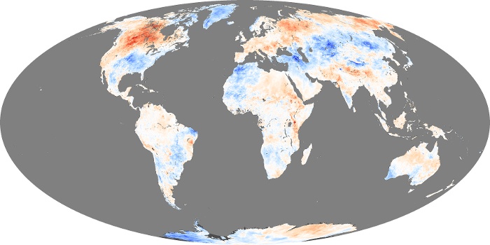
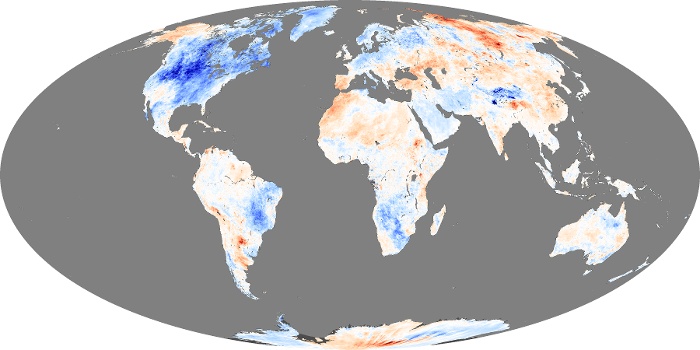
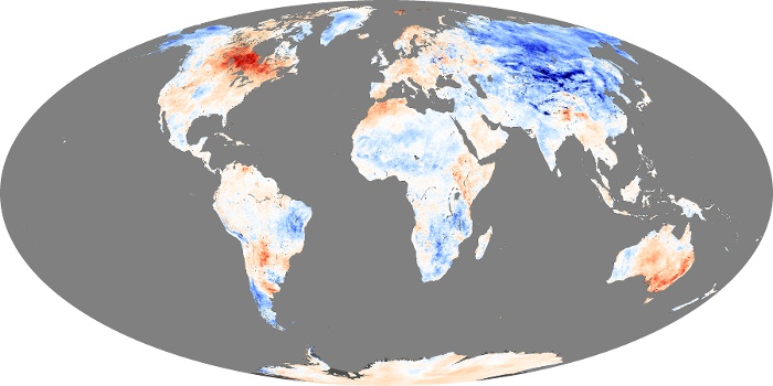
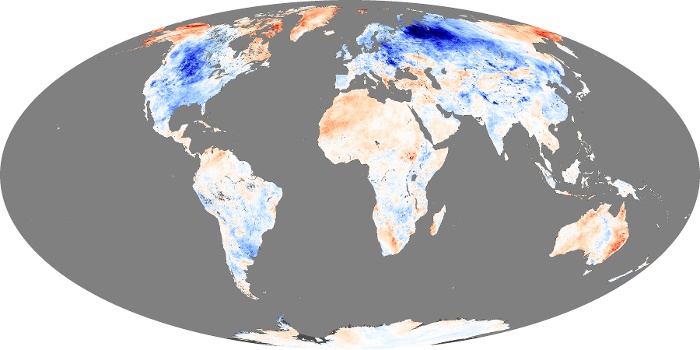
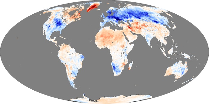
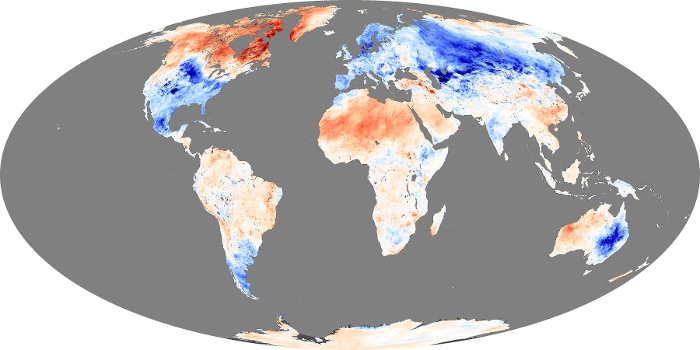
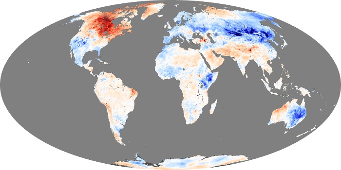
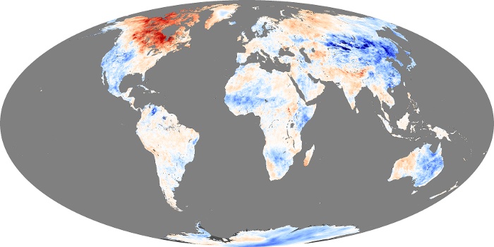
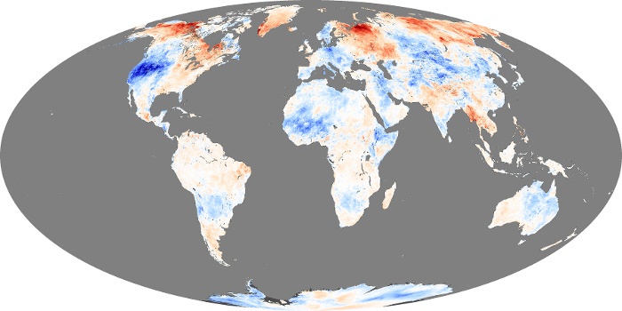
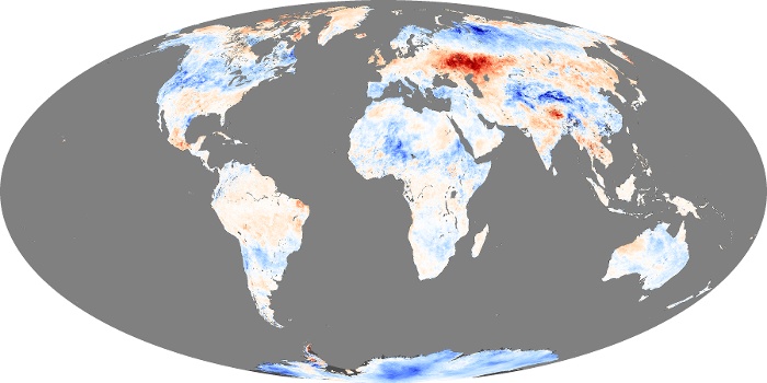
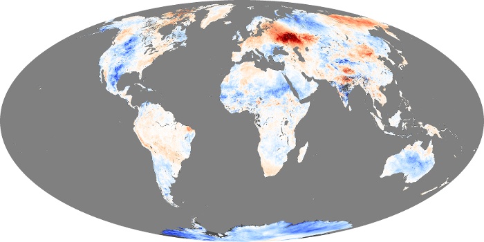
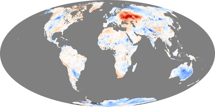
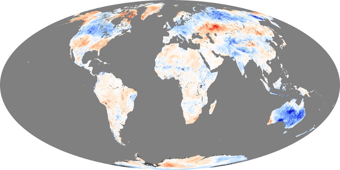
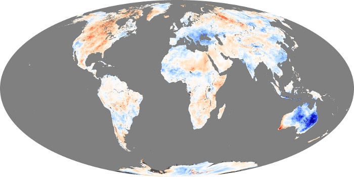
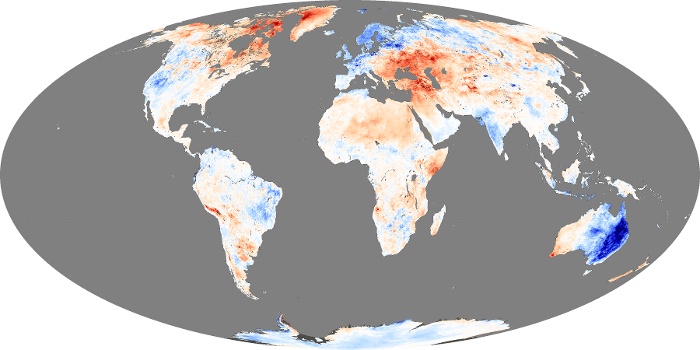
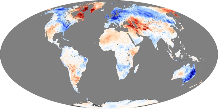
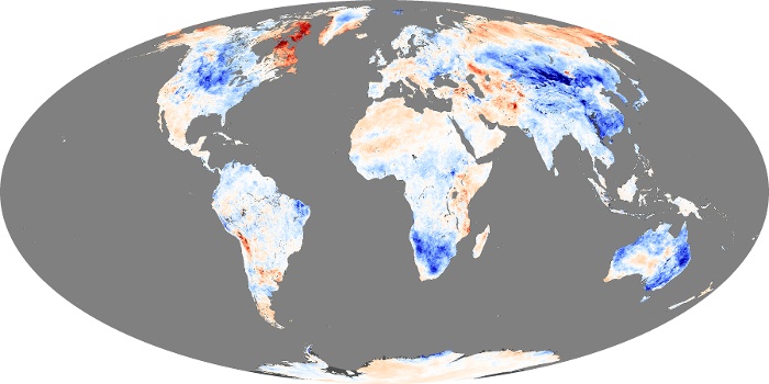
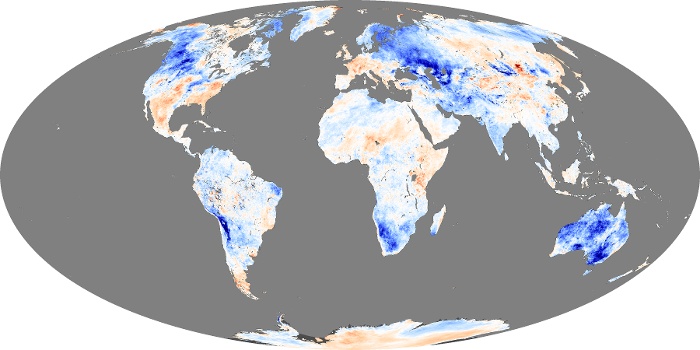
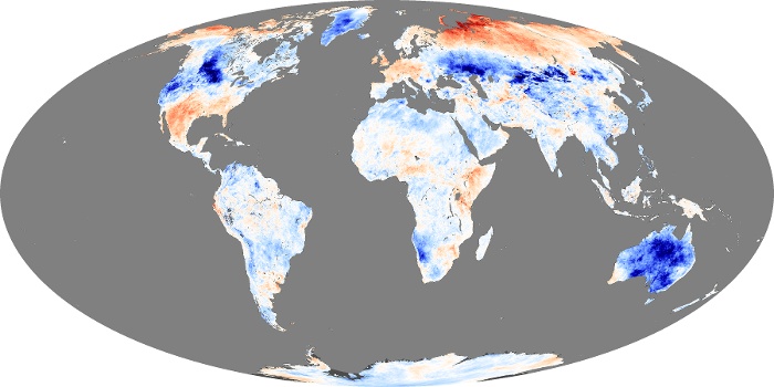
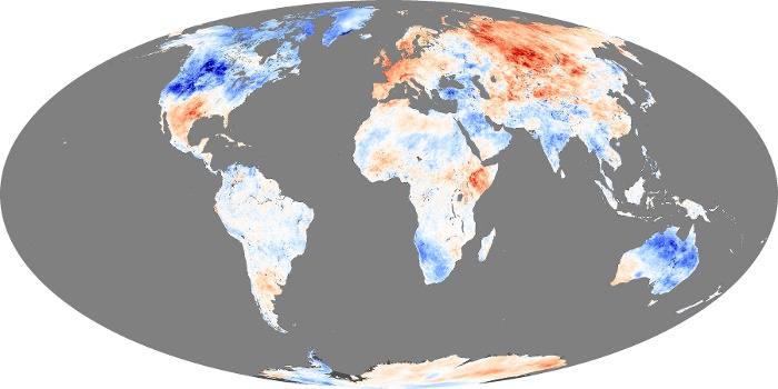
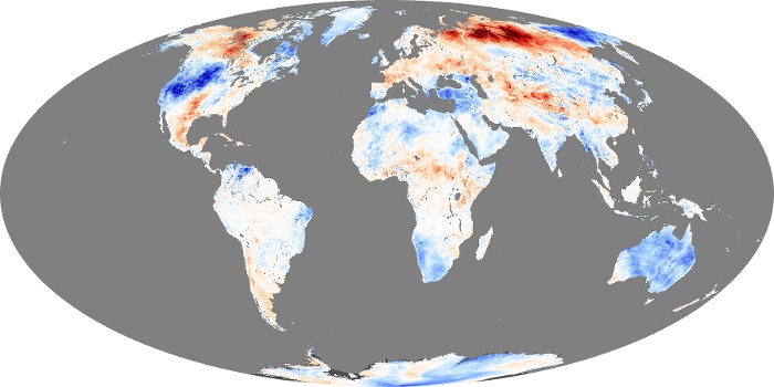
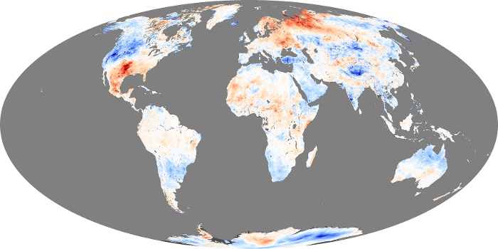
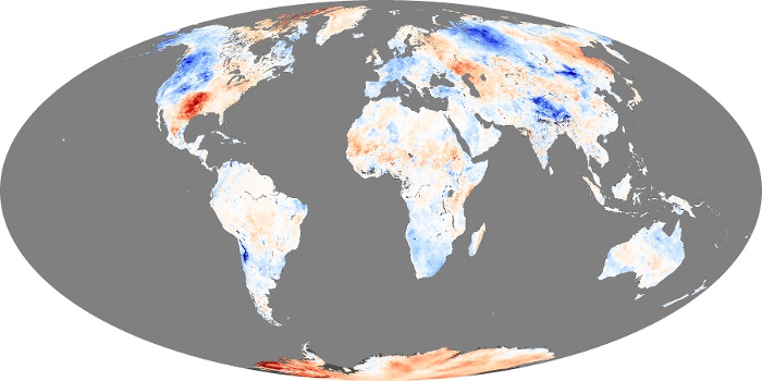
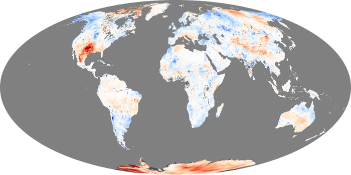
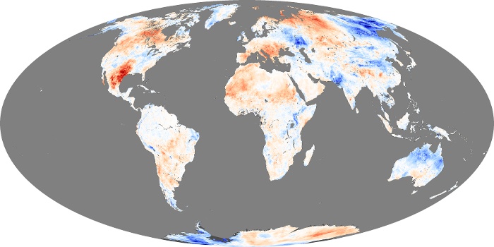
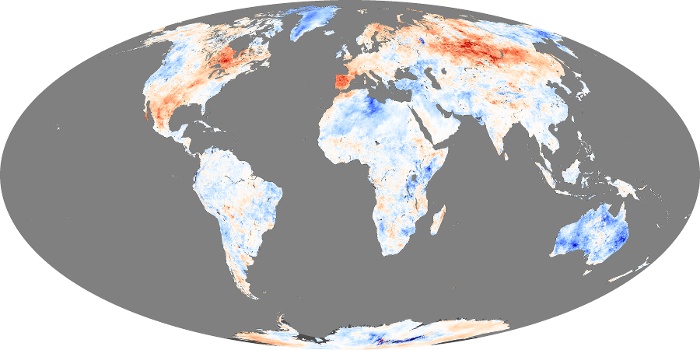
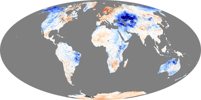
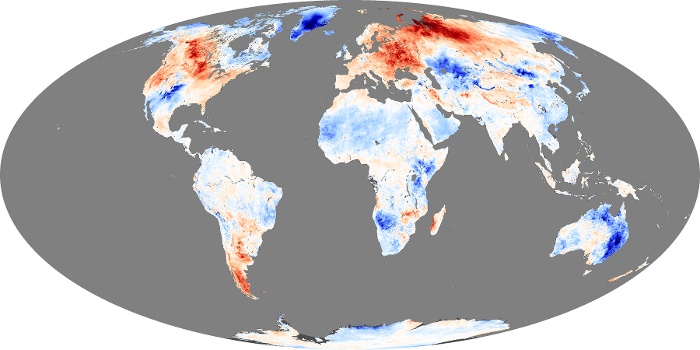
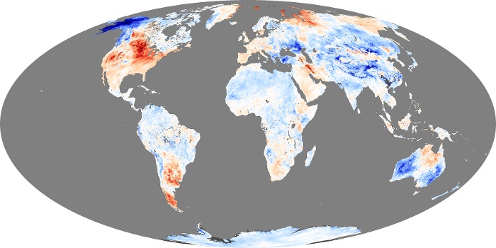
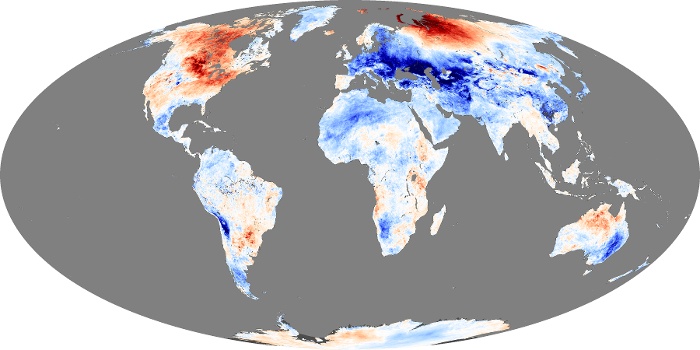
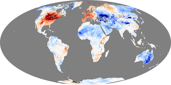
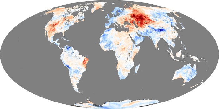
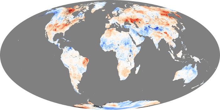
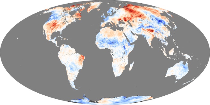
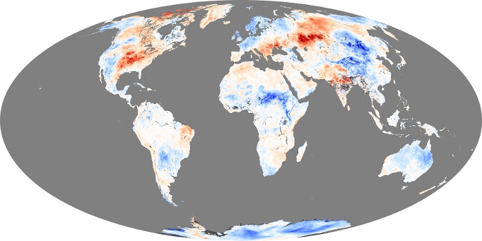
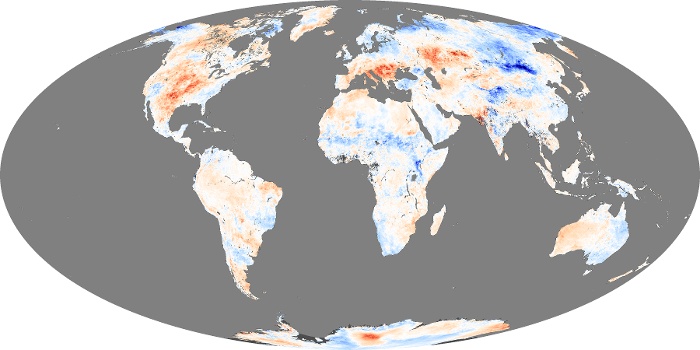
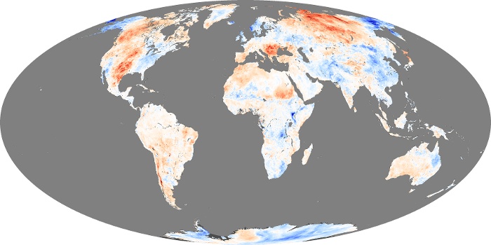
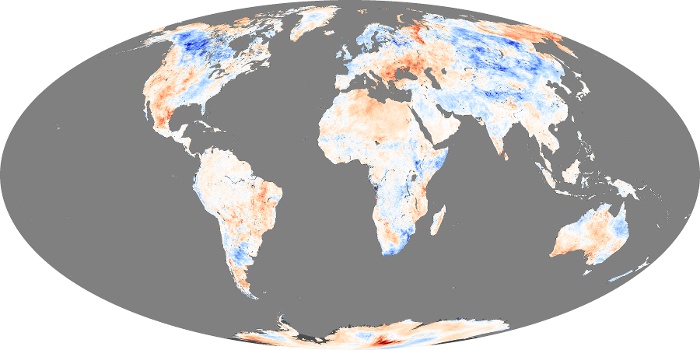
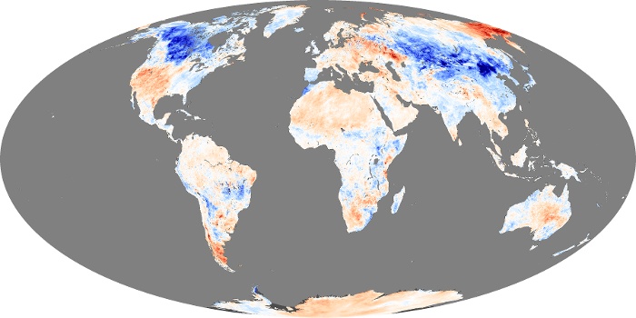
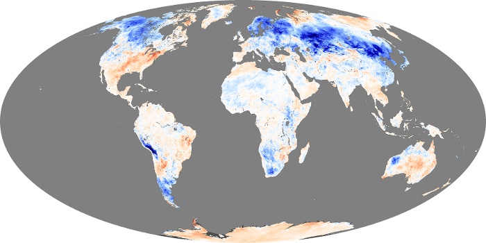
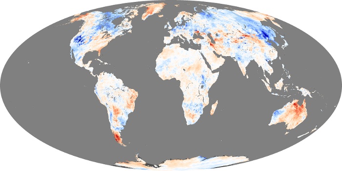
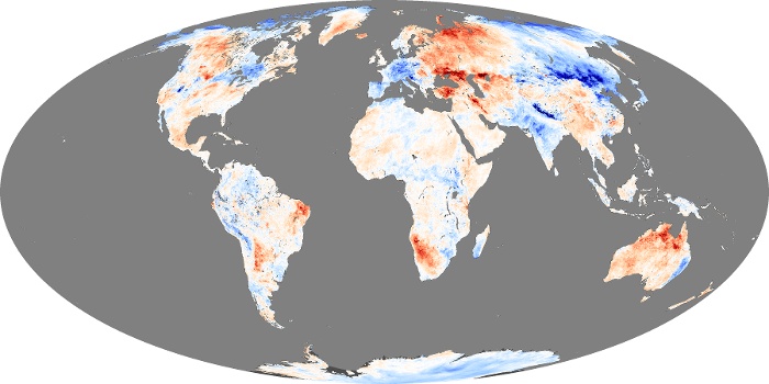
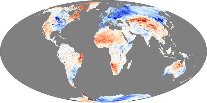
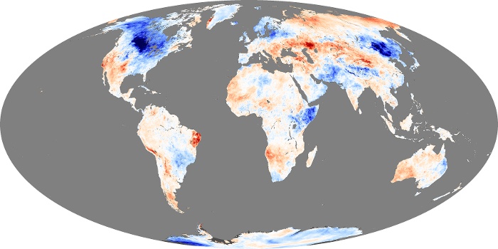
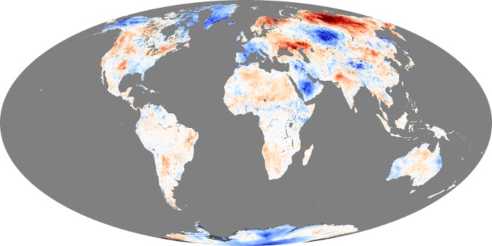
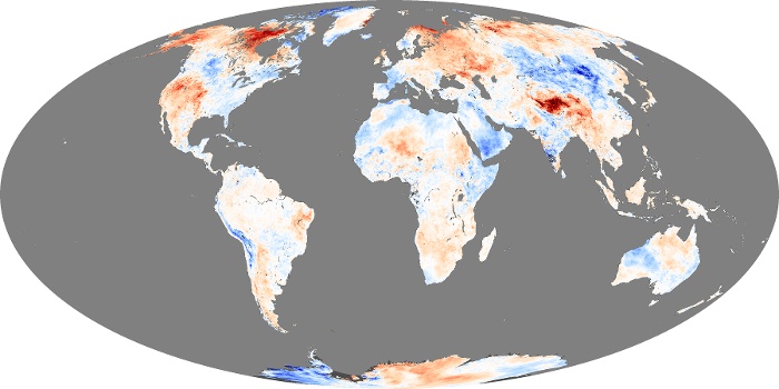
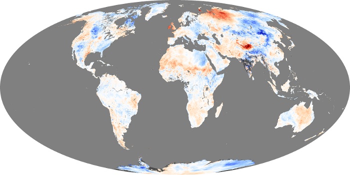
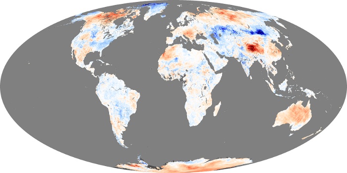
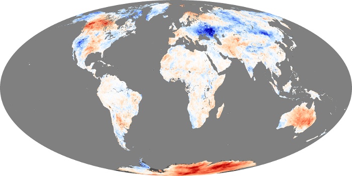
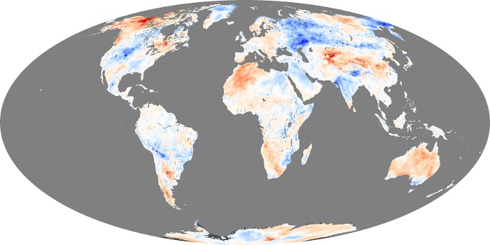
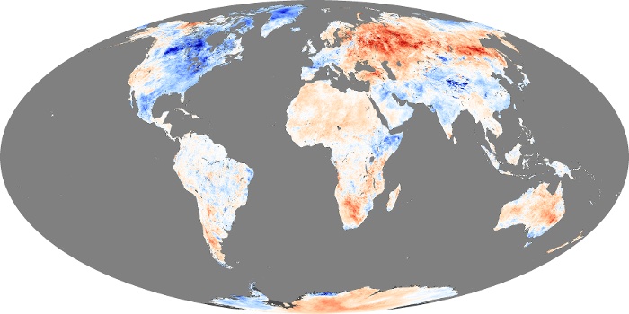
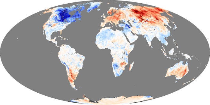
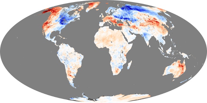
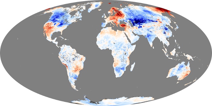
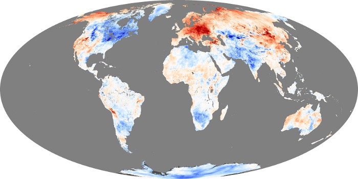
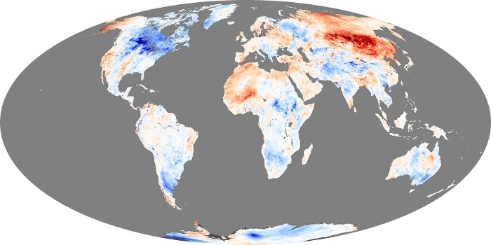
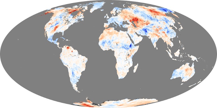
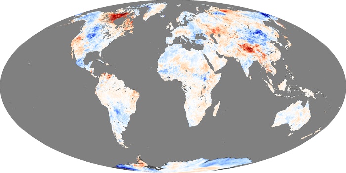
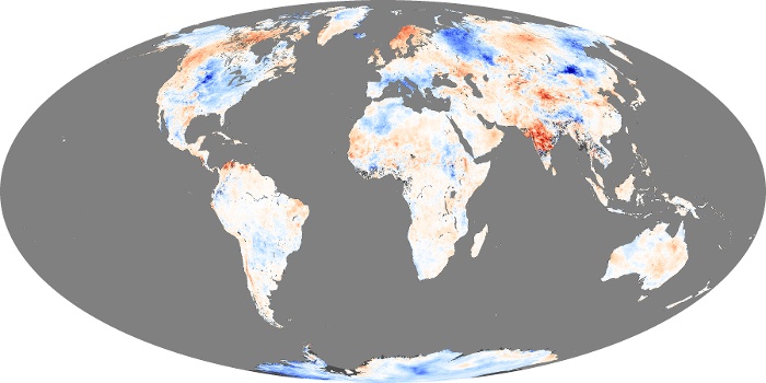
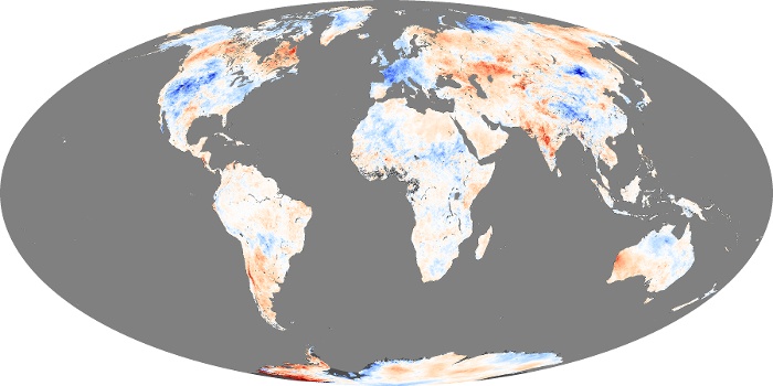

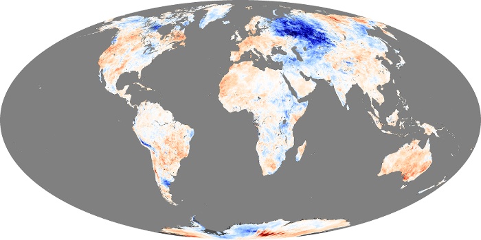
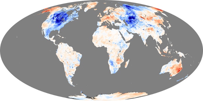
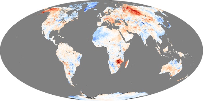
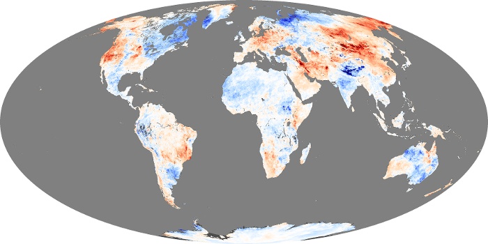
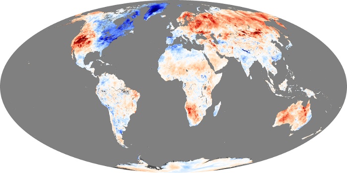
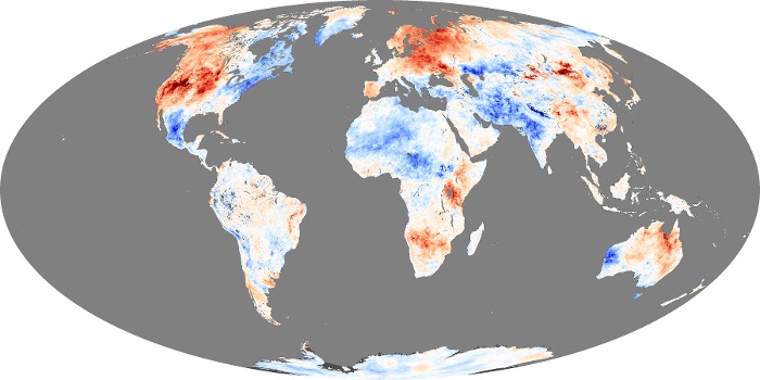
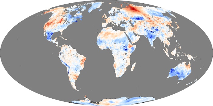
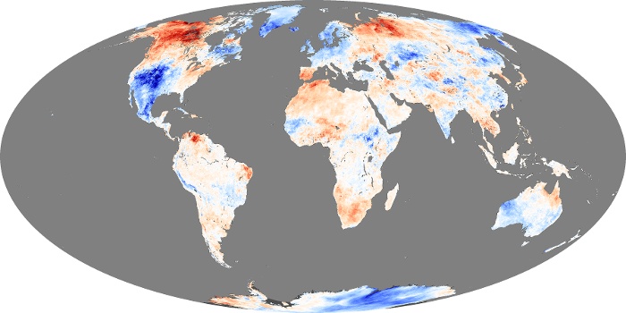
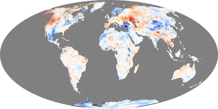
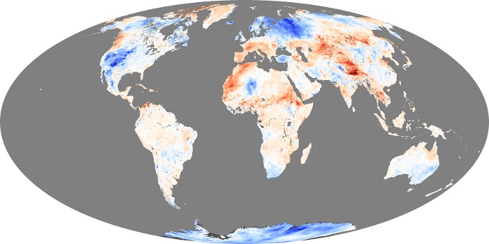
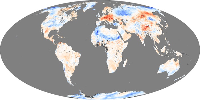
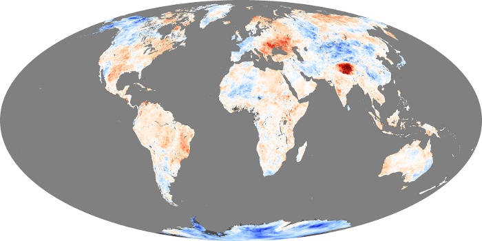
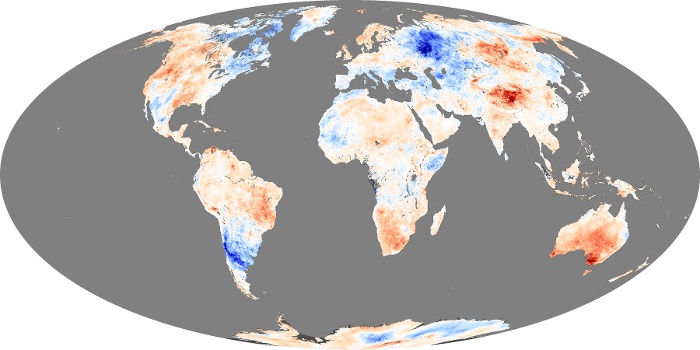
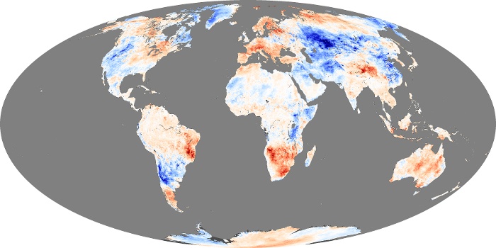
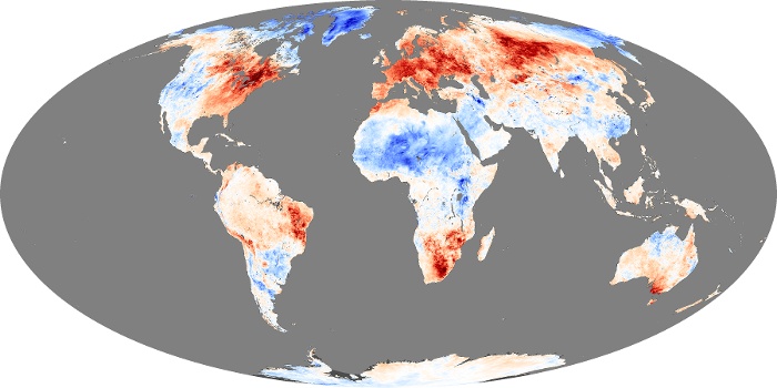
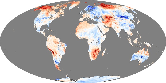
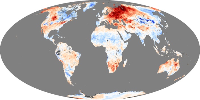
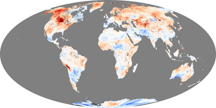
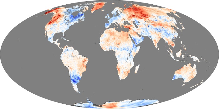
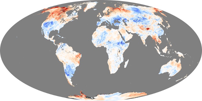
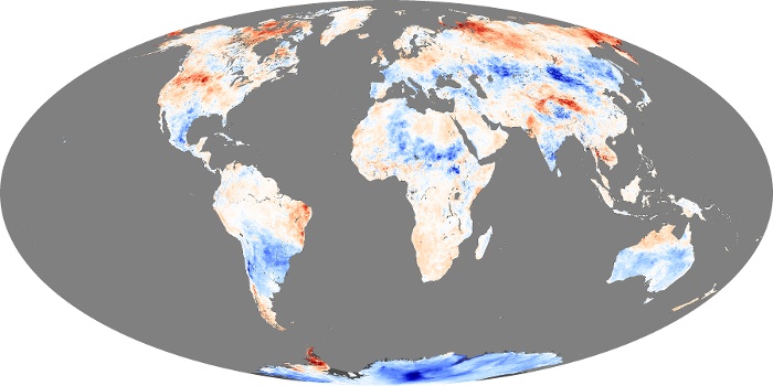
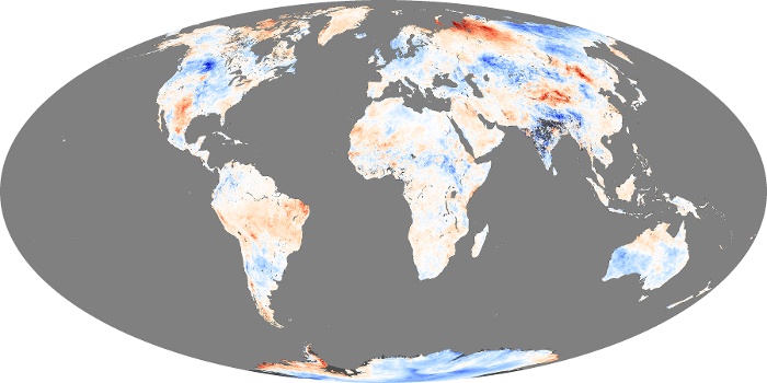
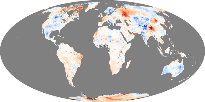
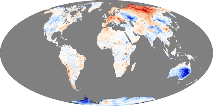
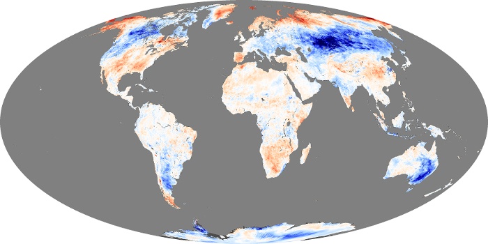
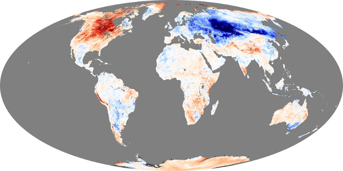
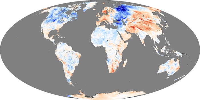
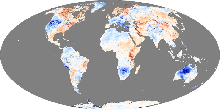
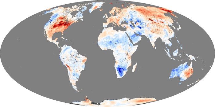
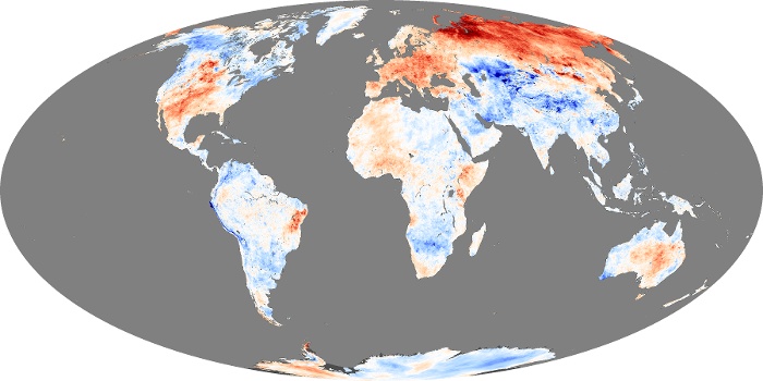
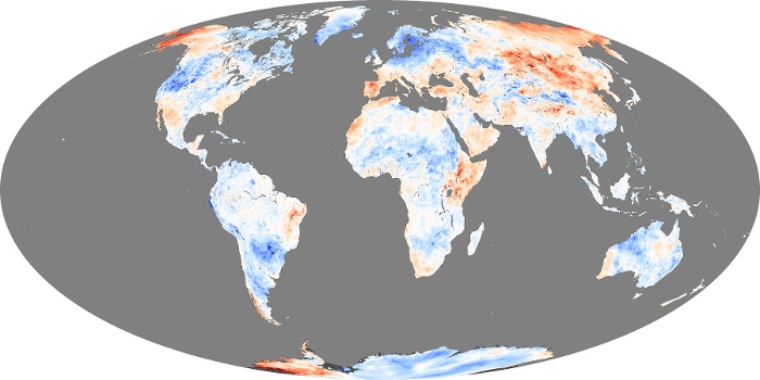
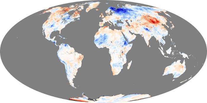
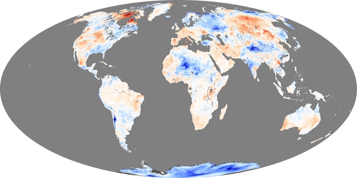
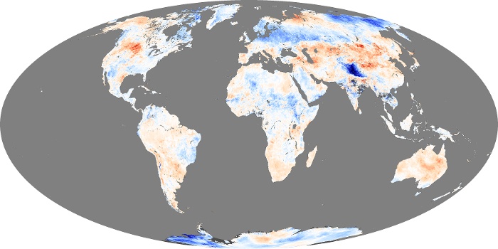
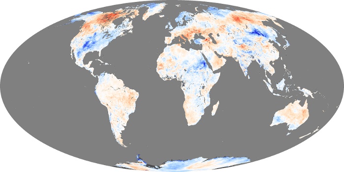
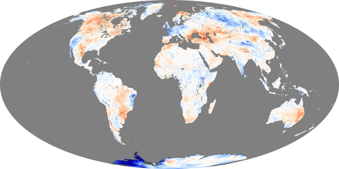
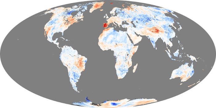
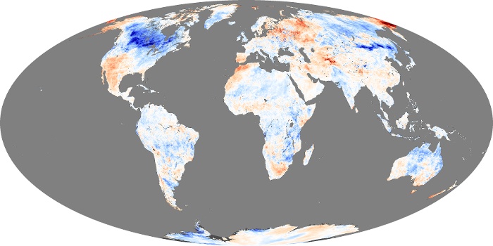
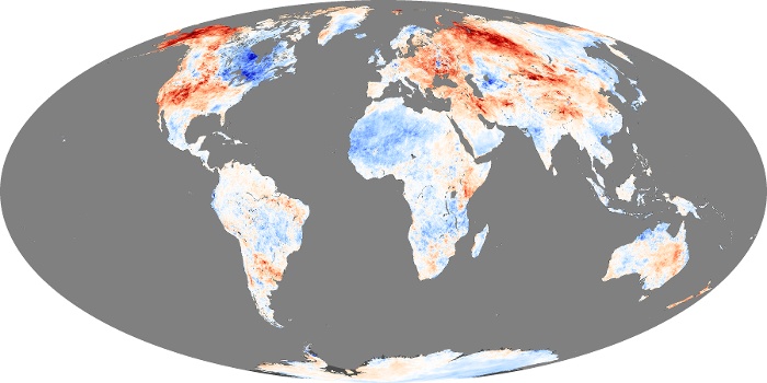
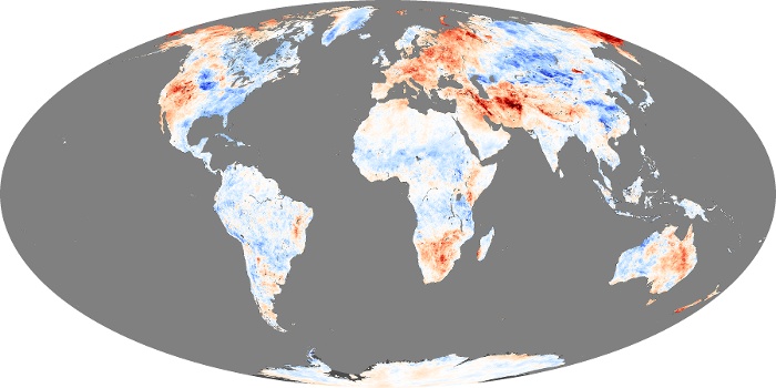
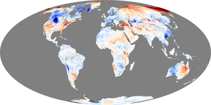
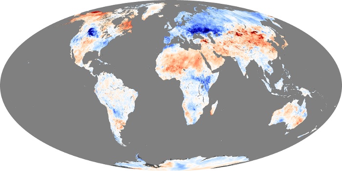
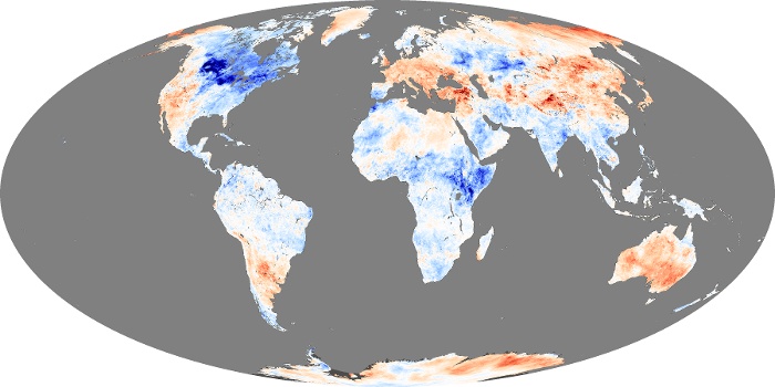
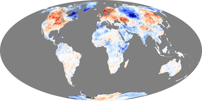
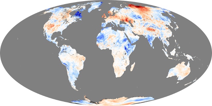
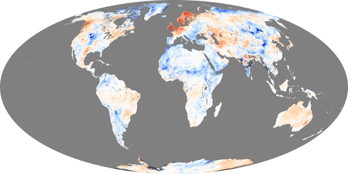

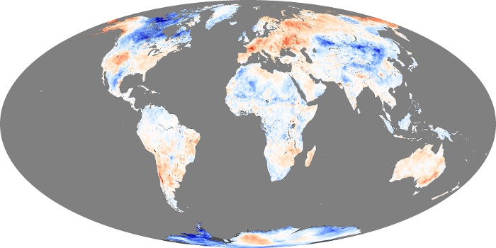
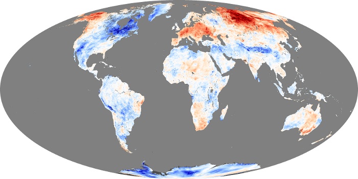
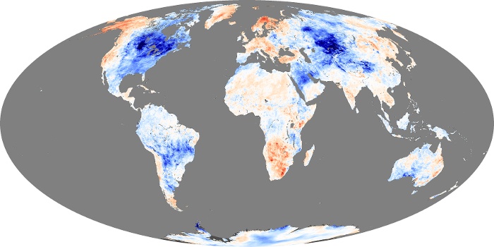
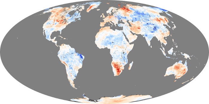
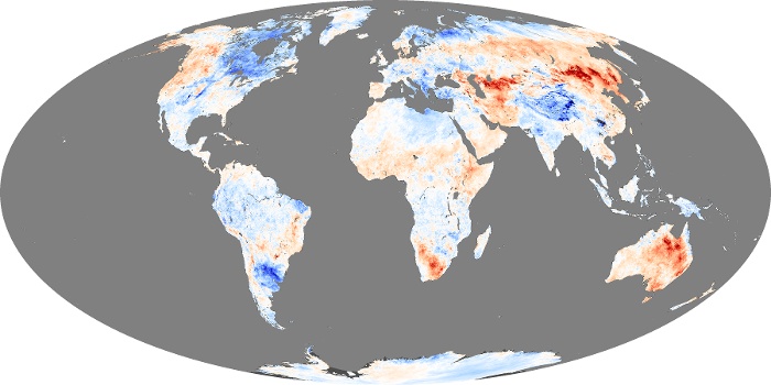
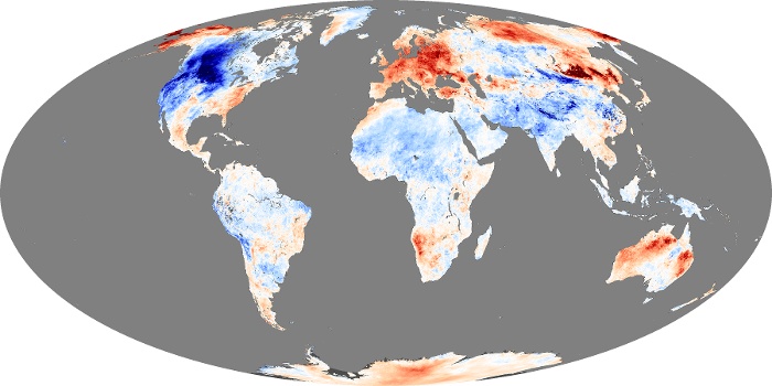
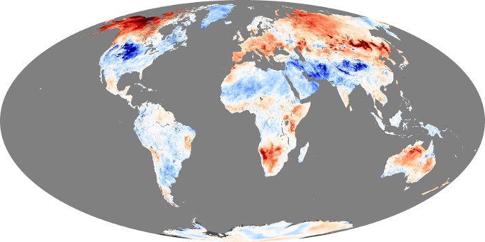
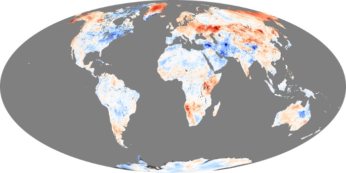
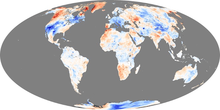
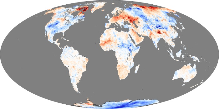
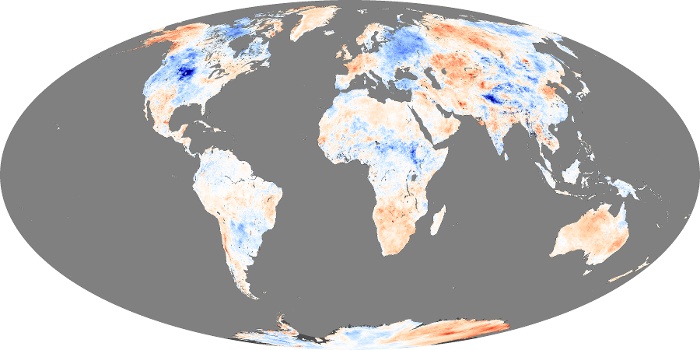
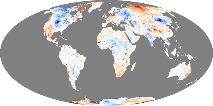
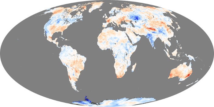
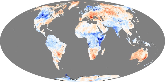
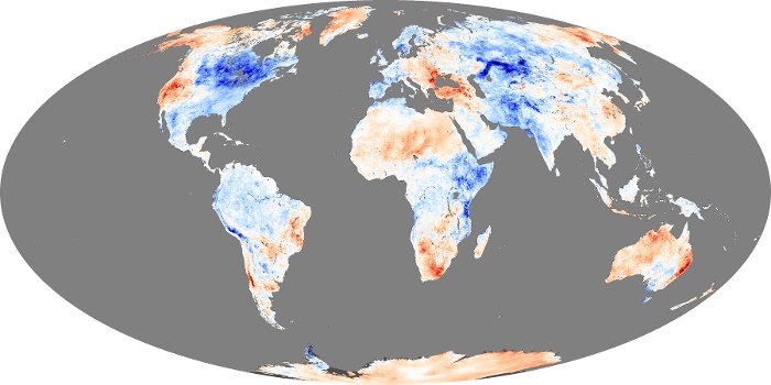
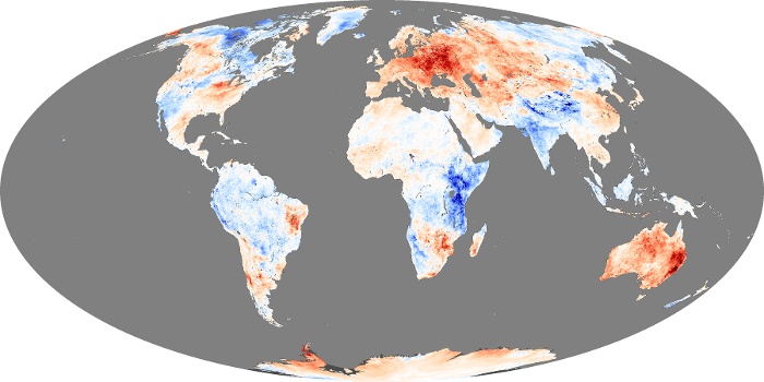
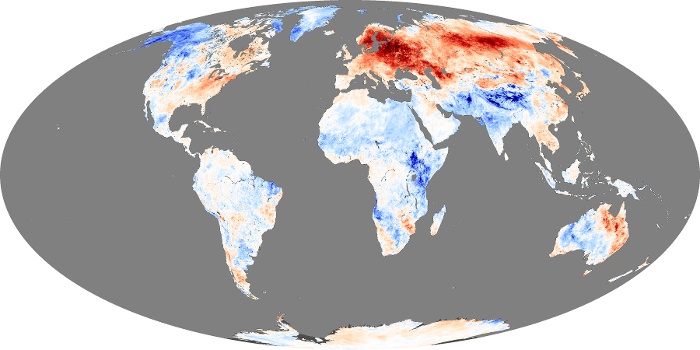
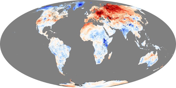
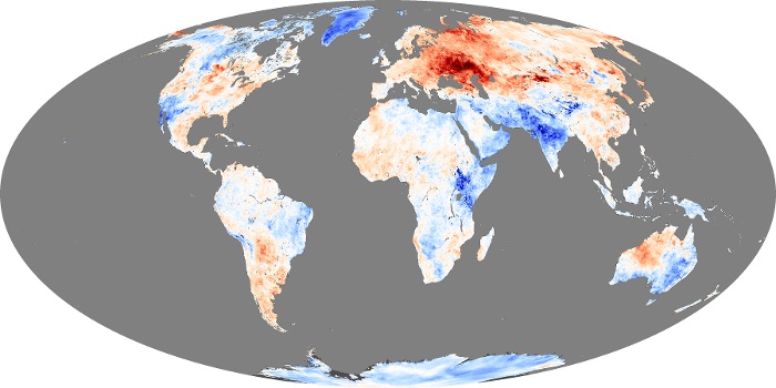
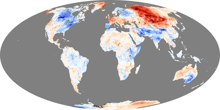
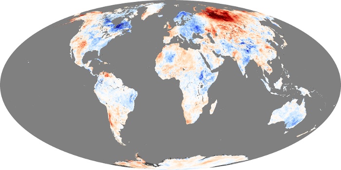
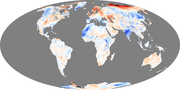
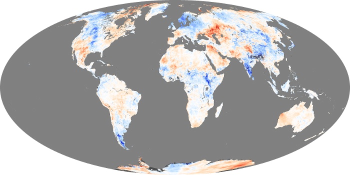
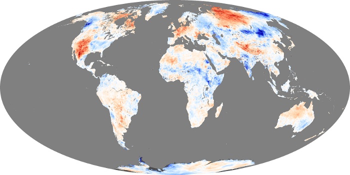
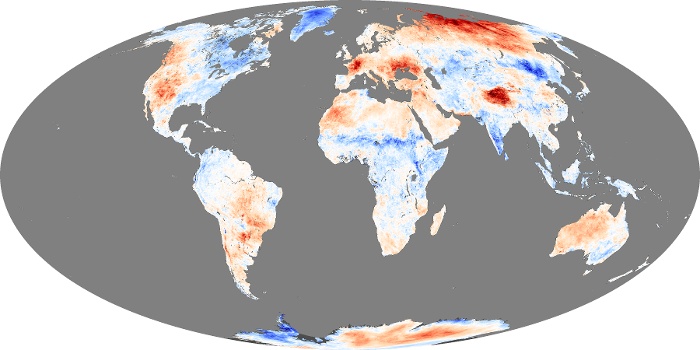
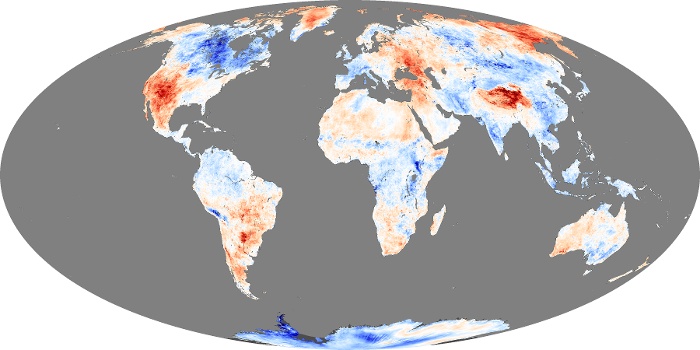
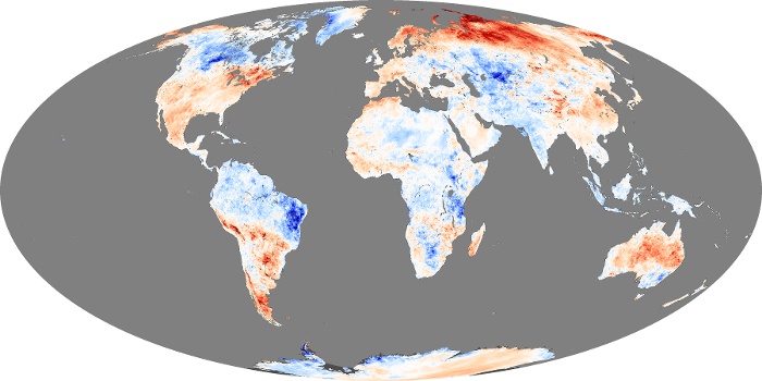

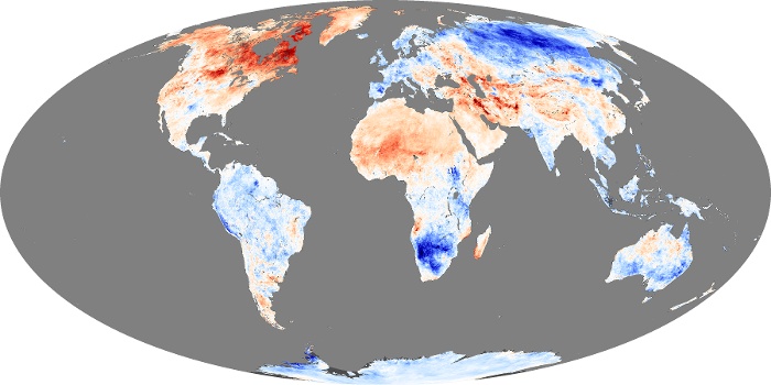
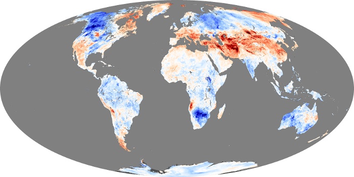
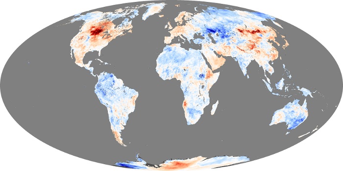
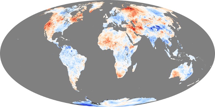
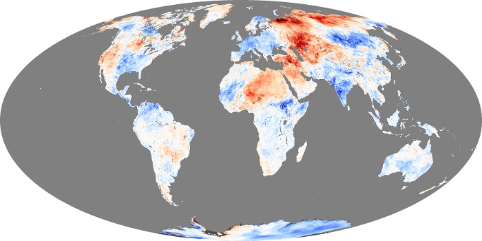
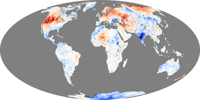
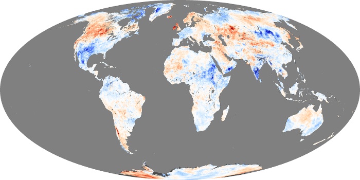
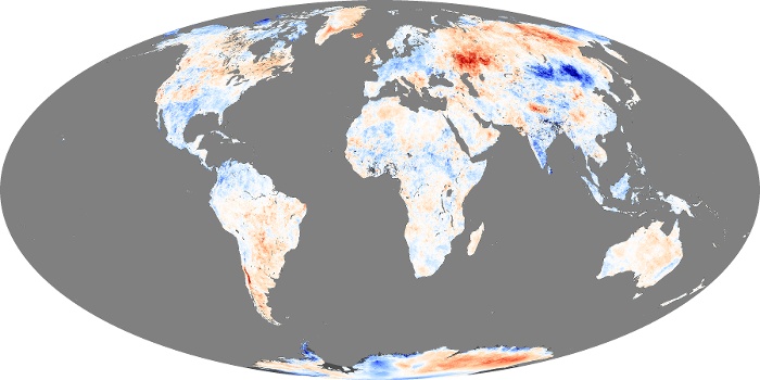
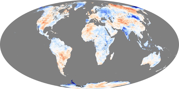
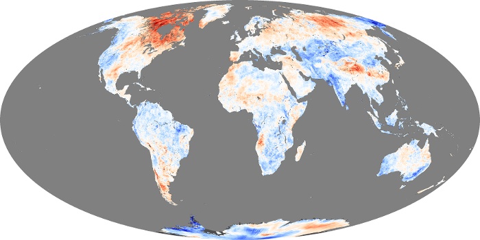
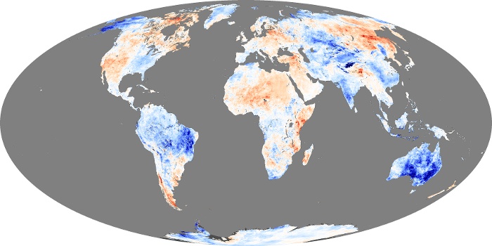
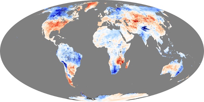
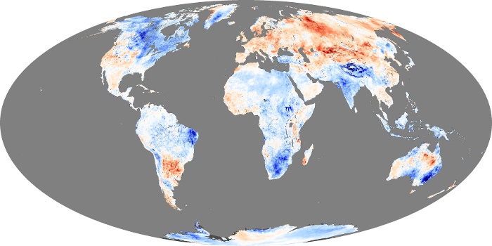
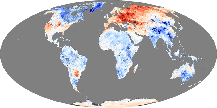
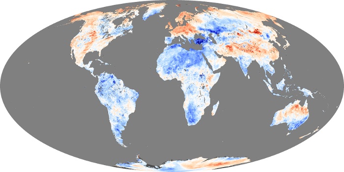
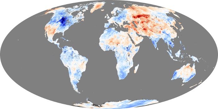
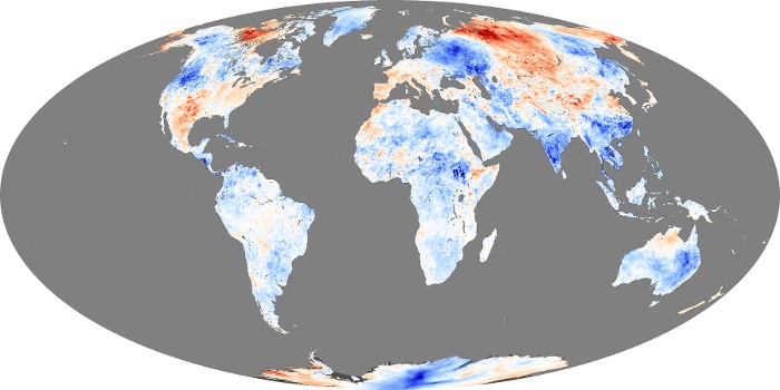
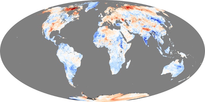
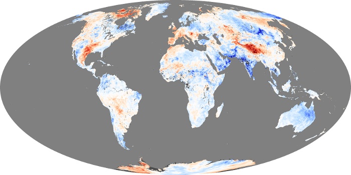
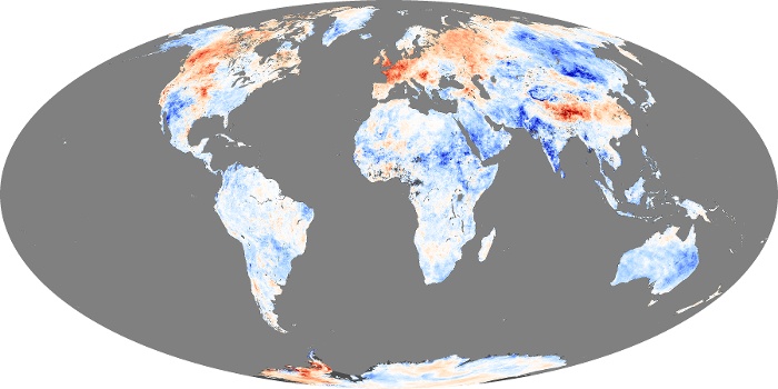
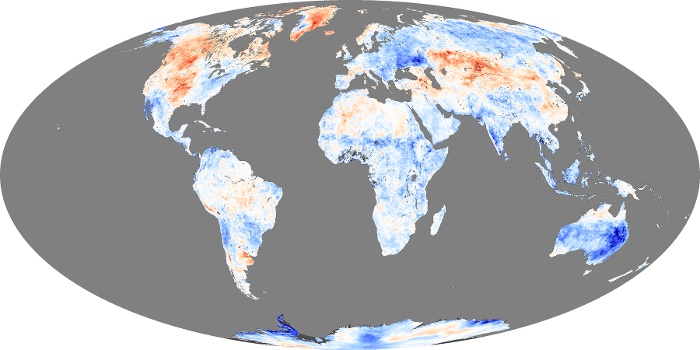
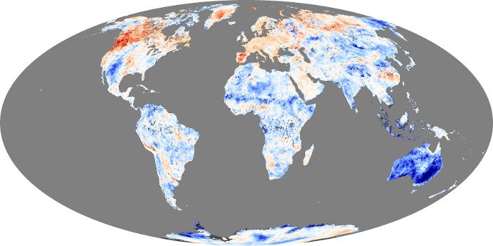
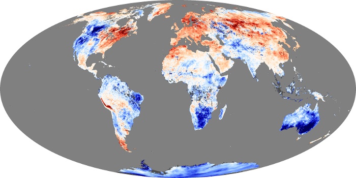
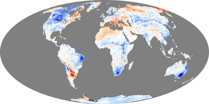
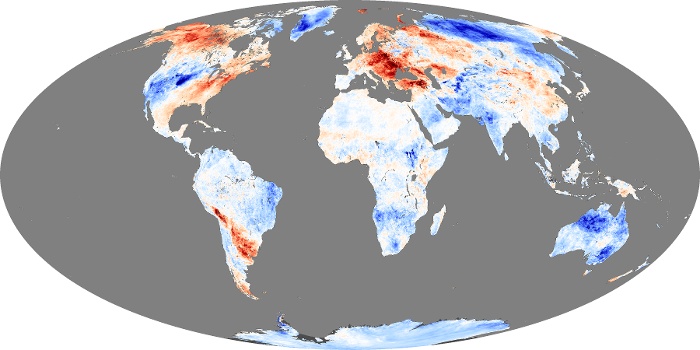
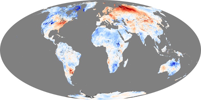
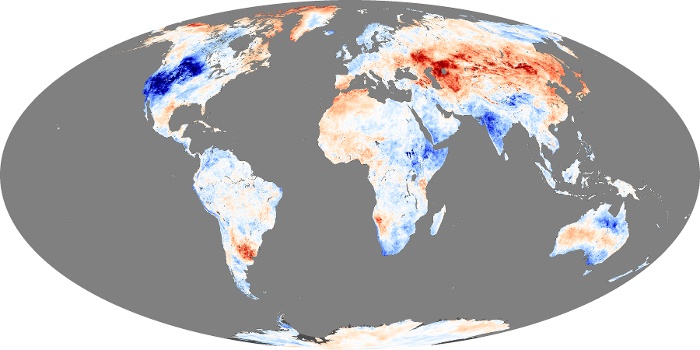
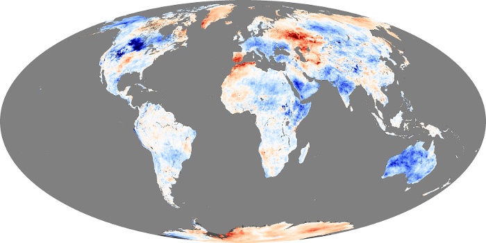
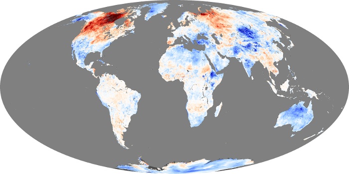
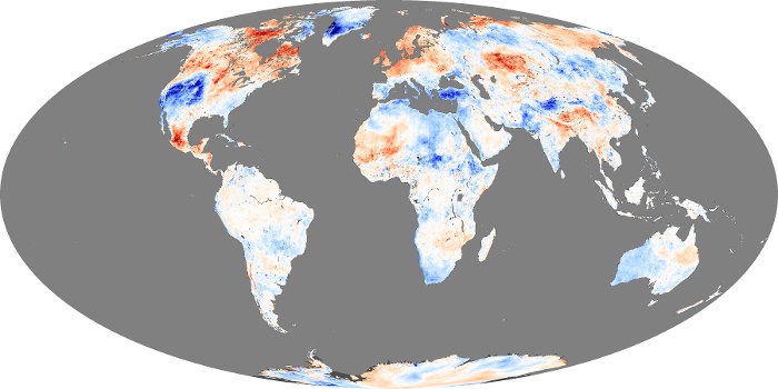


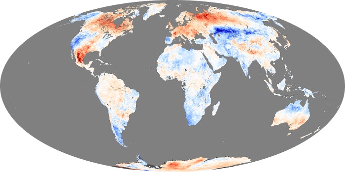
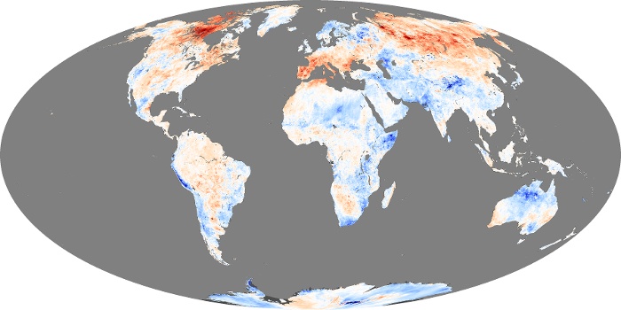
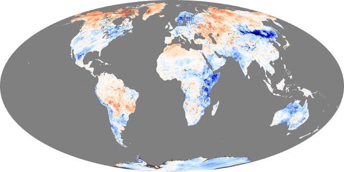
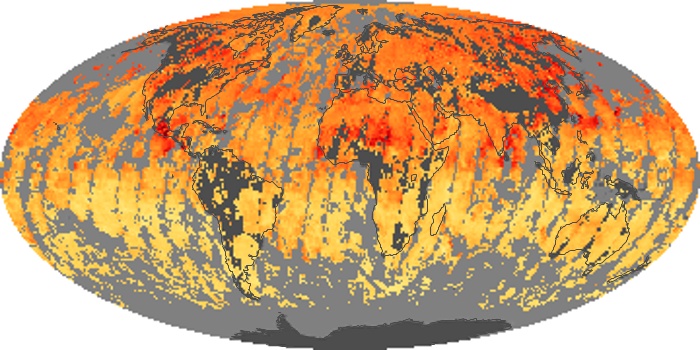


Land surface temperature is how hot the “surface” of the Earth would feel to the touch in a particular location. From a satellite’s point of view, the “surface” is whatever it sees when it looks through the atmosphere to the ground. It could be snow and ice, the grass on a lawn, or the roof of a building. These maps compare daytime land surface temperatures in a particular month to the average temperatures for that month from 2000-2008. Places that were warmer than average are red, places that were near normal are white, and places that were cooler than average are blue. The observations were collected by the Moderate Resolution Imaging Spectroradiometer (MODIS) on NASA’s Terra satellite.
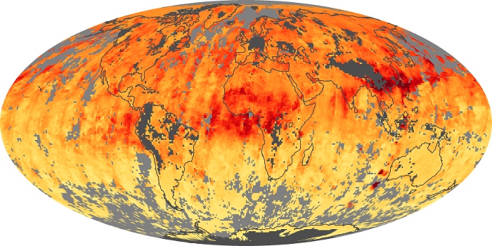
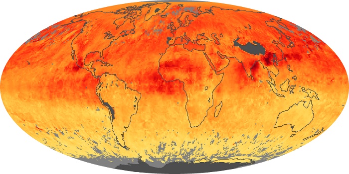
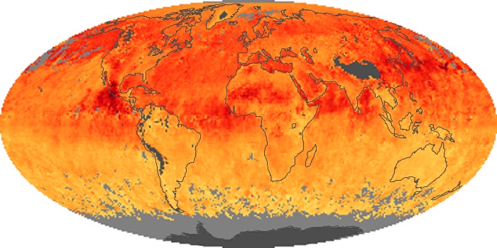
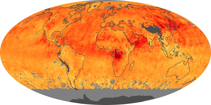
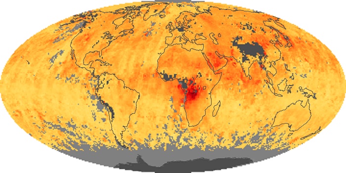
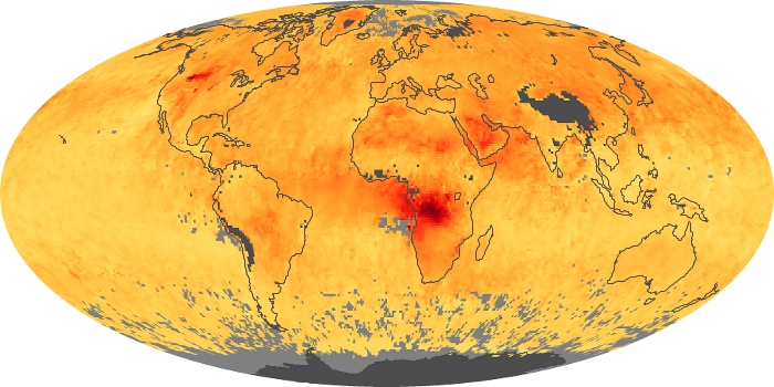
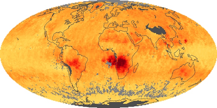
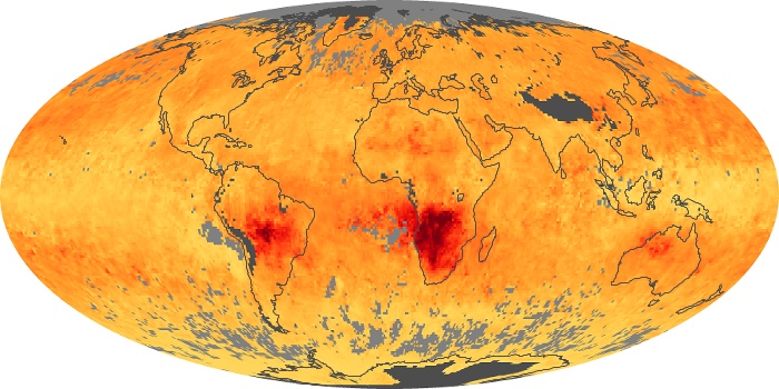
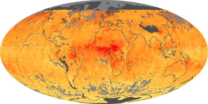
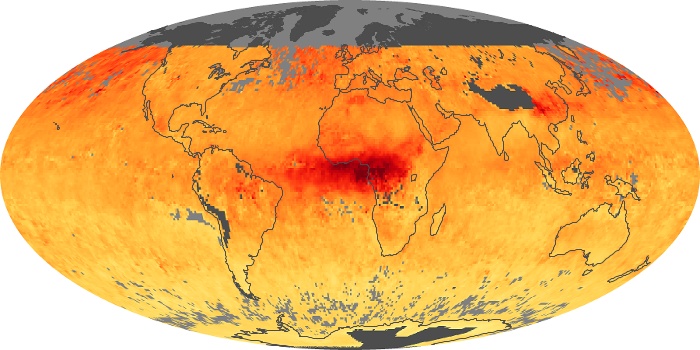
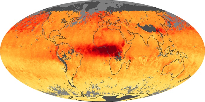
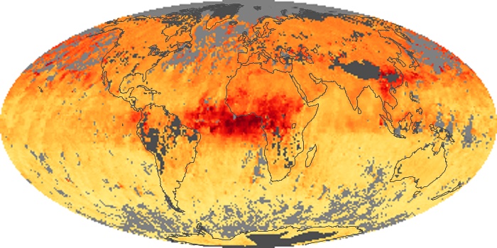
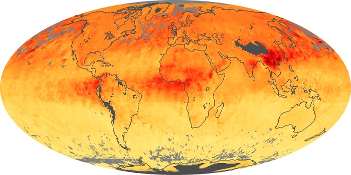
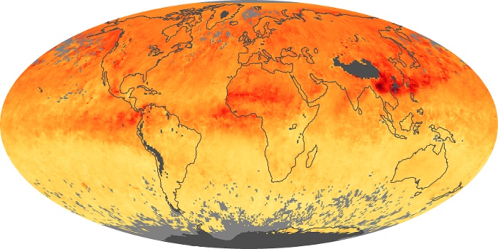
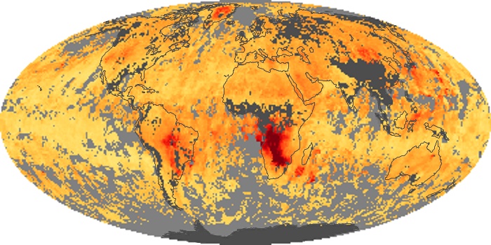
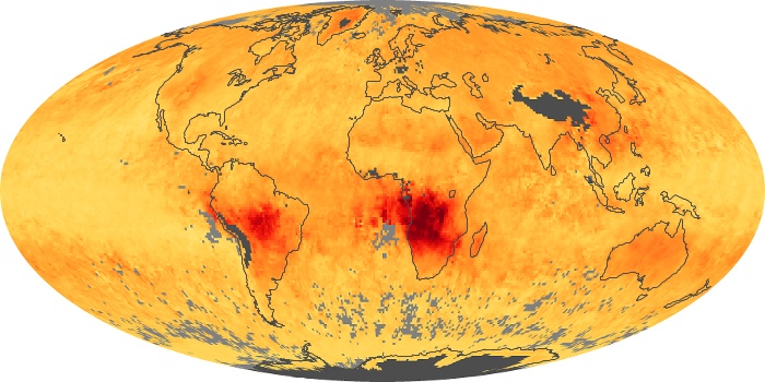
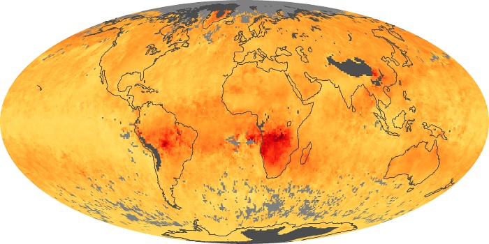
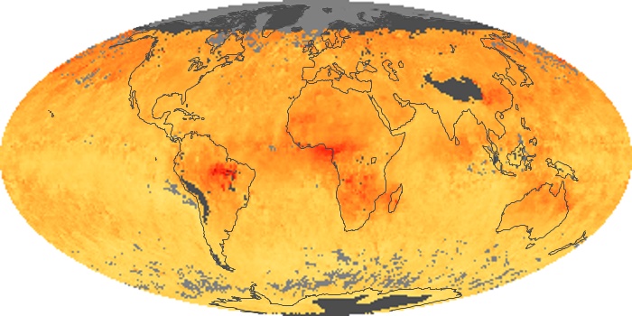
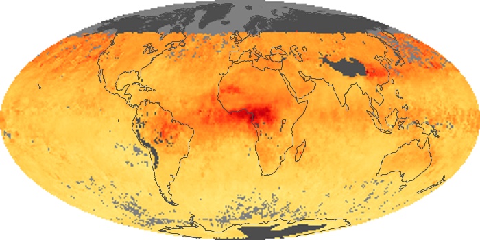
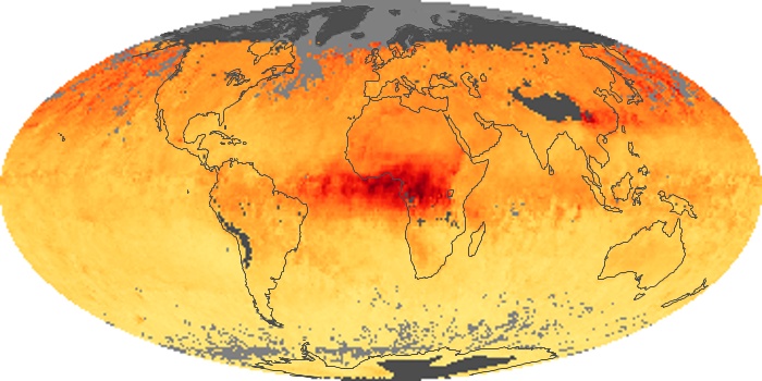
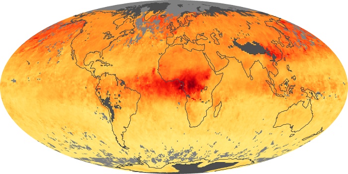
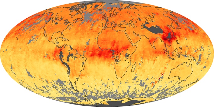
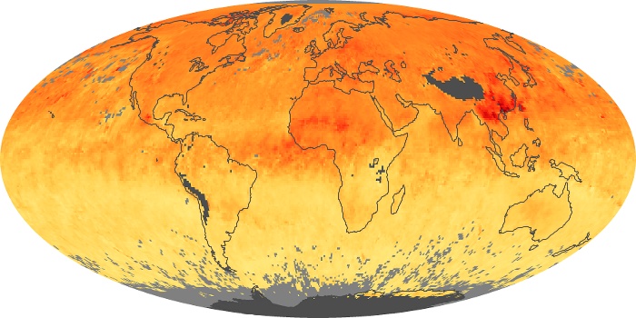
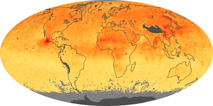
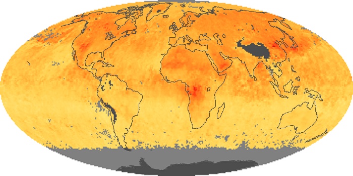
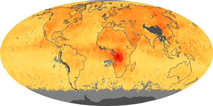
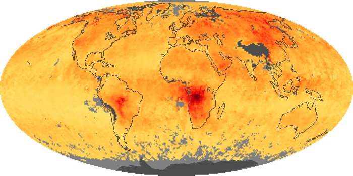
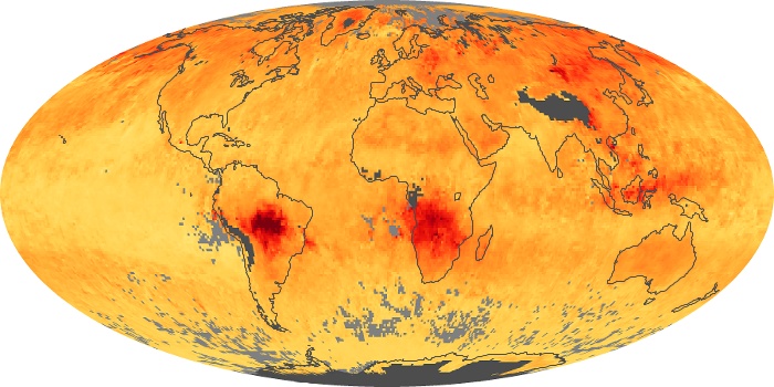
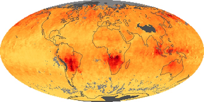
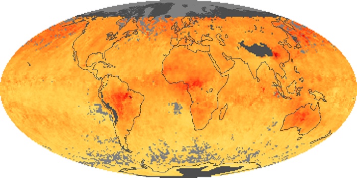
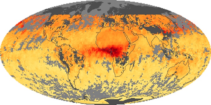
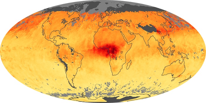
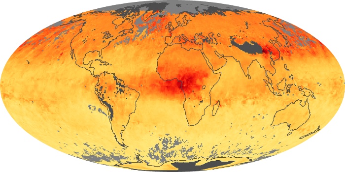
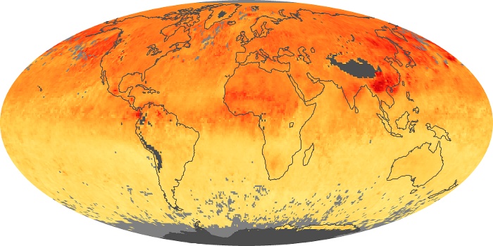
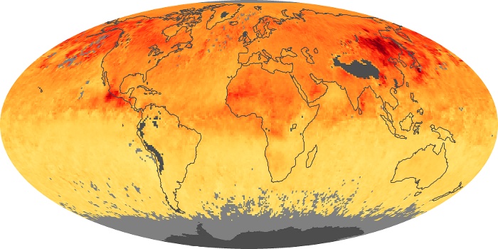
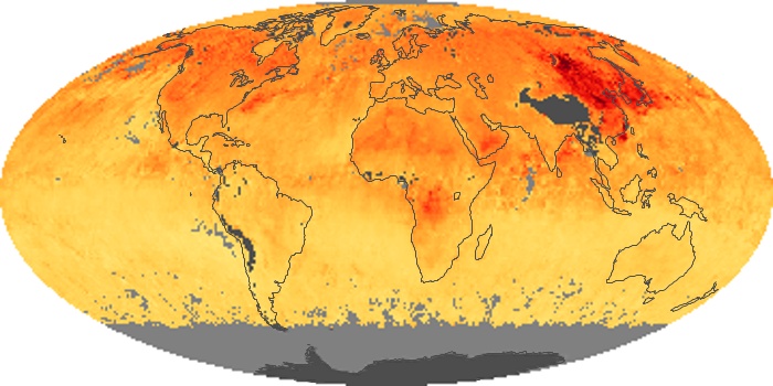
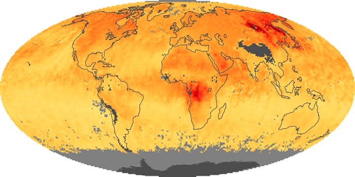
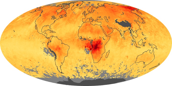
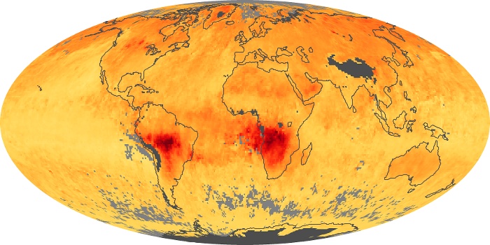
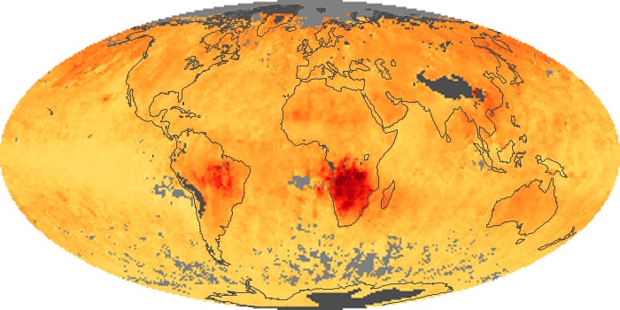
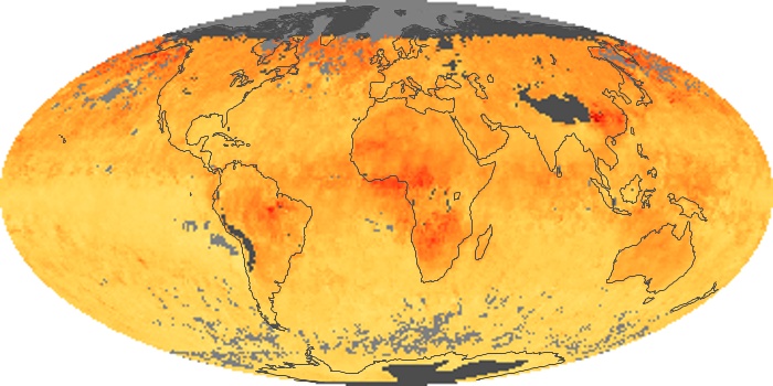
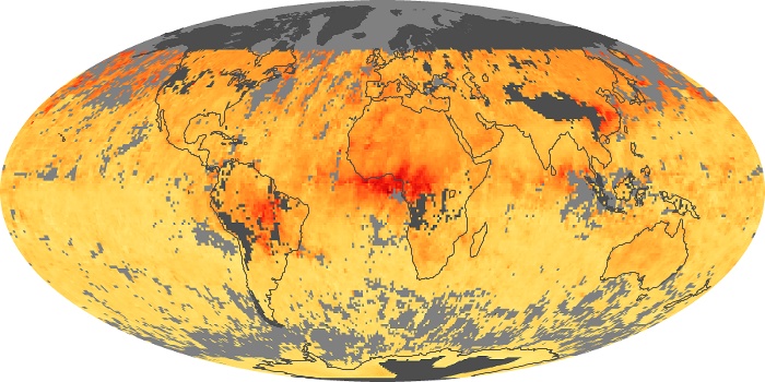
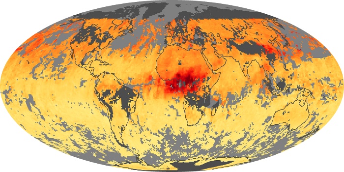
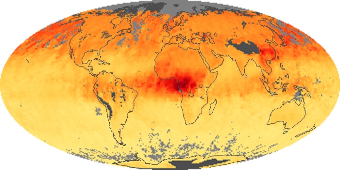
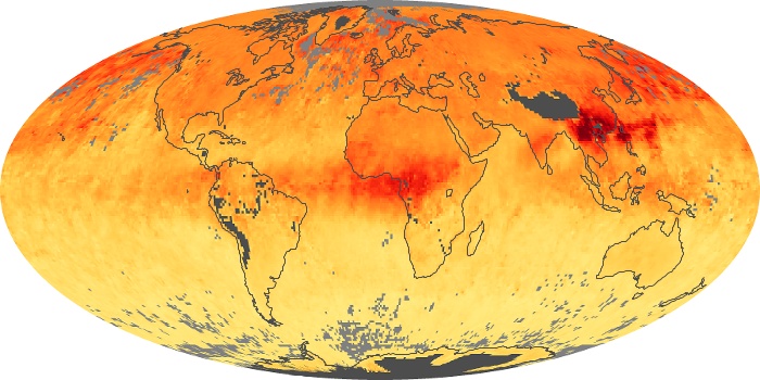
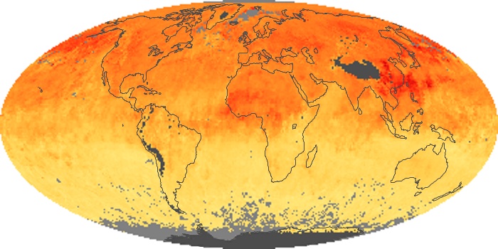
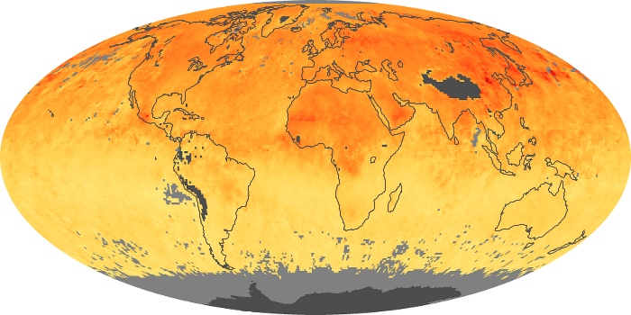
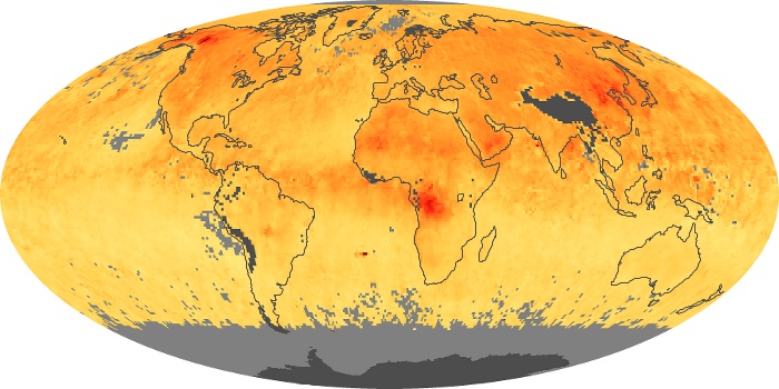
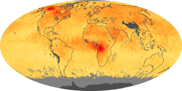
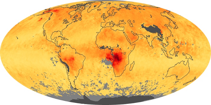
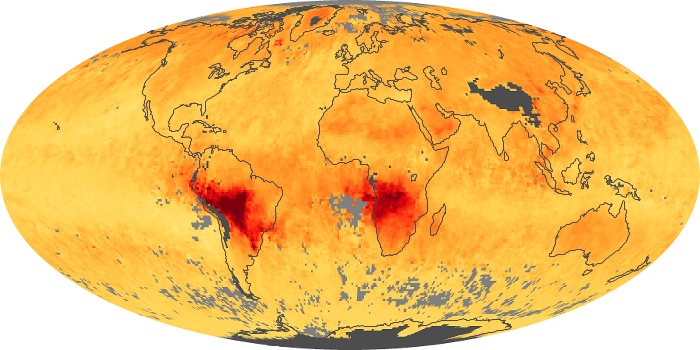
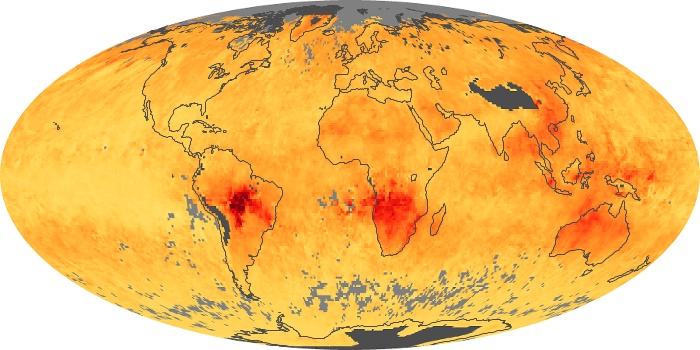
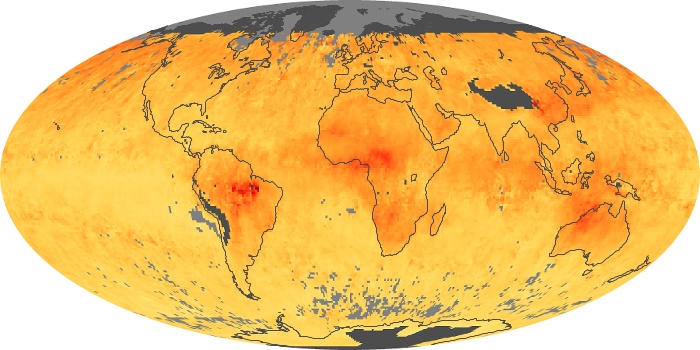
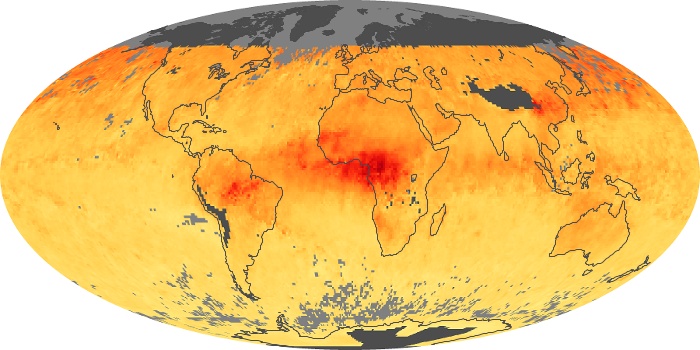
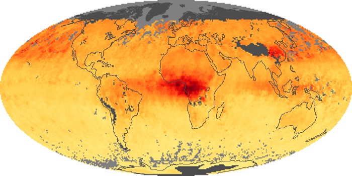
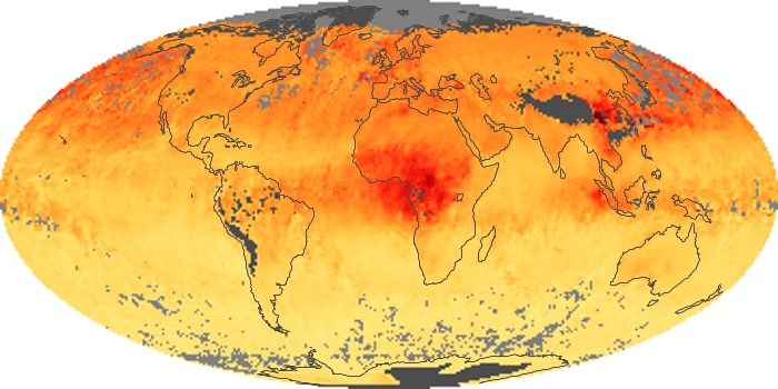
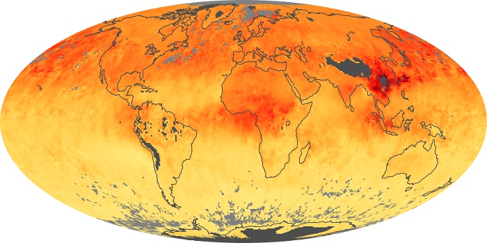
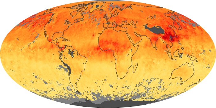
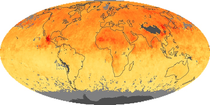
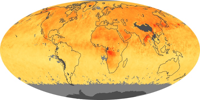
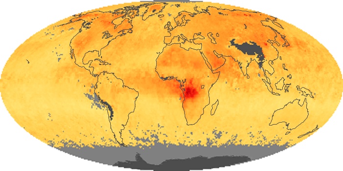
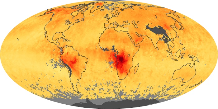
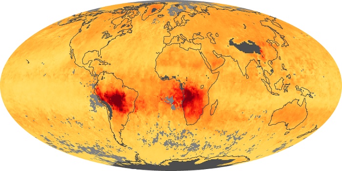
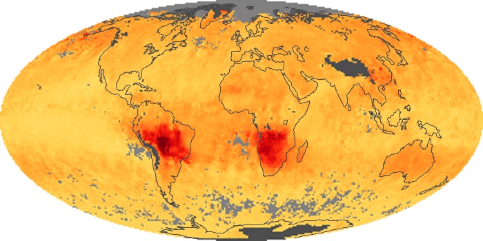
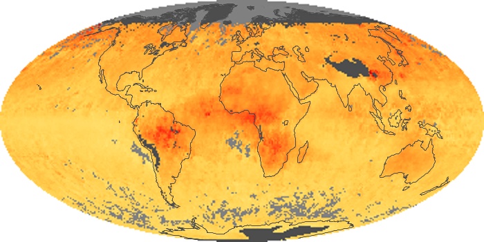
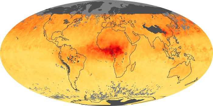
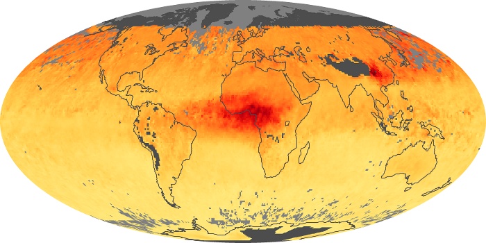
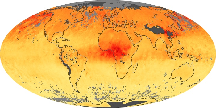
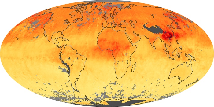
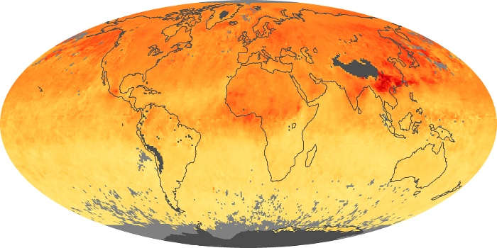
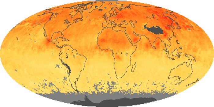
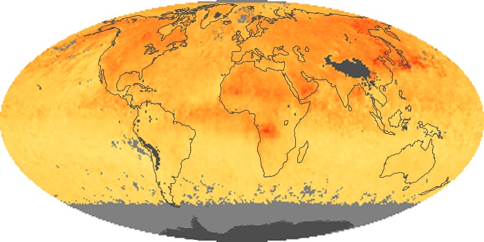
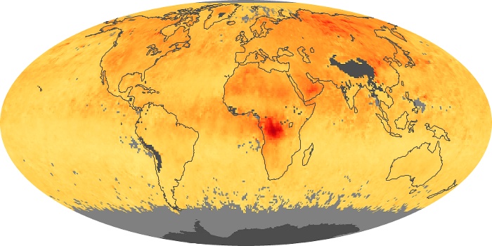
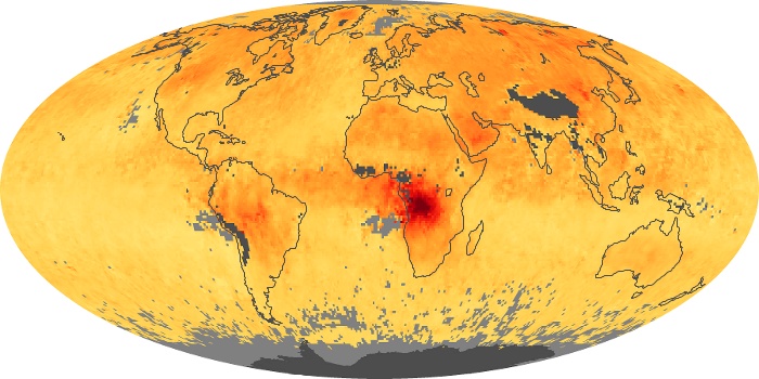
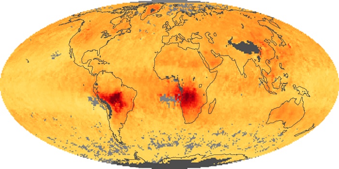
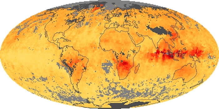
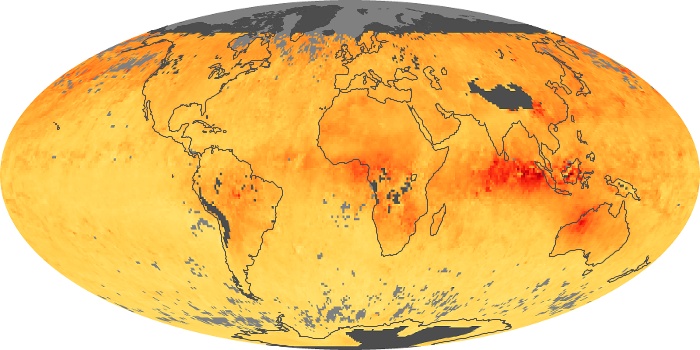
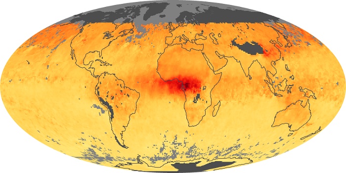
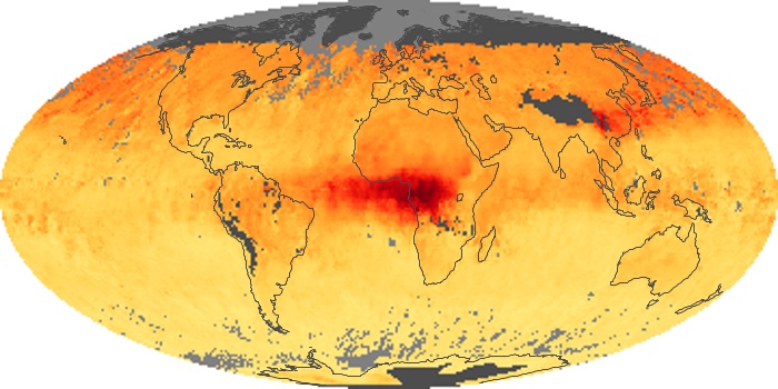
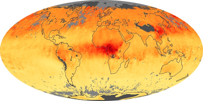
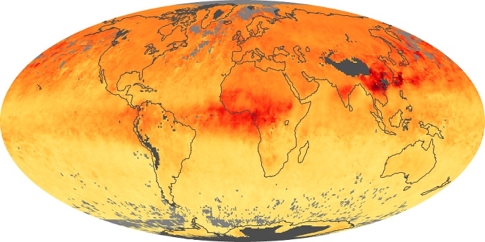
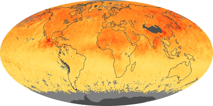
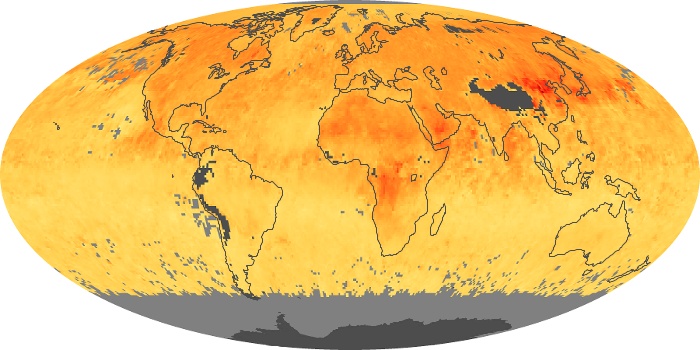
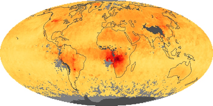
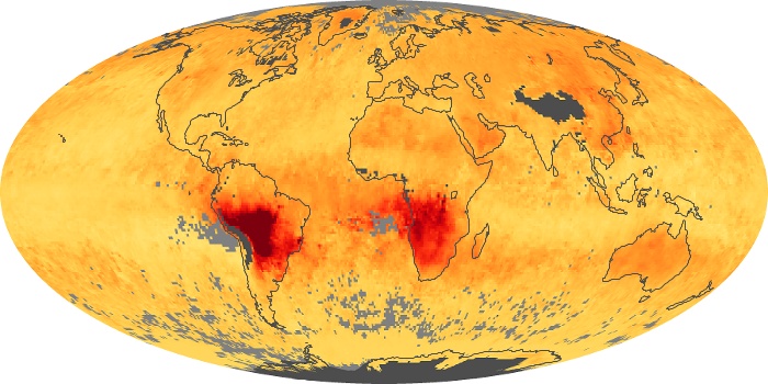
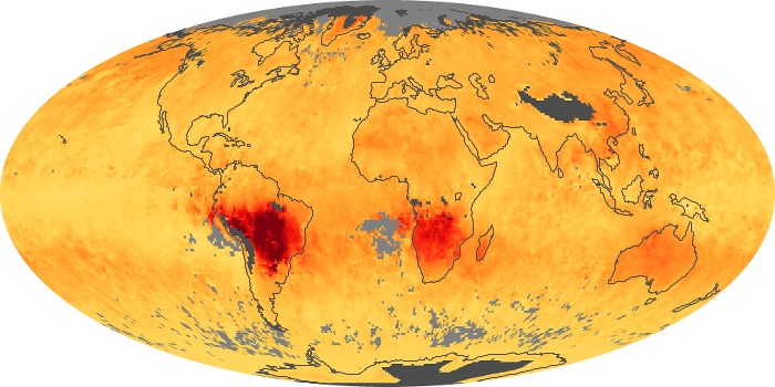
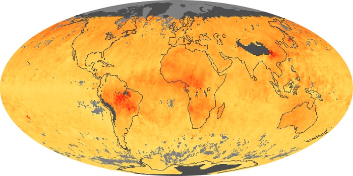
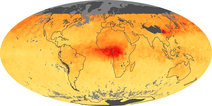
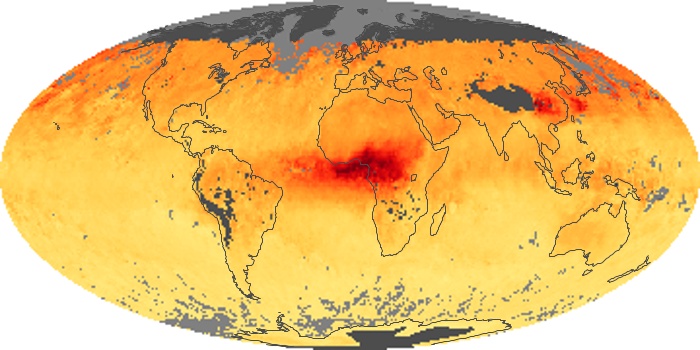
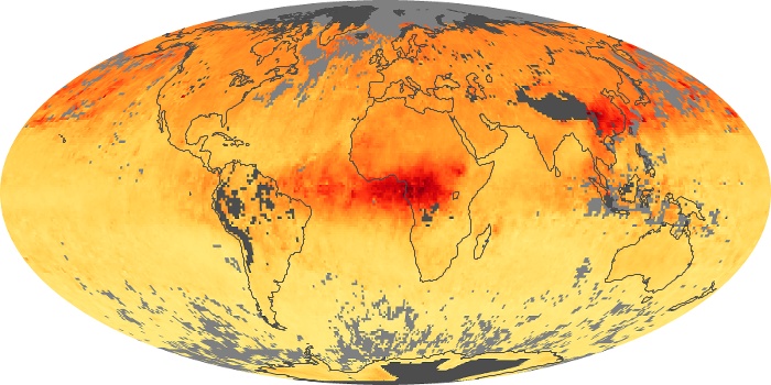
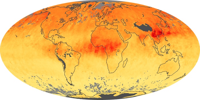
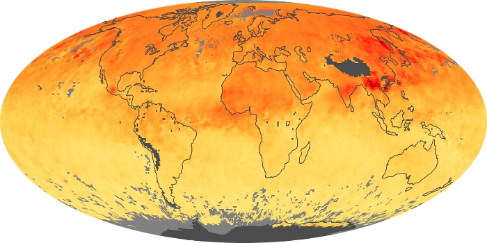
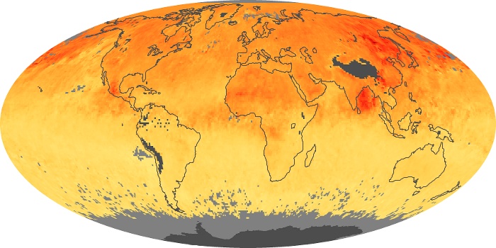
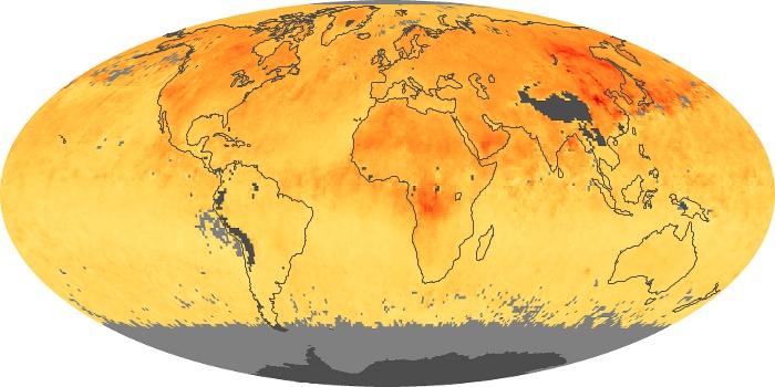
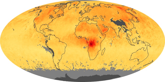
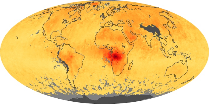
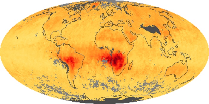
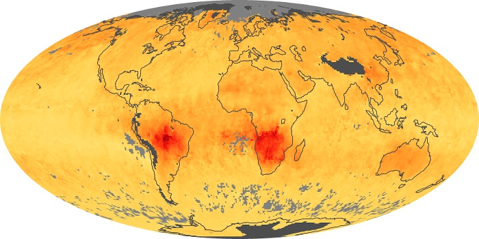
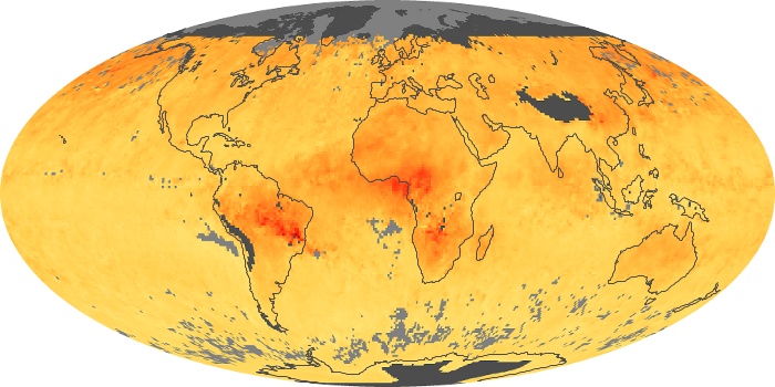
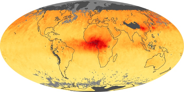
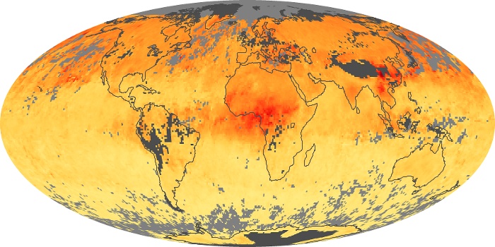
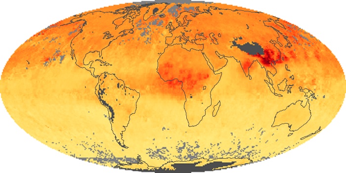
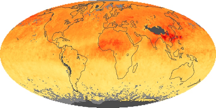
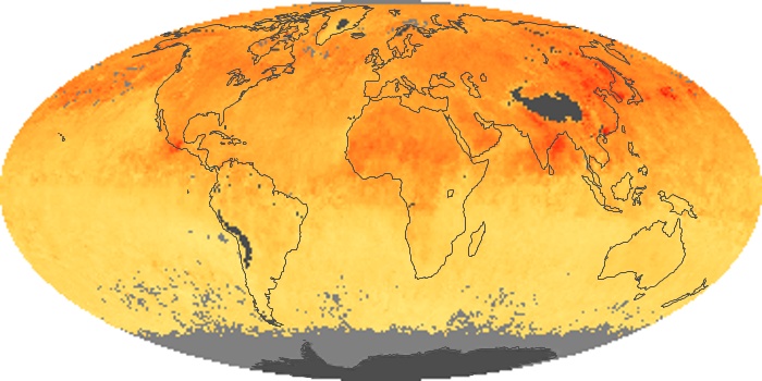
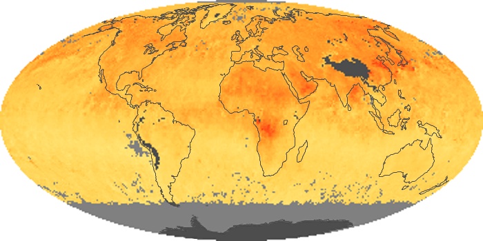
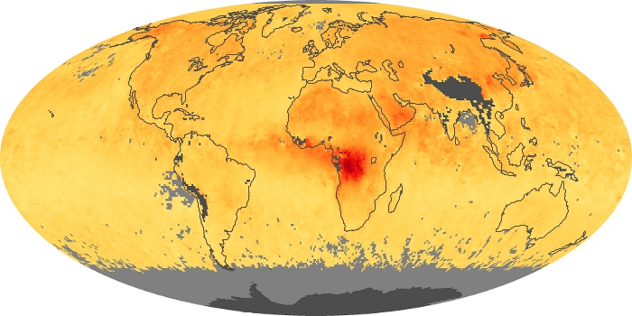
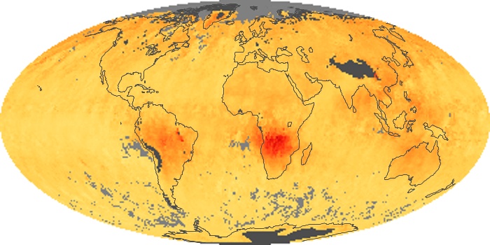
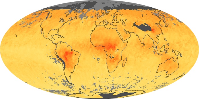
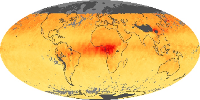
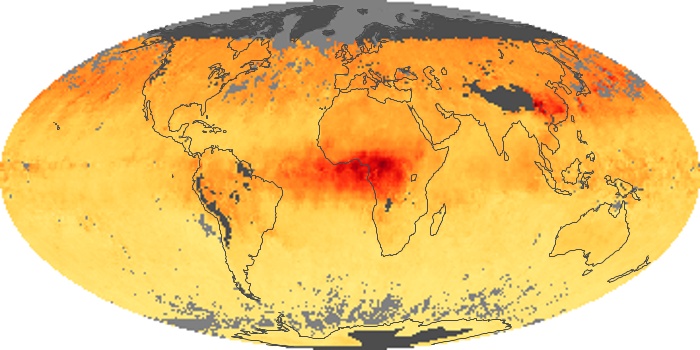
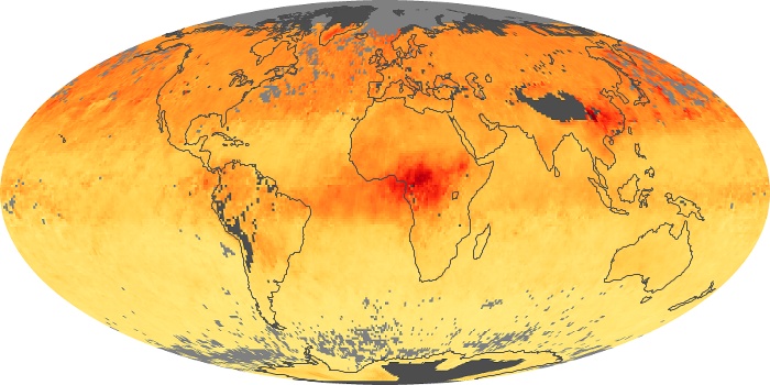
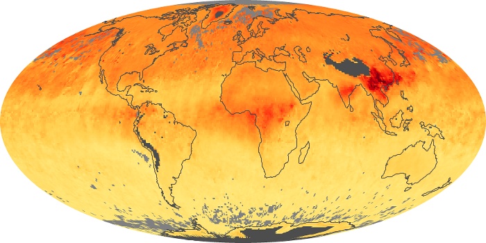
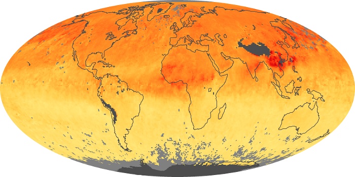
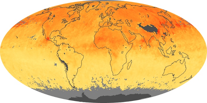
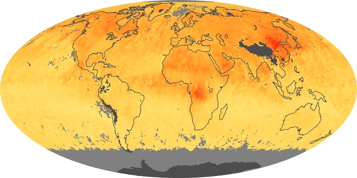
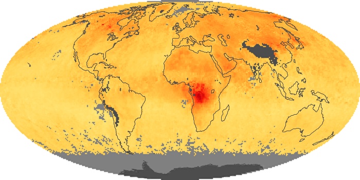
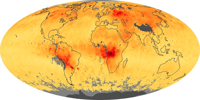
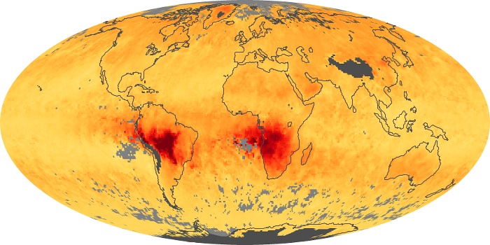
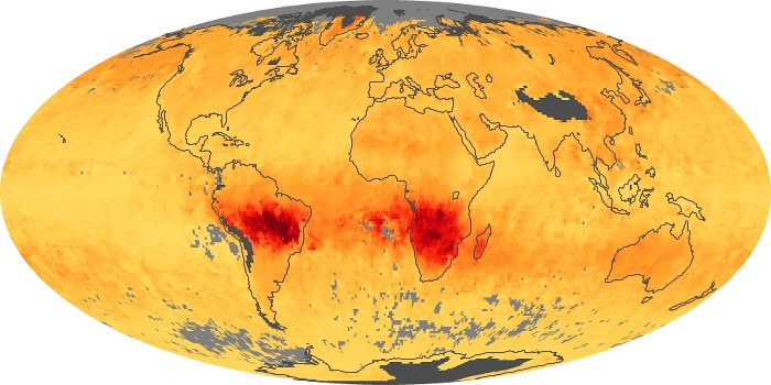
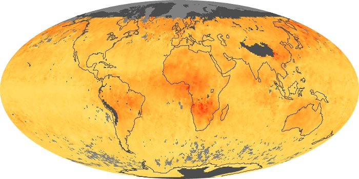
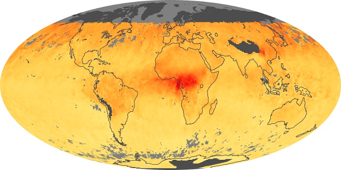
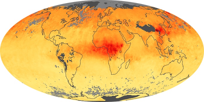
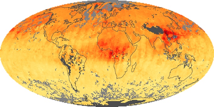
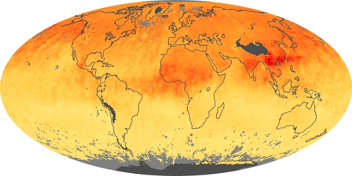
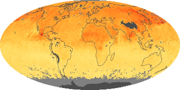
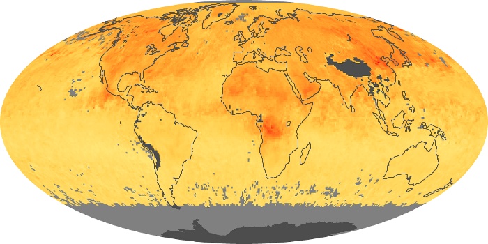
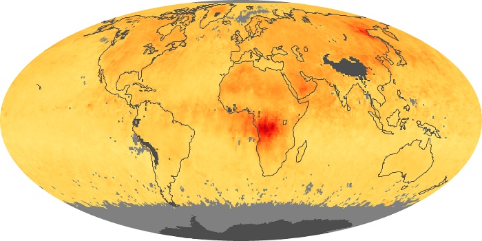
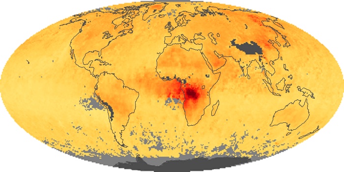
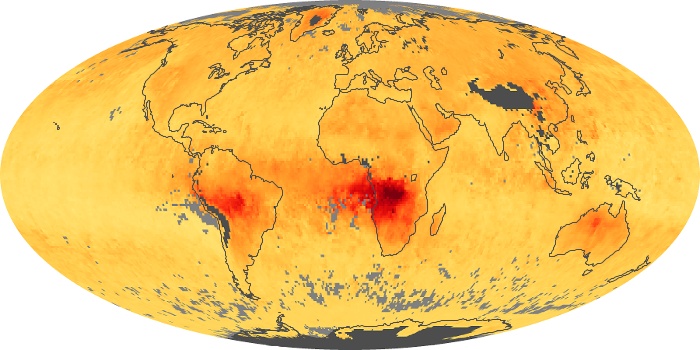
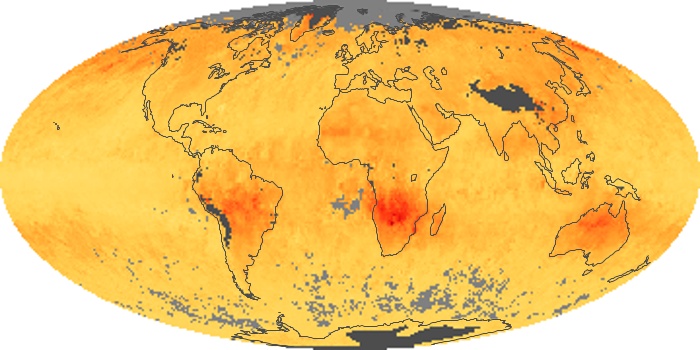
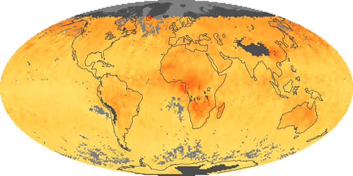
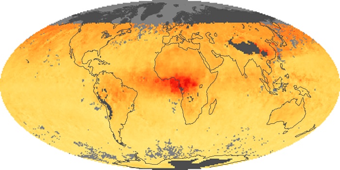
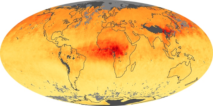
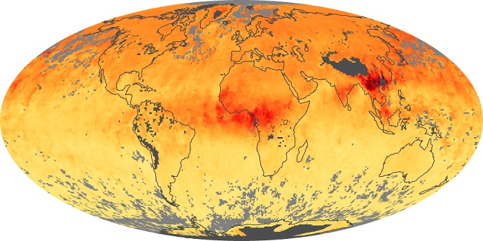
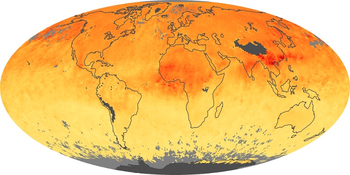
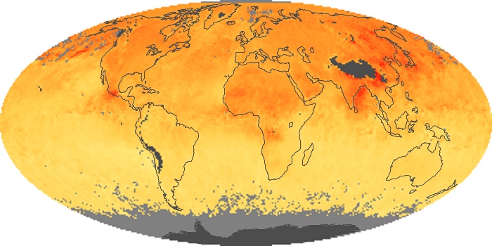
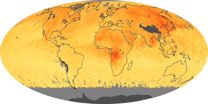
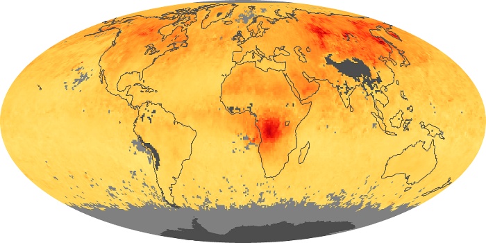
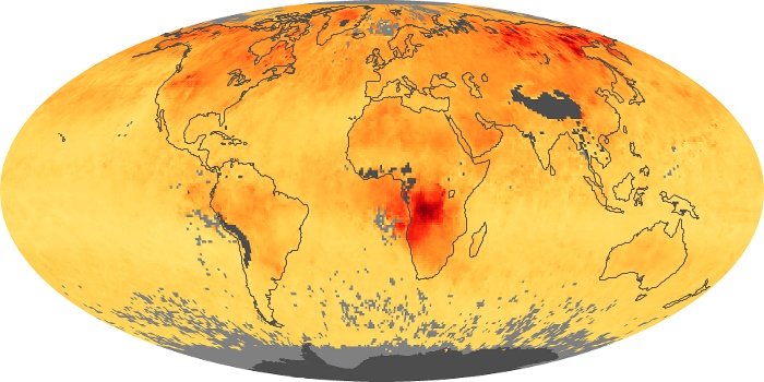
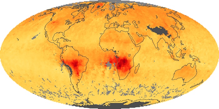
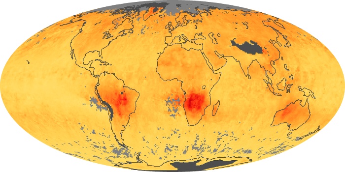
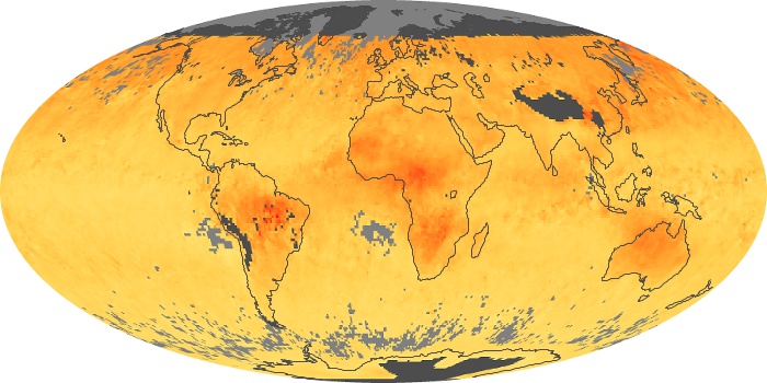
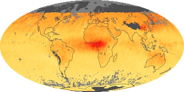
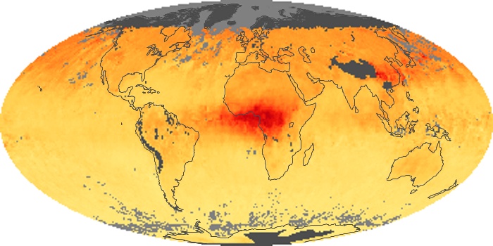
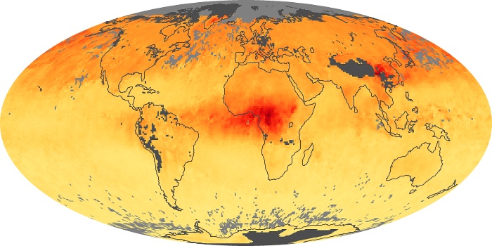
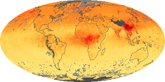
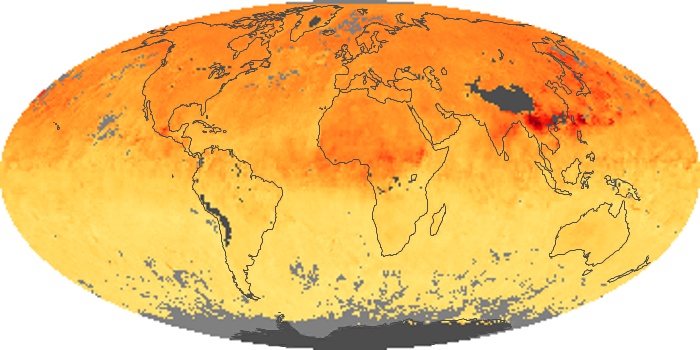
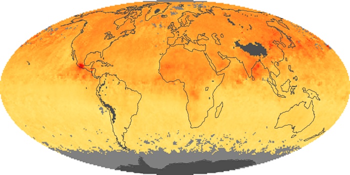
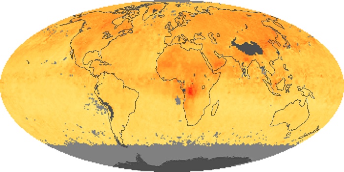
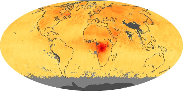
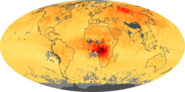
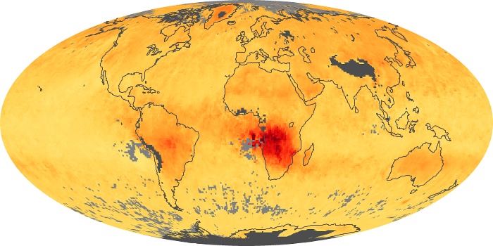
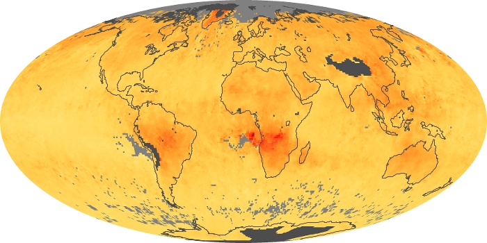
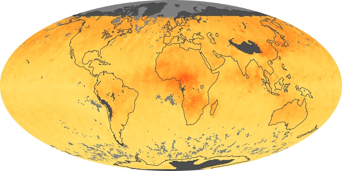
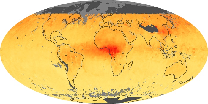
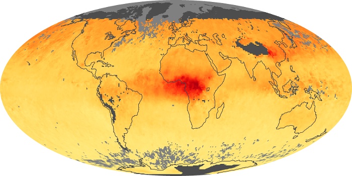
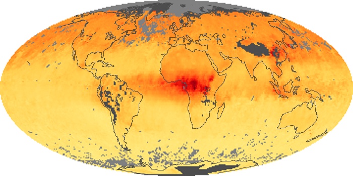
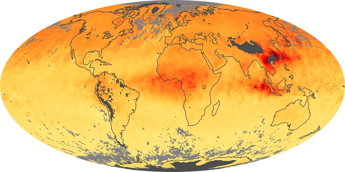
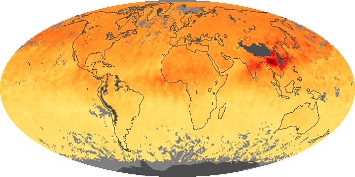
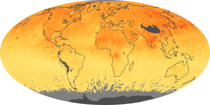
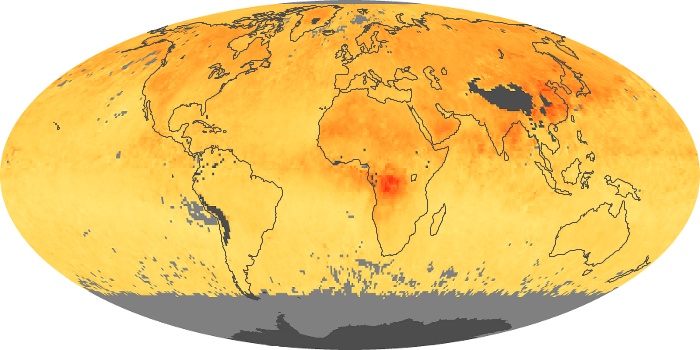
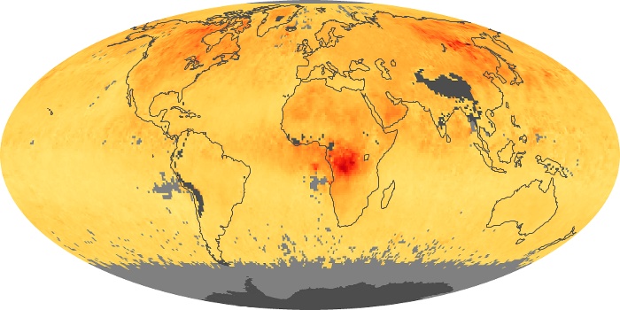
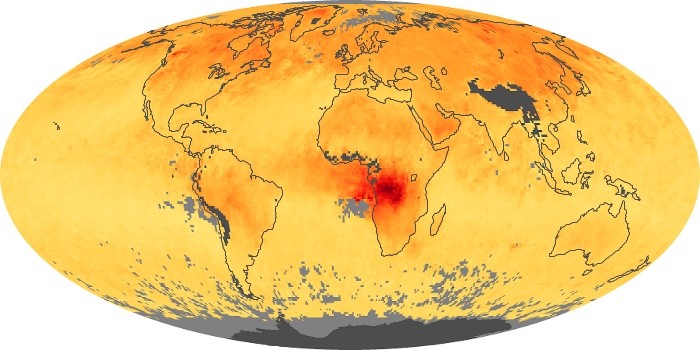
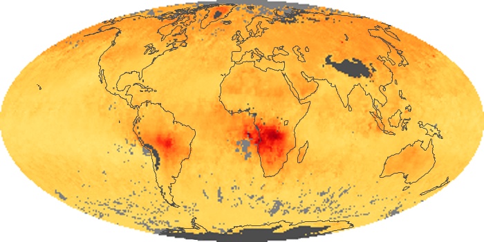
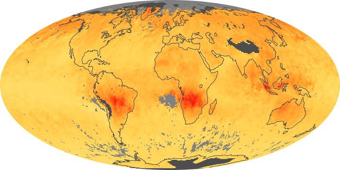
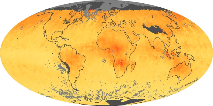
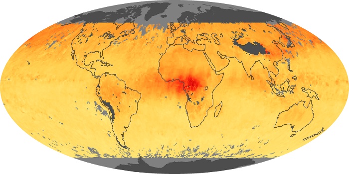
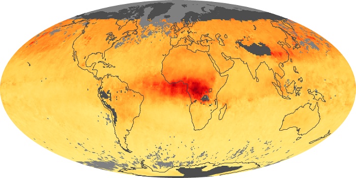
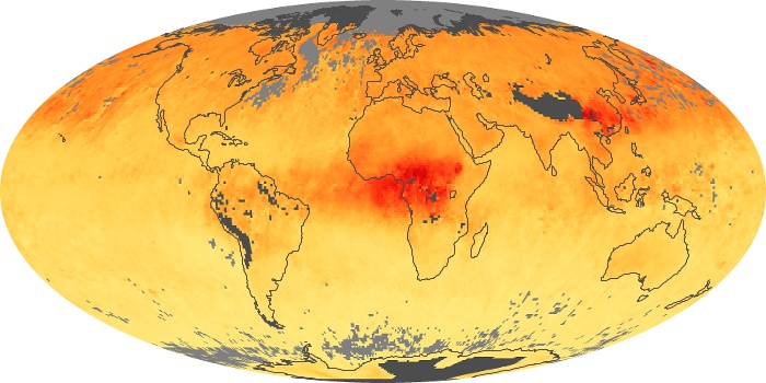
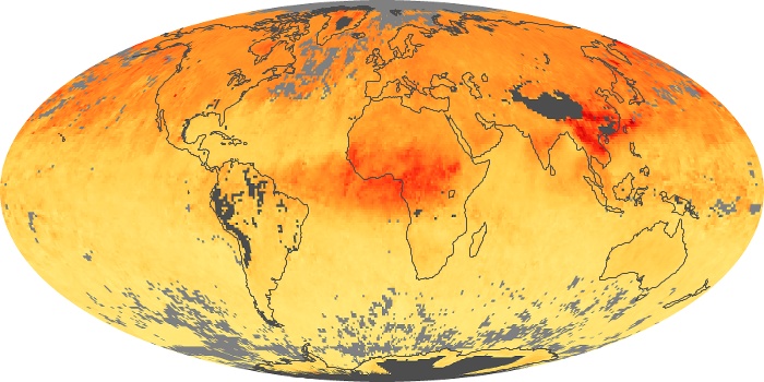
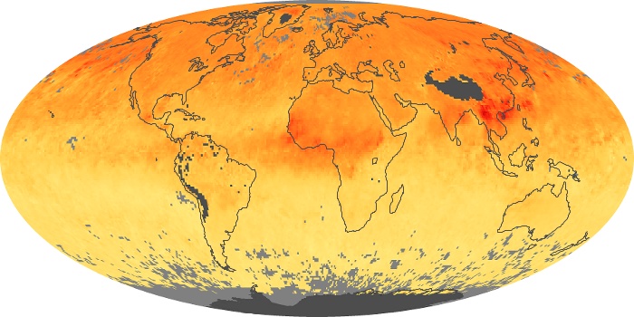
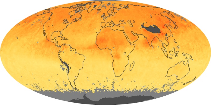
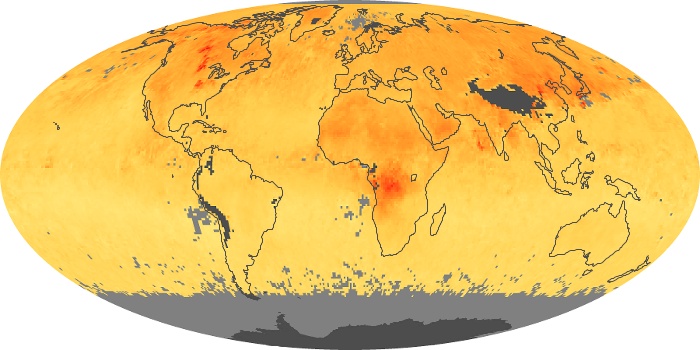
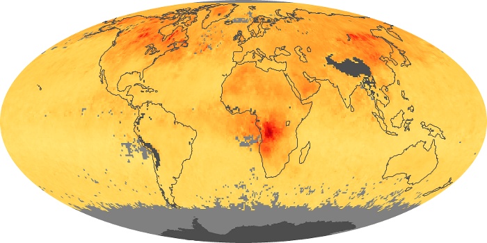
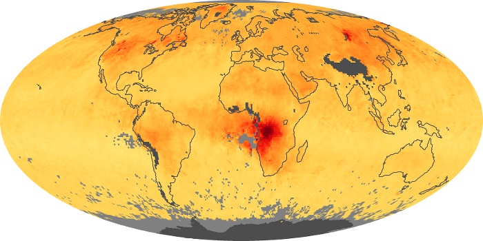
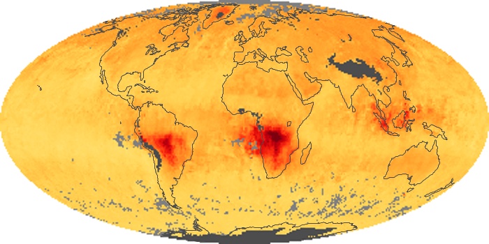
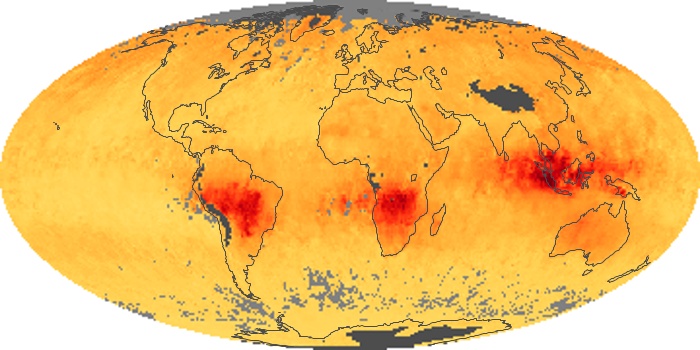
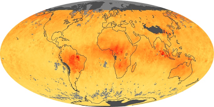
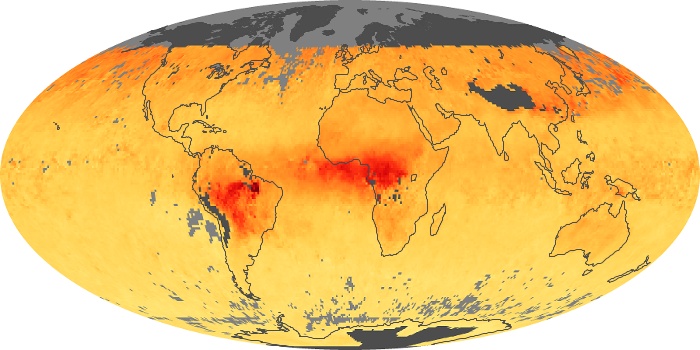
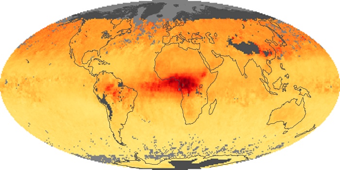
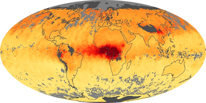
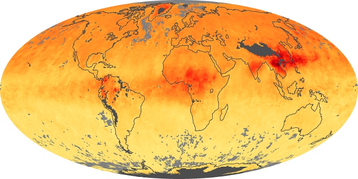
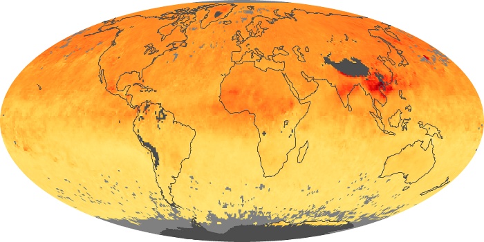
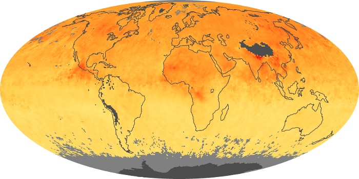
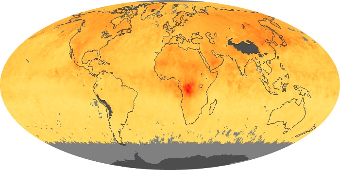
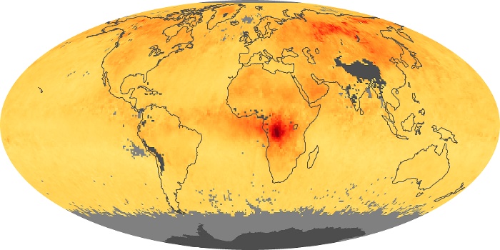
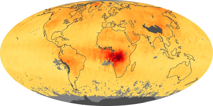
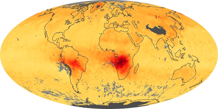
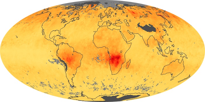
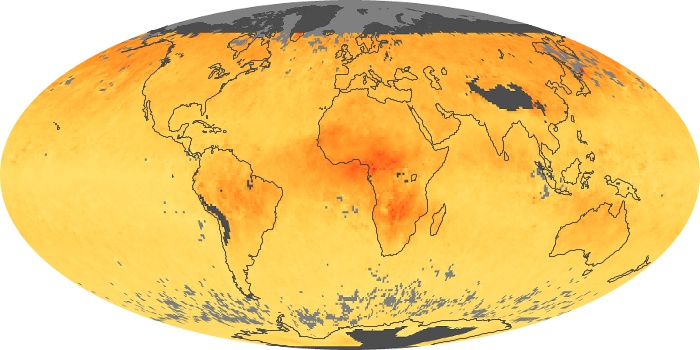
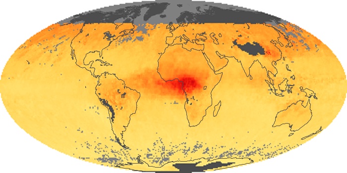
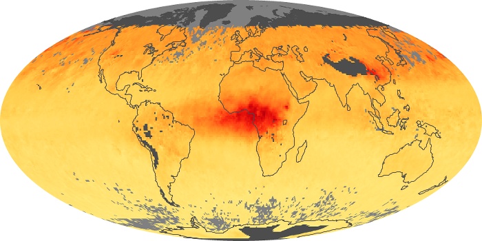
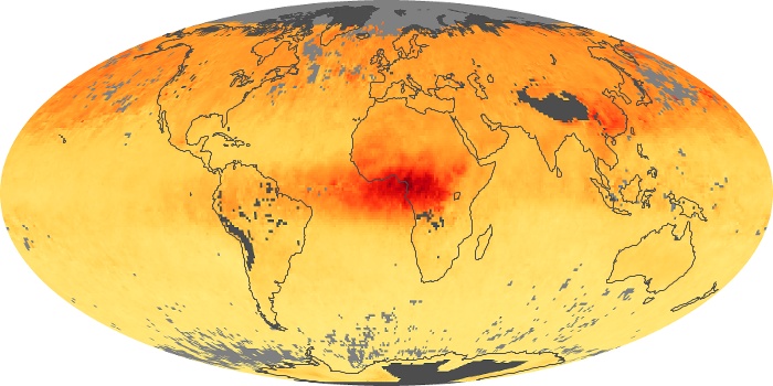
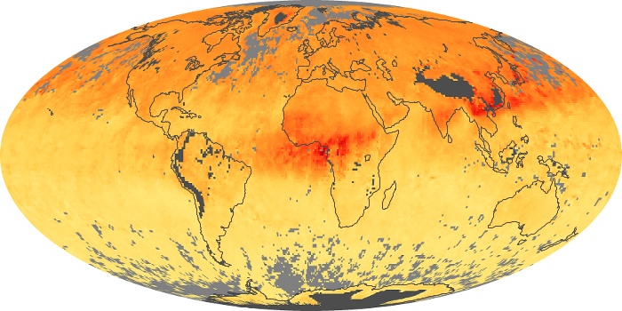
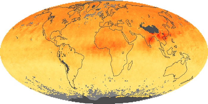
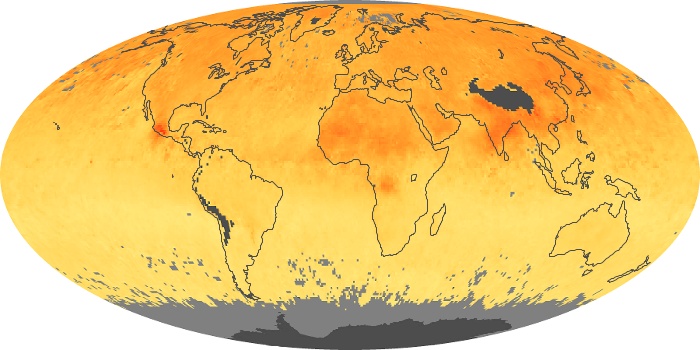
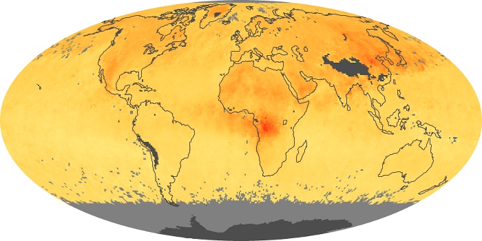
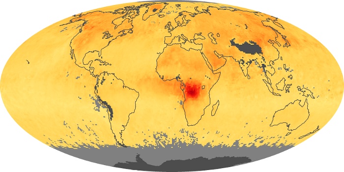
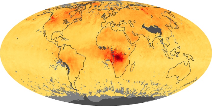
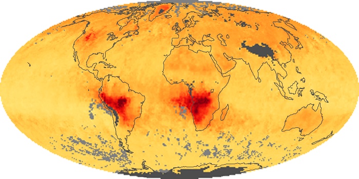
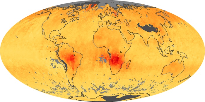
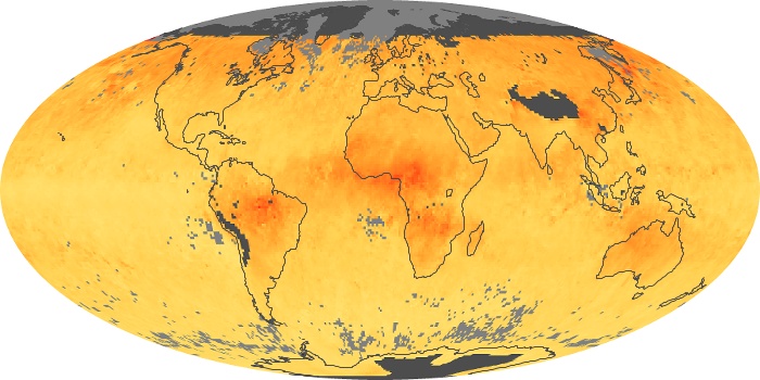
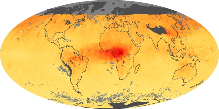
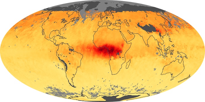
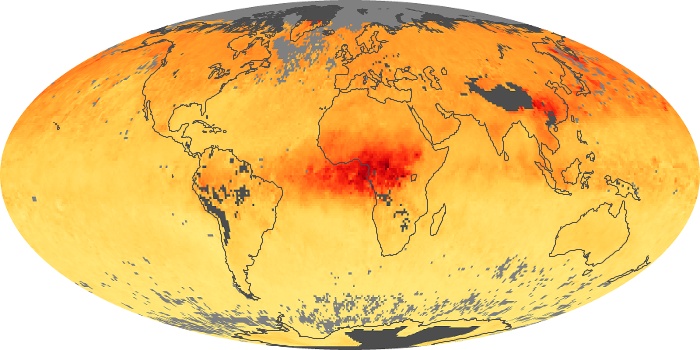
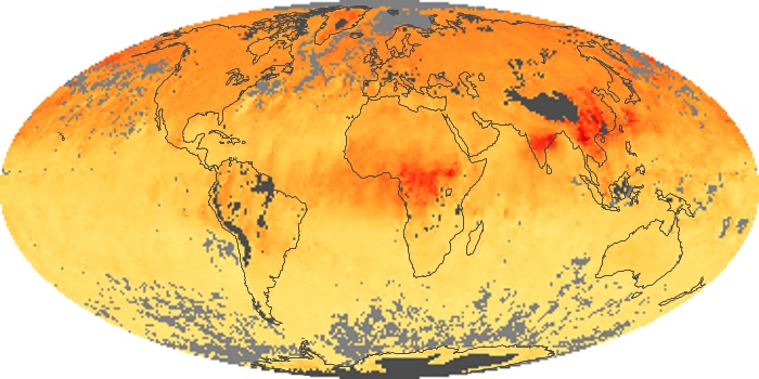
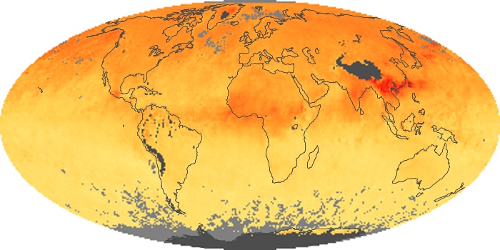
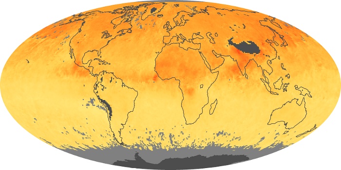
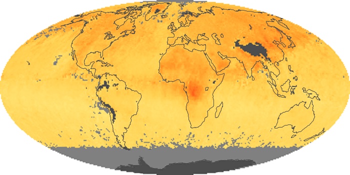
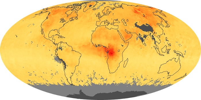
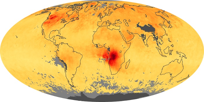
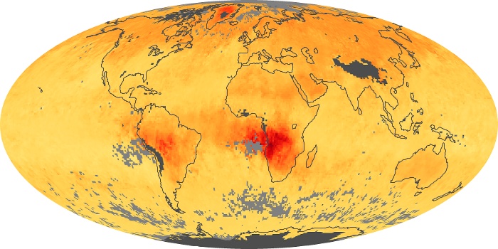
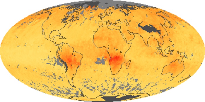
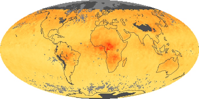
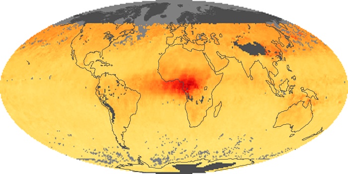
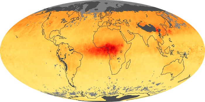
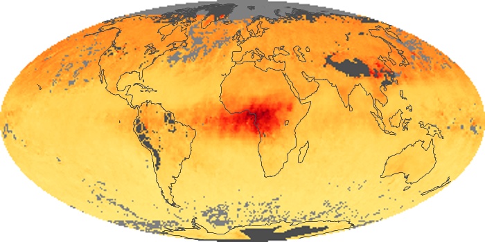
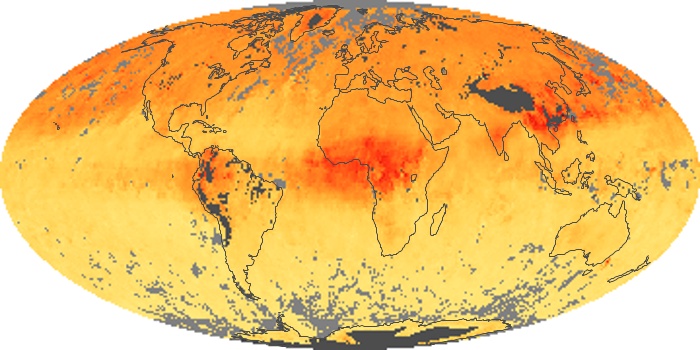
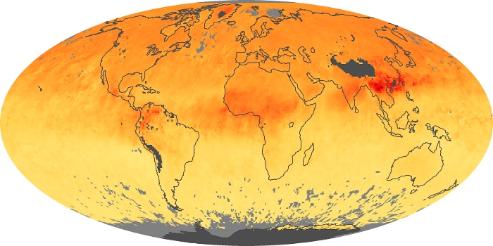
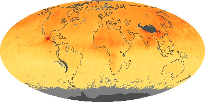
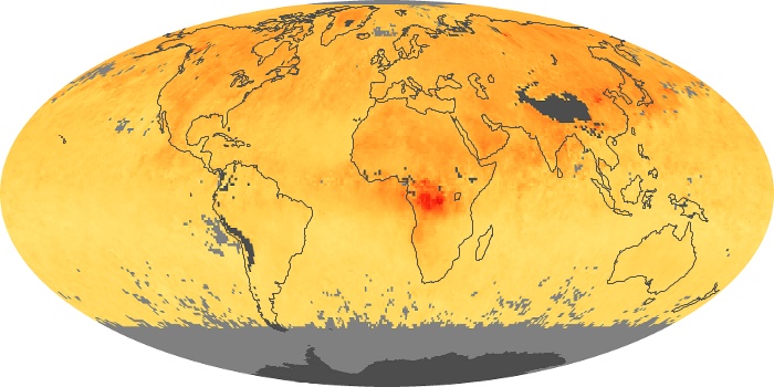
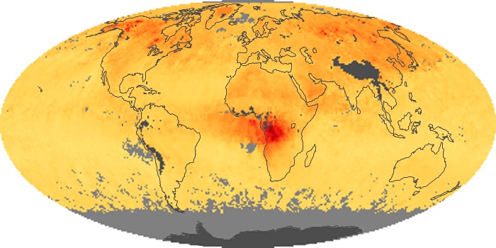
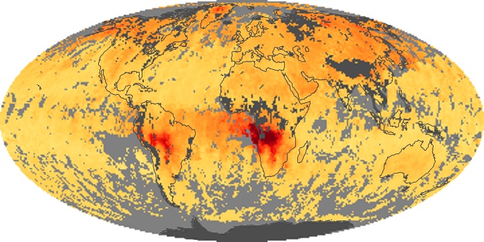
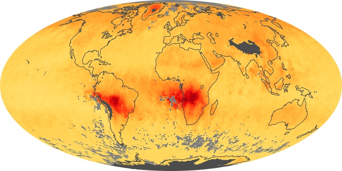
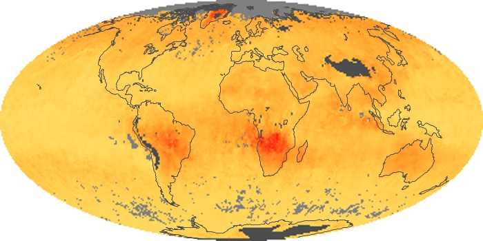
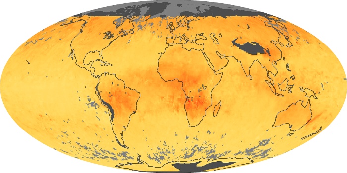
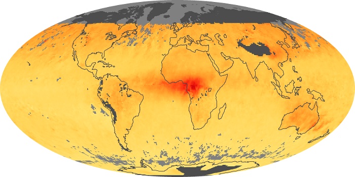
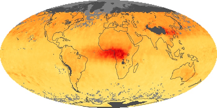
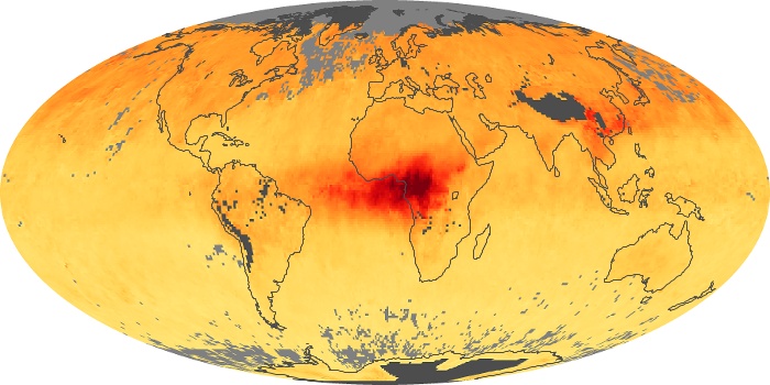
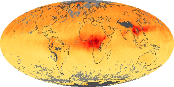
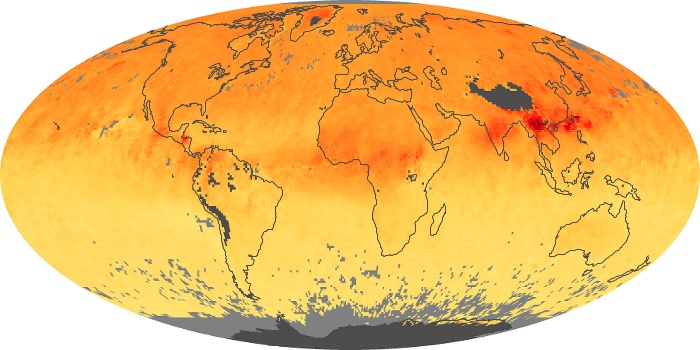
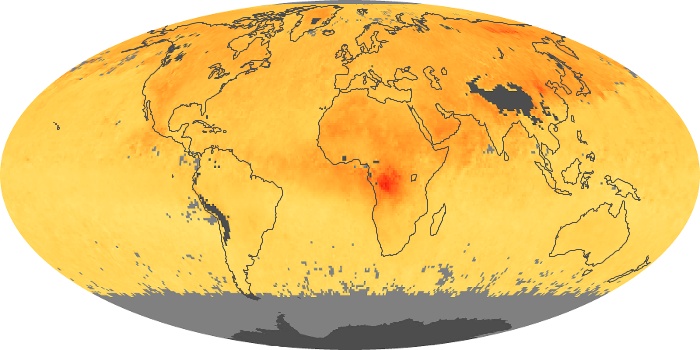
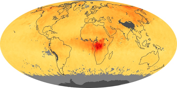
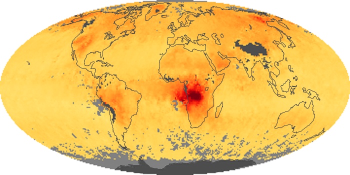
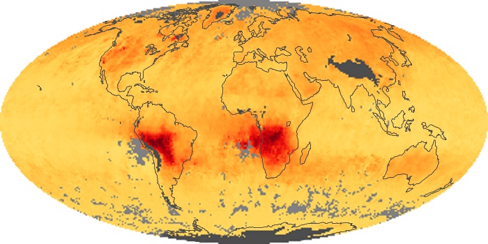
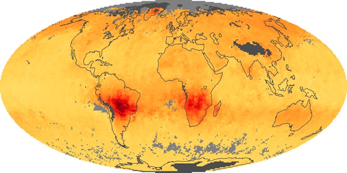
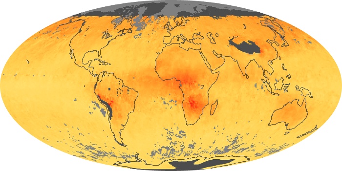
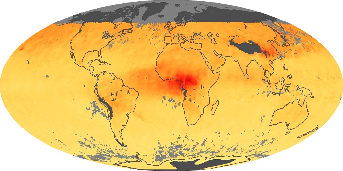
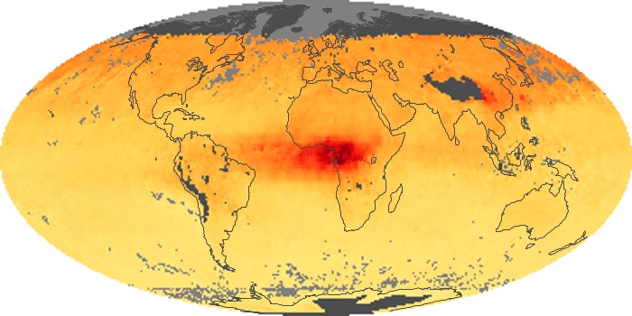
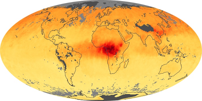
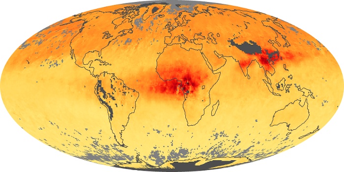
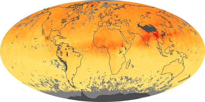
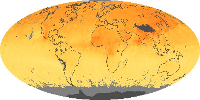
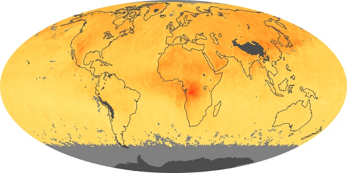
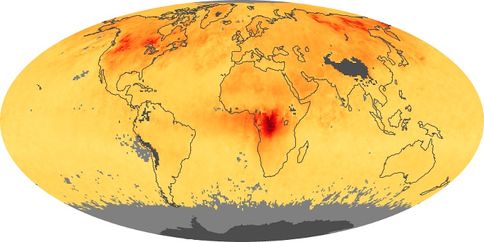
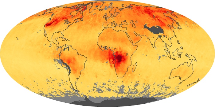
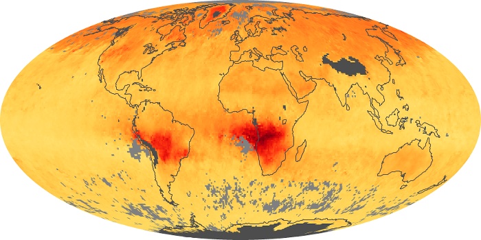
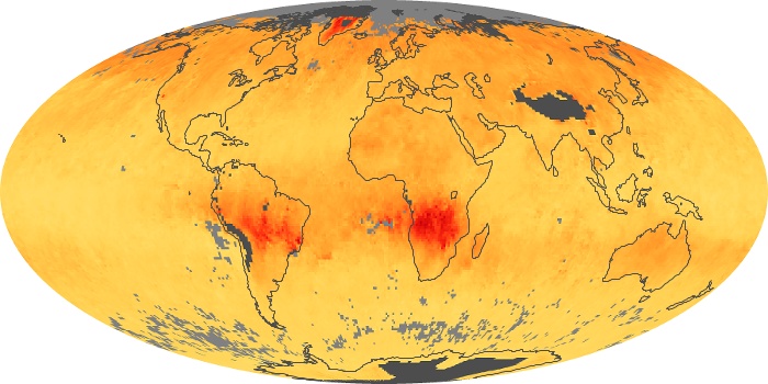
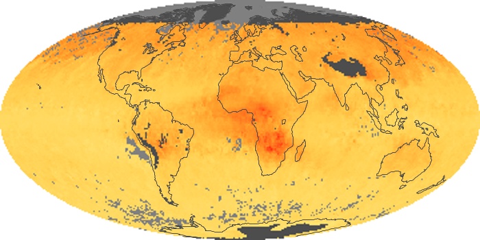
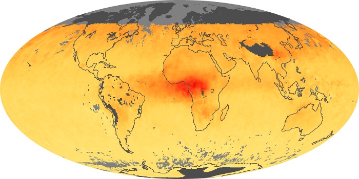
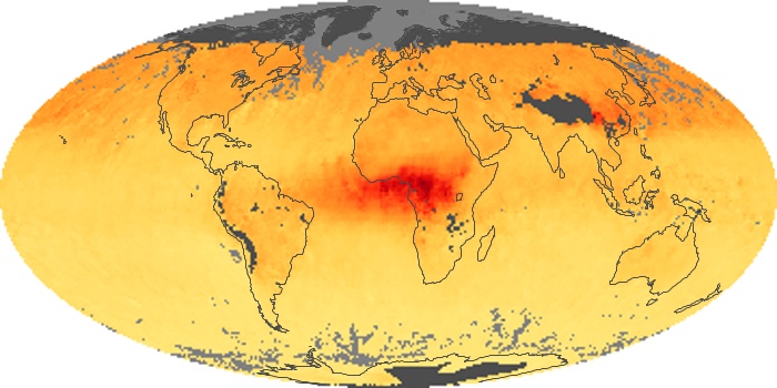
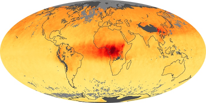
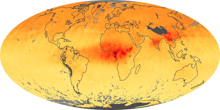
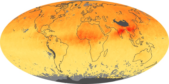
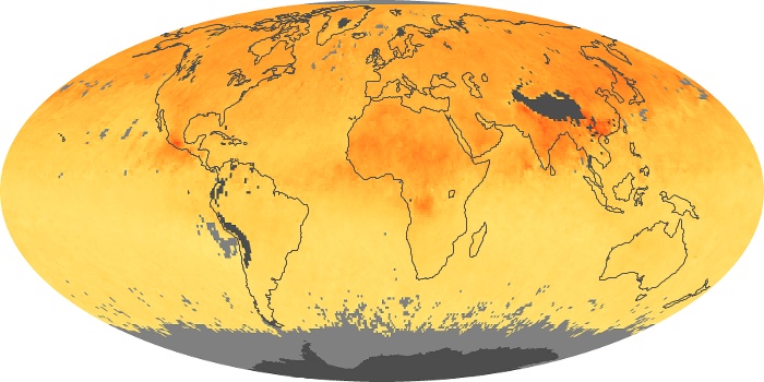
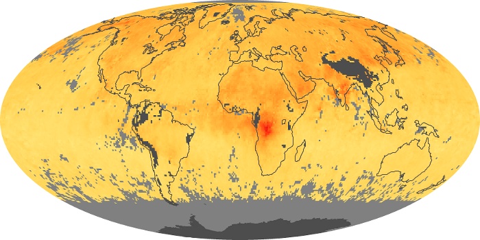
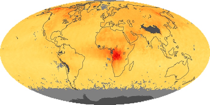
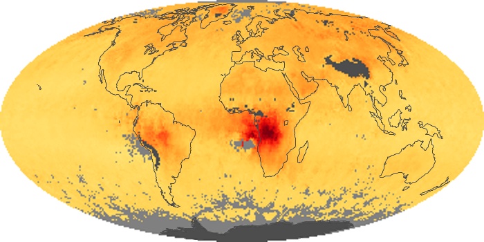
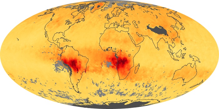
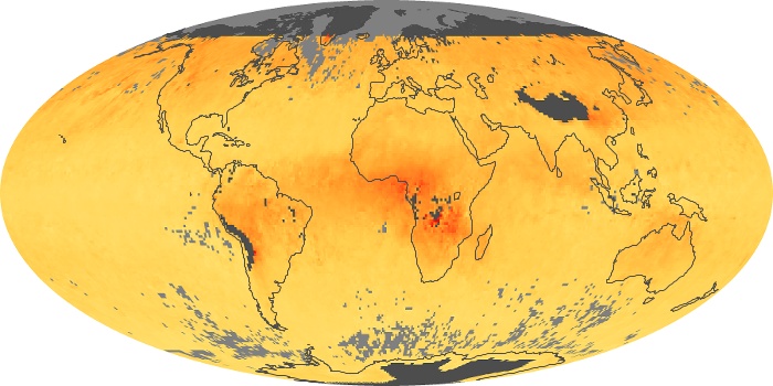
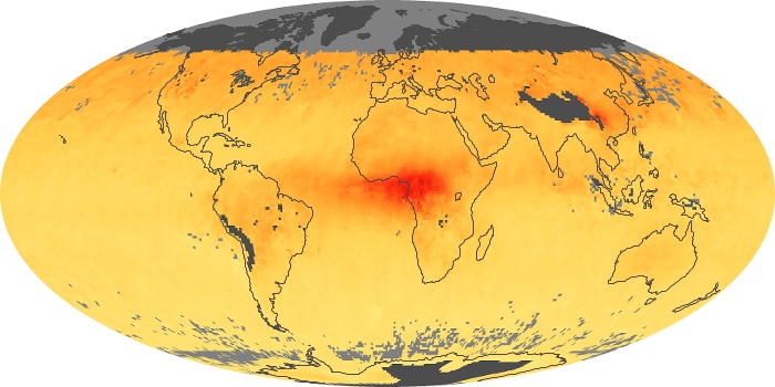
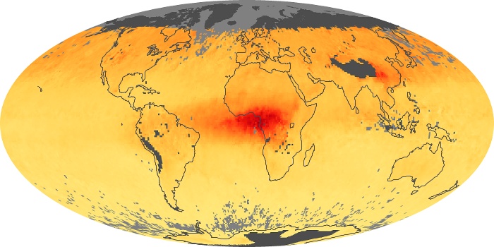
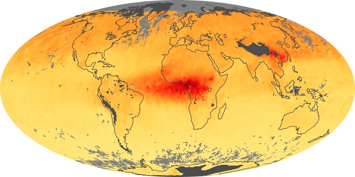
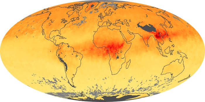
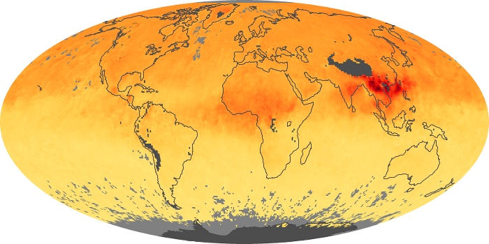
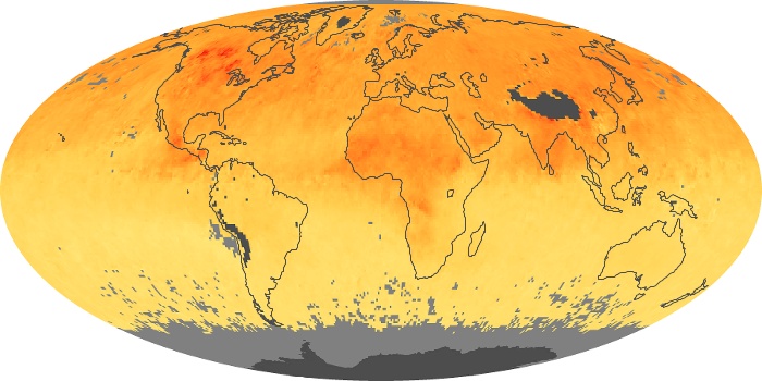
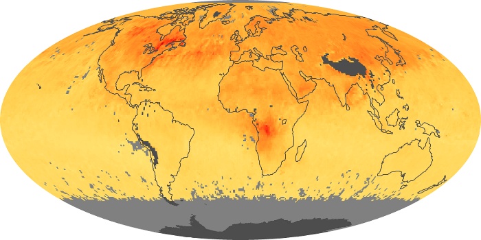
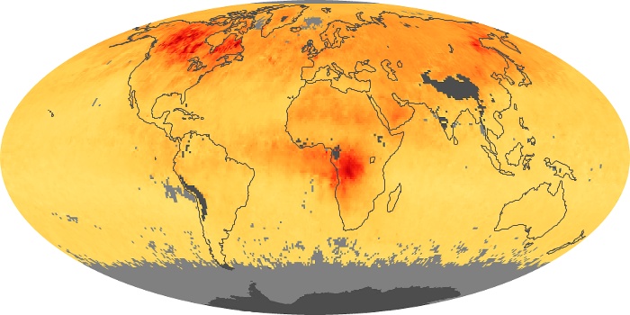
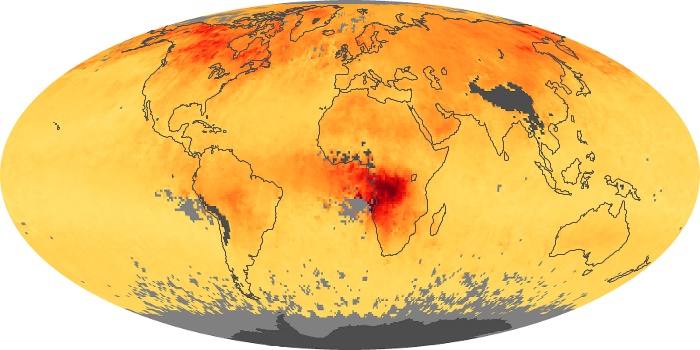
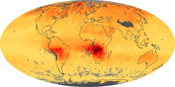
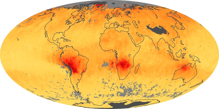
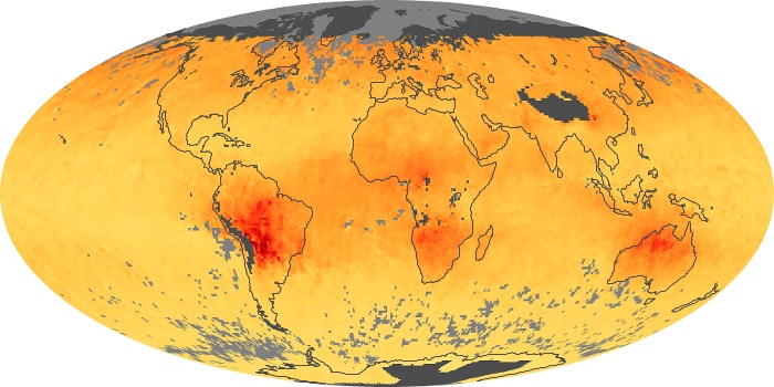
The carbon monoxide maps show the monthly averages of carbon monoxide at an altitude of about 12,000 feet, based on data from the MOPITT sensor on NASA’s Terra satellite. Concentrations of carbon monoxide are expressed in parts per billion by volume (ppbv). A concentration of 1 ppbv means that for every billion molecules of gas in the measured volume, one of them is a carbon monoxide molecule. Yellow areas have little or no carbon monoxide, while progressively higher concentrations are shown in orange and red.
View, download, or analyze more of these data from NASA Earth Observations (NEO):
Land Surface Temperature Anomaly
Carbon Monoxide
