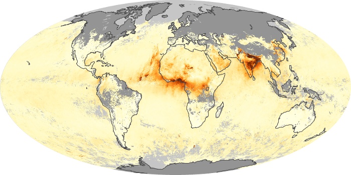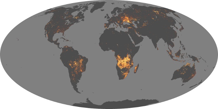
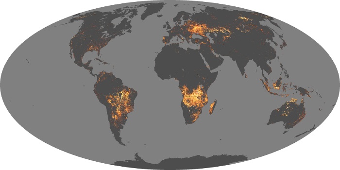
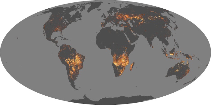
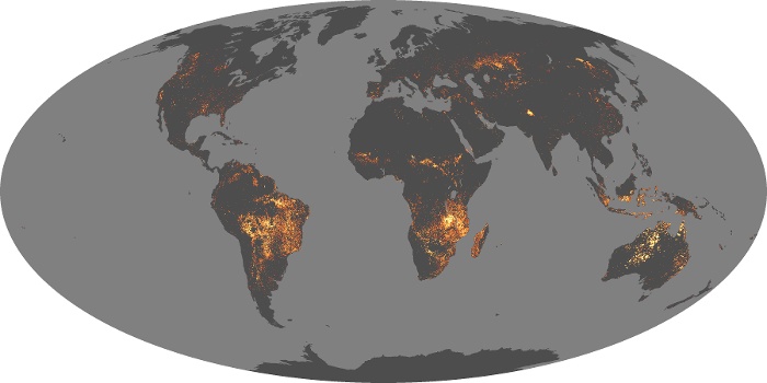
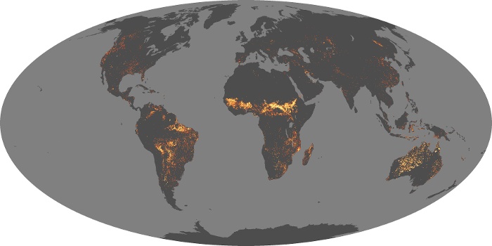
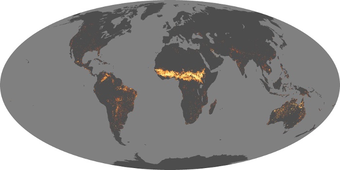
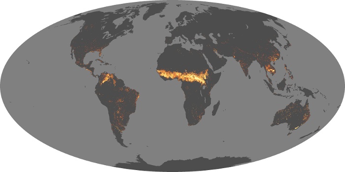

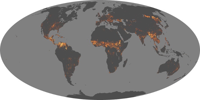
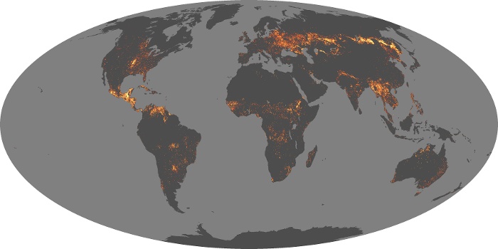
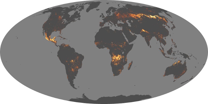

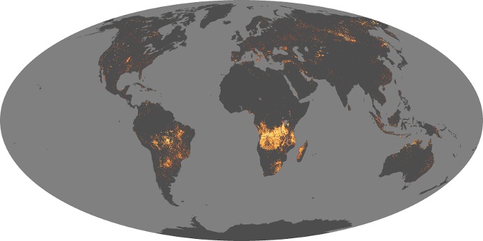
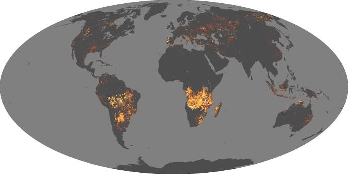
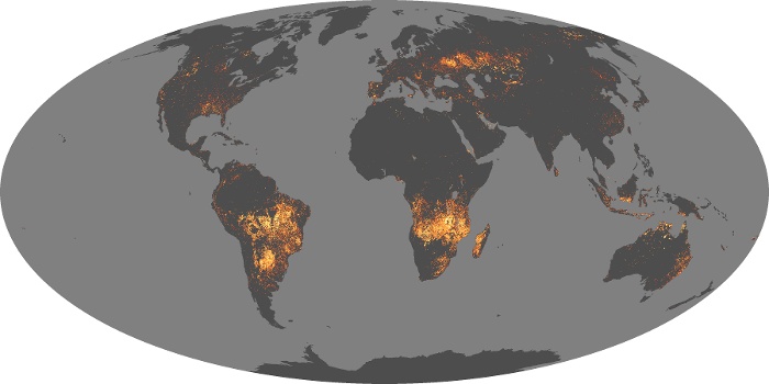
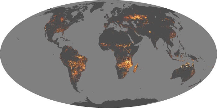
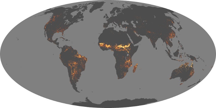


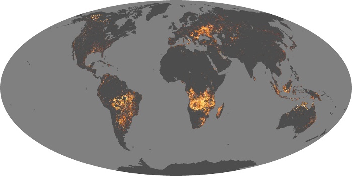
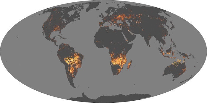
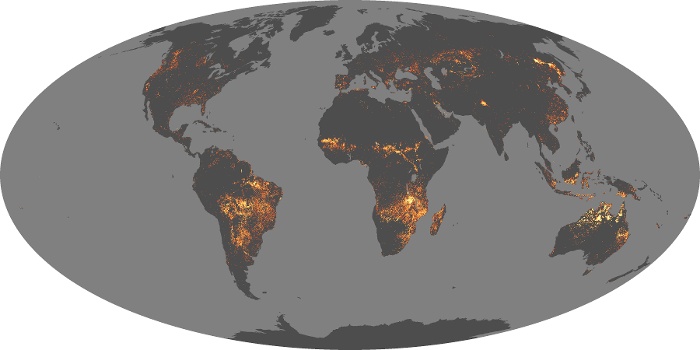
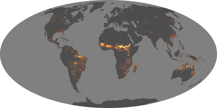
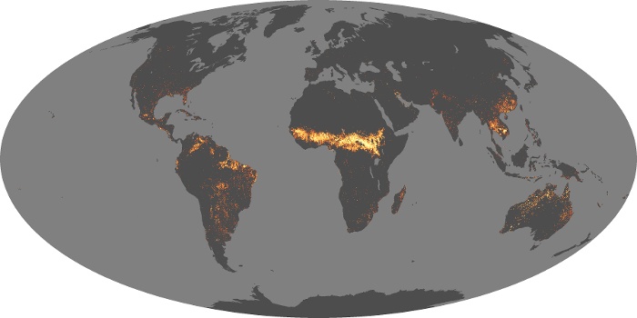

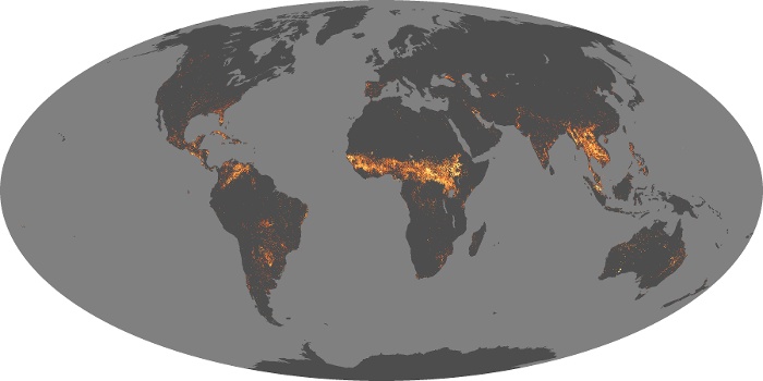


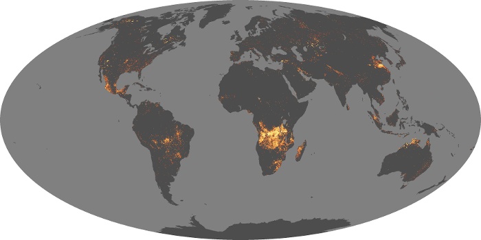
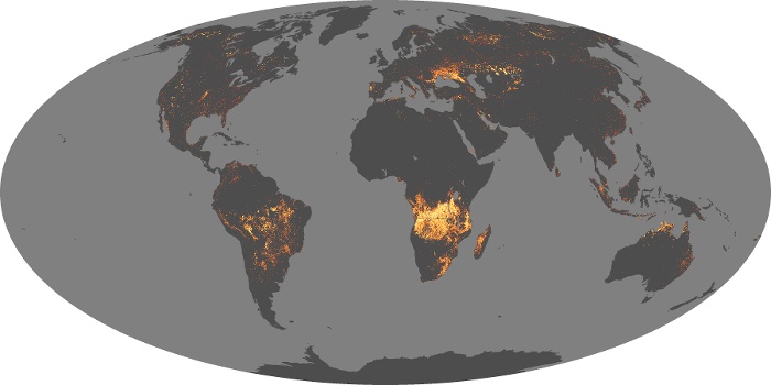
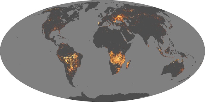
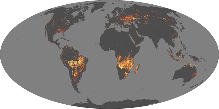
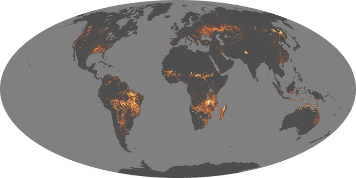
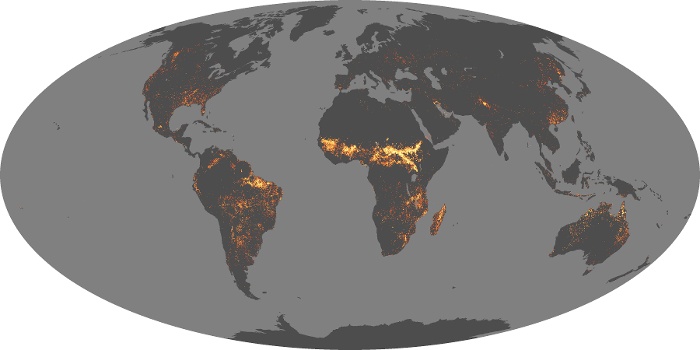


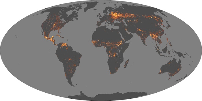
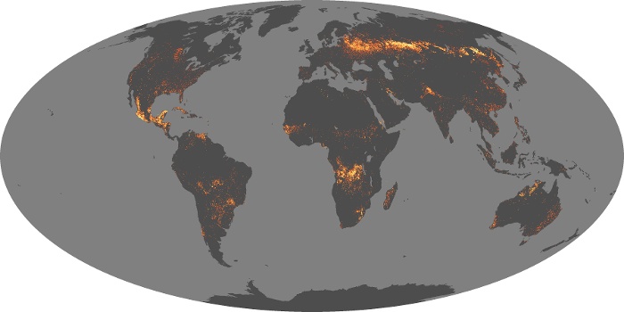
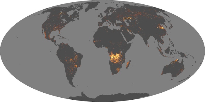


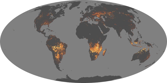
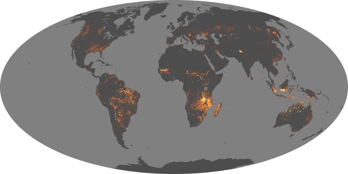
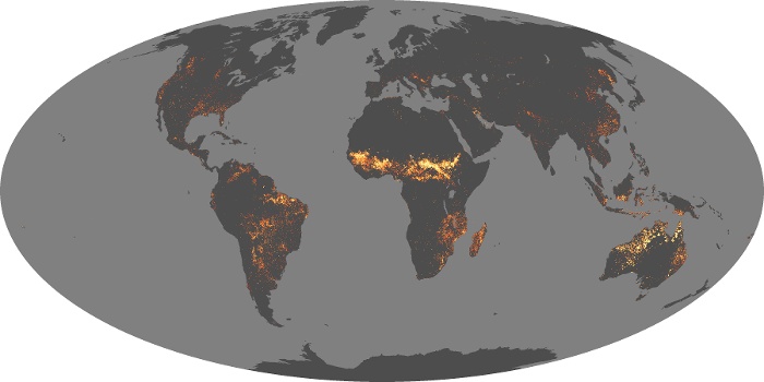

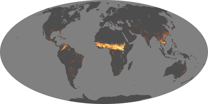


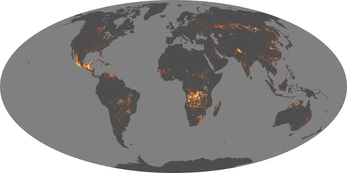

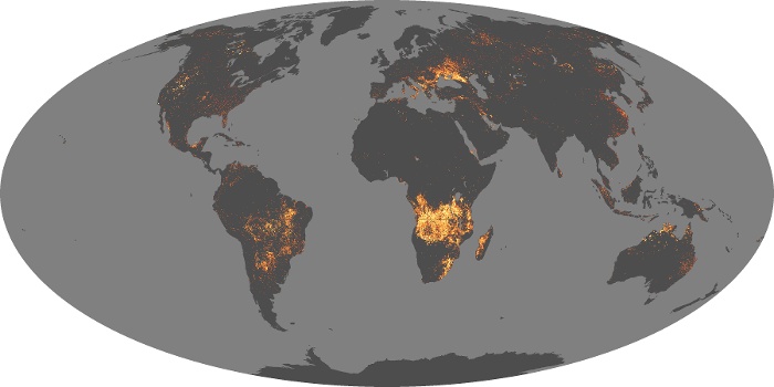
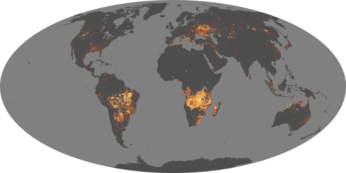
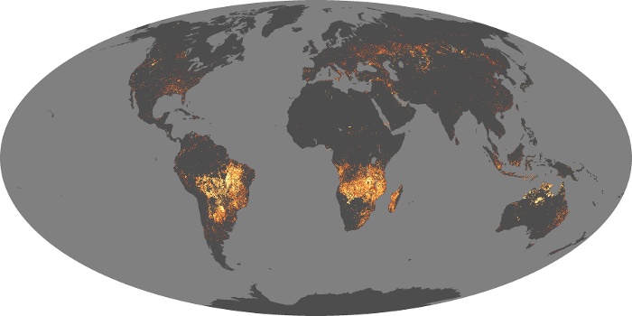
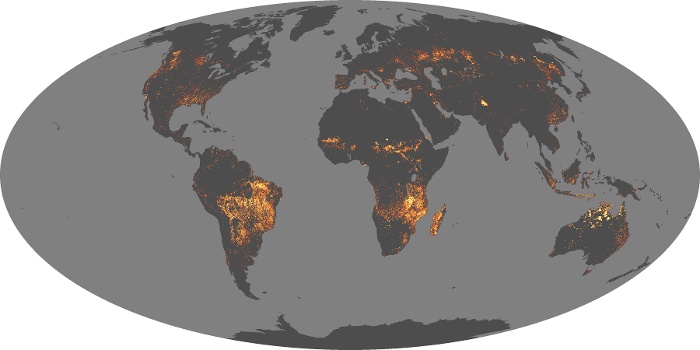
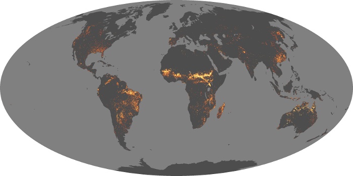

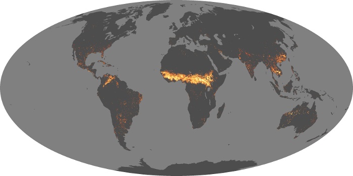


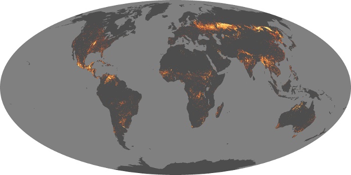
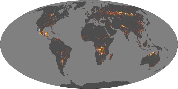


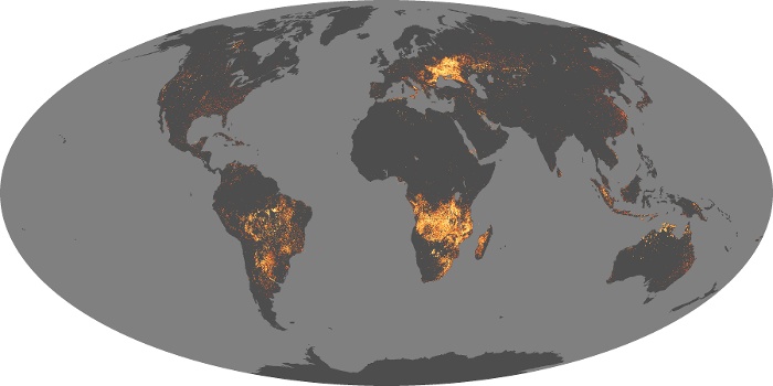
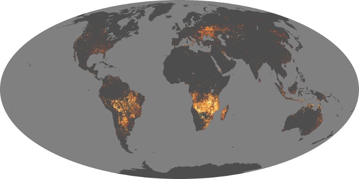
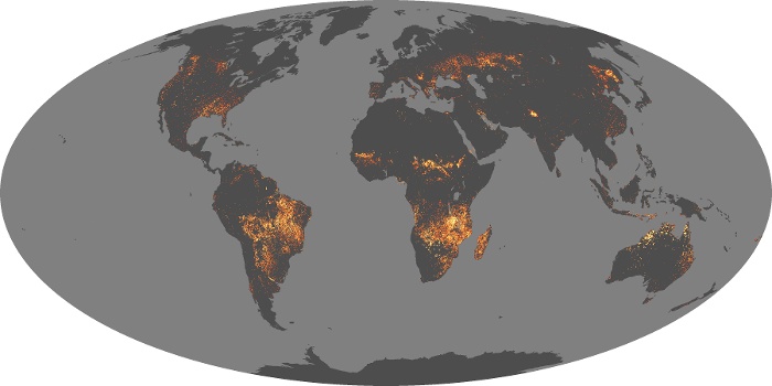
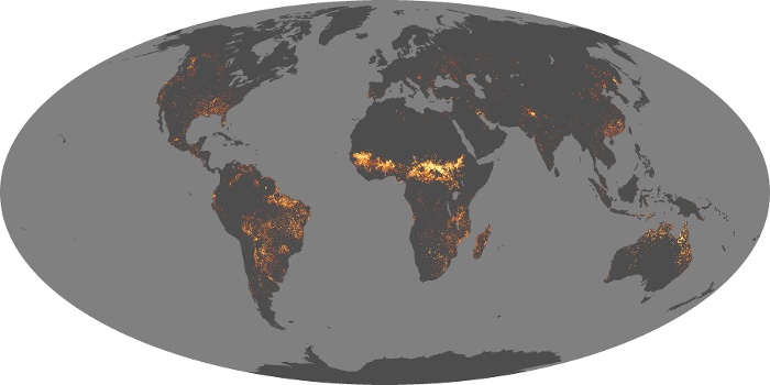
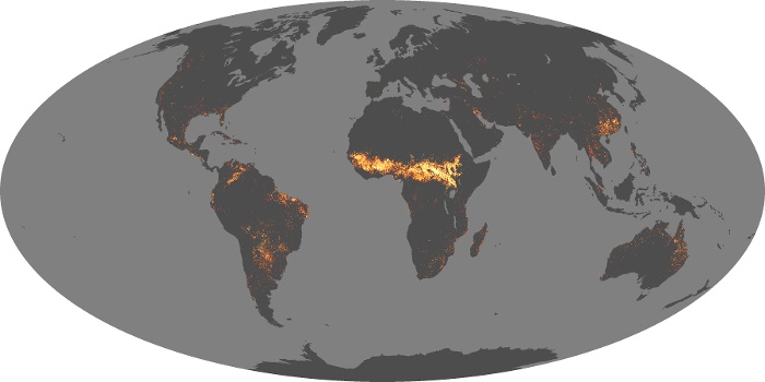

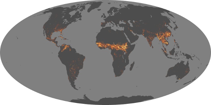


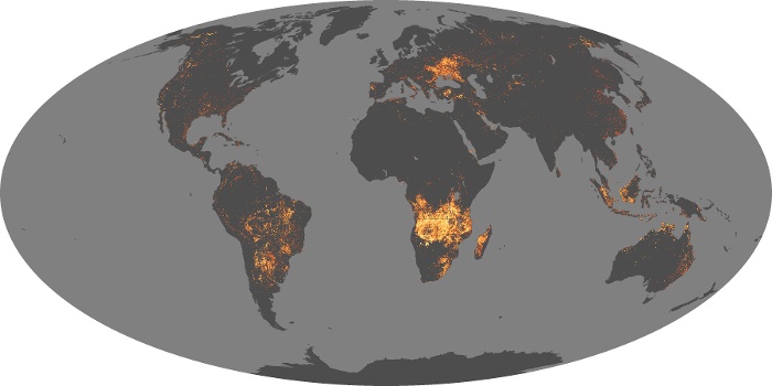
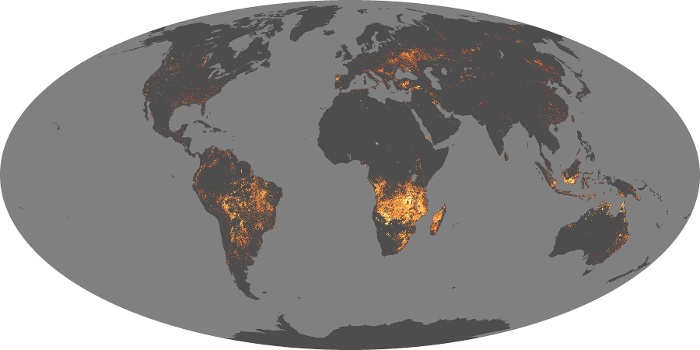
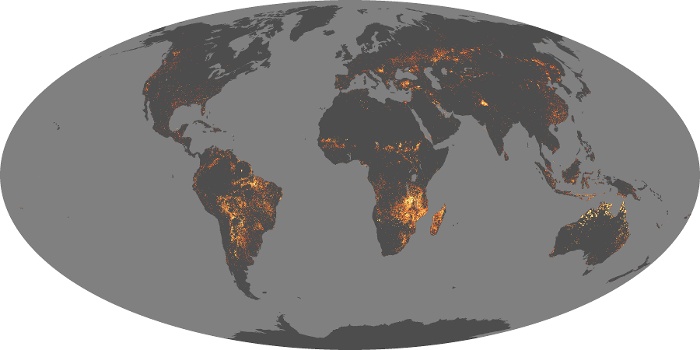
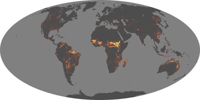


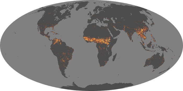


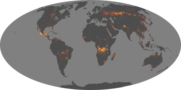


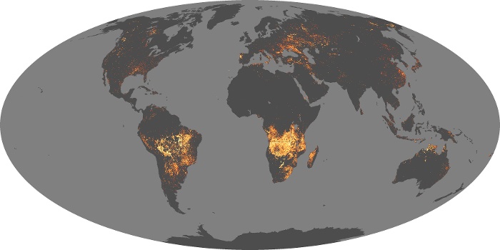
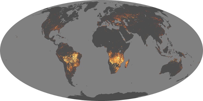
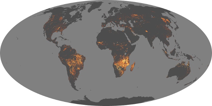
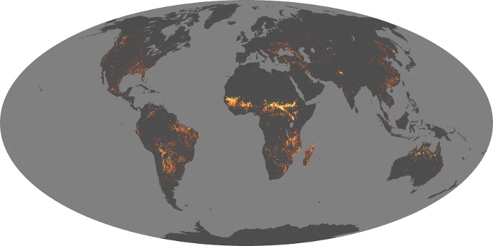

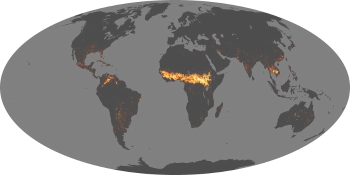

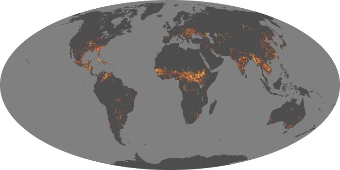


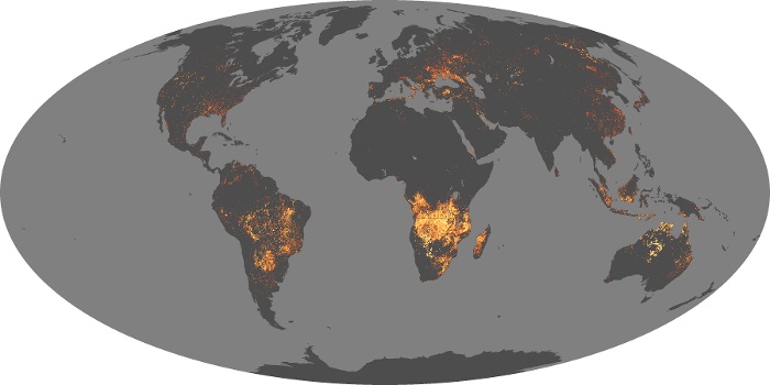
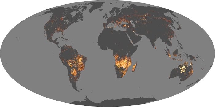


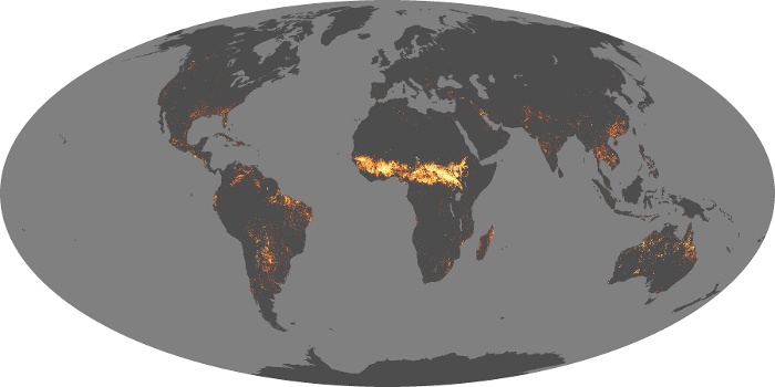
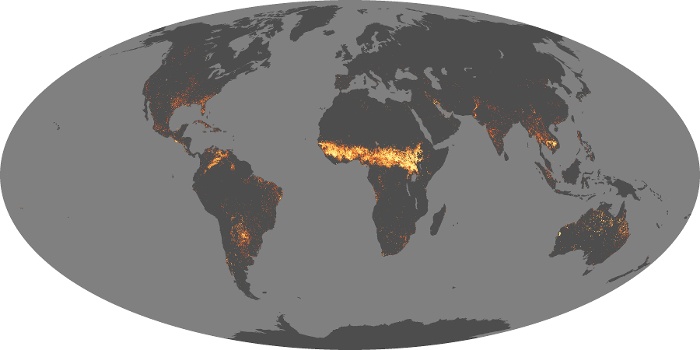


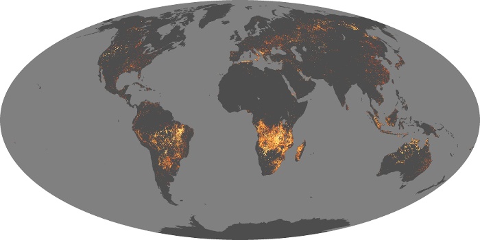
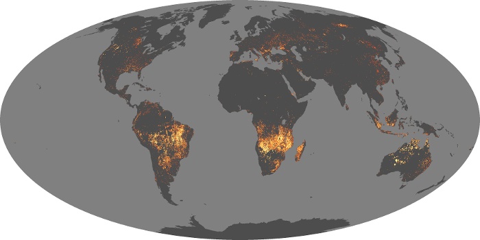
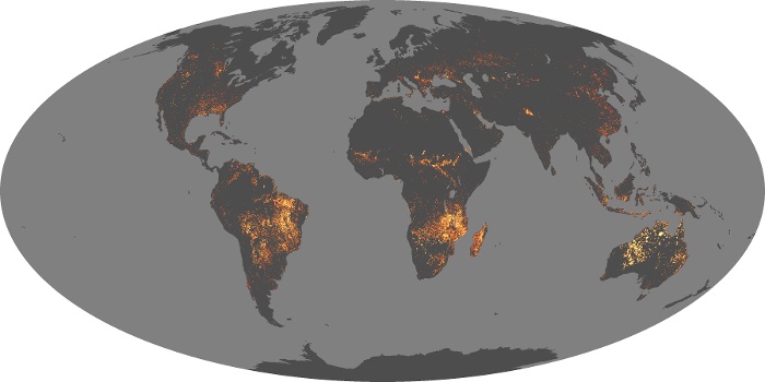
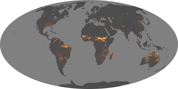

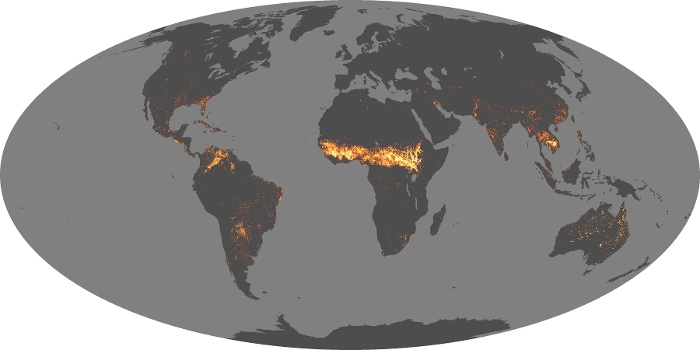


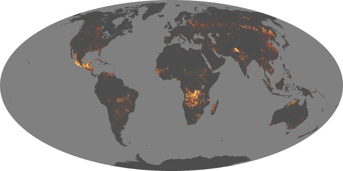
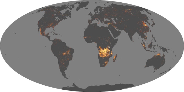


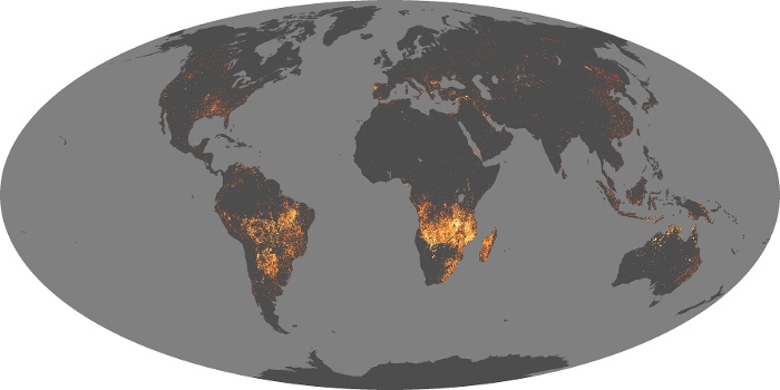
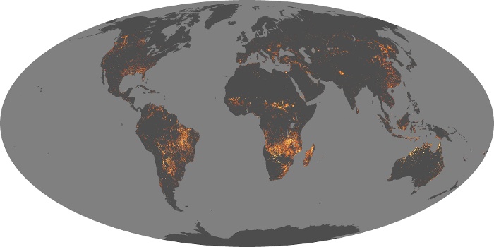
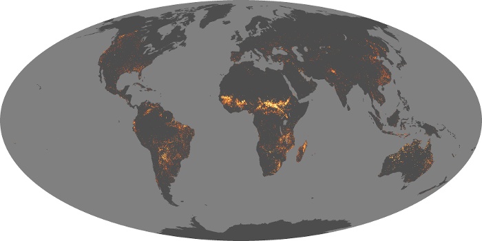
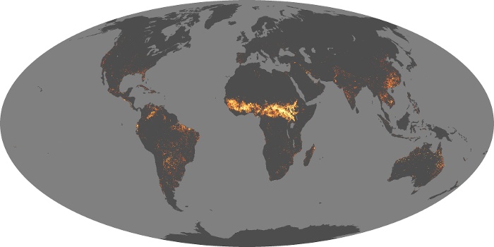
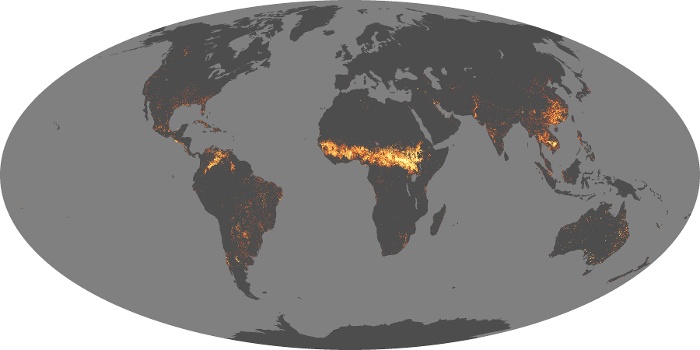


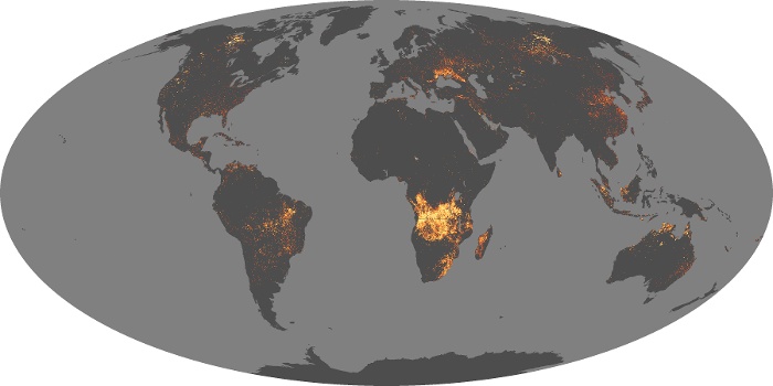
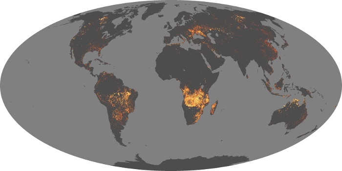

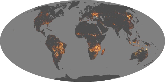
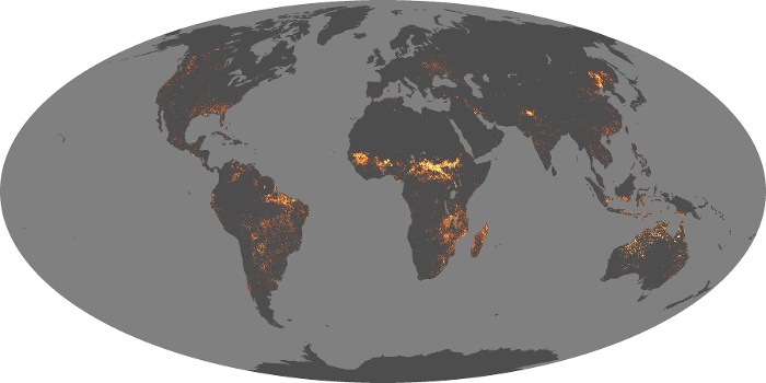


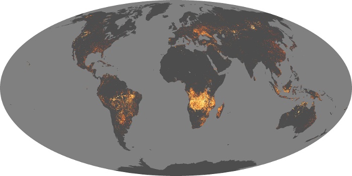
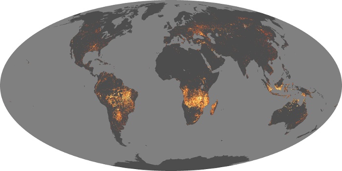
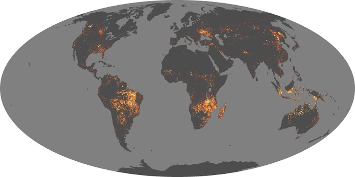
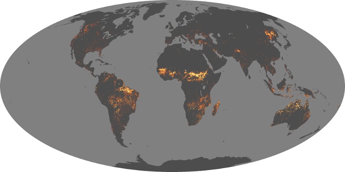


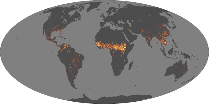

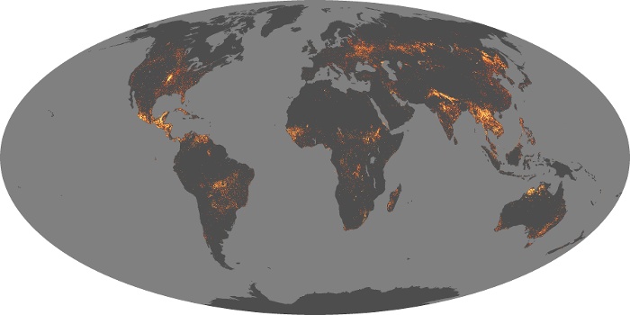


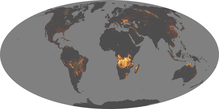
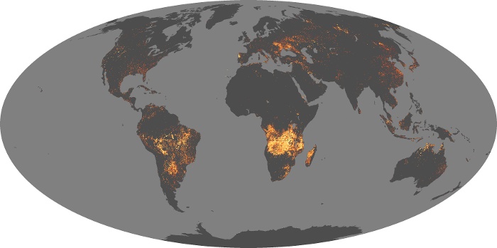
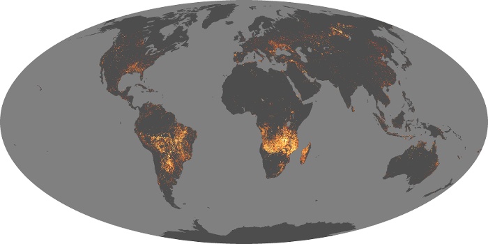
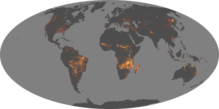
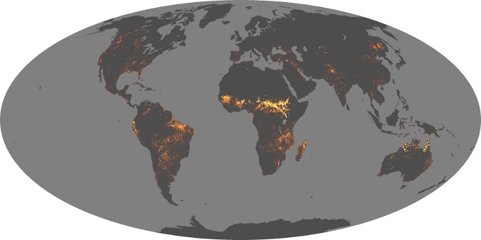


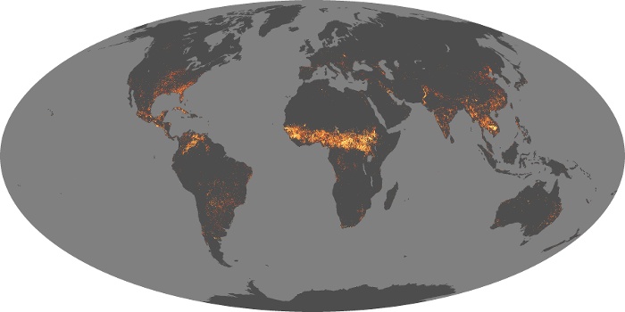


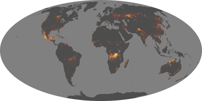

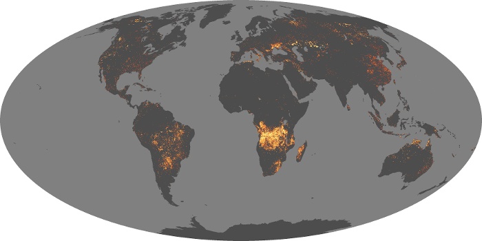
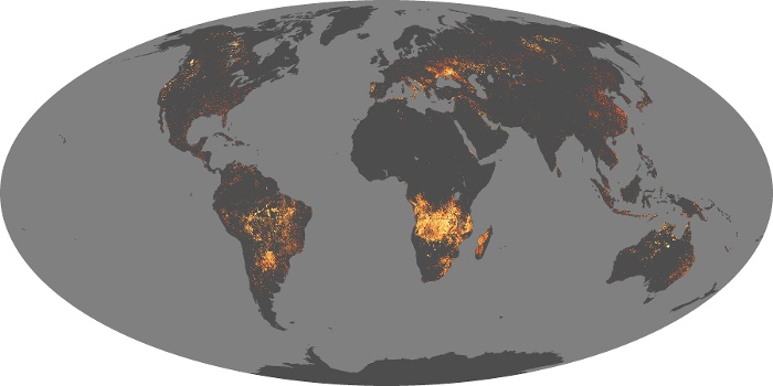
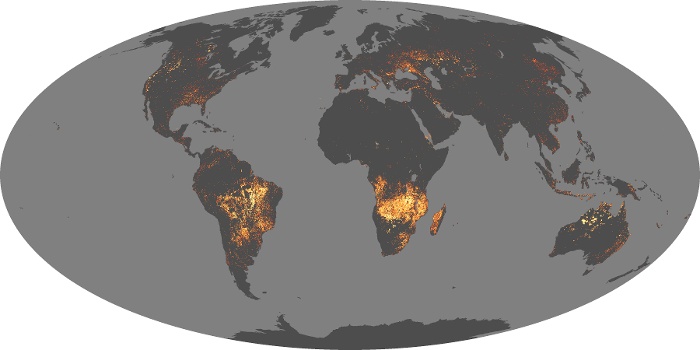
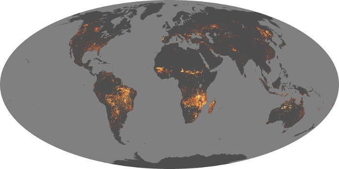

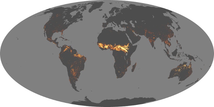

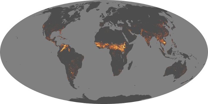


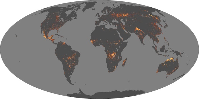


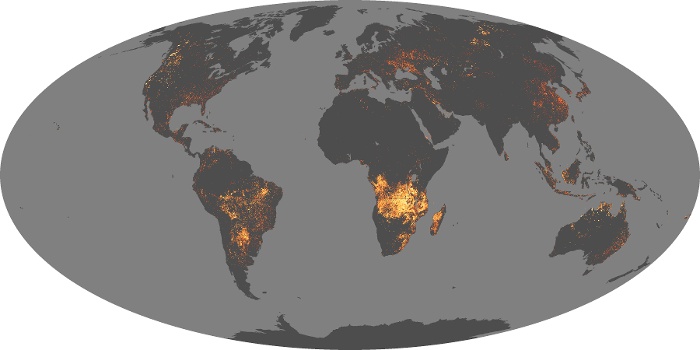

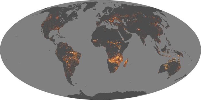
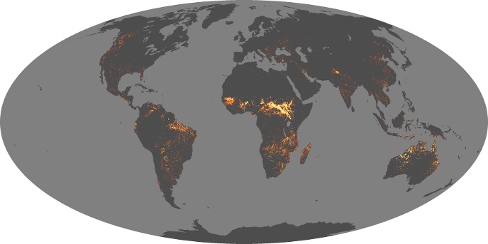
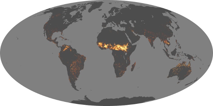

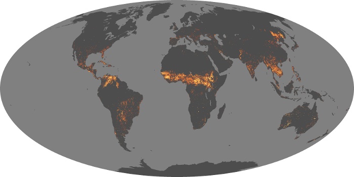


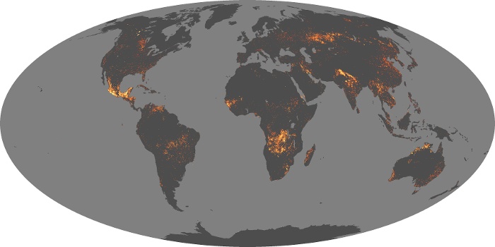


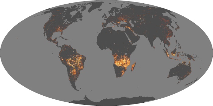
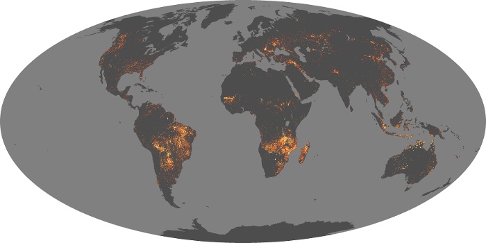
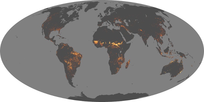


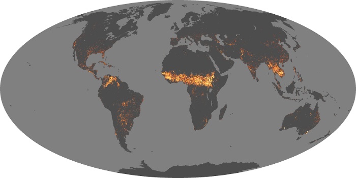


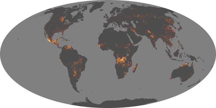

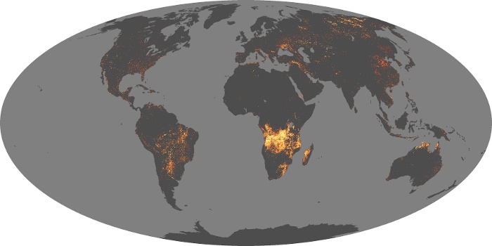
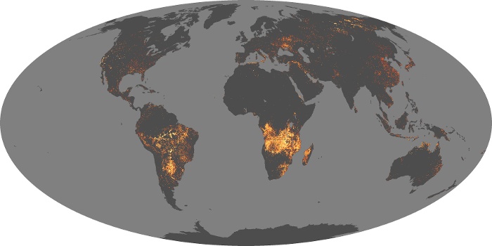

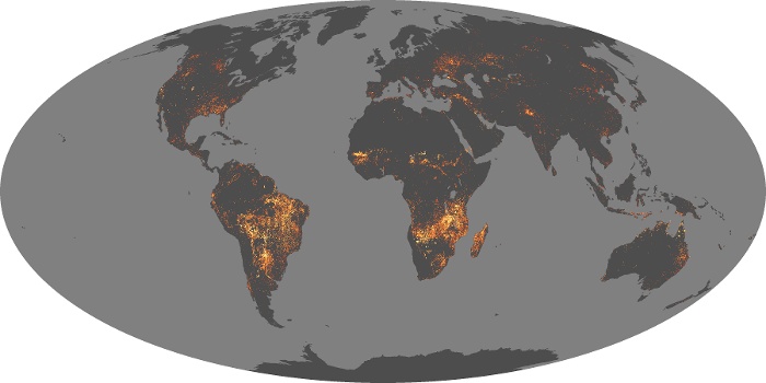
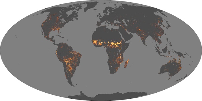
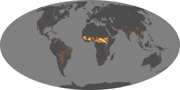

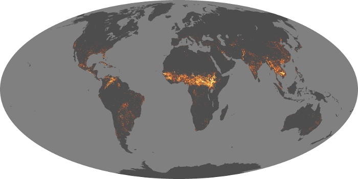
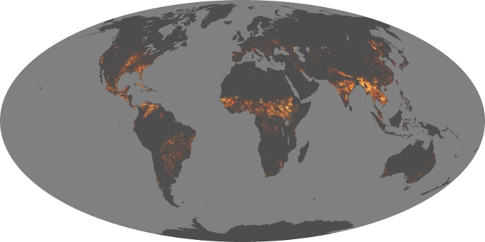

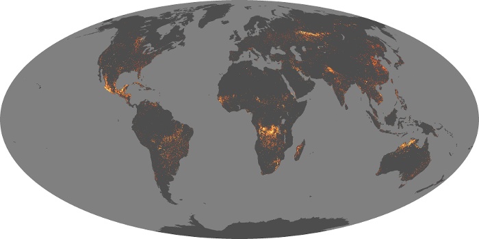
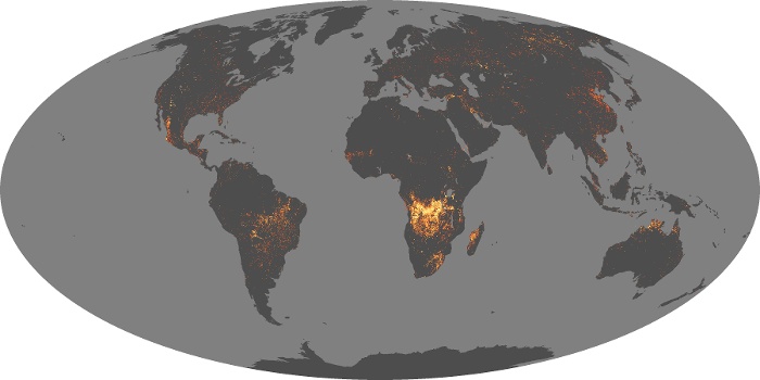
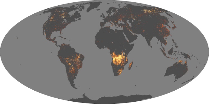

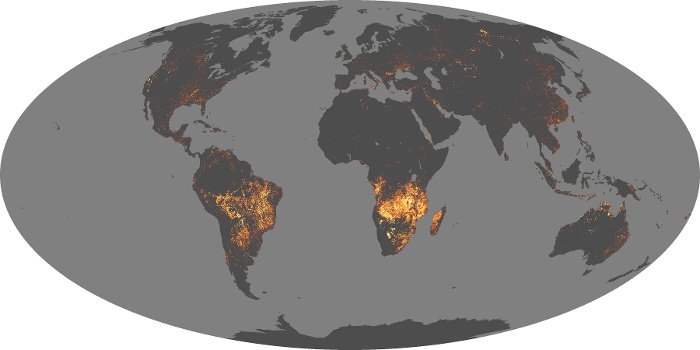
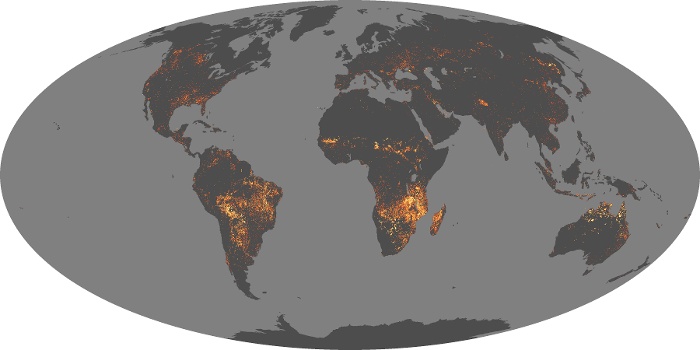
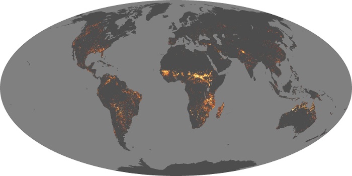
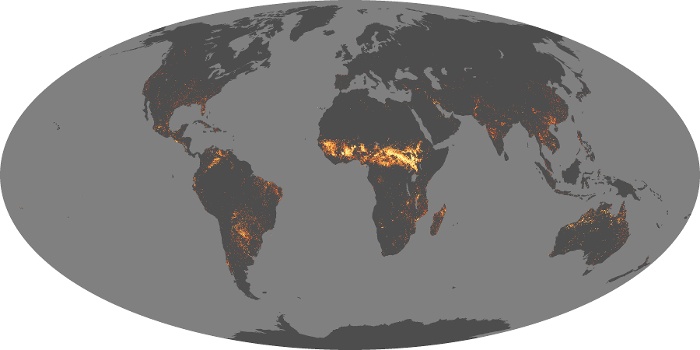
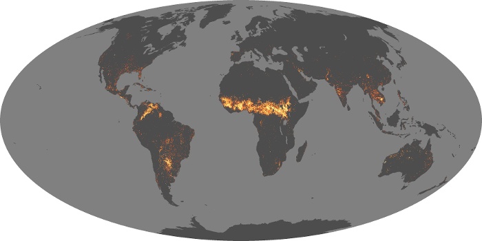
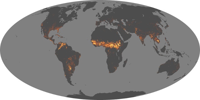
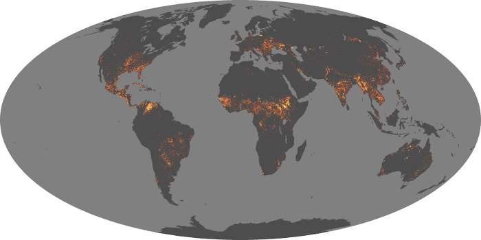
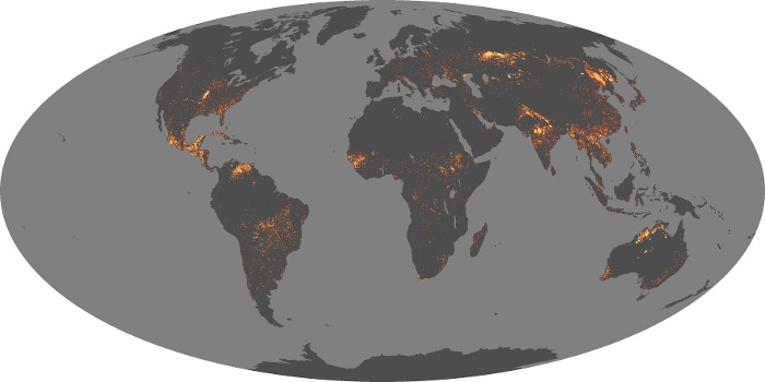


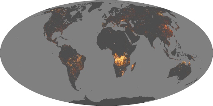
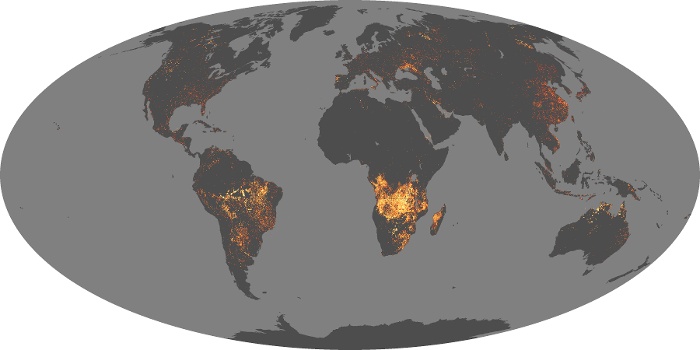
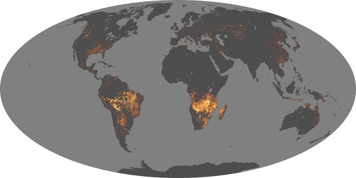
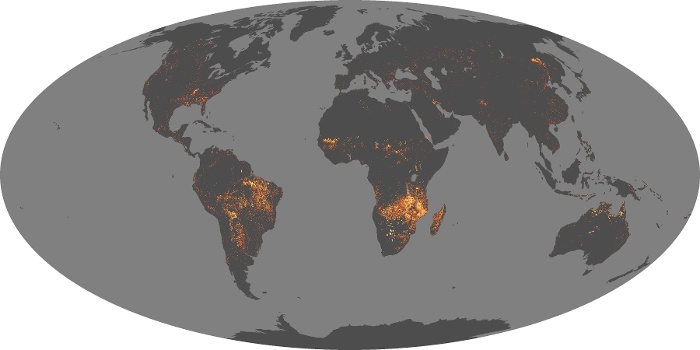

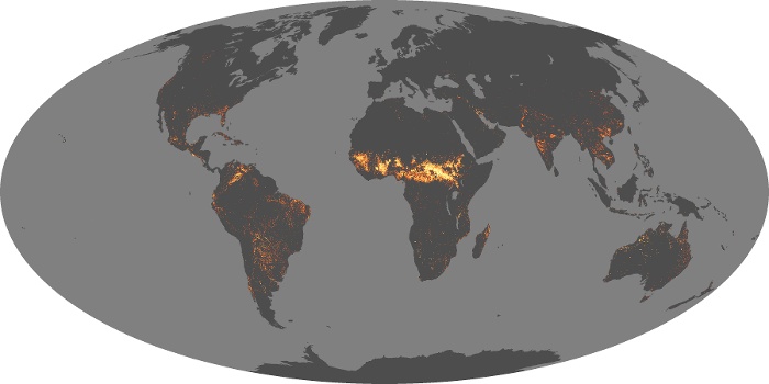
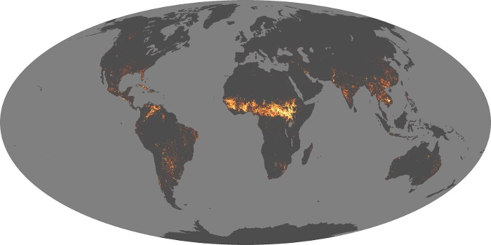


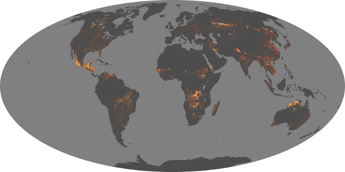
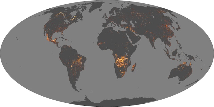

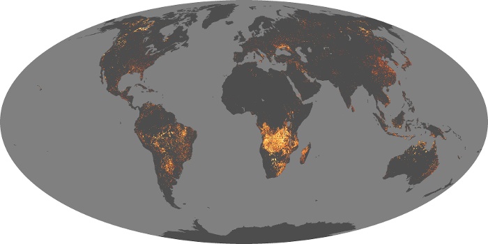
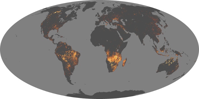


The fire maps show the locations of actively burning fires around the world on a monthly basis, based on observations from the MODIS sensors on NASA's Terra satellite. The colors are based on a count of the number (not size) of fires observed within a 1,000-square-kilometer area. White pixels show the high end of the count — as many as 30 fires in a 1,000-square-kilometer area per day. Orange pixels show as many as 10 fires, while red areas show as few as 1 fire per day.
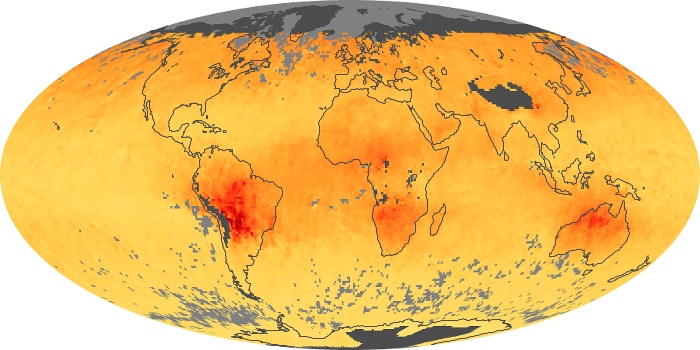
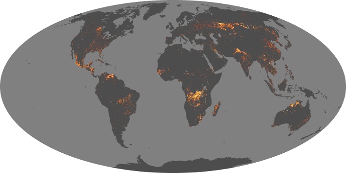
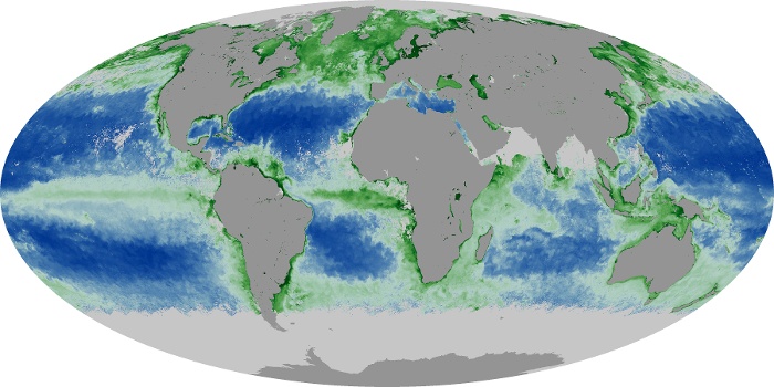
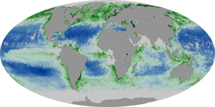
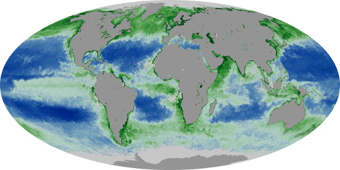
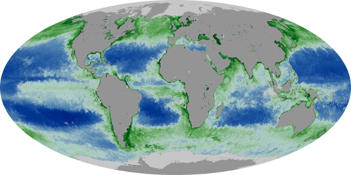
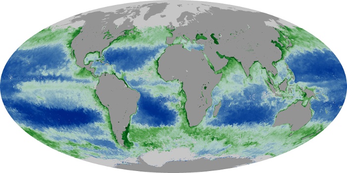
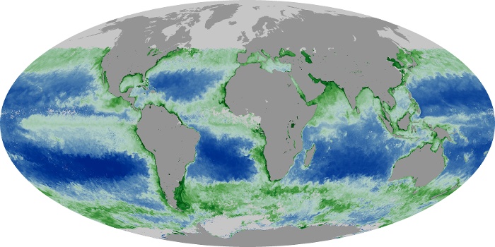
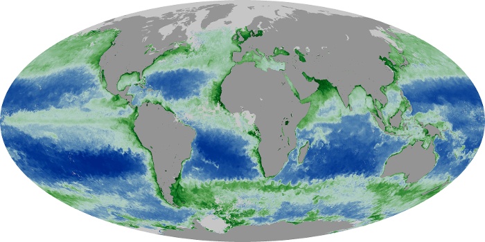
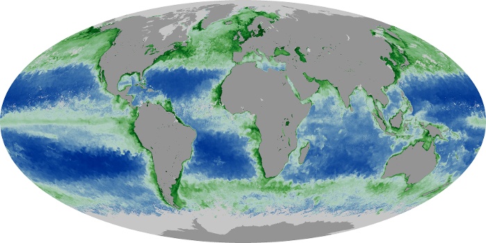
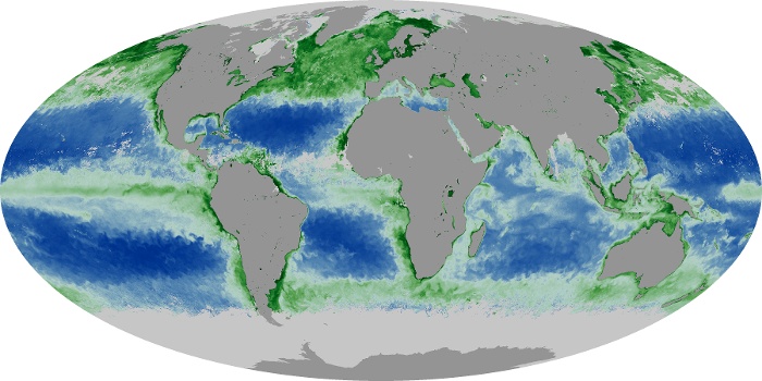
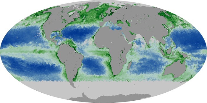
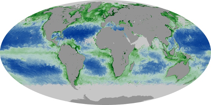
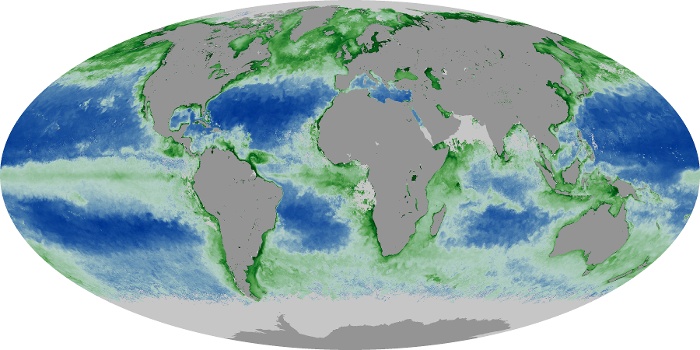
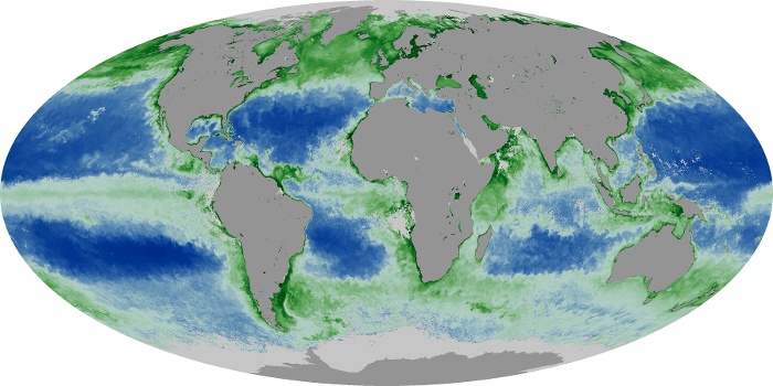
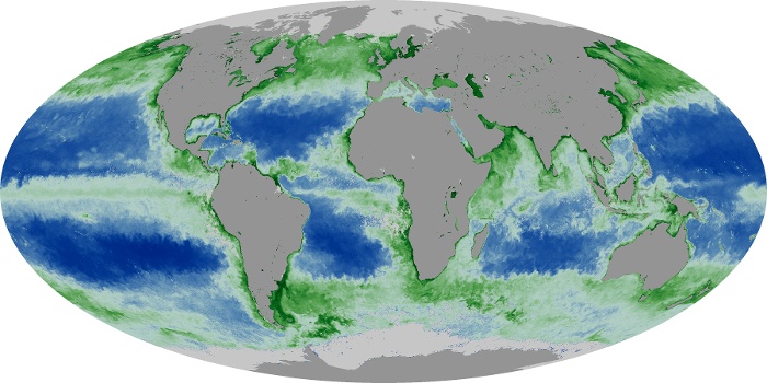
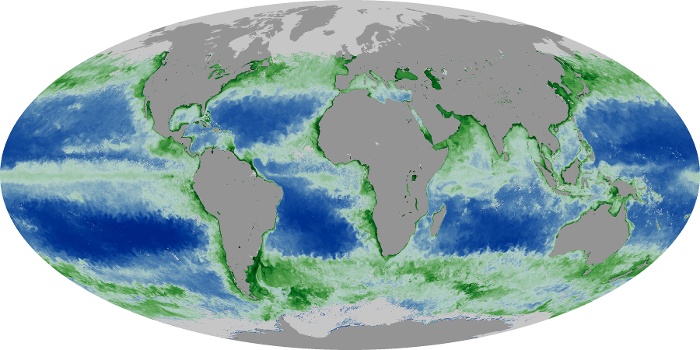
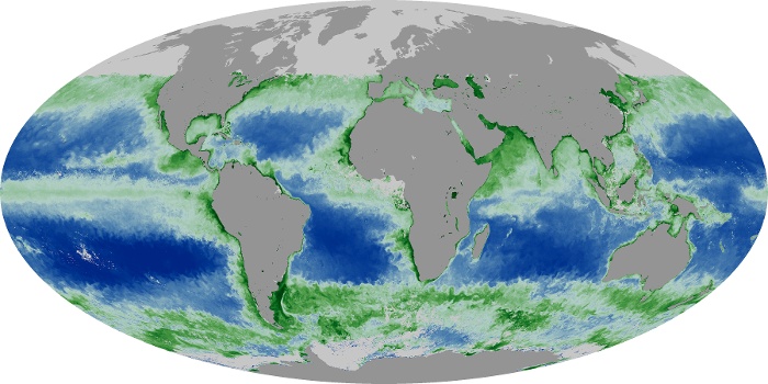
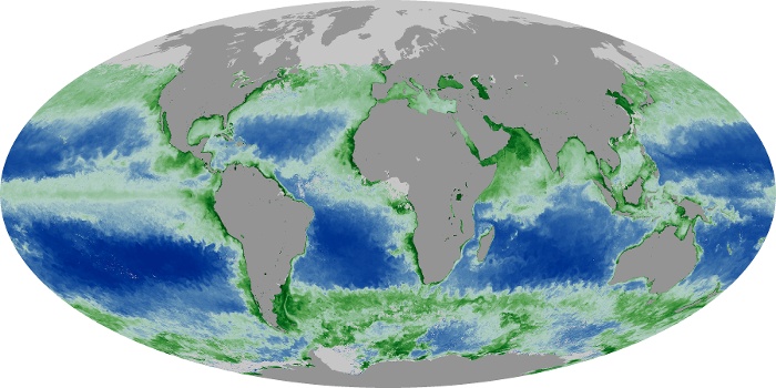
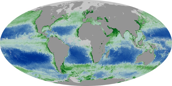
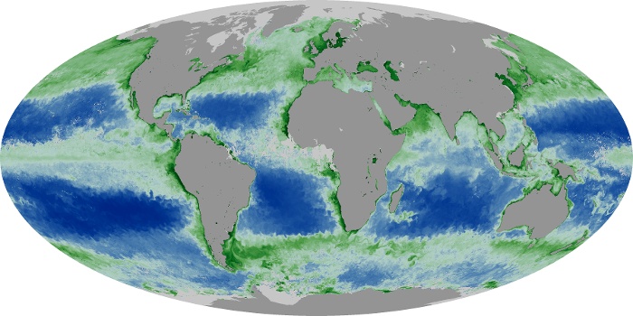
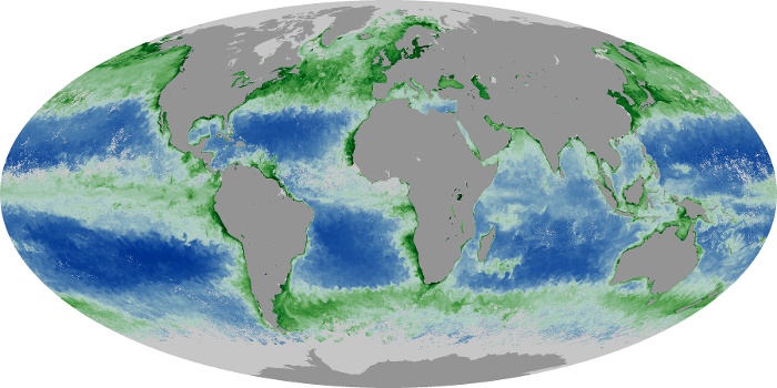
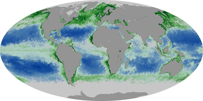
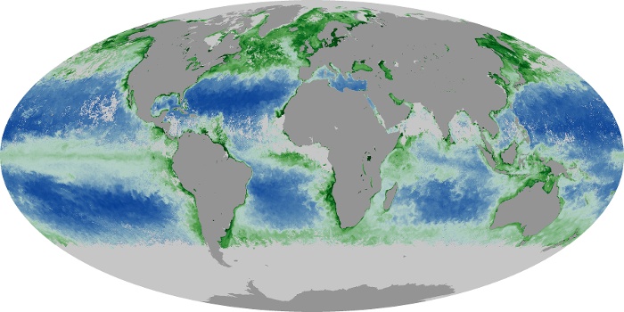
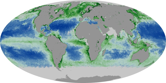
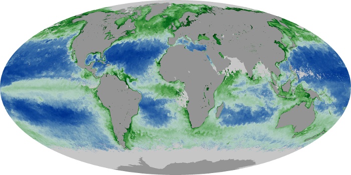
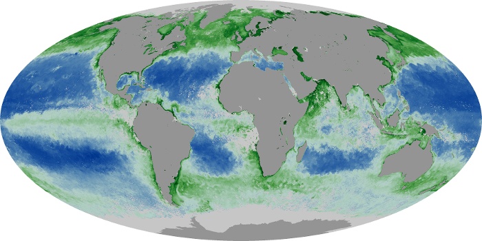
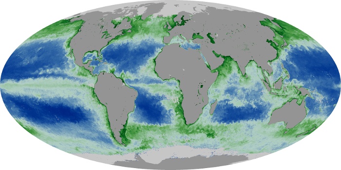
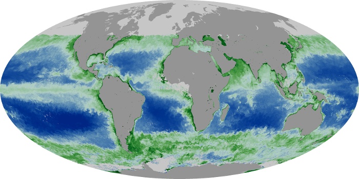
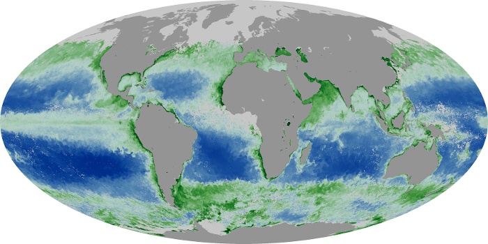
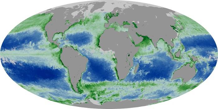
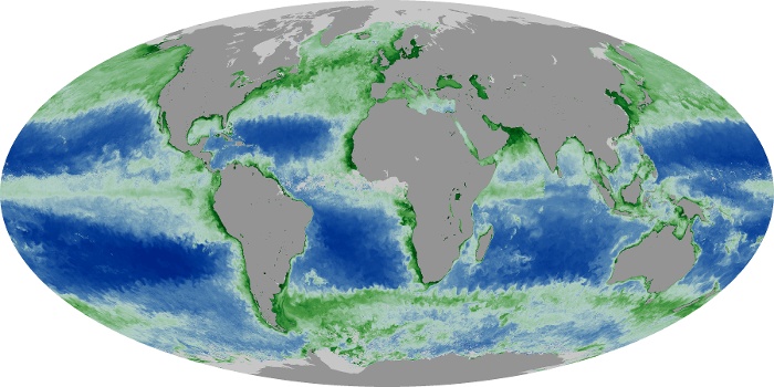
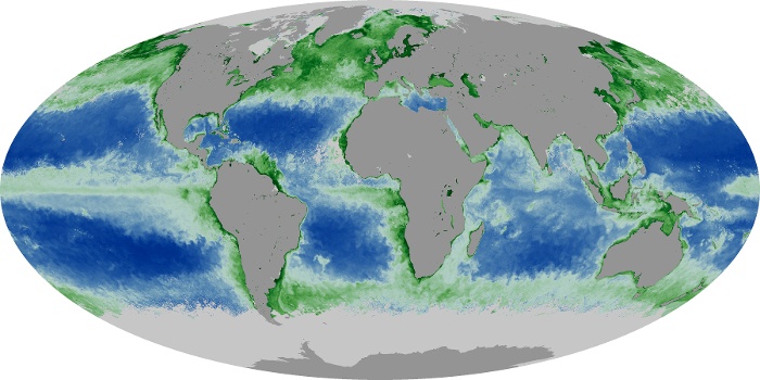
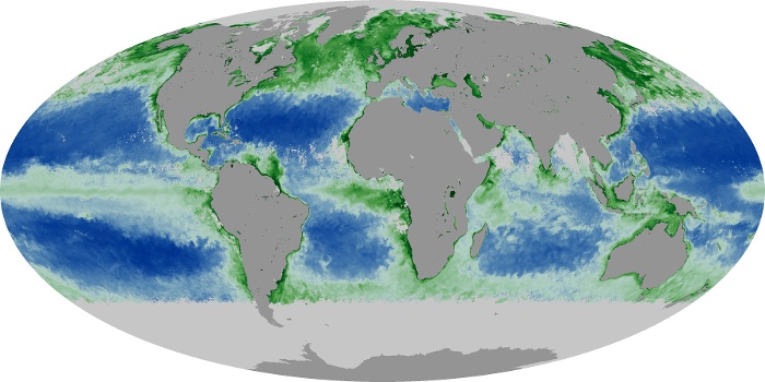
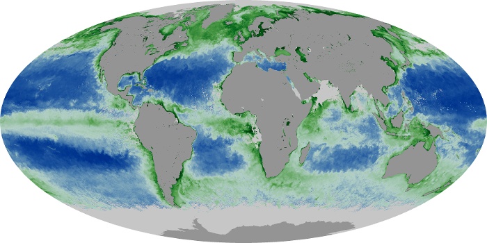
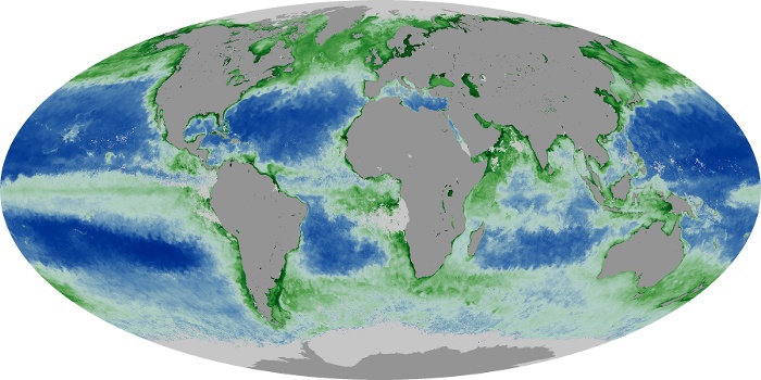
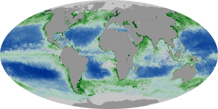
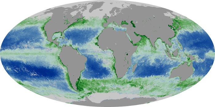
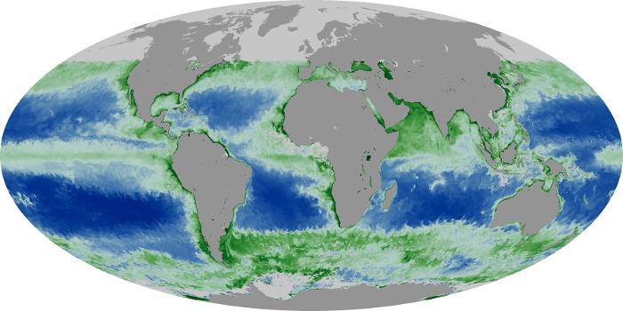
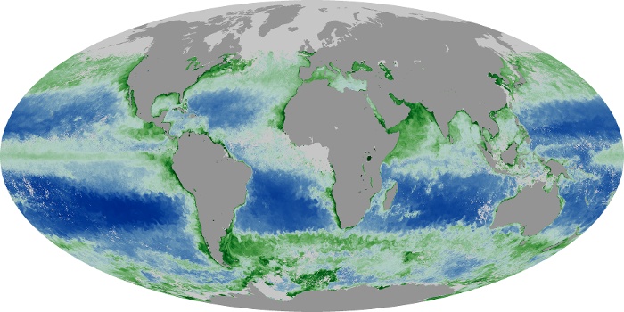
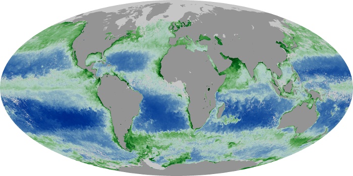
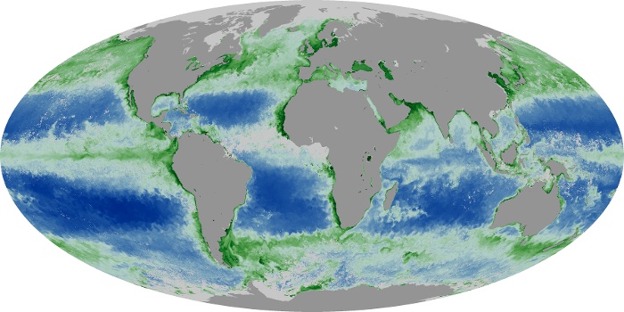
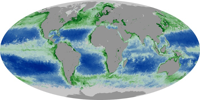
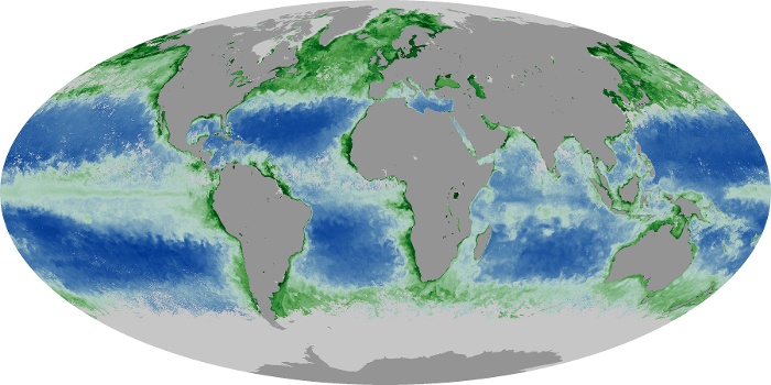
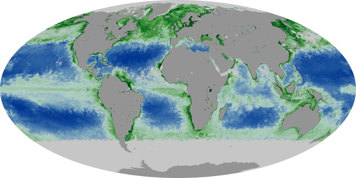
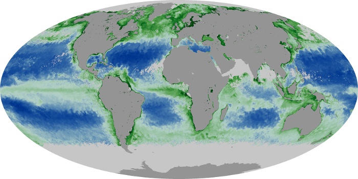
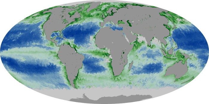
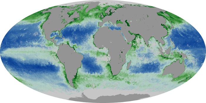
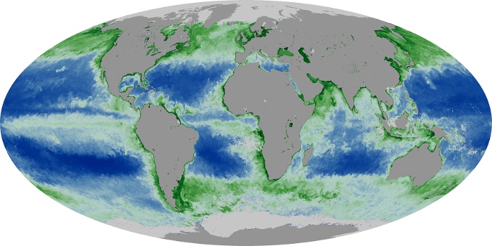
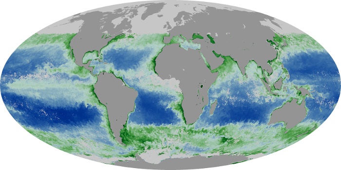
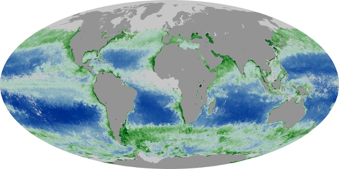
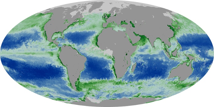
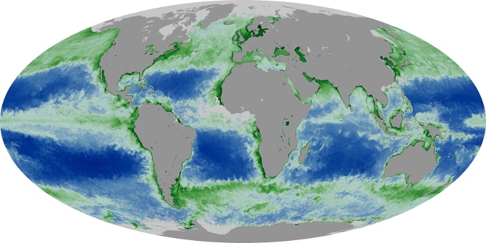
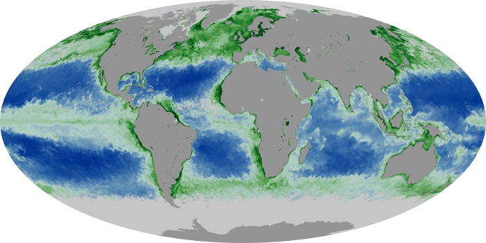
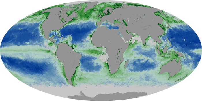
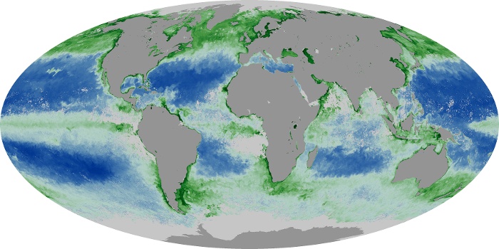
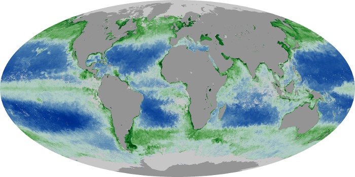
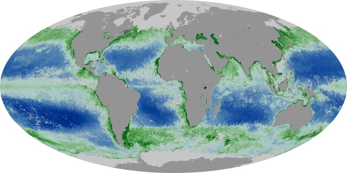
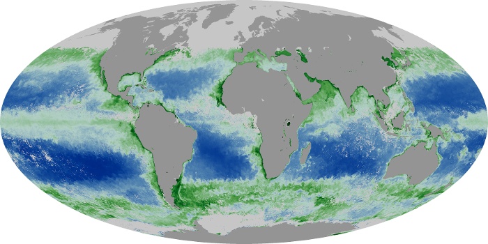
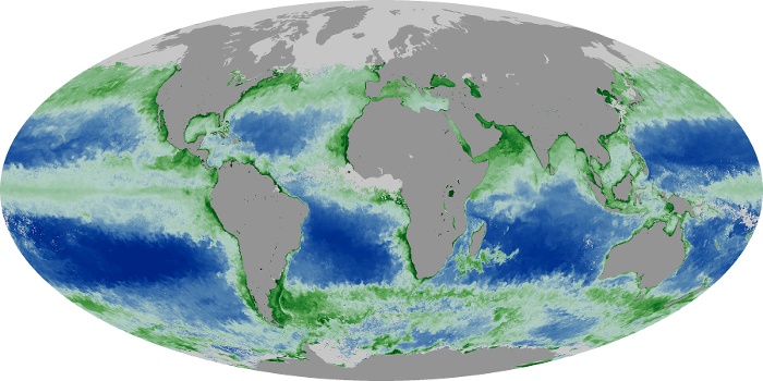
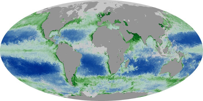
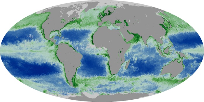
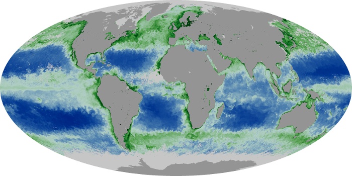
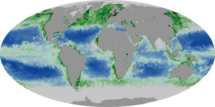
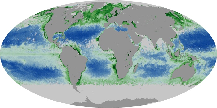
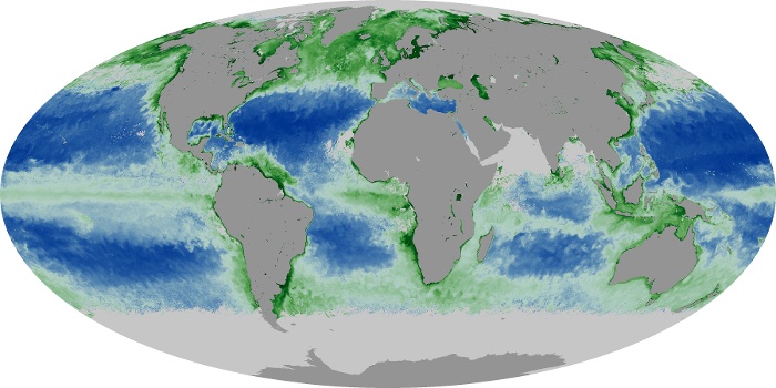
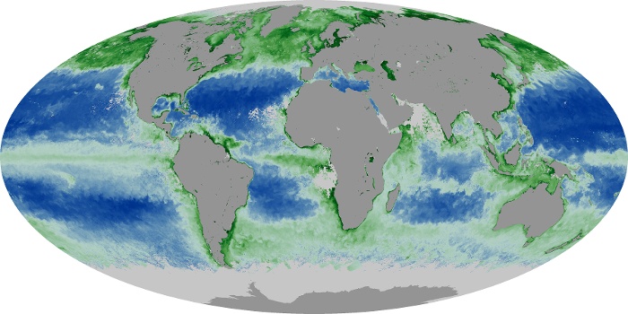
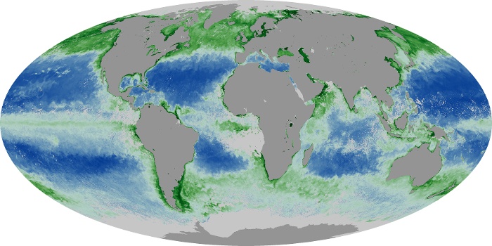
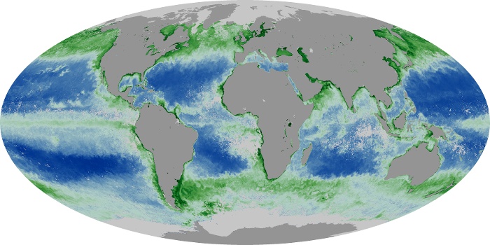
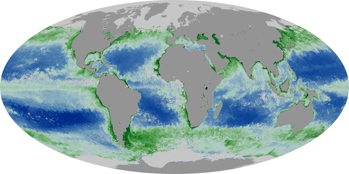
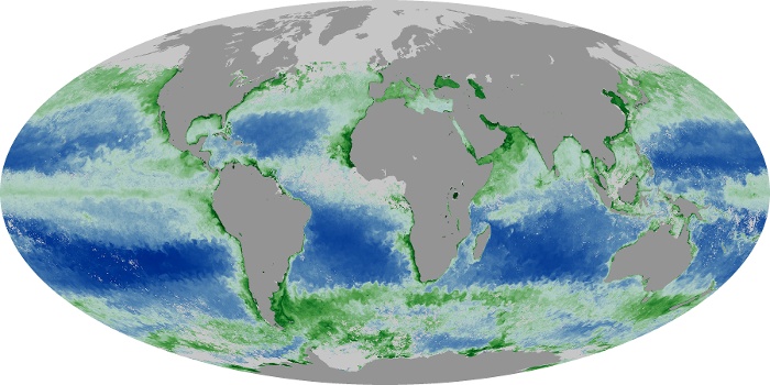
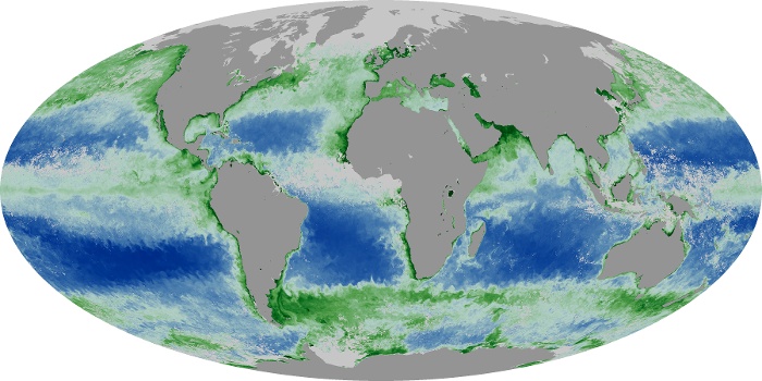
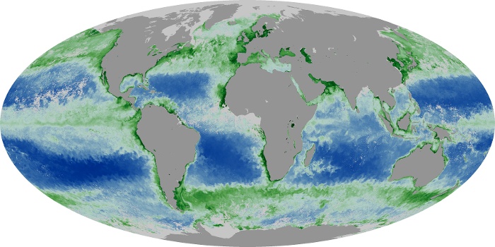
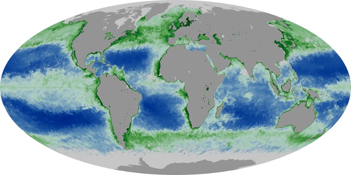
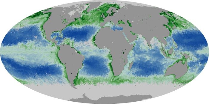
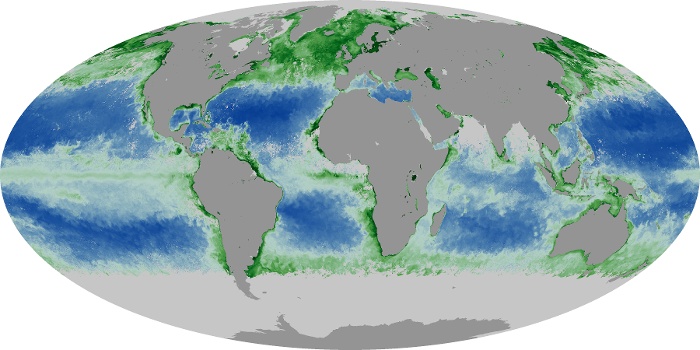
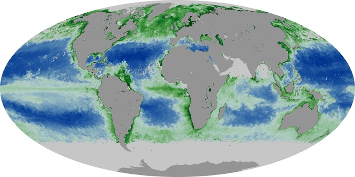
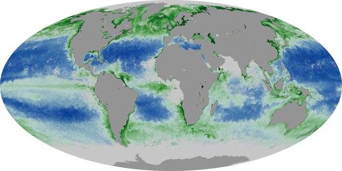
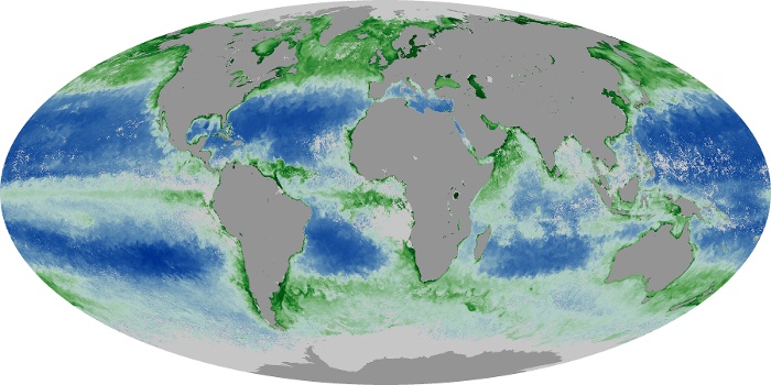
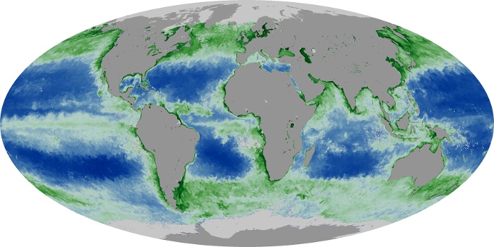
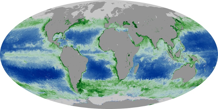
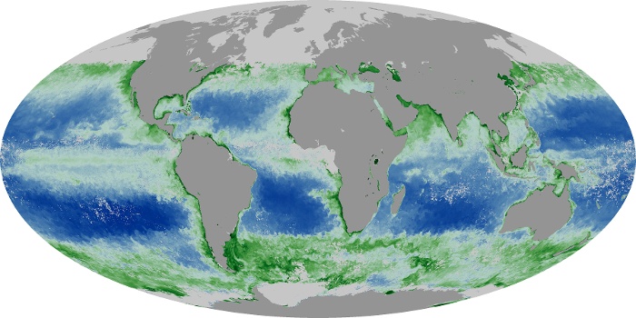
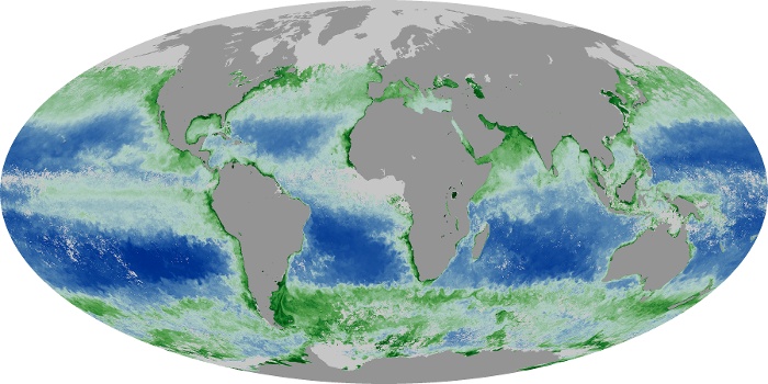
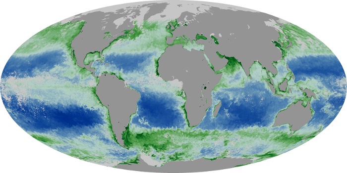
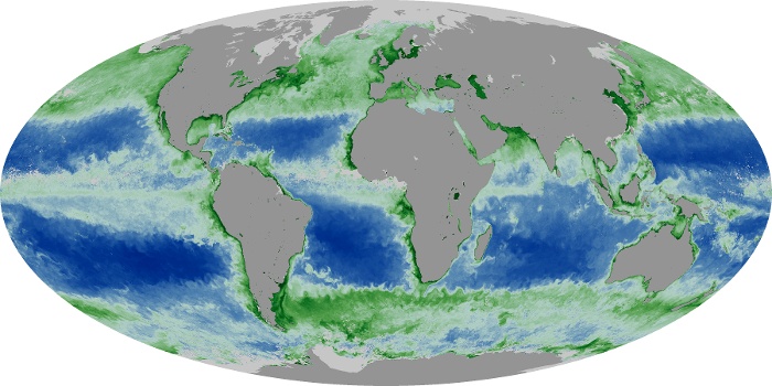
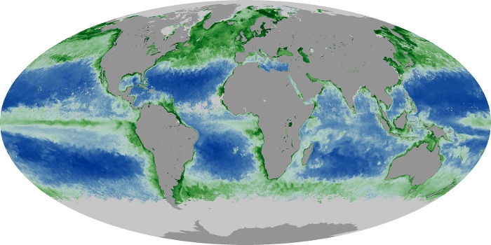
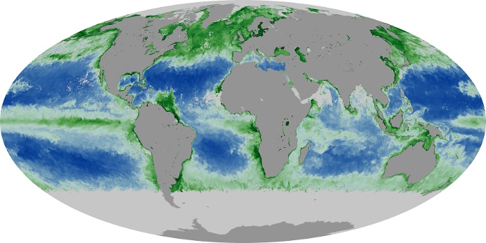
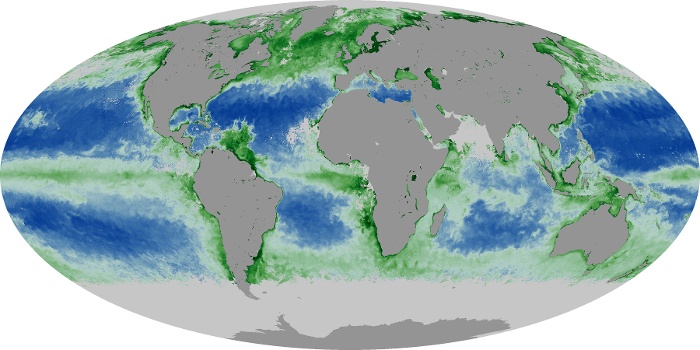
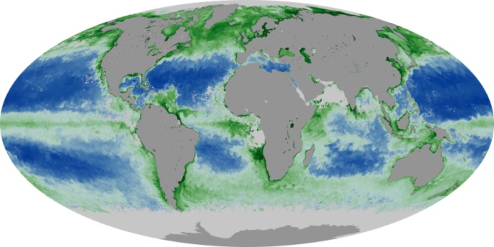
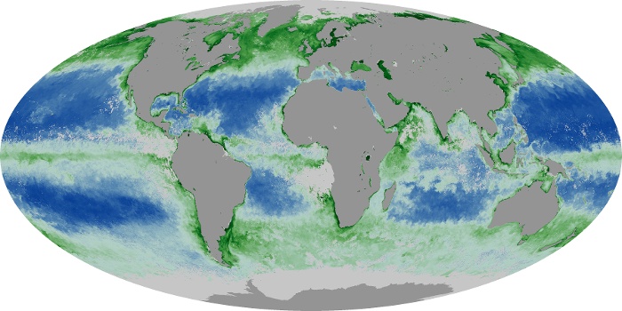
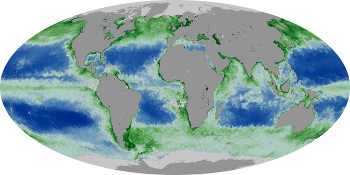
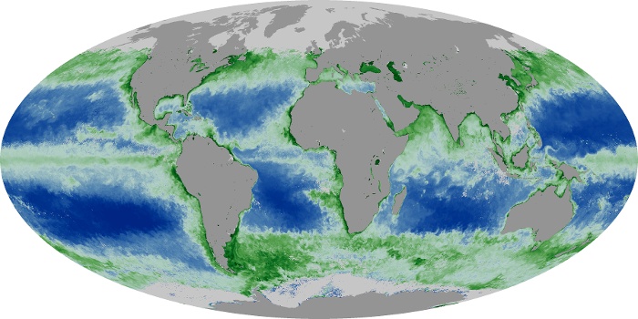
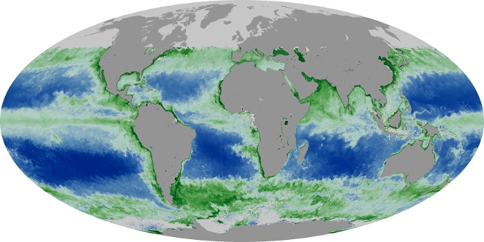
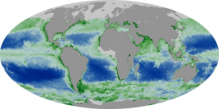
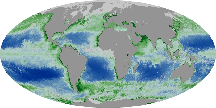
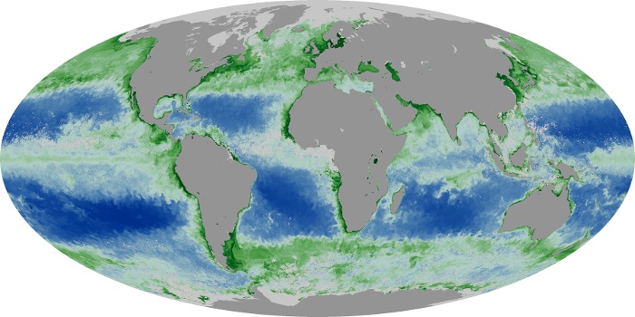
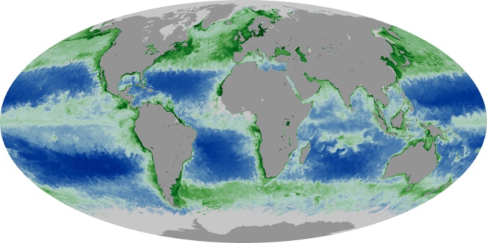
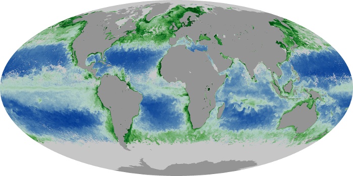
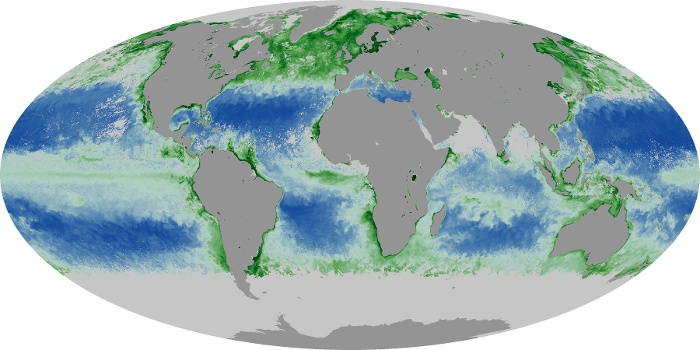
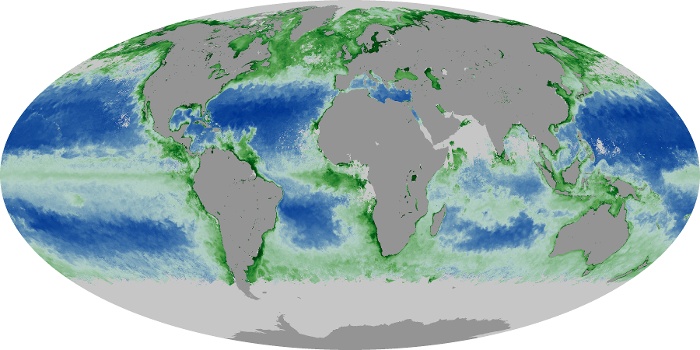
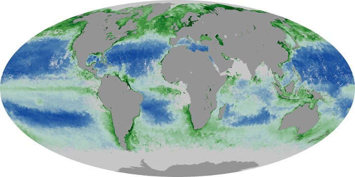
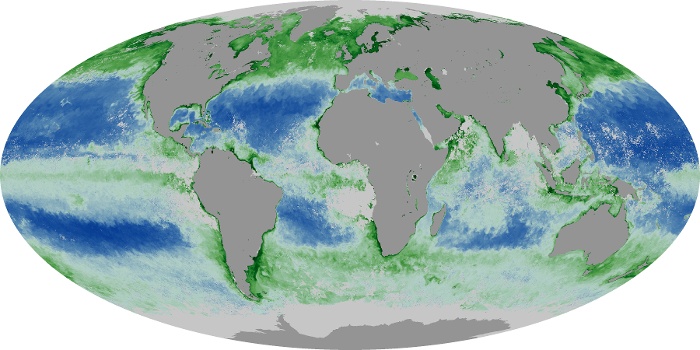
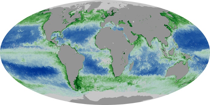
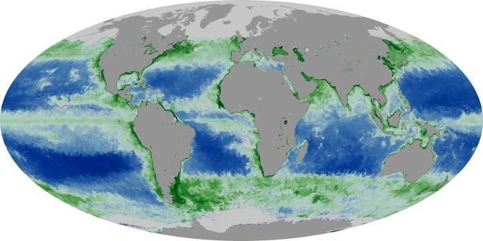
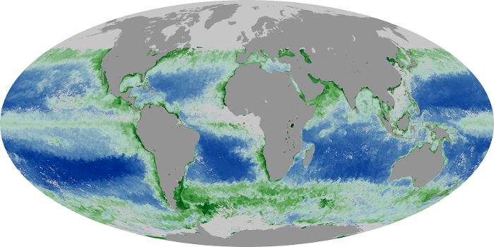
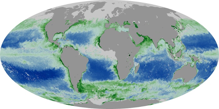
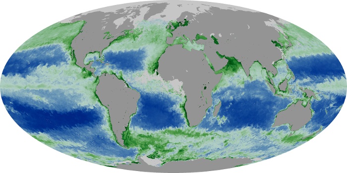
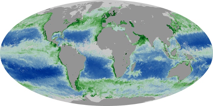
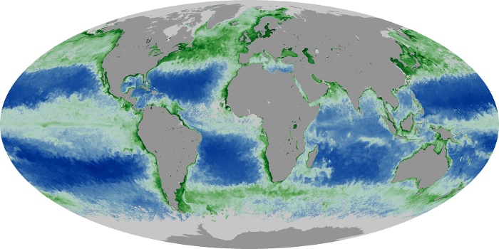
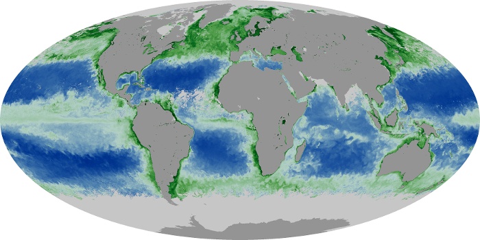
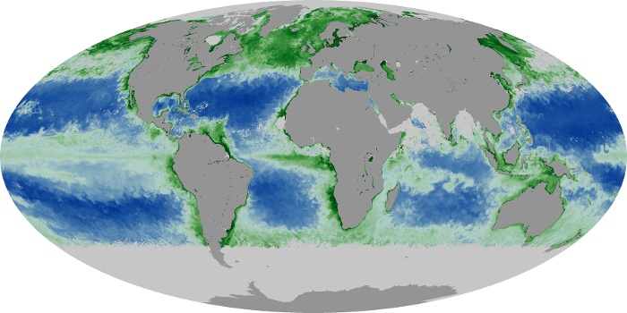
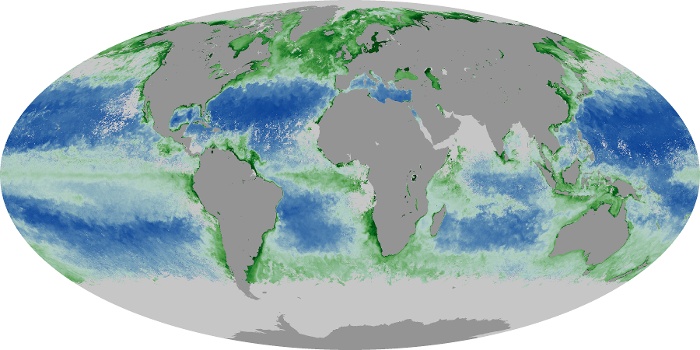
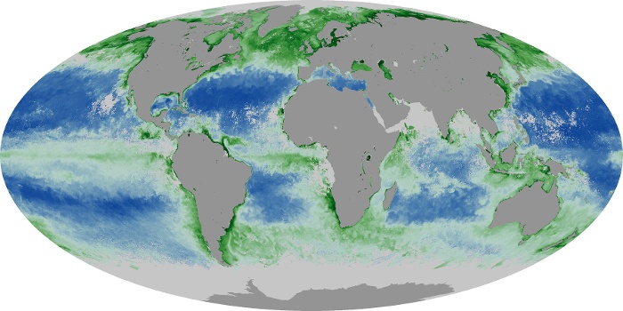
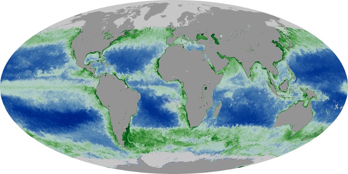
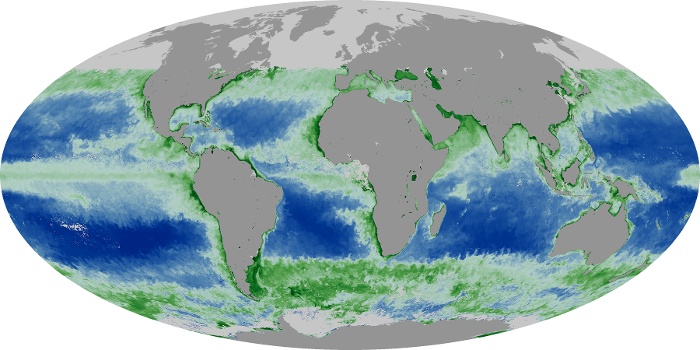
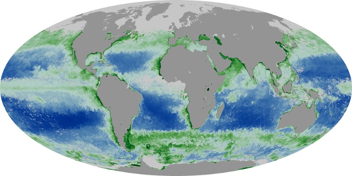
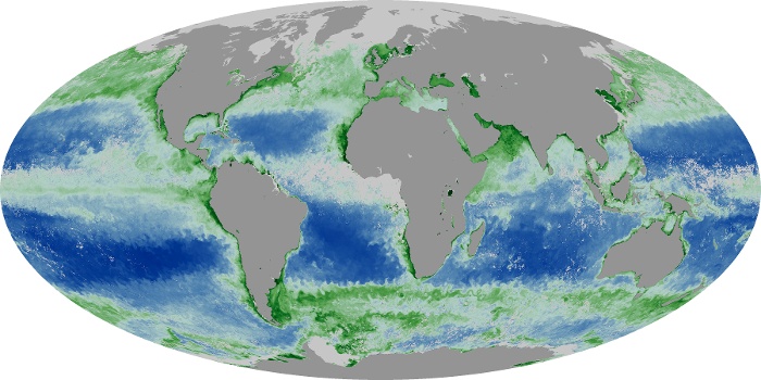
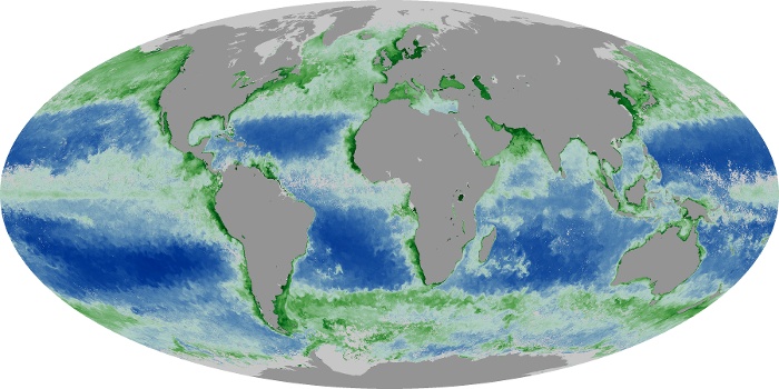
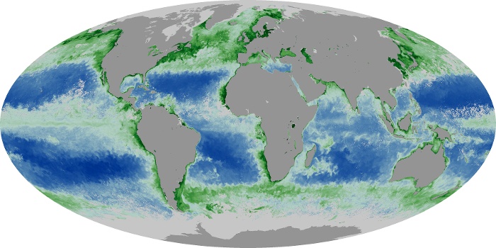
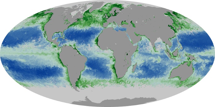
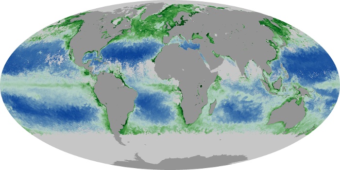
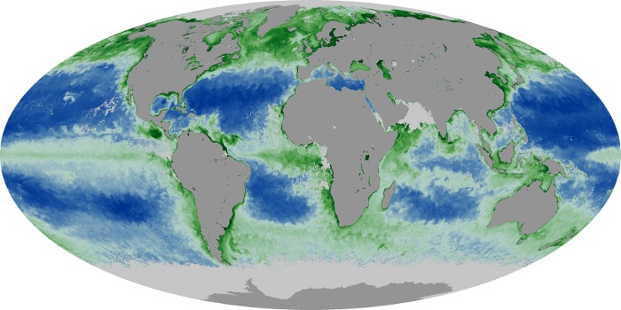
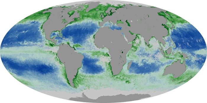
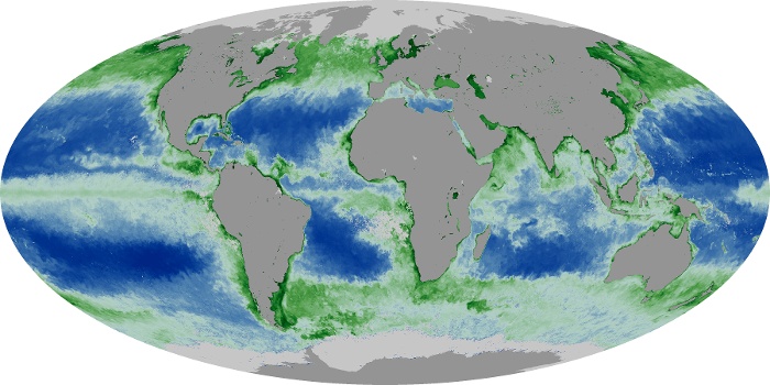
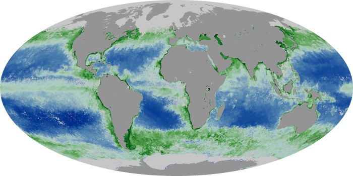
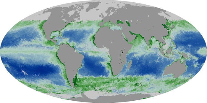
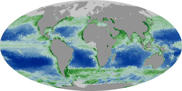
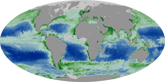
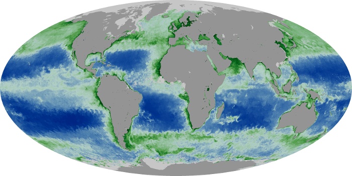
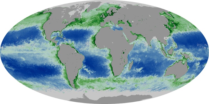
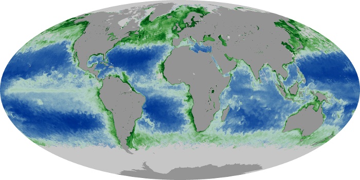
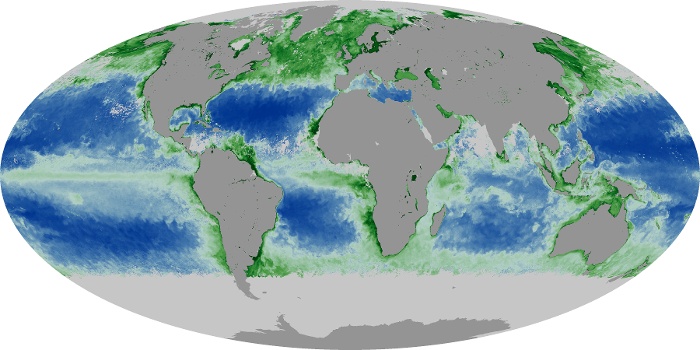
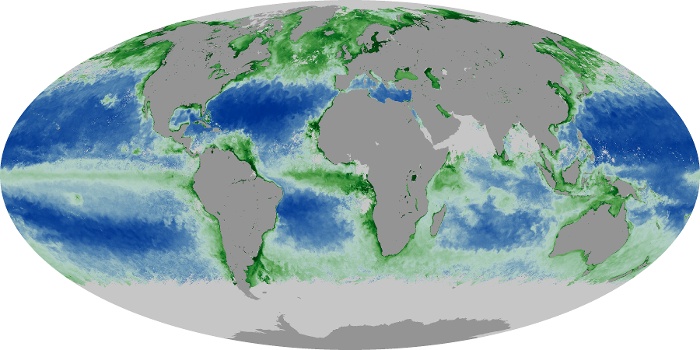
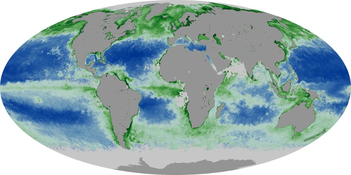
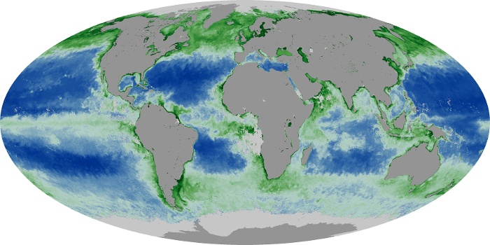
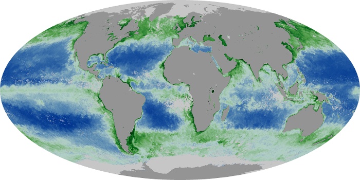
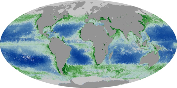
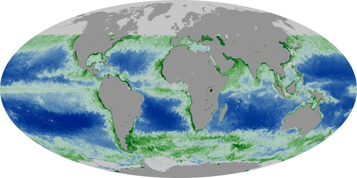
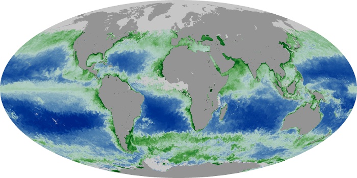
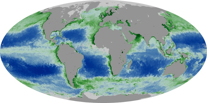
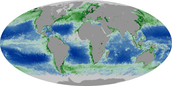
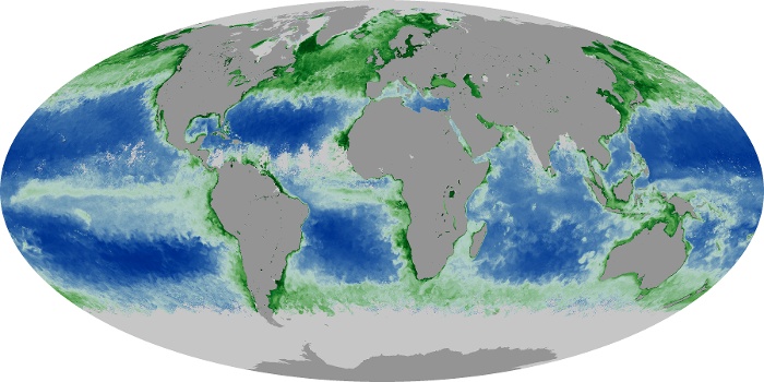
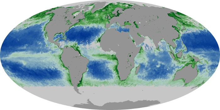
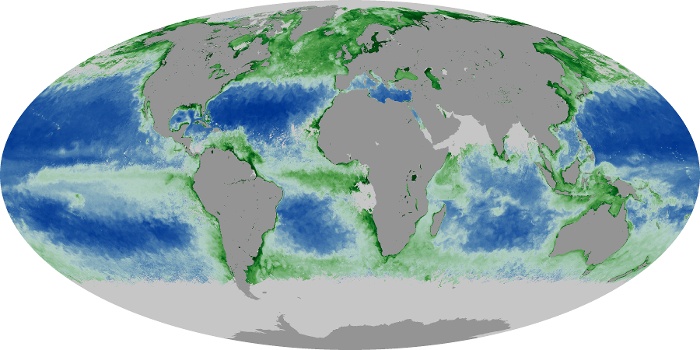
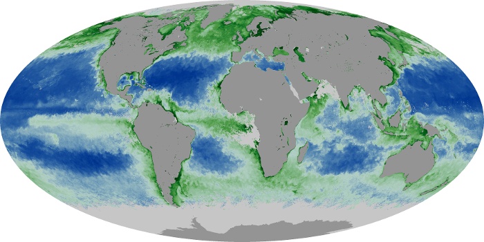
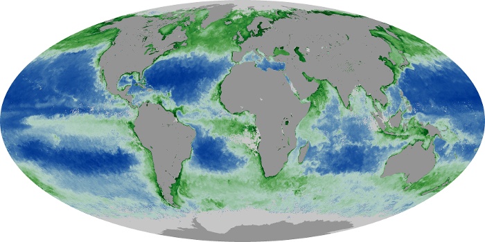
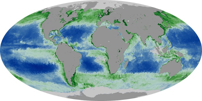
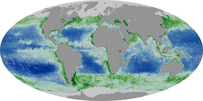
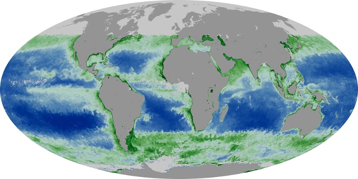
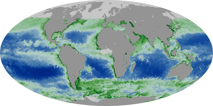
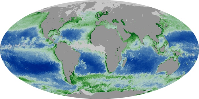
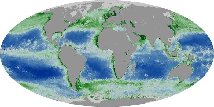
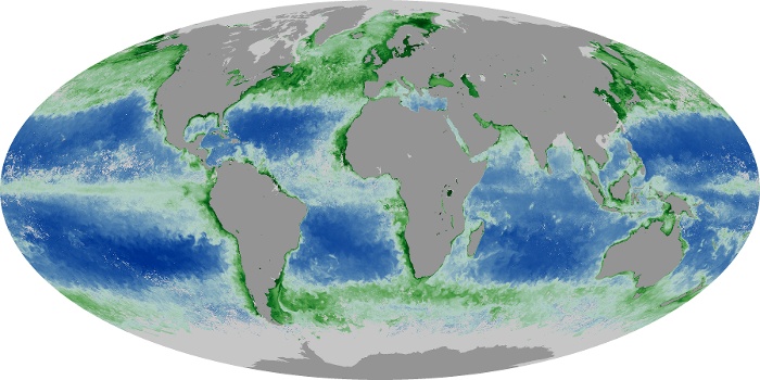
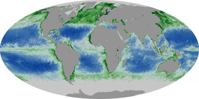
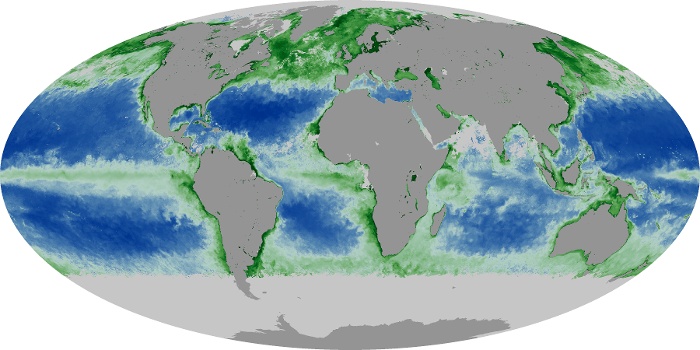
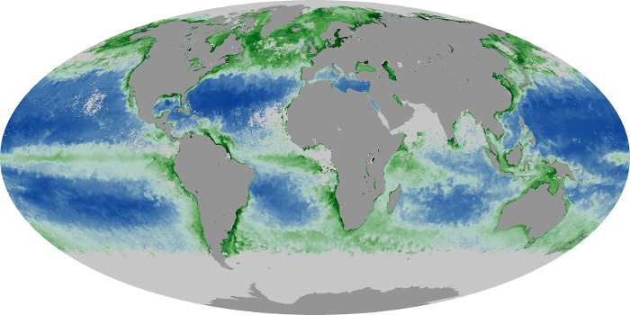
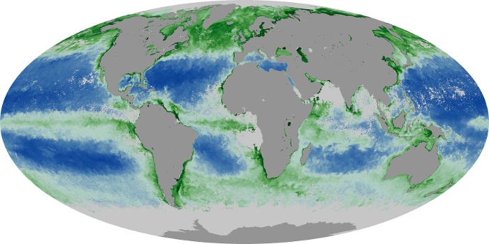
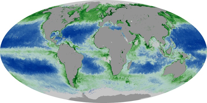
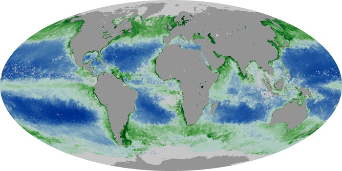
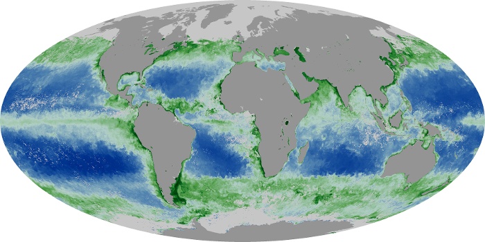
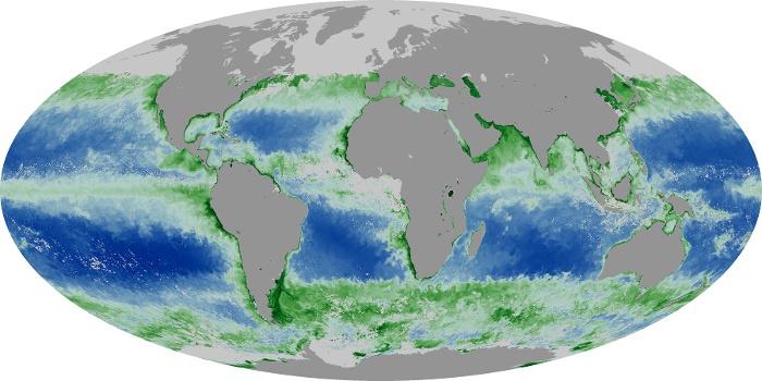
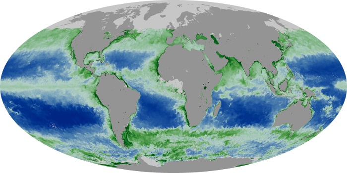
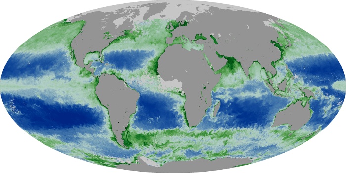
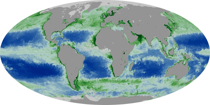
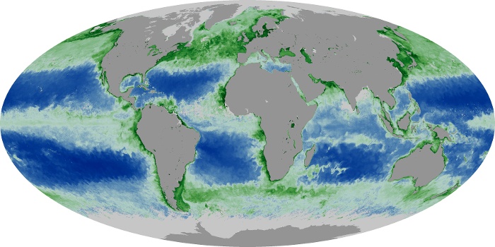
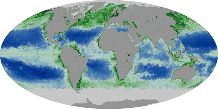
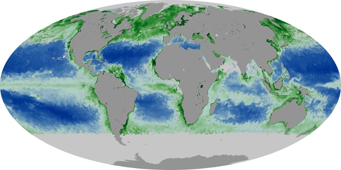
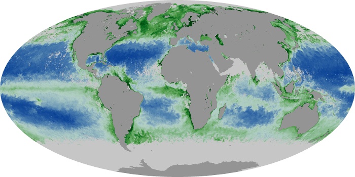
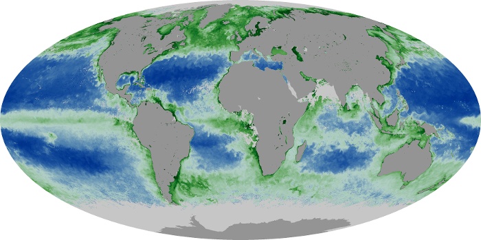
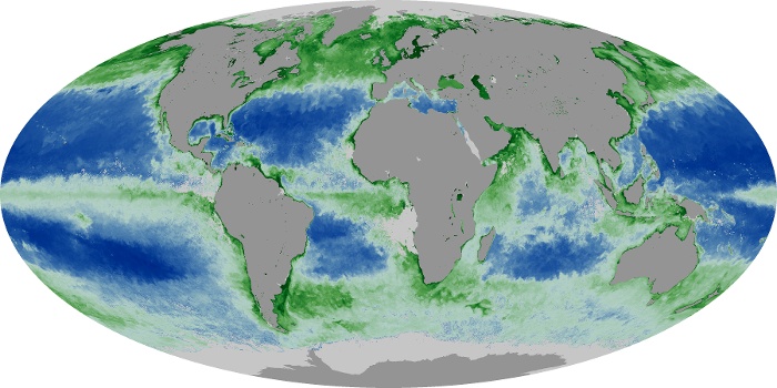
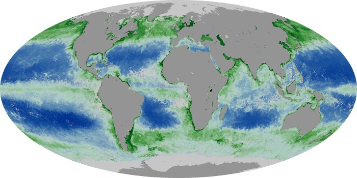
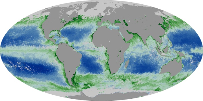
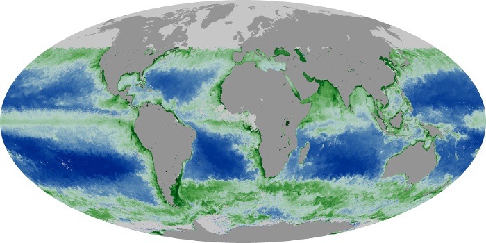
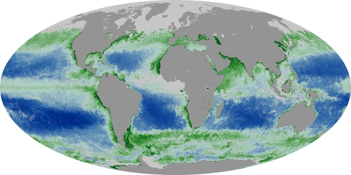
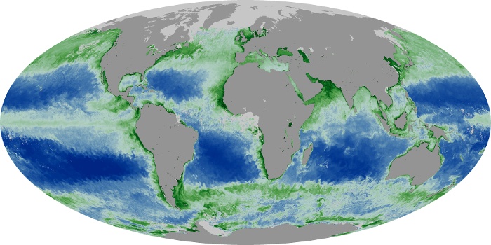
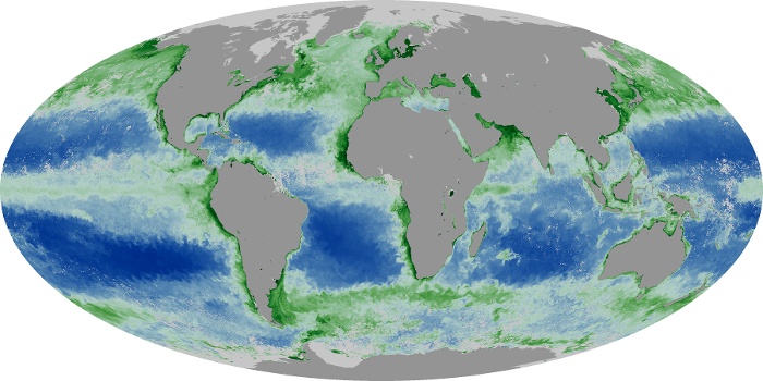
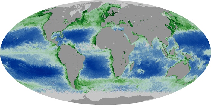
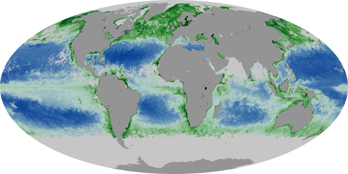
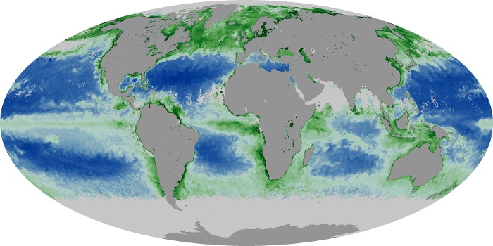
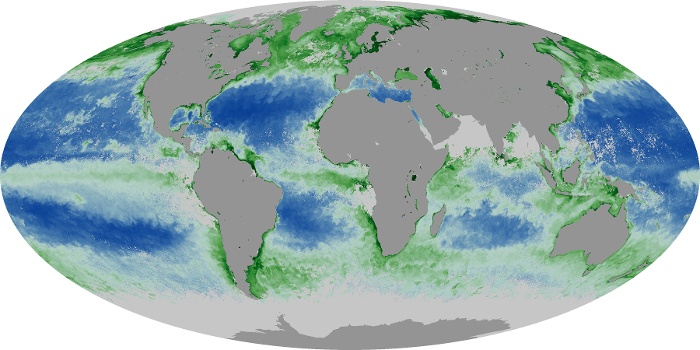
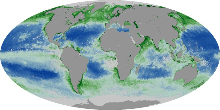
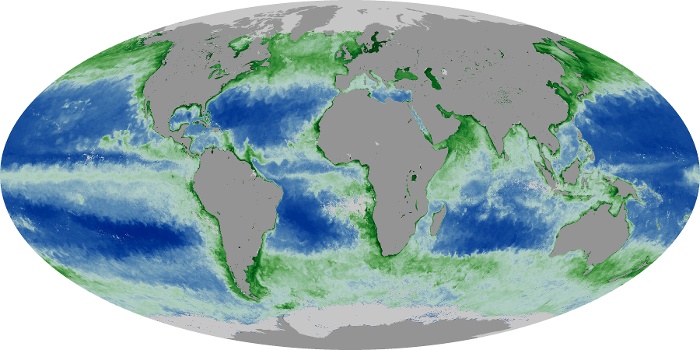
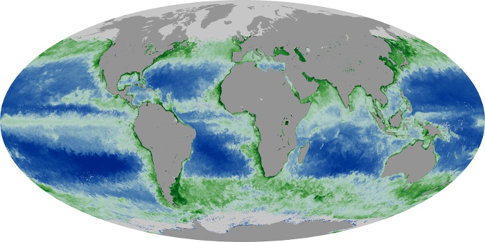
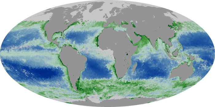
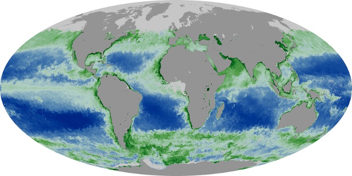
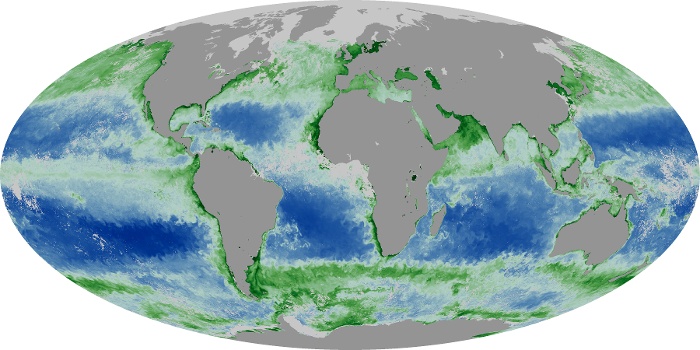
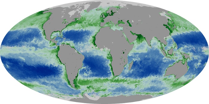
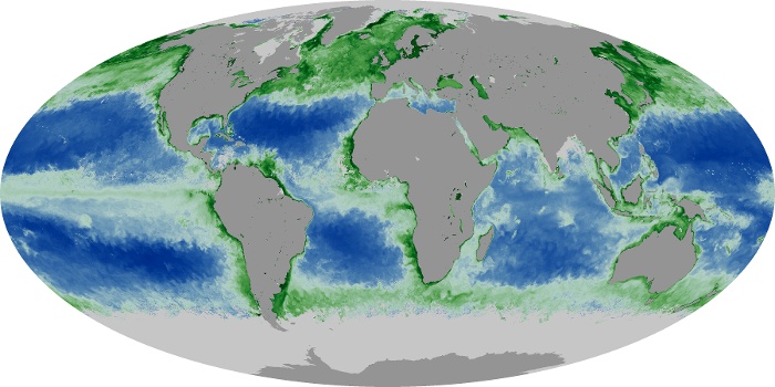
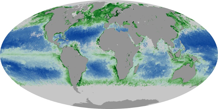
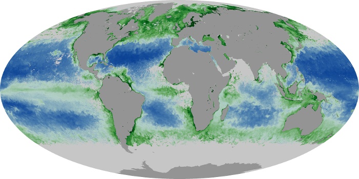
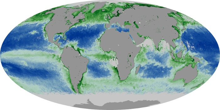
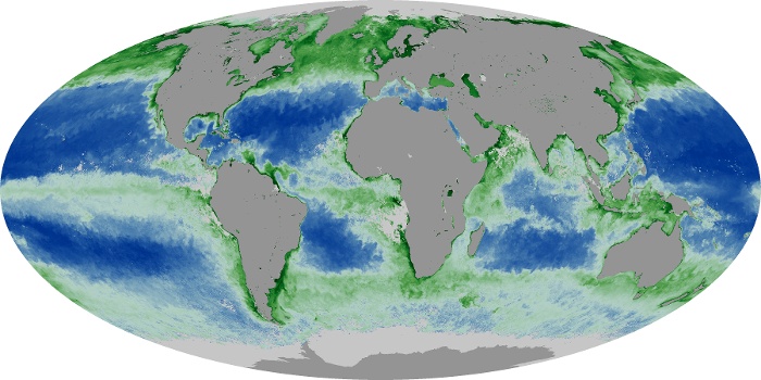
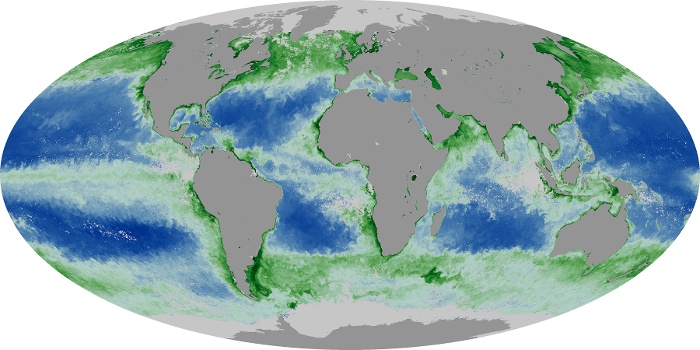
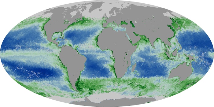
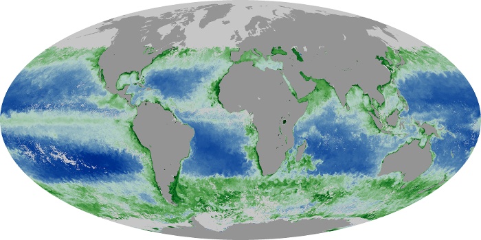
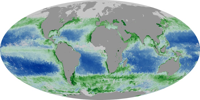
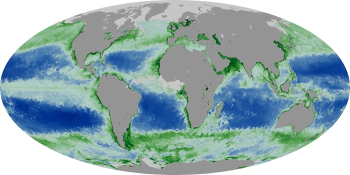
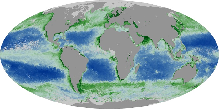
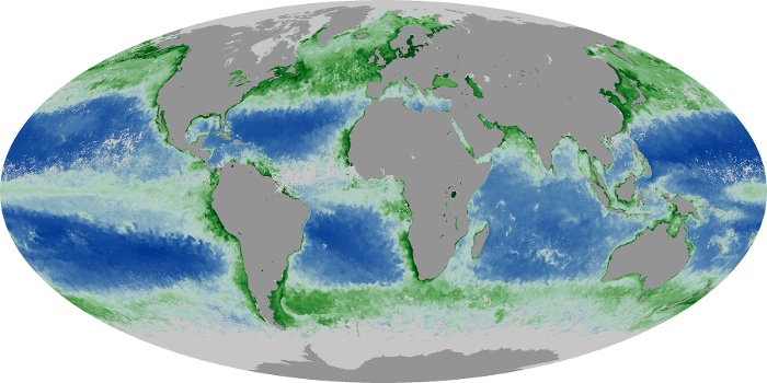
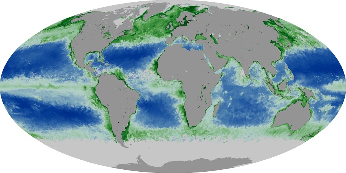
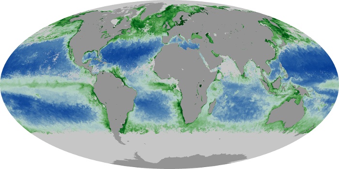
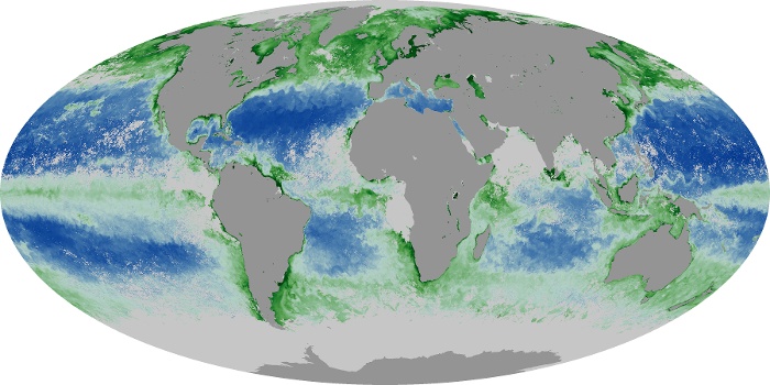
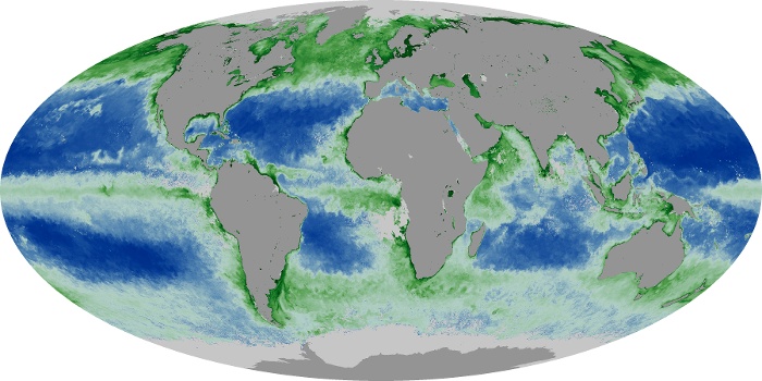
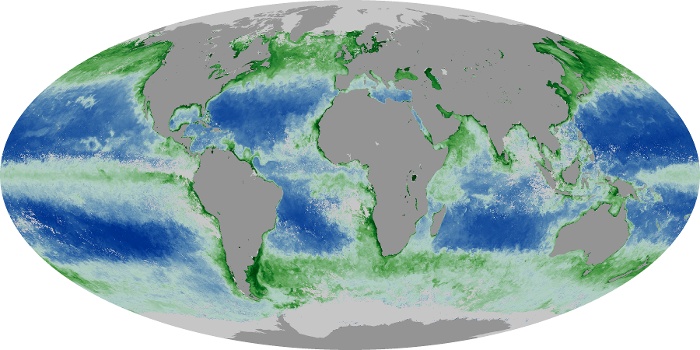
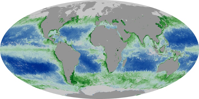
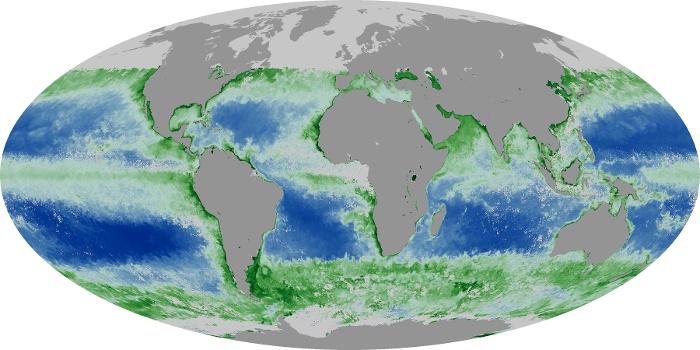
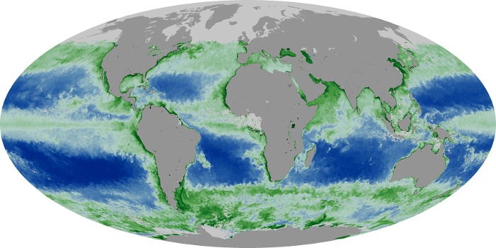
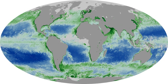
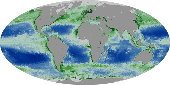
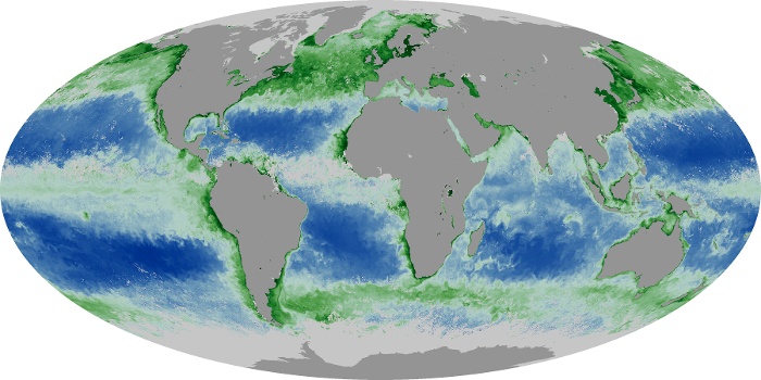
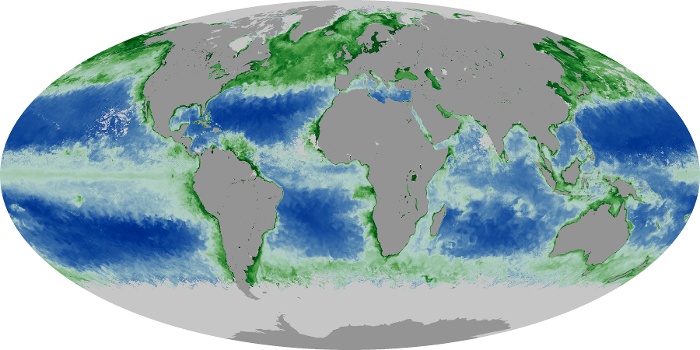
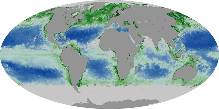
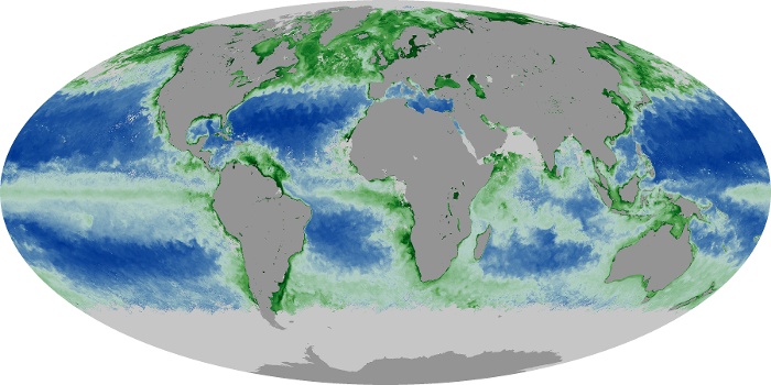
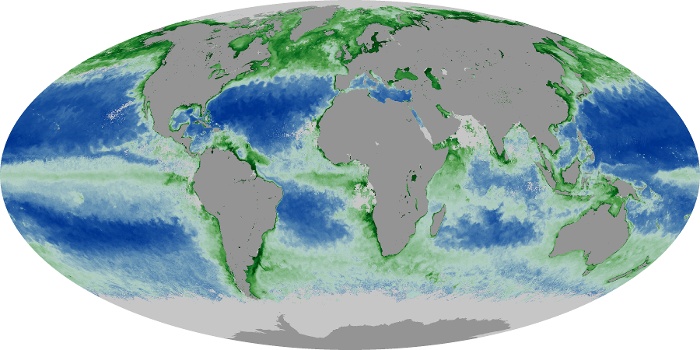
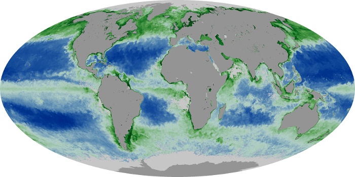
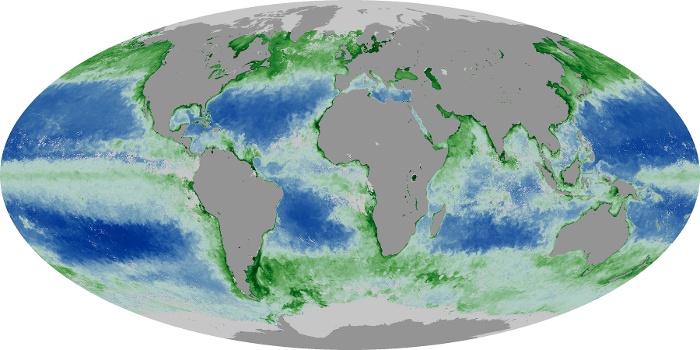
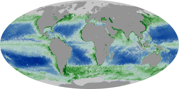
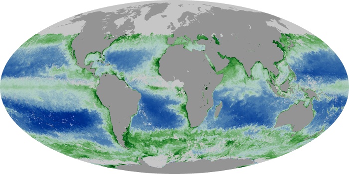
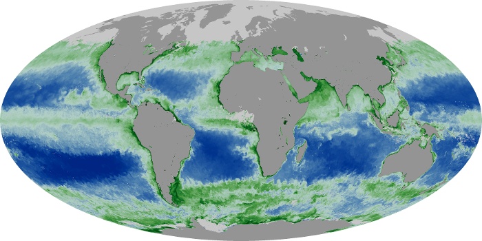
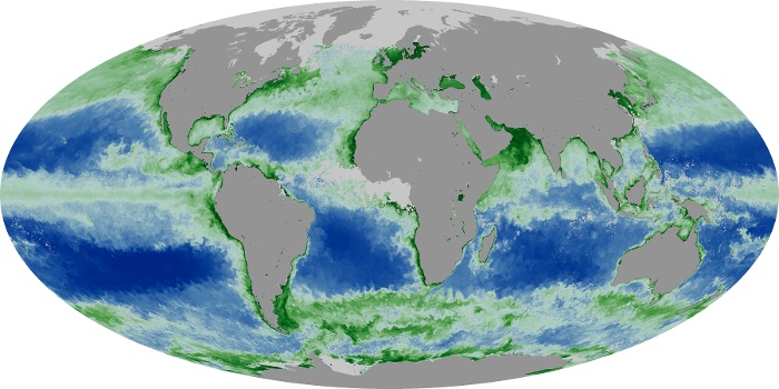
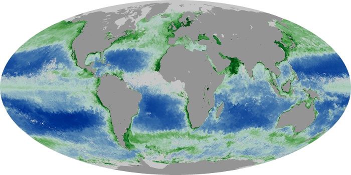
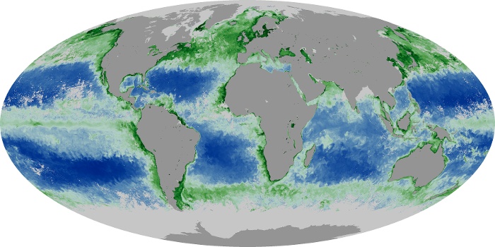
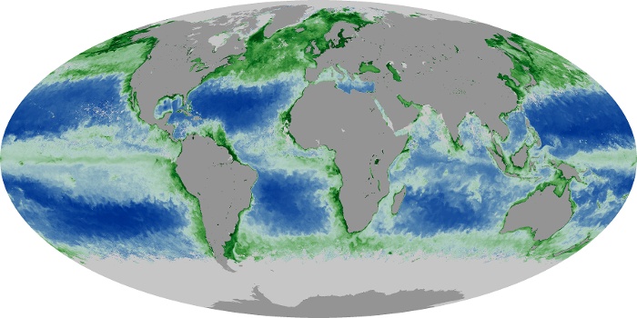
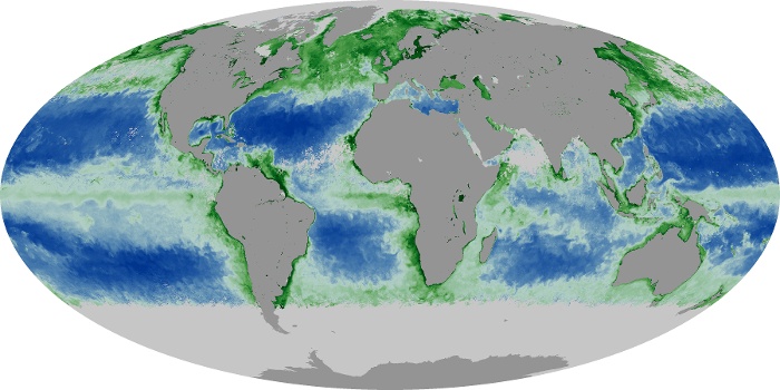
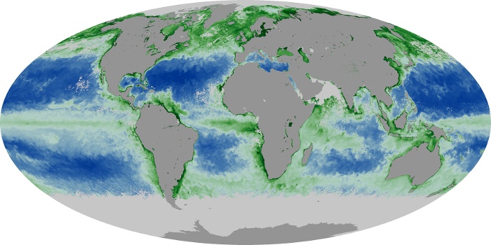
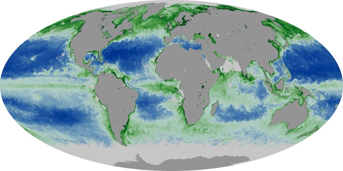
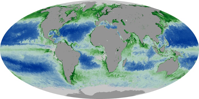
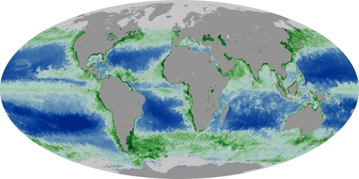
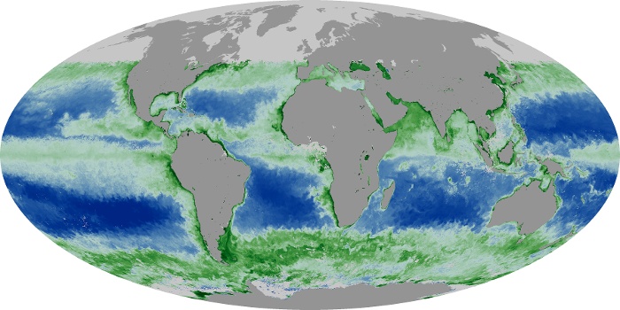
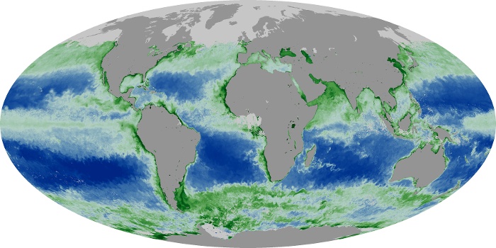
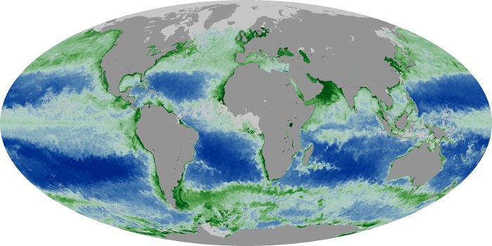
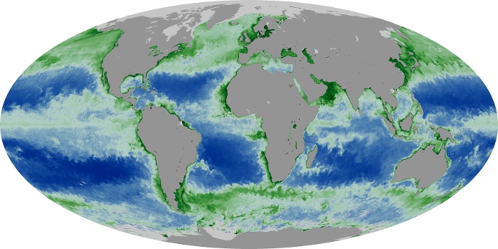
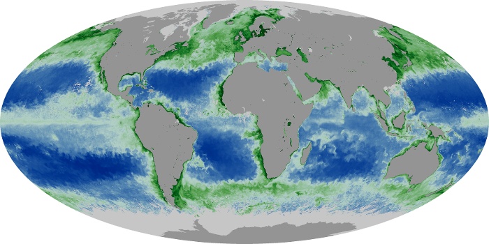
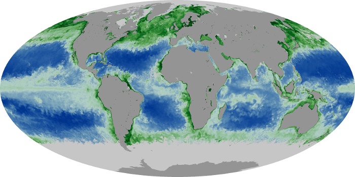
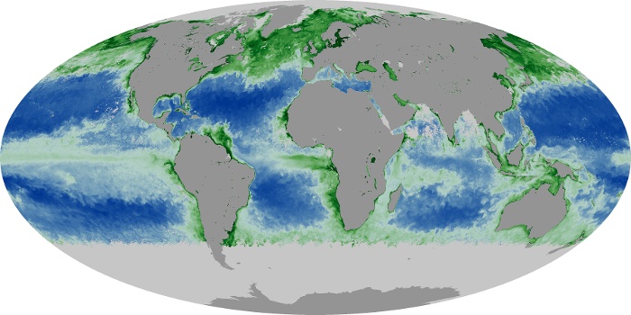
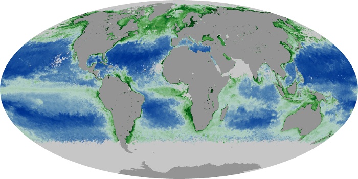
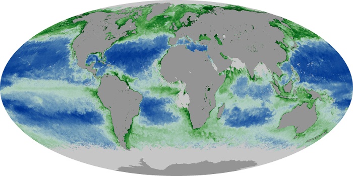
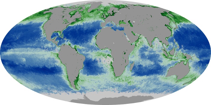
The chlorophyll maps show milligrams of chlorophyll per cubic meter of seawater each month. Places where chlorophyll amounts were very low, indicating very low numbers of phytoplankton are blue. Places where chlorophyll concentrations were high, meaning many phytoplankton were growing, are dark green. The observations come from the MODIS sensor on NASA's Aqua satellite. Land is dark gray, and places where MODIS could not collect data (reasons include sea ice, polar darkness, or clouds) are light gray.
View, download, or analyze more of these data from NASA Earth Observations (NEO):
Fire
Chlorophyll